Write in front
During my two years of working in the development of React Native (hereinafter referred to as RN), I and my team members often encountered some puzzling screen adaptation problems, such as: the full-screen mask style cannot cover the entire screen, and the 1-pixel border sometimes fails. Display, layout of special models is disordered, etc. In addition, some members also have doubts about the meaning of the values returned by the RN's API for obtaining screen parameters- Dimensions.get('window') and Dimensions.get('screen')
In fact, the adaptation of RN is relatively simple. In this article, I will explain the principle of adaptation, propose adaptation schemes, and explain the reasons for some special problems. In principle, it can cover the adaptation of all models. If there are omissions and improprieties, please point them out and communicate together.
Previous wonderful RN articles recommended:
[Analysis from source code] Probably the most practical React Native exception solution on the entire network [Recommended collection]
Suitable for reading groups
- Have certain RN development experience, understand how the RN js module communicates with the native module;
- Have RN adaptation experience, understand, but don’t fully understand the kind;
- Want to know RN adaptation;
Why do we need to adapt
Ensure that the interface can be displayed according to the design effect on different device screens, unifying the user's visual and operating experience
Explanation of common suitable nouns
If you search for screen adaptation from the Internet, there must be a lot of terms and explanations in the blog posts you find
- Adaptation: The element display effect is the same on different screens
- Screen size: refers to the length of the diagonal of the screen
- px (unit): px is actually the abbreviation of pixel. According to Wikipedia, it is the basic unit of image display. It is neither a definite physical quantity, nor a point or small square, but an abstract concept. So be aware of its context when talking about pixels!
- Resolution: refers to the maximum number of physical pixels that can be displayed in width and height
- Device physical pixel: Refers to the smallest physical unit that the device can control the display, which means one point on the display. From the day the screen was produced in the factory, the pixel points of the device on it have been fixed, which is related to the size of the screen.
- Device independent pixel (device logical pixel): A point in the computer coordinate system. This point represents a virtual pixel that can be used by the program (for example: css pixel). This point has no fixed size. The smaller the pixel, the clearer it is. Conversion of related systems to physical pixels
- CSS pixels: The correspondence between css px and physical pixels, which is related to the zoom of the viewport. When scale = 1/dpr, 1px corresponds to one physical pixel
- DPI: The printing point density of the printing device. How many points per inch
- PPI: The physical pixel density of the device. How many physical pixels per inch
- DPR: device pixel ratio = device physical pixel / device independent pixel (CSS pixel)
The feeling of most people after reading these terms: understand, but not fully understand\~
Let's forget these noun concepts first, and only remember the following 4 concepts:
- Adaptation: elements display the same effect on
- Device independent pixels = device logical pixels = CSS pixels
- DPR: device pixel ratio = device physical pixel / device independent pixel (CSS pixel)
- The dimensions in the design drawing and coding are CSS pixels
OK, now, let’s start! Guest officers, please come with me.
RN size unit
To do RN adaptation, you must first understand the size unit of the RN style.
It is clearly marked on RN's official website:
All dimensions in React Native are unitless, and represent density-independent pixels.
The dimensions in React Native are all unitless and represent logical pixels that have nothing to do with the pixel density of the device.
Why is it a unitless logical pixel?
Because RN is a cross-platform framework, the size is usually described in logical pixel unit pt on IOS, and the size is usually described in logical pixel unit dp on Android. It is not good for RN to choose whichever one is the same. Which unit is used by default for rendering on which platform.
RN provides to developers is the logical pixel size that has been converted by DPR (device pixel ratio), and developers no longer need to care about the size and numerical calculation problems caused by different device DPR
In some blog posts, it will be mentioned that RN has already been adapted, which actually means this.
Adaptation scheme
Note: The size standard of the design drawings in the examples and descriptions in this article is 375X667 (iPhone6/7/8)
For RN adaptation, I sum it up as the following formula:
One idea, one pixel, one ratio;
partial boxes are all proportional;
A pop in the vertical direction when encountering a full-page layout;
Android needs to handle the status bar.
One idea
Adaptation is the concept of consistent element display effect under different screens.
How to understand it?
Give a chestnut:
Suppose there is an element marked as 375X44 on the 375X667 design drawing, that is, the width occupies the entire screen and the height is 44px. If we do the screen adaptation of RN, then:
On iPhone 6/7/8 (375X667) models and iPhone X (375X812) models, the rendering result of this element will occupy the screen width ;
On the iPhone 6/7/8 Plus (414X736) model, the rendering result of this element should also occupy the full screen width ;
To make an analogy in real life:
According to the size of the Engel coefficient, the United Nations has a standard for dividing the living standards of countries in the world, that is, if the Engel coefficient of a country’s average household is greater than 60%, it means poverty; 50%-60% means food and clothing; 40%-50% means well-off; 30%- 40% is relatively rich; 20%-30% is rich; 20% or less is extremely rich.
Assuming that to achieve a well-off life, no matter which country you are from, whether it is a developed country or a developing country, the Engel coefficient of the family must reach 40%-50%.
Here, the country can be understood as the mobile phone screen, and the living standard can be understood as the element rendering effect.
As for some of the above terms, such as: physical pixels, pixel ratio, etc., you can understand the currency of the country and the currency exchange rate. After all, programming comes from life.
So, you who are moving bricks, are you well off~?
One pixel
All sizes in RN style, including but not limited to width, height, margin, padding, top, left, bottom, right, fontSize, lineHeight, transform, etc. are logical pixels (web players can understand as css pixels)
  h3: {
    color: '#4A4A4A',
    fontSize: 13,
    lineHeight: 20,//逻辑像素
    marginLeft: 25,
    marginRight: 25,
  },
A ratio
Device logical pixel width ratio
In order to have a better visual and user experience, the current popular mobile terminal adaptation schemes are all width adaptations in size, and they are freely arranged in the vertical direction in the layout. The advantage of this is: ensure that the size of the elements on the page are scaled in proportion to the design drawing, and the content can only cover the width of the screen; if the content in the vertical direction exceeds the screen, you can slide your finger up and down to view more content on the page .
Of course, if you want to take a special path, it is designed to be highly adapted, and sliding in the horizontal direction is also possible.
back to the 16076b623e54e4 "one idea" example , on the iPhone 6/7/8 Plus (414X736) model, if you render a design drawing with 375 size elements, it is easy to calculate that the actual width we want to set should be: 375 * 414/375 = 414.
Here 414/375 is device logical pixel width ratio
Formula: WLR = device width logical pixels/design drawing width
WLR (width logic rate abbreviation), bulk English, haha.Dimensions.get('window').widthobtain the logical pixels of the width of the device. The specific reason will be explained later. [Q1]
Then, the size calculation formula to be set on the target device is: size = set the size of the elements on the map * WLR
The four arithmetic operations in elementary school are very simple!
In fact, all adaptations are done around a ratio , such as web-side scaling, rem adaptation, postcss plugin, etc. , and the same goes for different routes!
Partial boxes are all proportional
For ease of understanding, the "box" here means the same as the "box model" in the web.
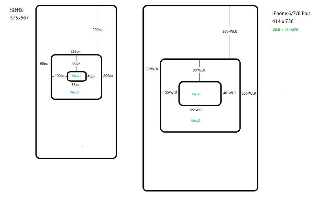
The partial boxes are all to scale. It means that the size, position, inner and outer margins of the elements in the RN page are all calculated according to the size calculation formula -ratio As shown below:
The effect rendered in this way will retain the size of the design drawing and the layout design effect to the greatest extent.
Why is it said that it is the maximum? I will leave it as a question first and explain it later. [Q2]
At this point, some novice students may ask: Why is the device height logical pixel ratio not used for calculation in the vertical direction?
Because the device height logic pixel/design drawing height may not be equal to the device width logic pixel/design drawing width, it will cause the box to stretch.
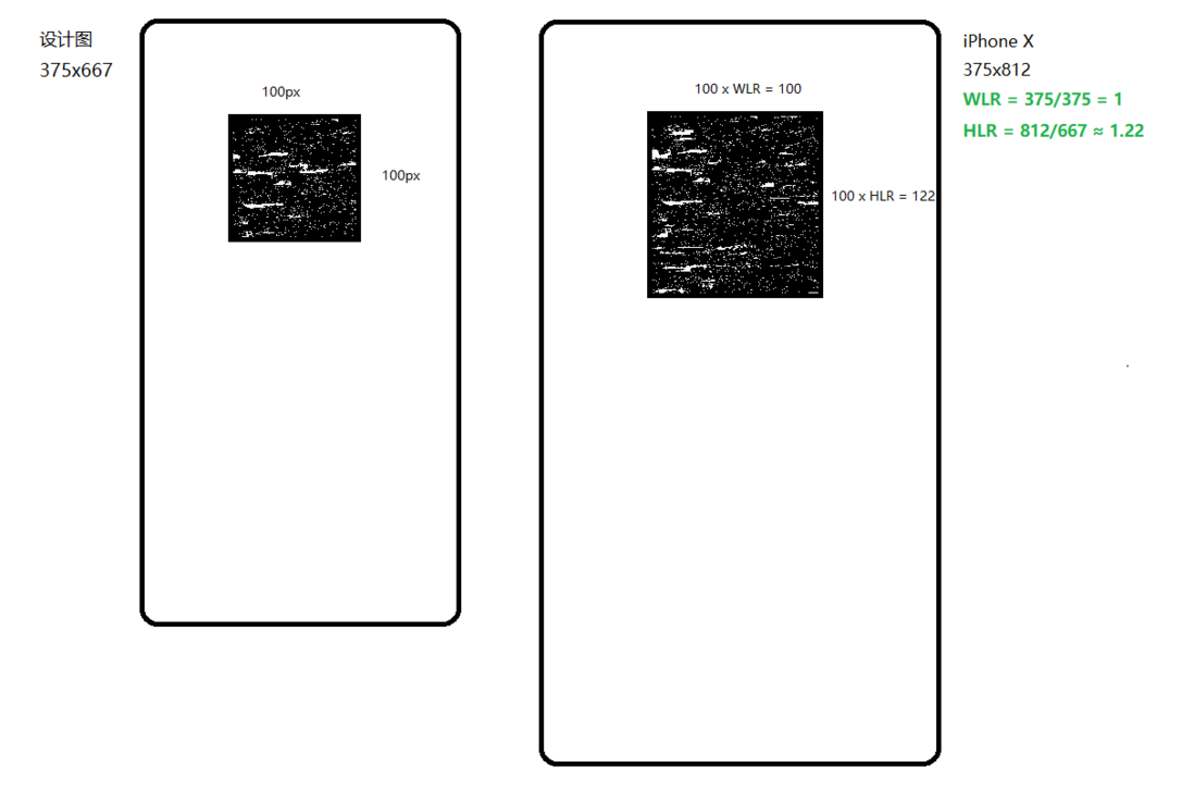
For example, now according to the design drawing a 100X100px square box is rendered on iPhone X (375X812), the width logical pixel ratio is 1, the height logical pixel ratio is 812/667≈1.22, if the width and height are calculated according to the previous two ratios respectively , Then the size of the final box model will become:
  view1: {
    width: 100,
    height: 122,
  },
Well, a square has been stretched into a rectangular shape!
This is obviously undesirable.
Speaking of this, RN adaptation has actually completed 70%, yes, just play with multiplication and division~
When encountering a full-page layout, a pop in the vertical direction
What is a full page layout?
The content just fills the entire page without overflowing the screen.
The bounce here refers to the flex layout. In RN, the default is flex layout, and the direction is column, layout from top to bottom.
Why do you want to play?
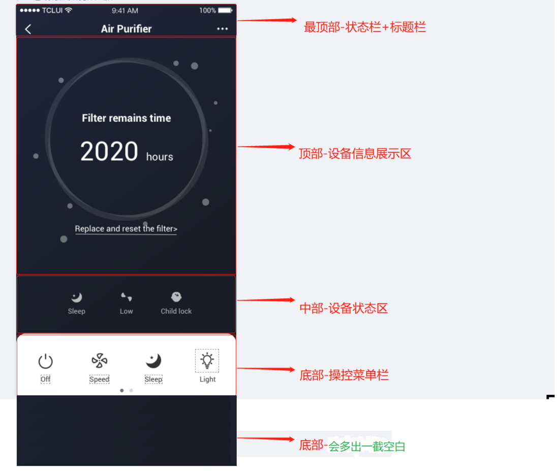
Let's first look at the layout design of the top, middle and bottom partitions that are common in the mobile terminal page layout. Take the old UI design of the TCL IOT single product as an example:
According to the design, on the iPhone 6/7/8 model (375X667), the entire page is covered. According to the above-mentioned adaptation method on the iPhone 6/7/8 model (414X736), it is actually almost covered. 414/375≈736/667 , because 06076b623e595e. However, on the iPhone X (375X812) model, if the layout is from top to bottom according to the design drawing, there will be a vacant section at the bottom:
There are two ways to deal with this:
- The bottom-control menu bar area is
bottom:0, the topmost-status bar + title bar is fixed at the top, no processing is required, then calculate and use absolute positioning to fine-tune the top-device information display area, middle-device status area , So that they just divide the extra blank space, making the page look more coordinated; - The top-device information display area, the middle-device status area, and the bottom-manipulation menu bar area are wrapped in a parent container. Using the flexible layout of RN flex, set
justifyContent:'space-between'make these three areas vertically aligned at the top and bottom ends, and the middle area is equally divided up and down. Extra blank area.
In the first type, each device needs to calculate the size of the blank area and then fine-tune the position of the element, which is very troublesome.
I recommend the second type, which is easier to code. This is "Bounce one bomb"
Some students may worry that the second method will result in a very large vertical span in the middle area, and the page looks uncoordinated. But in practice, the logical pixels of the device screen height are rarely much larger than 667, and the extra blank area is relatively small, and the UI effect is still possible. At present, we also use this type of N products on the line. Way, please rest assured to eat.
So far, if you follow the previous web-side adaptation experience, RN adaptation should have been completed, but there are still pitfalls.
Android needs to handle the status bar
Although RN is cross-platform, the rendering effect is different on iOS and Android. The most obvious is the status bar. As shown below:
Android does not set StatusBar of translucent property true when, from the bottom of the status bar to start drawing. This is not in line with our adaptation goal, because in our design drawings, the entire page layout design covers the status bar. Therefore, it is recommended to set the attribute of the translucent true entire page to our developers to layout.
<StatusBar translucent={true} />If you have seen this, congratulations, classmate, you have mastered the adaptation of RN and can handle more than 90% of the scenarios.
But there are some weird scenarios and some APIs that you may not understand. This is included in the remaining 10% adaptation scenarios or helps you understand and debug them. It doesn't matter, I will continue to elaborate below. Some will involve the source code, if you are interested, you can continue to read it with me.
is very, very much, but for me personally, this part is the most important part I want to share this time.
Some weird and interesting things
There is a lot of content in this part, please read as appropriate
1. DimensionsAPI
Dimensions is an API provided by RN to obtain the size information of the device We can use it to get the width and height of the screen, which is the core API .
It provides two ways to obtain:
const {windowWidth,windowHeight} = Dimensions.get('window');
const {screenWidth,screenHeight} = Dimensions.get('screen');
The official document does not explain the meaning and difference of the results of these two acquisition methods. In actual development, the results obtained by these two methods are sometimes the same, and sometimes they are different, which confuses some students: Which one should I use is correct?
I recommend that you always use Dimensions.get('window') . Only the result obtained through it is the area that we can really manipulate the drawing.
First, clarify the meaning of the results obtained in these two ways:
Dimensions.get('window')viewport parameters width, height, scale, fontScaleDimensions.get('screen')screen parameters width, height, scale, fontScale
Among them, the width and height of the screen are always ≥ the width and height of the window when the device screen is in the same state by default, because the parameters obtained by the window will exclude the height of the status bar (when translucent is false) and the height of the bottom virtual menu bar . When this Android machine sets the status bar translucent to true and does not open the virtual menu bar, Dimensions.get('window') will be the same Dimensions.get('screen') the width and height obtained by 06076b623e5d16, otherwise it will be different. This is the answer to the question that was sometimes the same at the beginning of this paragraph, and sometimes it was different.
This is not based on conjecture or groundlessness, directly source code arrangement:
Due to the limited equipment of the author, the source code of this article is only analyzed from the Android platform. The source code of ios can be consulted by students with ios experience.
Preparation: Create a new Demo RN project official document For stability, we use the previous RN version 0.62.0. The command is as follows:npx react-native init Demo --version 0.62.0
step1. first find the js file of this API of RN. node_modules\react-native\Libraries\Utilities\Dimensions.js
/**
 * Copyright (c) Facebook, Inc. and its affiliates.
 *
 * This source code is licensed under the MIT license found in the
 * LICENSE file in the root directory of this source tree.
 *
 * @format
 * @flow
 */

'use strict';

import EventEmitter from '../vendor/emitter/EventEmitter';
import RCTDeviceEventEmitter from '../EventEmitter/RCTDeviceEventEmitter';
import NativeDeviceInfo, {
  type DisplayMetrics,
  type DimensionsPayload,
} from './NativeDeviceInfo';
import invariant from 'invariant';

type DimensionsValue = {
  window?: DisplayMetrics,
  screen?: DisplayMetrics,
  ...
};

const eventEmitter = new EventEmitter();
let dimensionsInitialized = false;
let dimensions: DimensionsValue;

class Dimensions {
  /**
   * NOTE: `useWindowDimensions` is the preffered API for React components.
   *
   * Initial dimensions are set before `runApplication` is called so they should
   * be available before any other require's are run, but may be updated later.
   *
   * Note: Although dimensions are available immediately, they may change (e.g
   * due to device rotation) so any rendering logic or styles that depend on
   * these constants should try to call this function on every render, rather
   * than caching the value (for example, using inline styles rather than
   * setting a value in a `StyleSheet`).
   *
   * Example: `const {height, width} = Dimensions.get('window');`
   *
   * @param {string} dim Name of dimension as defined when calling `set`.
   * @returns {Object?} Value for the dimension.
   */
  static get(dim: string): Object {
    invariant(dimensions[dim], 'No dimension set for key ' + dim);
    return dimensions[dim];
  }

  /**
   * This should only be called from native code by sending the
   * didUpdateDimensions event.
   *
   * @param {object} dims Simple string-keyed object of dimensions to set
   */
  static set(dims: $ReadOnly<{[key: string]: any, ...}>): void {
    // We calculate the window dimensions in JS so that we don't encounter loss of
    // precision in transferring the dimensions (which could be non-integers) over
    // the bridge.
    let {screen, window} = dims;
    const {windowPhysicalPixels} = dims;
    if (windowPhysicalPixels) {
      window = {
        width: windowPhysicalPixels.width / windowPhysicalPixels.scale,
        height: windowPhysicalPixels.height / windowPhysicalPixels.scale,
        scale: windowPhysicalPixels.scale,
        fontScale: windowPhysicalPixels.fontScale,
      };
    }
    const {screenPhysicalPixels} = dims;
    if (screenPhysicalPixels) {
      screen = {
        width: screenPhysicalPixels.width / screenPhysicalPixels.scale,
        height: screenPhysicalPixels.height / screenPhysicalPixels.scale,
        scale: screenPhysicalPixels.scale,
        fontScale: screenPhysicalPixels.fontScale,
      };
    } else if (screen == null) {
      screen = window;
    }

    dimensions = {window, screen};
    if (dimensionsInitialized) {
      // Don't fire 'change' the first time the dimensions are set.
      eventEmitter.emit('change', dimensions);
    } else {
      dimensionsInitialized = true;
    }
  }

  /**
   * Add an event handler. Supported events:
   *
   * - `change`: Fires when a property within the `Dimensions` object changes. The argument
   *   to the event handler is an object with `window` and `screen` properties whose values
   *   are the same as the return values of `Dimensions.get('window')` and
   *   `Dimensions.get('screen')`, respectively.
   */
  static addEventListener(type: 'change', handler: Function) {
    invariant(
      type === 'change',
      'Trying to subscribe to unknown event: "%s"',
      type,
    );
    eventEmitter.addListener(type, handler);
  }

  /**
   * Remove an event handler.
   */
  static removeEventListener(type: 'change', handler: Function) {
    invariant(
      type === 'change',
      'Trying to remove listener for unknown event: "%s"',
      type,
    );
    eventEmitter.removeListener(type, handler);
  }
}

let initialDims: ?$ReadOnly<{[key: string]: any, ...}> =
  global.nativeExtensions &&
  global.nativeExtensions.DeviceInfo &&
  global.nativeExtensions.DeviceInfo.Dimensions;
if (!initialDims) {
  // Subscribe before calling getConstants to make sure we don't miss any updates in between.
  RCTDeviceEventEmitter.addListener(
    'didUpdateDimensions',
    (update: DimensionsPayload) => {
      Dimensions.set(update);
    },
  );
  // Can't use NativeDeviceInfo in ComponentScript because it does not support NativeModules,
  // but has nativeExtensions instead.
  initialDims = NativeDeviceInfo.getConstants().Dimensions;
}

Dimensions.set(initialDims);

module.exports = Dimensions;
This Dimensions.js module initializes the Dimensions parameter information, and our Dimensions.get() method is to obtain the information. And, the module points out the source of the information:
//...
initialDims = NativeDeviceInfo.getConstants().Dimensions;
//...
Dimensions.set(initialDims);
let {screen, window} = dims
const {windowPhysicalPixels} = dims
const {screenPhysicalPixels} = dims
//...
dimensions = {window, screen};
The data source is from the DeviceInfo module in the native module.
Well, let's go directly to the Android source code to see what it provides.
step2: gets the Android source jar package from node_modules\react-native\android\com\facebook\react\react-native\0.62.0\react-native-0.62.0-sources.jar.
Download it and save it locally.
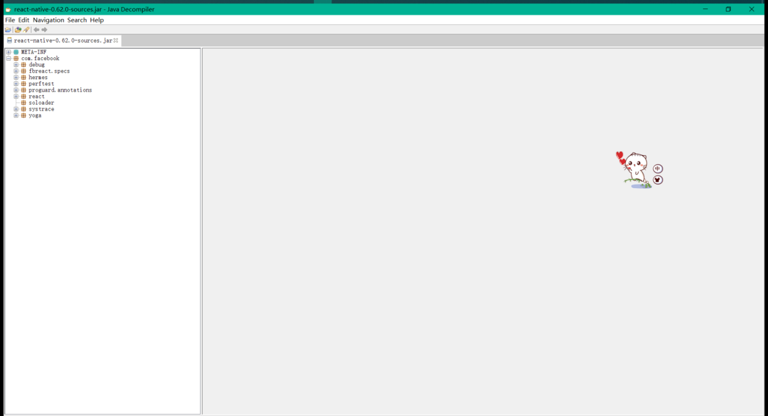
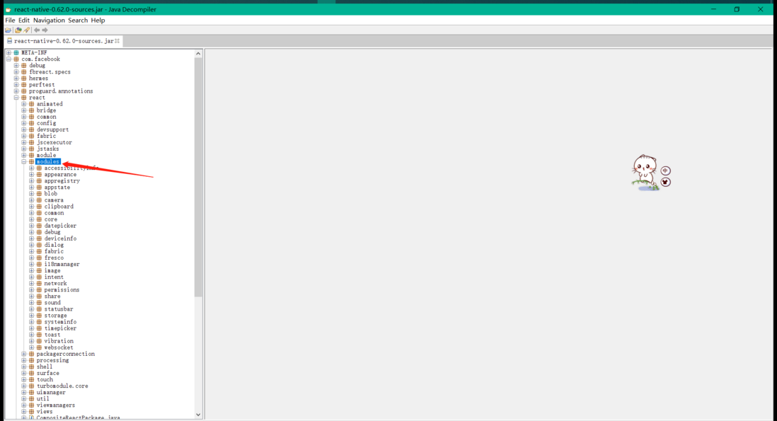
step3: Use tool java decompiler decompile react-native-0.62.0-sources.jar :
As you can see, there are many packages. We went straight to com.facebook.react.modules , this module is where most of the APIs natively provided for RN jsc.
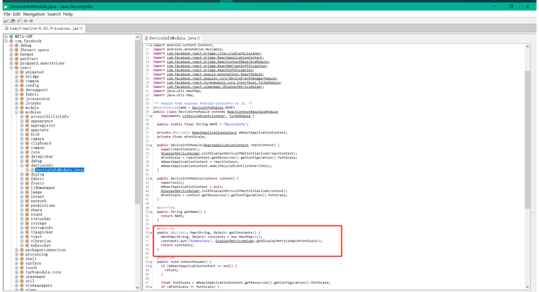
step4: open com.facebook.react.modules.deviceinfo.DeviceInfoModule.java :
Look at the place marked by the red box in the picture, which is in the above js module
initialDims = NativeDeviceInfo.getConstants().Dimensions; The initial size information of the device comes from this.
step5: open DisplayMetricsHolder.java , find the getDisplayMetricsMap() method:
How about, are windowPhysicalPixels & screenPhysicalPixels very familiar? And are their attribute fields width , height , scale , fontScale , densityDpi etc. often used? That's right, you have seen them Dimensions.js
Strictly speaking, Dimensions.js also missed a densityDpi (device pixel density) which has not been deconstructed~
Ok, let's look at their original data source:
result.put("windowPhysicalPixels", getPhysicalPixelsMap(sWindowDisplayMetrics, fontScale));
result.put("screenPhysicalPixels", getPhysicalPixelsMap(sScreenDisplayMetrics, fontScale));
Respectively from:sWindowDisplayMetrics 、sScreenDisplayMetrics。
Among them, sWindowDisplayMetrics passed
DisplayMetrics displayMetrics = context.getResources().getDisplayMetrics();
DisplayMetricsHolder.setWindowDisplayMetrics(displayMetrics);
Set upsScreenDisplayMetrics passed
 DisplayMetrics screenDisplayMetrics = new DisplayMetrics();
 screenDisplayMetrics.setTo(displayMetrics);
 WindowManager wm = (WindowManager) context.getSystemService(Context.WINDOW_SERVICE);
 Assertions.assertNotNull(wm, "WindowManager is null!");
 Display display = wm.getDefaultDisplay();
 // Get the real display metrics if we are using API level 17 or higher.
 // The real metrics include system decor elements (e.g. soft menu bar).
 //
 // See:
 // http://developer.android.com/reference/android/view/Display.html#getRealMetrics(android.util.DisplayMetrics)
 if (Build.VERSION.SDK_INT >= Build.VERSION_CODES.JELLY_BEAN_MR1) {
 display.getRealMetrics(screenDisplayMetrics);
 } else {
 // For 14 <= API level <= 16, we need to invoke getRawHeight and getRawWidth to get the real
 // dimensions.
 // Since react-native only supports API level 16+ we don't have to worry about other cases.
 //
 // Reflection exceptions are rethrown at runtime.
 //
 // See:
 // http://stackoverflow.com/questions/14341041/how-to-get-real-screen-height-and-width/23861333#23861333
 try {
 Method mGetRawH = Display.class.getMethod("getRawHeight");
 Method mGetRawW = Display.class.getMethod("getRawWidth");
 screenDisplayMetrics.widthPixels = (Integer) mGetRawW.invoke(display);
 screenDisplayMetrics.heightPixels = (Integer) mGetRawH.invoke(display);
 } catch (InvocationTargetException | IllegalAccessException | NoSuchMethodException e) {
 throw new RuntimeException("Error getting real dimensions for API level < 17", e);
 }
 }
 DisplayMetricsHolder.setScreenDisplayMetrics(screenDisplayMetrics);
Set up.
In Android, context.getResources().getDisplayMetrics(); only obtains the size information of the drawable area, and removes the top status bar and the bottom virtual menu bar by default. When setting screenDisplayMetrics, although there are different versions, the physical resolution of the entire screen is ultimately obtained.
Therefore, it is possible to explain the situation at the beginning with a real reason and evidence. And it fully describes the 06076b623e6238 API from the js layer to the native layer Dimensions talk about this one. Do you understand?
The full screen mask style cannot cover the entire screen
This problem appears on some old Android devices, probably in the low-end and mid-range models around 2016~2018, most of which are Honor models. This type of mobile phone comes with a virtual menu bar at the bottom, and can be automatically/manually hidden when in use.
problem situation:
When a custom Modal with mask pops up, if the height of the mask is set to Dimensions.get('window').height, after hiding the bottom virtual menu bar, there will be a section at the bottom that cannot be masked by the mask.
cause of the problem:
After the menu bar is hidden, the height of the drawable area of the page has changed, and the currently rendered view is still in the state where the menu bar was not hidden last time.
Solution:
The official website of monitoring screen status changes has actually pointed out this point ( https://www.react-native.cn/docs/dimensions), but many students automatically ignore .
Use Dimensions.addEventListener() monitor and set the mask height. The key point is to change the state and drive the view update through the state.
Of course, remember to remove the event listenerDimensions.removeEventListener()
1-pixel border sometimes cannot be displayed
The 1-pixel border of RN usually refers to:StyleSheet.hairlineWidth
It is a constant, and the rendering effect will meet the most detailed standards of the current platform.
However, when setting in the list item, some list items often lose this line, and the strange thing is that the same line, some mobile phones display normally, some mobile phones do not display, and even the lines on some models will be relatively " fat".
Old rules, move the source code:
You can find in node_modules\react-native\Libraries\StyleSheet\StyleSheet.js:
let hairlineWidth: number = PixelRatio.roundToNearestPixel(0.4);
if (hairlineWidth === 0) {
  hairlineWidth = 1 / PixelRatio.get();
}
Then find in node_modules\react-native\Libraries\Utilities\PixelRatio.js:
  /**
   * Rounds a layout size (dp) to the nearest layout size that corresponds to
   * an integer number of pixels. For example, on a device with a PixelRatio
   * of 3, `PixelRatio.roundToNearestPixel(8.4) = 8.33`, which corresponds to
   * exactly (8.33 * 3) = 25 pixels.
   */
  static roundToNearestPixel(layoutSize: number): number {
    const ratio = PixelRatio.get();
    return Math.round(layoutSize * ratio) / ratio;
  }
This principle is rendered logic about a 0.4 pixel line, is not necessarily the value 0.4, according to roundToNearestPixel converted into integer value most occupy a physical pixel DPR-related device, but also the above-described Dimensions in scale attribute value. The worst case is when DPR is less than 1.25, it is equal to 1 / PixelRatio.get() .
Calculated according to the above rules, no matter what, it should be displayed anyway. However, here we have to introduce two concepts first- pixel grid alignment and JavaScript number accuracy:
We can arbitrarily specify the precision when setting the logical pixels, but when the device is rendering, it is actually displayed by physical pixels one by one, and the physical pixels are always the whole. In order to ensure correct display in arbitrary precision, RN will do pixel grid alignment when rendering;
JavaScript has no real integers. Its number type is implemented based on the IEEE 754 standard, using a 64-bit binary "double precision" format. There will be a "machine accuracy" error between the values, usually Math.pow(2,-52) .
After the concept is finished, let's look at an example:
Assuming that there is an Android machine with DPR=1.5, and two height = StyleSheet.hairlineWidth are rendered on the top and bottom of the page, according to the above calculation rules, at this time height = StyleSheet.hairlineWidth≈0.66666667 , ideally occupies 1px physical pixel. But the actual situation may be:
Because of the accuracy of js numbers, Math.round(0.4 * 1.5) / 1.5 multiplied by 1.5 not necessarily equal to 1 , it may be greater than 1, it may be less than 1, of course, it may also be equal to 1.
Confused?
Let me show you a common interview question:0.1+0.2 === 0.3 // false
how about it? do you understand? Haha
The physical pixel is the whole. When it is greater than 1, it will occupy 2 physical pixels. When it is less than 1, it may occupy 1 or not. When it is 1, the display is normal. This is the pixel grid alignment, which leads to three situations when the StyleSheet.hairlineWidth is set:
- The display is thicker than expected;
- it shows good;
- Do not show;
solution:
In most cases, StyleSheet.hairlineWidth actually performed well. If this problem occurs, you can try to choose 0.4~1 to set the size:
wrapper:{
  height:.8,
  backgroundColor:'#333'
}
Then check the rendering effect and choose the most suitable one.
to sum up
In this article, I first introduced the RN adaptation scheme and summarized an adaptation formula for everyone. If you understand this formula, you will basically master RN adaptation;
Then, from the perspective of the source code, I will take you back to Dimensions and the source of its value. Finally, it explains "the full screen mask cannot cover the entire screen" and "the 1-pixel border sometimes cannot be displayed" Phenomenon or problem.
hope you have gained something after reading this article!
If you think it is good, please like and favorite and recommend to friends around you, thank you for your encouragement and recognition!
have any questions, please leave a message or
original is not easy, reprinting requires my consent.
FQA
- How to adapt to bangs and special-shaped screens?
It is recommended to turn on "immersive" drawing. IOS is turned on by default, and Android needs to be set to <StatusBar translucent={true} /> . Then set the height of the top status bar + title bar according to the actual situation of the bangs and the special-shaped screen.
- How to adapt to large-screen tablet computers such as iPad?
It depends on the actual business. If the requirements only need to be consistent with the mobile phone, then you can use my solution directly. If you also require horizontal and vertical screen adaptation, then you need to use Dimensions.addEventListener() monitor and set the RN viewport parameters at this time. When calculating the ratio, use the monitored value as the standard before adapting.
- Why is it said that adaptation is to maximize the reduction of design? [Q2] in the main text)
In the "1 pixel border sometimes can not be displayed" chapter, I mentioned the pixel grid alignment and js digital precision issues. When adapting, the final value we set is calculated based on the ratio. This calculation result will have accuracy errors, plus the pixel grid alignment, after rendering, there are some special situations, such as in a certain area When a large number of small element nodes are continuously rendered inside, it will cause a slight difference with the design drawing.











**粗体** _斜体_ [链接](http://example.com) `代码` - 列表 > 引用。你还可以使用@来通知其他用户。