Preface
Feng He Ri Li: I am grinning and grabbing my cool ikbc keyboard and typing bugs frantically.
Thunderbolt: I was pulled into a group, and the product said that the website I made was very stuck and needed performance optimization.
Unbelievable: I developed it with the distinguished Vue3+Ts (manual dog head).
Very resistant: Due to Yin Wei, I performed a physical examination and surgery on the website.
Physical examination
medicine. What is the medicine (standard)? We will explain below. Here I chose Google’s son "160950faac2940 lighthouse" (LightHouse) . Performance checkup.
Medical examination standards
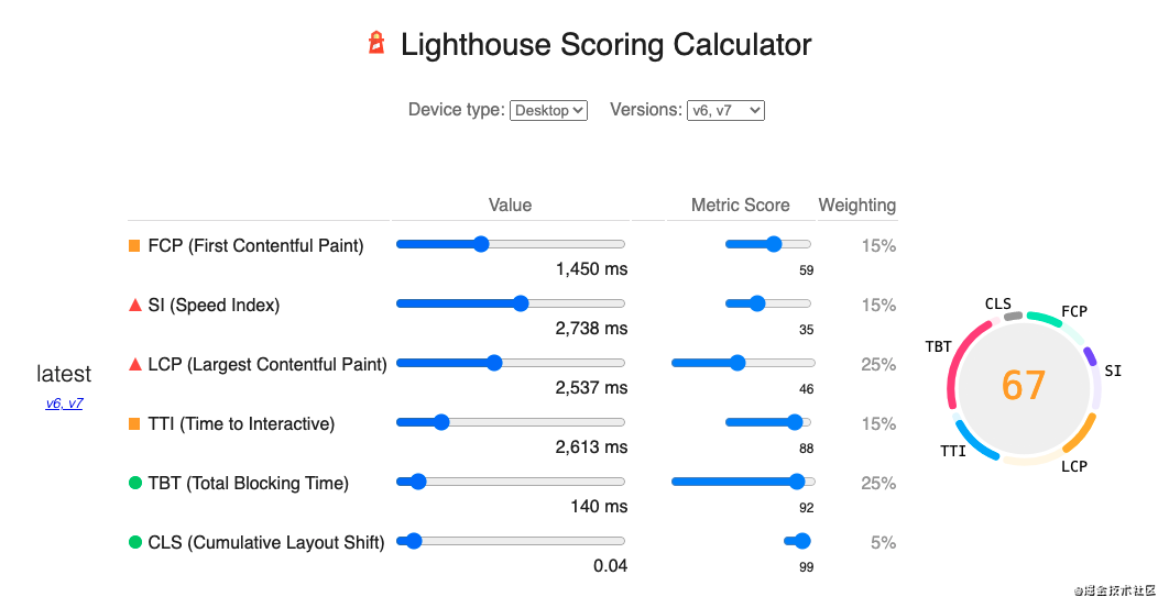
Why do I say that most of the medical check-up packages are changing soups and not changing medicines? Let's start with the scoring rules of the lighthouse:
From the above, we can see that the lighthouse v6/v7 version is scored by several performance indicators and different weights. These indicators are mainly PerformanceTiming and PerformanceEntry API standards. Most medical examinations on the market The package is also customized based on these indicators. Next, let's understand the meaning of these indicators.
FCP (First Contentful Paint)
The time point of rendering the first element (text, picture, canvas...)
SI (Speed Index)
First screen display time
LCP (Largest Contentful Paint)
The time point of rendering the largest content element in the viewable area
TTI (Time to Interactive)
The point in time when the page resource is loaded successfully and can respond to user interaction
TBT (Total Blocking Time)
Between FCP and TTI, the sum of the time that the main thread is blocked by a long task (more than 50ms)
CLS (Cumulative Layout Shift)
Cumulative layout offset value
FID (First Input Delay)
The first time the user interacts on the page (clicking a link, button, custom js event), to the time when the browser actually starts to process this event
Core Web Vitals
Speaking of user experience and performance metrics, let me mention Core Web Vitals by the way.
In May 2020, Google launched a set of core index standards (Core Web Vitals) for website user experience. It consists of three indicators:
Why not other indicators? Because this set of standards mainly evaluates from the following three dimensions:
- [Loading situation]: LCP
- [Interactivity]: FID
- [Visual Stability]: CLS
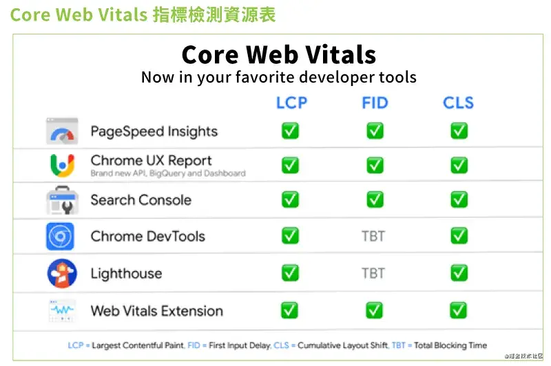
How to view Core Web Vitals metrics?
Developers can use the following tools to monitor Core Web Vitals:
Since FID requires a real user's interaction, it cannot be tested with experimental data. In order to test FID under experimental data, TBT (Total Blocking Time) is usually used. Although they measure different content, improving TBT usually improves FID .
Physical examination result
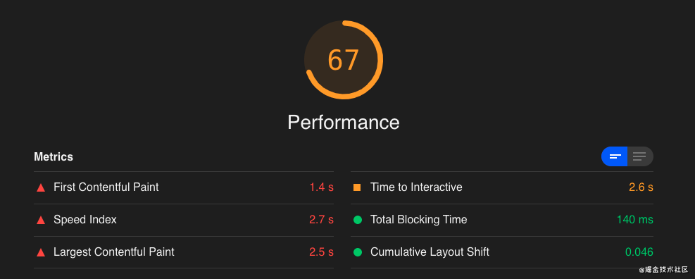
I don’t know if I don’t check it, I was shocked when I check it. The 6 "vital organs" are half cold... It's time to have an operation on it!
Index score
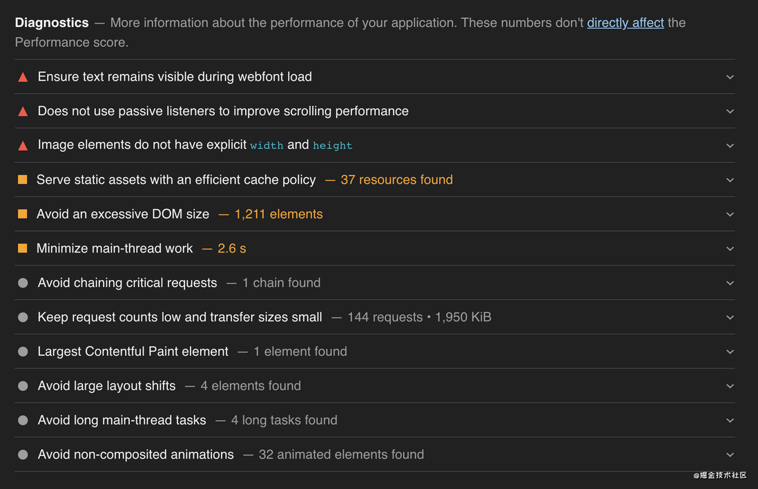
Recommendations for improvement
surgery
Surgical plan
Since it is a performance surgery, the plan mainly takes performance indicators as the dimension, which is mainly divided into the following points:
- Visual Stability (Cumulative Layout Shift)
- Loading situation (Largest Contentful Paint)
- TTI (Time to Interactive)
- TBT (Total Blocking Time)
- FCP (First Contentful Paint)
Surgical procedure
Visual Stability (Cumulative Layout Shift)
- Optimize image elements that are not dimensioned
The improvement suggestion mentioned that a high-priority optimization is to set explicit width and height for image elements, thereby reducing layout offset and improving CLS.
<img src="hello.png" width="640" height="320" alt="Hello World" />- The custom font file remains visible during loading
The improvement suggestion mentions using the CSS font-display property to ensure that the custom font file is visible during loading.
This is because it takes a while for websites to download custom font files, and different browsers have different behaviors at this time. Some browsers hide text when loading custom fonts. This is called FOIT (Flash Of Invisible Text). ). And some browsers will display degraded fonts, this situation is called FOUT (Flash Of Unstyled Tex) . These two behaviors will cause "font flicker problem", affecting visual stability (CLS).My approach is to directly set font-display: swap; this property can ensure that the font is visible at loading time. Although it still triggers FOUT, it has a smaller impact on visual stability than FOIT.
A better solution should be to preload the font file. Let the font download have a higher probability of catching up before the FCP, thereby avoiding FOIT/FOUT.
@font-face {
     font-family: 'Hello-World';
     src: url('../font/Hello-World.otf') format('OpenType');
     /* swap:如果设定的字体还未可用,浏览器将首先使用备用字体显示,当设定的字体加载完成后替换备用字体 */
     font-display:swap;
}- Avoid offsetting the page layout
There is an element dynamically inserted at the top of our product, which will cause the overall layout of the website to move down. This causes a larger layout offset. After trading with the product and ui py, we have adjusted this element friendly. This element is separated from the document flow and displayed in a fixed positioning manner, thus solving this problem.
- Avoid non-composite animation
The improvement suggestions mentioned that you should avoid using non-synthetic animations. Non-synthetic animations will make the page messy and increase CLS. Regarding this optimization suggestion, I think it should be analyzed in specific scenarios, and should not be "waste food due to choking". After all, the CSS that can be composited currently The only properties are transform & opacity. Of course, this also reminds us that we should pay attention to optimization when doing CSS animation (such as the common use of transform instead of top).
Loading situation (Largest Contentful Paint)
- Replace the largest content drawing element
In the improvement suggestions, I found that the largest content drawing element of the website is a tile element in Google Maps. It is no wonder that the data performance of the LCP indicator is not ideal. The reason: the link is too long-download Google Maps Js sdk => Initialization Google map => draw.Therefore, I decided to modify the largest content drawing element to improve the LCP time. I took a look at Largest Contentful Paint API regarding the definition of the element type, and locked the "target" to a loading element (low drawing cost: default rendering , Does not rely on any conditions and judgments). After I moved the size of the element (it became larger), the element was successfully "upper".
TBT (Total Blocking Time) / TTI (Time to Interactive)
Asynchronously load Google Maps Js sdk
The original Google Maps Js SDK was loaded synchronously by dynamically adding script tags. The disadvantages of this are actually very obvious:- Google Maps Js sdk is loaded too late, which affects TTI performance and user experience.
- The js engine occupies the main thread for related js execution.
My solution is to asynchronously load Google Maps Js SDK. What needs to be noted here is the difference between script async/defer, I use defer for asynchronous loading (async will be executed immediately after loading, blocking the main thread, affecting DOM parsing ).
<script src="//maps.googleapis.com/maps/api/js" type="text/javascript" defer ></script>- Optimize the volume of the built bundle
Looking at the volume analysis report generated based on webpack-bundle-analyzer , I found that there are two big products that can be optimized:
- lottie animation library
The site has only one animation effect implementation that uses this library. After having a py with the product and ui, we decided to sacrifice a little "visual effect". Remove the lottie library and use CSS3 instead.
- Momentjs dependency built in ant-design-vue
The momentjs language pack (locale) is very large, and the site has no internationalization requirements. So here I directly use webpack IgnorePlugin to ignore the language pack.
After optimization, the bundle size (before gizp) has been reduced from the original 1.8MB to 1.3MB.
FCP (First Contentful Paint)
website uses Vue to do client-side rendering. This also means that the FCP process will be a bit "long". (A series of tasks such as initializing the Vue instance need to occupy the main thread to execute Js). Here I am "smart" adding in the html file The "transparent text placeholder" is used to seize FCP time. I personally think this operation is a bit clever, you can selectively ignore it...
<div id="app">
   <!-- 占位符 -->
   <p style="color:#fff;">Hello World</p>
</div>
other
In addition to optimizing the above indicator dimensions, I also made a few optimizations. Here is a brief mention:
- Optimize the level and number of DOM nesting
- Reduce unnecessary interface requests
- Use translate to replace top for displacement/animation
Surgical results
After talking so much "nonsense", what is the result of the operation? Is it a gorgeous transformation or a "reverse one-Q-day fairy"? Directly above:
From the above picture, we can see that various indicators and ratings have qualitatively leap, although I "shamelessly cut the highest score" (LightHouse will fluctuate each time the score, the actual effect is increased from the original 50-70 points 70-90 points) !!!
Conclusion
The performance optimization points that we usually talk about are often the ones we most easily overlook. Performance optimization is by no means an overnight effort, and we need to continue to discover and optimize in daily development. The road is long...
If you think my article is helpful to you, welcome follow me and play together~


**粗体** _斜体_ [链接](http://example.com) `代码` - 列表 > 引用。你还可以使用@来通知其他用户。