Author: AAhmad Shadeed
Translator: Frontend Xiaozhi
Source: shaded
There are dreams and dry goods. search 160c94613a5496 [Daily Move to the World] still doing dishes in the early morning.
This article GitHub https://github.com/qq449245884/xiaozhi has been included, the first-line interview complete test site, information and my series of articles.
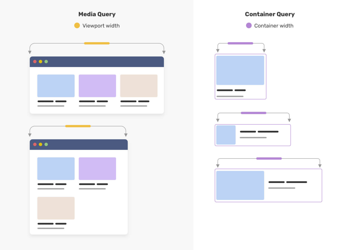
In front-end development, it is often necessary to design according to different screen sizes to achieve PC and mobile responsiveness. We generally use CSS media queries to detect the viewport width or height, and then change the design according to the mode. This is how the Web layout has been designed in the past 10 years.
CSS container query , a feature that has been requested by web developers for a long time, will soon appear in CSS. In the latest Chrome Canary, we can enable the Container Queries function chrome://flags/#enable-container-queries In this article, I will introduce what it is, how it will change the workflow as a designer, and so on.
Current state of responsive design
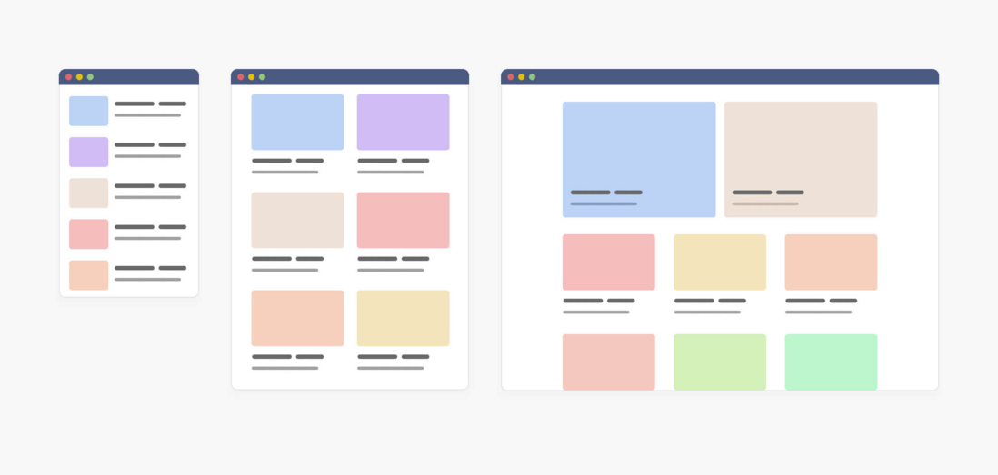
Currently, when we realize responsiveness, we generally need three styles of UI design, namely mobile, tablet and desktop.
In the above figure, the UI is designed in three versions, so developers can implement it very well, which is very nice (but I am afraid that the lazy UI only provides the PC version, which is very painful).
Now let's take a look at using media queries to see how to implement it.
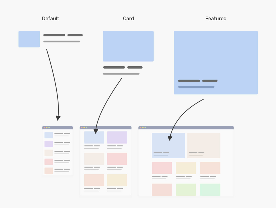
The picture above is the same component, it has three variants, namely default , Card and Featured . In CSS, developers need to create three variants of this component, each of which is unique.
.c-media {
  /* the default styles */
  display: flex;
  flex-wrap: wrap;
  gap: 1rem;
}

@media (min-with: 400px) {
  .c-media--card {
    display: block;
  }

  .c-media--card img {
    margin-bottom: 1rem;
  }
}

@media (min-with: 1300px) {
  .c-media--featured {
    position: relative;
    /* other styles */
  }

  .c-media--featured .c-media__content {
    position: absolute;
    left: 0;
    top: 0;
    width: 100%;
    height: 100%;
  }
}
The above variant depends on the media query or viewport width. This means that we cannot control them based on the width of their parent. Now you may be thinking, what's the problem here? Oh or, this is a very good question.
The problem is that only when the viewport width is greater than a certain value, the developer will use a variant of the component. For example, if I use featured which is the PC style, in a tablet, it does not work. Why? Because its media query width is greater than 1300px .
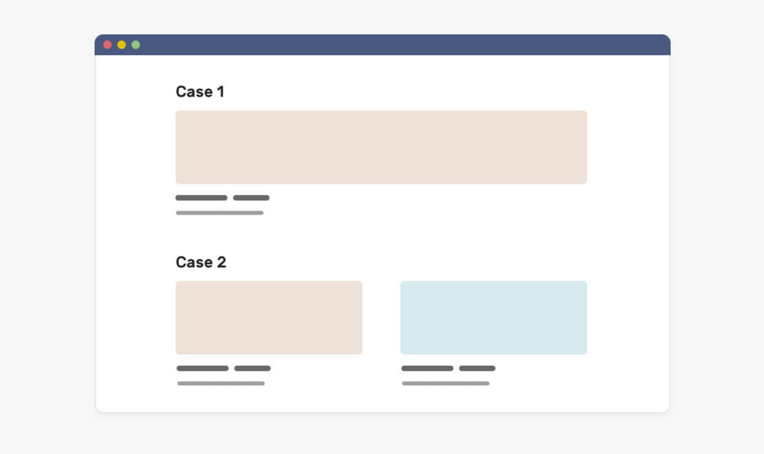
Not only that, when the content is lower than expected, we will also face a problem. Sometimes, the UP owner may only add one article, and the design includes three of them. In this case, either we will have an empty space or the project will expand to fill the available space. Consider the following picture:
In the first case (Case 1), the article is too wide and the cover will be deformed. The same problem in the second case (Case 2)
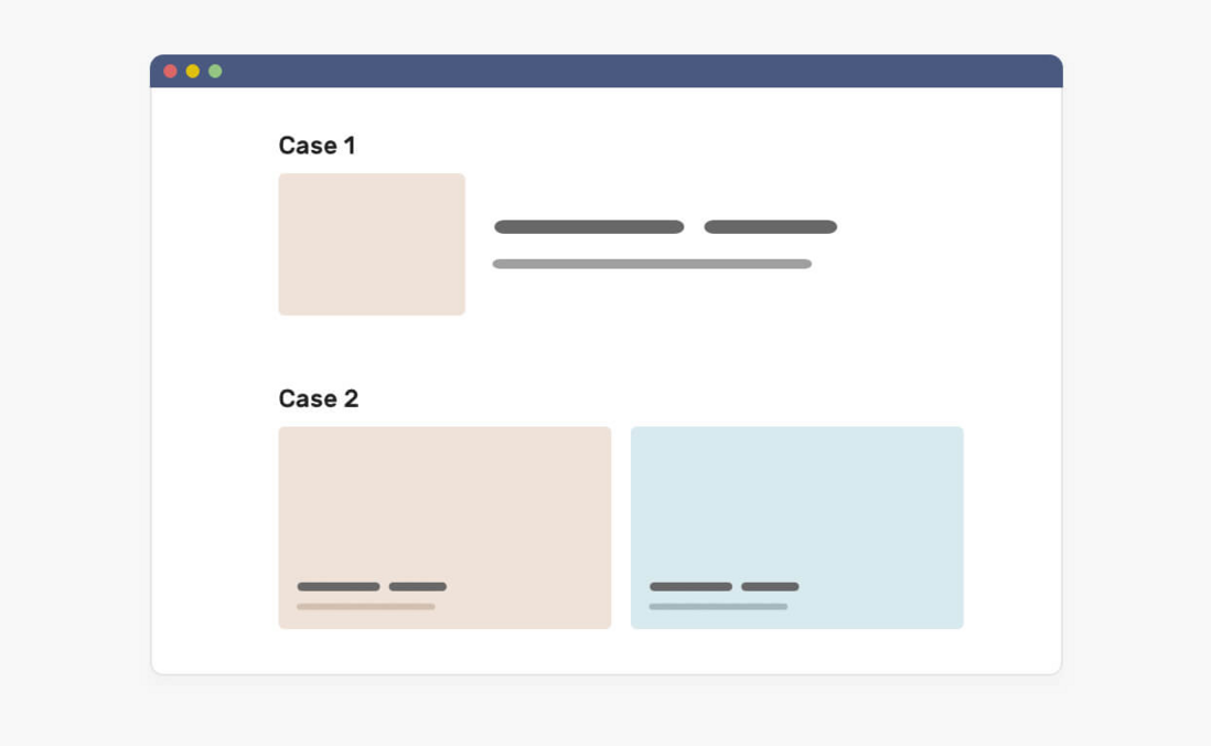
If you use container query, we can solve these problems by querying the parent component to determine how to display a specific component. Consider the image below, which shows how we can use container queries to fix this problem.
In this case, what if we turn our thinking to the parent component of the component? In other words, if we query the parent component and determine what the component should look like based on the width or height of the parent component? Let’s look at the container query the concept of.
What is a container query
First, let me define the container. It contains the element of another element, generally we call it wrapper .
In the latest Chrome Canary, we can enable the Container Queries function through chrome://flags/#enable-container-queries.
When a component is placed in an item, it is included in the item. This means that we can query the width of the parent element and modify it accordingly. Consider the picture below
Note that each card has a yellow outline, which represents the parent component of each component. Using CSS container query, we can modify the component according to the width of the parent component.
<div class="o-grid">
  <div class="o-grid__item">
    <article class="c-media"></article>
  </div>
  <!-- + more items -->
</div>
This component is an .c-media , and its parent is the .o-grid__item element. In CSS, we can do the following:
.o-grid__item {
  contain: layout inline-size style;
}

.c-media {
  /* Default style */
}

@container (min-width: 320px) {
  .c-media {
    /* The styles */
  }
}

@container (min-width: 450px) {
  .c-media {
    /* The styles */
  }
}
First, we tell the browser that each .o-grid item is a container. Then, tell the browser that if the width of the parent element is equal to or greater than 500px, it should be displayed in a different way. The same is true for 700px queries. This is how CSS container queries work.
In addition, we can define them wherever we want, which means we can query on the top-level container if needed. Now that everyone has understood the basic idea of CSS container query, take a look at the picture below to deepen the image.
On the left, this is a viewport that is being resized. On the right, a component that changes according to the width of the parent component. This is the function and purpose of the container query.
Consider container queries when designing
As a UI, you need to adapt to this revolutionary CSS feature, because it will change the way we design for web pages. We not only design for the screen size, but also consider how the component should adapt when the container width changes.
Now, design systems are becoming more and more popular. The design team will build a set of rules and components so that other members can build pages based on them. With the advent of CSS container queries, we will also design how a component should be adjusted according to the width of its parent component.
Consider the following design:
Please note that we have titles, article sections, citations and newsletters. Each of them should adapt to the width of the parent view.
I can divide these components into the following parts
- Viewport (media inquiries)
- Parent (container query)
- General: Components that are not affected, such as buttons, tags, and paragraphs.
For the sample UI, here is how we divide the components.
When we think in this mindset when designing UI, we can start to consider different variants of components that depend on their parent width.
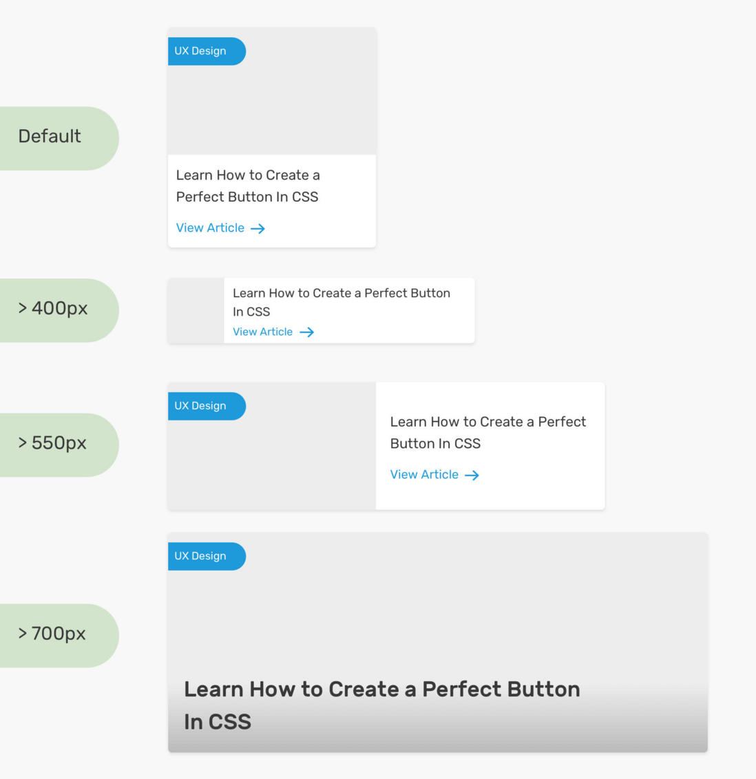
In the image below, please note how each change of the article component starts with a specific width.
As a designer, it may be a bit strange to consider the parent width at first, but this is the future direction of development. We provide front-end developers with details and versions of each component, and they can use them.
Not only that, we may also have a variant of the component, which should only be displayed in a specific context. For example, the event list page. In this case, it is important to know where to use this variant.
The question is how to tell the designer where to use these components.
Communicate with developers
Good communication is an important factor for the success of the project. As a designer, we should provide guidance on where component variants should be used. It can be a complete page design or a simple diagram showing how to use each component.
Notice how I mapped each variant to a specific context, not a viewport. To further prove this point, when we use it with a CSS grid, the behavior of the component will be different.
In the CSS grid, we can tell the browser by using the auto-fit keyword that if the number of columns is lower than expected, we want to expand the columns (you can read more about it here). This feature is very powerful because it can help us present different variants in the same context.
It is very useful to have a component react to the width of its parent. As you have just seen, we reviewed the desktop-sized page, and there are different sections, each with a different number of columns.
Avoid complexity when designing responsive components
It is important to remember that the internal part of the component is like a Lego game. We can sort them according to current changes, but everything has a limit. Sometimes, it is better for front-end developers to deal with a completely new component than to use container queries to create variants.
Consider the following.
It has the following contents:
- Avatar
- name
- Button
- Key/value pair
If the internal part remains the same, or at least does not contain the new part, we can change the component, and there are many changes as shown below.
CSS container query use case
Let's explore some use cases that can be implemented using CSS container queries.
Chat list
I saw this pattern on Facebook messenger. The chat list changes according to the width of the viewport. We can use CSS container query to achieve it.
When there is enough space, the list will expand and display the name of each user. The parent element of the chat list can be a dynamically resized element (for example: using CSS viewport units, or CSS comparison functions).
// HTML
<div class="content">
  <aside>
    <ul>
      <li>
        <img src="shadeed.jpg" alt="Ahmad Shadeed" />
        <span class="name">Ahmad Shadeed</span>
      </li>
    </ul>
  </aside>
  <main>
    <h2>Main content</h2>
  </main>
</div>
// CSS
.content {
display: grid;
grid-template-columns: 0.4fr 1fr;
}
aside {
contain: layout inline-size style;
}
@container (min-width: 180px) {
.name {
display: block;
}
}aside width of 0.4f is 060c94613a5b6e, so it is dynamic width. In addition, I added the attribute contain Then, if the container width is greater than 180px, the username will be displayed.
Another similar use case is side navigation. We can switch the position of the navigation item label from the icon in the new row or next to it.
When the container is small, how does the navigation item label switch from a new line, and when there is enough space, how does the navigation item label approach the navigation icon?
Example address: https://codepen.io/shadeed/pen/Popmryw?editors=0100
~End, I’m Xiaozhi, I’m going to wash the dishes, see you next time!
code is deployed, the possible bugs cannot be known in real time. In order to solve these bugs afterwards, a lot of time was spent on log debugging. By the way, I would like to recommend a useful BUG monitoring tool Fundebug .
Original: https://ishadee.com/article/contner-queries-for-designers/
communicate with
If you have dreams and dry goods, search on [Daily Move to the World] attention to this wise brush who is still doing dishes in the early morning.
This article GitHub https://github.com/qq449245884/xiaozhi has been included, the first-line interview complete test site, information and my series of articles.






**粗体** _斜体_ [链接](http://example.com) `代码` - 列表 > 引用。你还可以使用@来通知其他用户。