Author: Ahmad Shadeed
Translator: Frontend Xiaozhi
Source: shaded
If you have dreams and dry goods, search on for 160d91813e65ea [Moving to the World] Follow this brushing wit who is still doing dishes in the early morning.
This article GitHub https://github.com/qq449245884/xiaozhi has been included, the first-line interview complete test site, information and my series of articles.
It is important to have a consistent ratio between the width and height of the image and other responsive elements. In CSS, we have used the padding hack for many years, but now we have native aspect ratio support in CSS.
In this article, we will discuss what is aspect ratio, how we did it in the past, and what is the new approach. Of course, there will be some use cases and fall back to them appropriately.
What is the aspect ratio
According to Wikipedia:
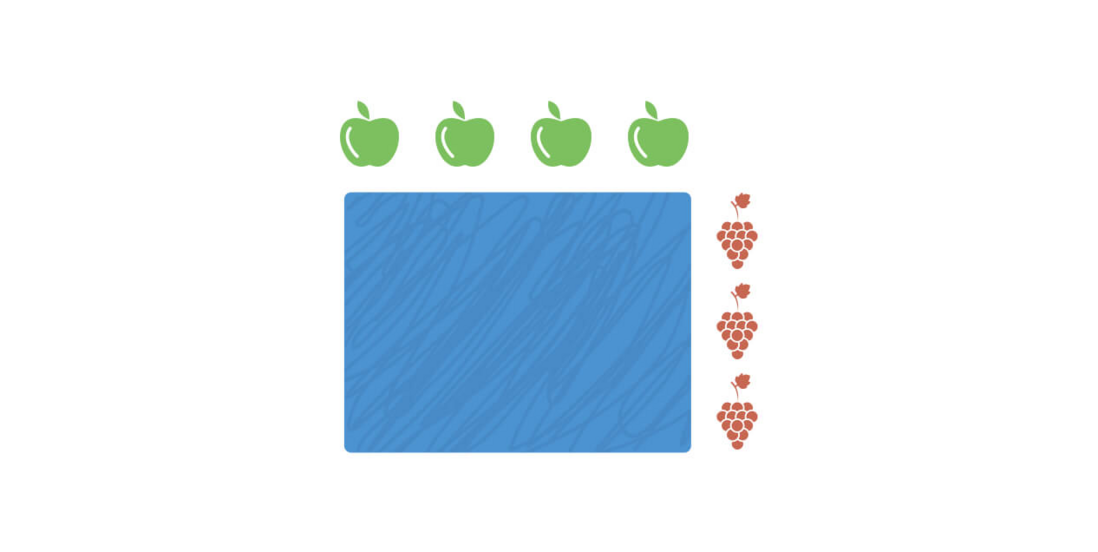
Mathematically, a ratio indicates how many times a number contains another number. For example, if there are eight oranges and six lemons in a bowl of fruit, then the ratio of oranges to lemons is eight to six (that is, 8:6, which is equivalent to a ratio of 4:3).
In web design, the concept of aspect ratio is used to describe that the width and height of an image should be adjusted proportionally.
Consider the picture below
The ratio is 4:3, which indicates that the ratio of apples to grapes is 4:3 .
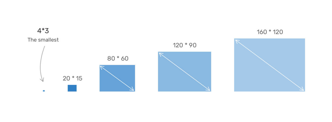
In other words, we can make the smallest box with an aspect ratio of 4:3 as the 4px * 3px box. When the height of this box is proportionally adjusted to its width, we will have a box with a wider size.
Consider the picture below.
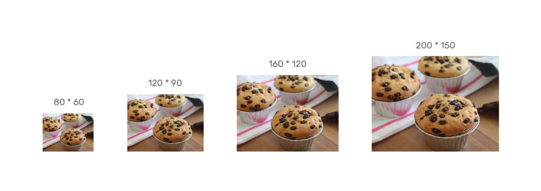
The box is resized proportionally, and the ratio between its width and height is the same. Now, let us imagine that there is an important picture in this box and we care about all its details.
Please note that the image details are preserved regardless of the size. By having a consistent aspect ratio, we can get the following benefits
- The image of the entire website will be consistent in different viewport sizes.
- We can also have responsive video elements.
- It helps designers create a clear guide to the size of images so that developers can deal with them during the development process.
Calculate the aspect ratio
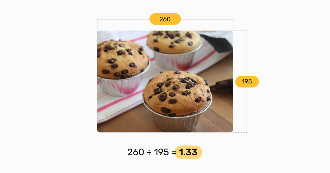
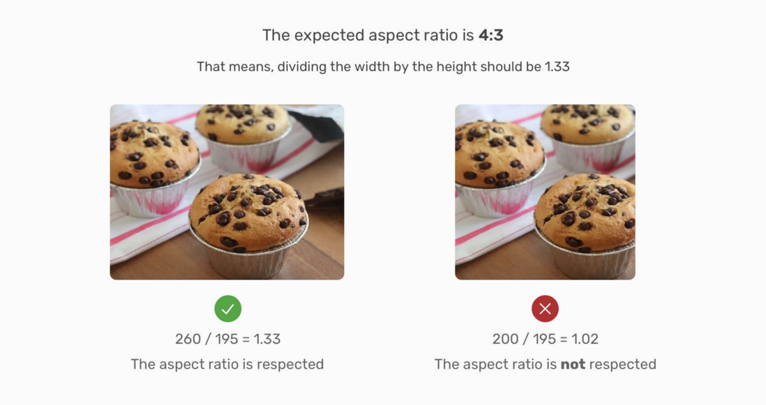
In order to measure the aspect ratio, we need to divide the width by the height as shown in the image below.
The ratio between width and height is 1.33. This means that this ratio should be respected. Please consider
Note that in the picture on the right, the value of width÷height is 1.02 , which is not the original aspect ratio (1.33 or 4:3).
You may be thinking, how to get the value of 4:3? Well, this is called the closest normal aspect ratio, and there are some tools to help us find it. When doing UI design, it is strongly recommended that you know exactly what the aspect ratio of the image you are using. Using this URL can help us quickly calculate.
Website address: http://lawlesscreation.github.io/nearest-aspect-ratio/
Implement aspect ratio in CSS
We used to achieve the aspect ratio by using the percentage padding The good news is that recently, we have received native support aspect-ratio Before we dive into the native way, let's first explain the good old way.
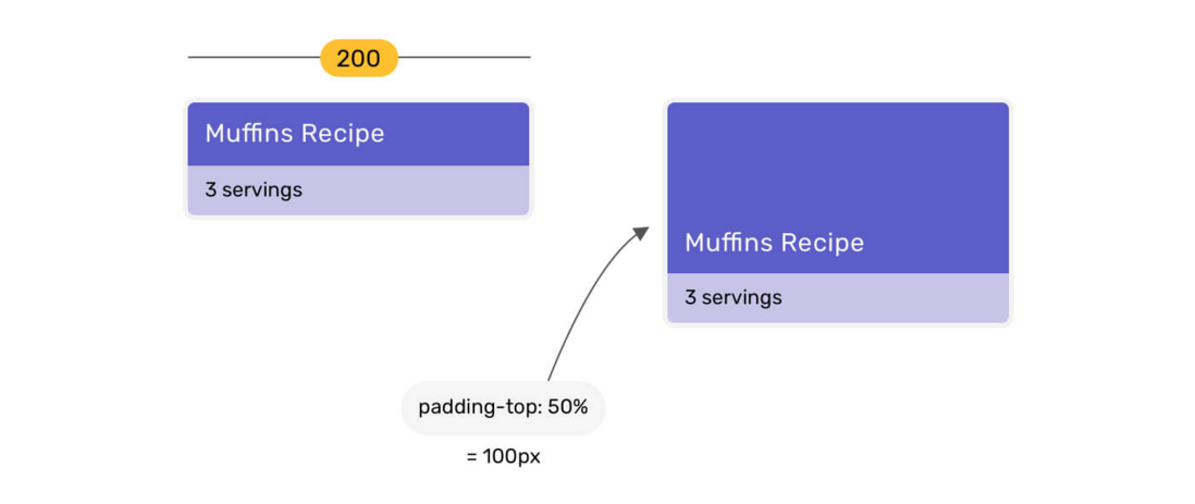
When an element has a vertical percentage of padding , it will be based on the width of its parent. Please see the picture below.
When the title has padding-top: 50% , the value is calculated based on the width of its parent element. Because the width of the parent element is 200px , padding-top will become 100px .
To find out the percentage value to use, we need to divide the height of the image by the width. The number obtained is the percentage we want to use.
Suppose the image width is 260px and the height is 195px .
Percentage padding = height / width195/260 result is 0.75 (or 75% ).
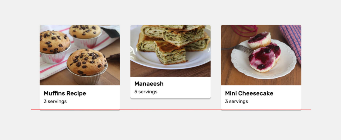
We assume that there is a grid of cards, and each card has a thumbnail. The width and height of these thumbnails should be equal.
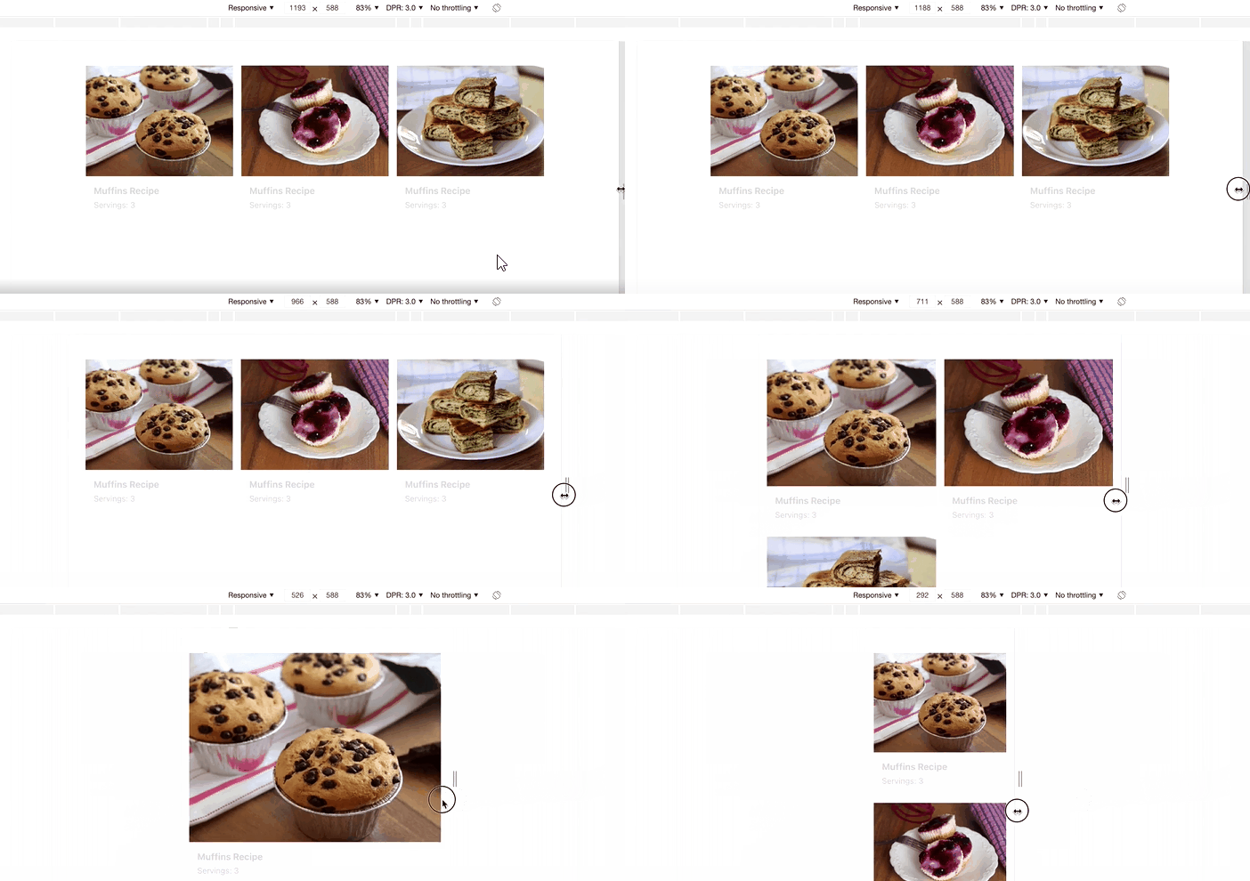
Due to some reasons, the operator uploaded a picture with a size inconsistent with other pictures. Notice that the height of the card in the middle is different from the height of the other cards.
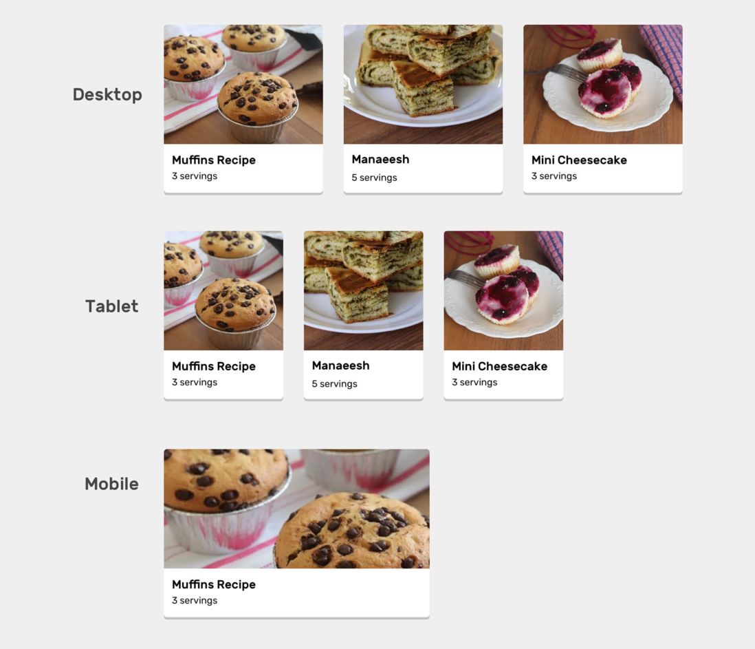
You might think, is this not easy to solve? We can add object-fit: cover to the picture. The problem is solved, right? It's not that simple. This solution will not look good in multiple viewport sizes.
Notice that in the medium size, the fixed-height pictures are cropped too much from the left and right, while on the phone, they are too wide. All of this is due to the use of a fixed height. We can manually adjust the height through different media queries, but this is not a practical solution.
What we need is that the size of the thumbnail should be the same regardless of the size of the viewport. To achieve this, we need to use the percentage padding to achieve an aspect ratio.
HTML
<article class="card">
  <div class="card__thumb">
    <img src="thumb.jpg" alt="" />
  </div>
  <div class="card__content">
    <h3>Muffins Recipe</h3>
    <p>Servings: 3</p>
  </div>
</article>
CSS
.card__thumb {
  position: relative;
  padding-top: 75%;
}

.card__thumb img {
  position: absolute;
  left: 0;
  top: 0;
  width: 100%;
  height: 100%;
  object-fit: cover;
}
Through the above, we have defined that .card__thumb ) depends on its width. In addition, the picture is absolutely positioned, it has the full width and height of its parent element, object-fit: cover , used to upload pictures of different sizes. Please see the animation below.
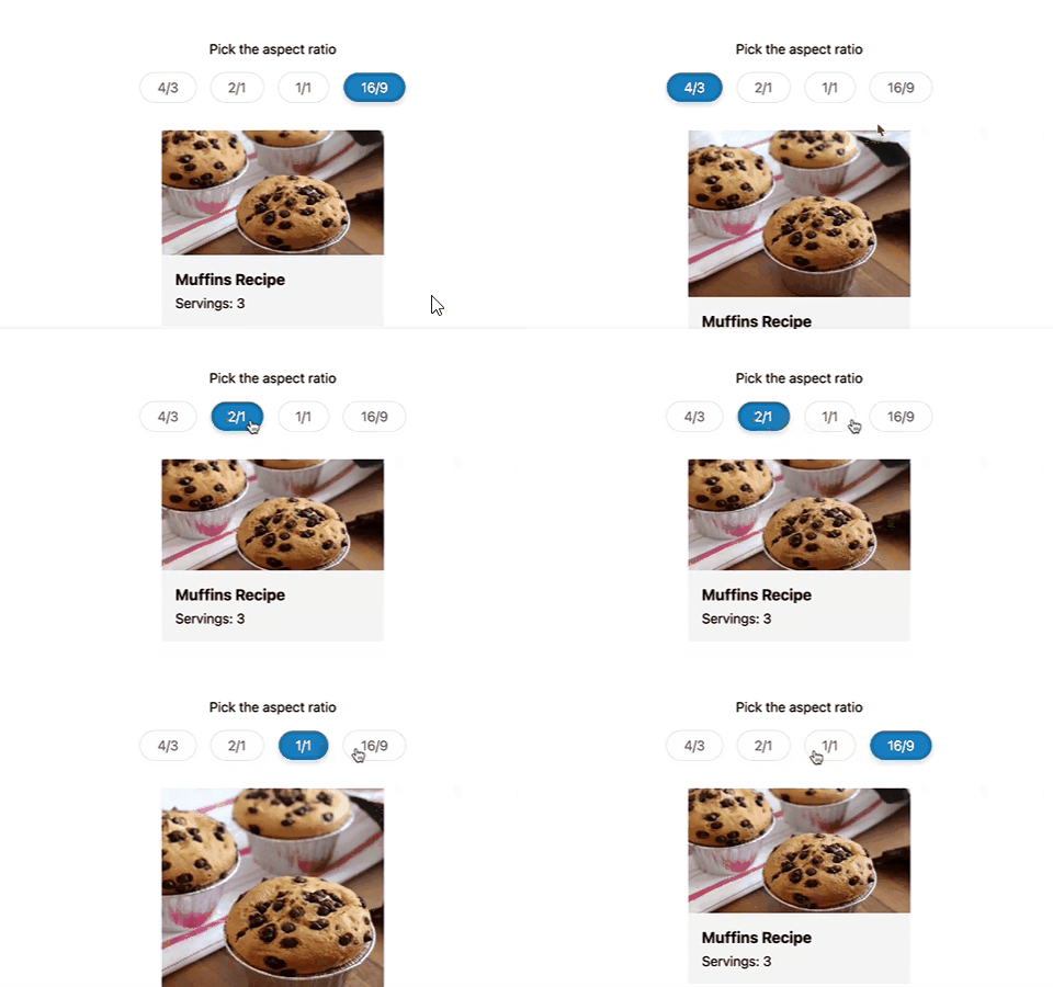
Please note that the change in card size and the aspect ratio of thumbnails are not affected.
aspect-ratio attribute
Earlier this year, Chrome, Safari TP and Firefox Nightly all supported the aspect-ratio CSS property. Recently, it was supported in the official version of Safari 15.
Let's go back to the previous example, we can rewrite it like this.
/* 上面的方式 */
.card__thumb {
  position: relative;
  padding-top: 75%;
}

/* 使用 aspect-ratio 属性 */
.card__thumb {
  position: relative;
  aspect-ratio: 4/3;
}
Please see the animation below to understand how the aspect ratio changes.
Demo address: https://codepen.io/shadeed/pen/ZEeMjZe
With this, let's explore some use cases where the original aspect ratio can be useful, and how to use it in a progressively enhanced way.
Progressive enhancement
We can use CSS @supports to use CSS and CSS variables aspect-ratio .
.card {
  --aspect-ratio: 16/9;
  padding-top: calc((1 / (var(--aspect-ratio))) * 100%);
}

@supports (aspect-ratio: 1) {
  .card {
    aspect-ratio: var(--aspect-ratio);
    padding-top: initial;
  }
}
Logo Images
Take a look at the logo below
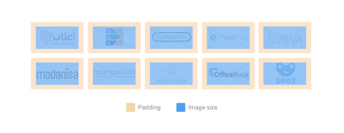
Have you noticed that their dimensions are the same, and they are aligned? Let's take a look behind the scenes.
// html
<li class="brands__item">
  <a href="#">
    <img src="assets/batch-2/aanaab.png" alt="" />
  </a>
</li>
.brands__item a {
padding: 1rem;
}
.brands__item img {
width: 130px;
object-fit: contain;
aspect-ratio: 2/1;
}I added a 130px to have a minimum size, and aspect-ratio will take care of the height.
The blue area is the size of the image, object-fit: contain is important to avoid distorting the image.
Responsive Circles
Have you ever needed to create a circular element that should be responsive? CSS aspect-ratio is the best choice for this use case.
.person {
  width: 180px;
  aspect-ratio: 1;
}
If the two values of the aspect ratio are the same, we can write aspect-ratio: 1 instead of aspect-ratio: 1/1 . If you use flexbox or grid , the width will be optional and it can be added as a minimum value.
~End, I am Xiaozhi, Bao, have you learned it~
possible bugs after code deployment cannot be known in real time. In order to solve these bugs afterwards, a lot of time was spent on log debugging. By the way, I would like to recommend a useful BUG monitoring tool Fundebug .
Original: https://ishadeed.com/article/css-aspect-ratio/
communicate with
If you have dreams and dry goods, search on [Great Move to the World] Follow this brushing wit who is still doing dishes in the early morning.
This article GitHub https://github.com/qq449245884/xiaozhi has been included, the first-line interview complete test site, information and my series of articles.



**粗体** _斜体_ [链接](http://example.com) `代码` - 列表 > 引用。你还可以使用@来通知其他用户。