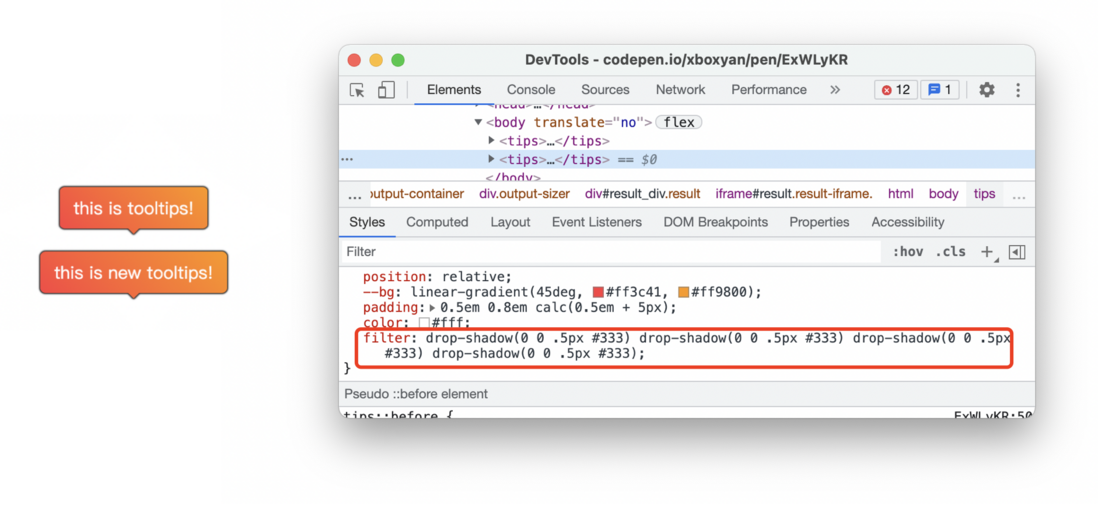
I have done a lot of special layouts before. For example, in these two articles CSS implementation of coupon techniques , CSS implements gradient-supported tooltips (tooltips) , as follows
But there has always been a pain point: cannot add borders to these graphics
Today we bring a little trick: Use drop-shadow get all irregular borders with one line of code
One, projection
Here you need to use the projection drop-shadow , if you don’t know much about it, you can refer to : Underestimated CSS filter: drop-shadow , here is a brief introduction
The grammar is actually very simple
filter: drop-shadow(offset-x offset-y blur-radius color)Not a separate attribute, but a method under the filter filter
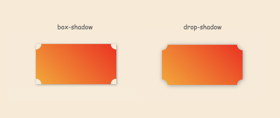
Here offset-x and offset-y are the offsets, blur-radius is the blur radius, and color is the projection color. The actual function is to simulate the projection of the real world (the transparent part will not be projected), the difference is as follows
It is a pity that although it box-shadow , it lacks the expansion radius. Just imagine, if the extended radius is supported, is it easy for irregular borders (it should not be supported, because the real world projection does not have an extended radius)?
So, drop-shadow generate the frame?
Two, multiple projections
box-shadow can easily achieve multiple shadows
box-shadow: 0 0 3px #333, 1px 1px 5px #666, ...Can be superimposed indefinitely.
However, drop-shadow will not work, for example
filter: drop-shadow(0 0 3px #333, 1px 1px 5px #666, ...)You can see that the browser directly considers it illegal
But you can change the way of thinking, although drop-shadow does not support, but filter supports a variety of filters, so it can be achieved in this way
filter: drop-shadow(0 0 3px #333) drop-shadow(0 0 3px #333) drop-shadow(0 0 3px #333)...This will take effect
Is it a bit like a border? If you only set a 0.5px blur, will be superimposed a few more times, the blurred part will become clear , this is a bit like a softer brush stroke, a few more strokes will become clearer, so you can get this effect
This is closer. In practice, it may need to be fine-tuned. Here is a perfect solution ( is here~ )
.wrap{
  filter: drop-shadow(0px 0px 0.5px #333) drop-shadow(0px 0px 0px #333) drop-shadow(0px 0px 0px #333) drop-shadow(0px 0px 0px #333) drop-shadow(0px 0px 0px #333)
}
The frame realized in this way is clear enough and can basically be used daily
The code in more colors, you can optimize it, projected colors is to follow the current default text color , it can be simplified to
.wrap{
  filter: drop-shadow(0 0 0.5px)drop-shadow(0 0 0)drop-shadow(0 0 0)drop-shadow(0 0 0)drop-shadow(0 0 0);
  color: #333;
}
For online examples, you can visit coupon-border and this tooltips-border
Three, use and limitations
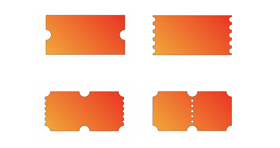
The usage is simple, just add this line of CSS to the outermost layer of the container, such as the previous coupon example, the resulting border effect is like this
There is this
The frame is not bad, almost no projection
However, it should be noted here that the graphics need to be nested in the outer layer mask, otherwise the projection will be directly cropped mask
<div class="wrap">
  <div class="coupon">
   <!--优惠券-->
  </div>
</div>
In addition, this solution is suitable for a smaller frame. If the frame is larger, it may be smoother, and more filters need to be superimposed, and the effect is not very good, as follows
These need to be chosen by yourself (in general, there will be no too thick borders)
Four, summary and explanation
This article introduces a general scheme for implementing irregular borders. The cost is very low and the effect is very good. Here is a summary:
- drop-shadow will only generate projections on opaque parts, which conforms to the real physical world
- drop-shadow does not support multiple projections, filter supports multiple filters, which can indirectly realize multiple projections
- The realization principle of the frame is the multiple superposition of projection
- Some mask need to be wrapped with a layer of container, and then the frame is generated
- Suitable for relatively small frame, too large frame is not ideal
- The filter is actually a more performance-consuming property, not suitable for too wide use
Maybe most of the students may choose "cut picture.png" in the end, but this is also a solution, and it is always right to have one more solution. Finally, if you think it’s pretty good, if it’s helpful to you, please like, bookmark, and forward ❤❤❤


**粗体** _斜体_ [链接](http://example.com) `代码` - 列表 > 引用。你还可以使用@来通知其他用户。