
This article will elaborate on how to use the features of CSS 3D to achieve various interesting and cool animation effects from more aspects. After reading carefully, you will gain:
- Learn about the various uses of CSS 3D
- Inspire you new inspiration and feel the beauty of animation
- It will help to improve the level of CSS animation production
CSS 3D basics
This article assumes that readers have a certain knowledge of CSS 3D and can draw preliminary 3D animation effects. Of course, I will briefly go over the basics of CSS 3D.
Use transform-style to enable 3D mode
To use CSS3 to achieve 3D effects, the most important thing is to use the transform-style attribute. transform-style has only two values to choose from:
// 语法:
transform-style: flat|preserve-3d;

transform-style: flat; // 默认,子元素将不保留其 3D 位置
transform-style: preserve-3d; // 子元素将保留其 3D 位置。
When we specify the transform-style attribute value of a container to preserve-3d, the descendant elements of the container will have a 3D effect. This is a bit abstract, that is, after the current parent container sets the preserve-3d value, its child elements You can perform 3D deformation operations relative to the plane where the parent element is located.
Use perspective & perspective-origin to set 3D viewing distance to achieve perspective/depth of field effect
perspective sets a three-dimensional perspective distance for an element, which only affects the descendants of the element, not the element itself.
Simply put, when the element is not set to perspective , that is, when all descendant elements are compressed on the same two-dimensional plane perspective:none/0
If you set perspective , you will see a three-dimensional effect.
// 语法
perspective: number|none;

// 语法
perspective-origin: x-axis y-axis;
// x-axis : 定义该视图在 x 轴上的位置。默认值:50%
// y-axis : 定义该视图在 y 轴上的位置。默认值:50%
perspective-origin represents the position of the base point of the perspective perspective of the 3D element. The default perspective center perspective , not the midpoint of its descendant elements, which is perspective-origin: 50% 50% .
Familiarize yourself with CSS 3D by drawing Webpack Logo
For students who are new to CSS 3D, they can quickly familiarize themselves with the grammar and understand the rules by drawing a cube.
The Logo of Webpack is composed of 2 cubes:

In terms of one of the cubes, it is actually very easy to implement:
- A cube is composed of 6 faces, so first set a parent element div, and then this div contains 6 child divs, at the same time, the parent element is set to
transform-style: preserve-3d; - 6 sub-elements, first rotate different angles in turn, and then
translateZhalf of the length of the cube through 06125c057d014f - The parent element can adjust the visual angle
transformandperspective
Taking a cube as an example, the simple pseudo code is as follows:
<ul class="cube-inner">
  <li class="top"></li>
  <li class="bottom"></li>
  <li class="front"></li>
  <li class="back"></li>
  <li class="right"></li>
  <li class="left"></li>
</ul>
.cube {
width: 100px;
height: 100px;
transform-style: preserve-3d;
transform-origin: 50px 50px;
transform: rotateX(-33.5deg) rotateY(45deg);
li {
position: absolute;
top: 0;
left: 0;
width: 100px;
height: 100px;
background: rgba(141, 214, 249);
border: 1px solid #fff;
}
.top {
transform: rotateX(90deg) translateZ(50px);
}
.bottom {
transform: rotateX(-90deg) translateZ(50px);
}
.front {
transform: translateZ(50px);
}
.back {
transform: rotateX(-180deg) translateZ(50px);
}
.left {
transform: rotateY(-90deg) translateZ(50px);
}
.right {
transform: rotateY(90deg) translateZ(50px);
}
}Superimpose two, adjust the color and transparency, we can easily realize the Webpack LOGO:

Of course, in order to ensure the visual consistency of each line, the LOGO here does not set the depth of field effect perspective . We can try to add the following code to the top-level parent container, adjust the visual angle and set the depth of field effect transform and perspective
.father {
    transform-style: preserve-3d;
    perspective: 200px;
    transform: rotateX(10deg);
}
You can get the real 3D effect, and the feeling is very different:

For the complete code, you can here: 16125c057d02ee CodePen Demo - Webpack LOGO
OK, the warm-up is over, next, let us plug in the wings of imagination and walk into the world of CSS 3D.
Realize the 3D effect of text
First, take a look at some interesting CSS 3D text effects.
To achieve the 3D effect of text, which looks three-dimensional, the usual way is to superimpose multiple layers.
Here are some ways to achieve the 3D effect of a text.
Suppose we have the following structure:
<div class="g-container">
    <p>Lorem ipsum</p>
</div>
If nothing is added, the display of the text may look like this:

We can create a 3D feel by superimposing multiple layers of shadows, mainly to reasonably control the distance and color of the shadows. The core CSS code is as follows:
p {
    text-shadow:
        4px 4px 0 rgba(0, 0, 0, .8),
        8px 8px 0 rgba(0, 0, 0, .6),
        12px 12px 0 rgba(0, 0, 0, .4),
        16px 16px 0 rgba(0, 0, 0, .2),
        20px 20px 0 rgba(0, 0, 0, .05);
}
In this way, there is a basic 3D visual effect.
3D neon text effect
Based on this, we can achieve some 3D text effects, look at a 3D neon light text effect, the core is:
- Use
text-shadowoverlay multiple text shadows - Use animation to dynamically change the shadow color
<div class="container">
    <p class="a">CSS 3D</p>
    <p class="b">NEON</p>
    <p class="a">EFFECT</p>
</div>
Core CSS code:
.container {
    transform: rotateX(25deg) rotateY(-25deg);
}
.a {
    color: #88e;
    text-shadow: 0 0 0.3em rgba(200, 200, 255, 0.3), 0.04em 0.04em 0 #112,
        0.045em 0.045em 0 #88e, 0.09em 0.09em 0 #112, 0.095em 0.095em 0 #66c,
        0.14em 0.14em 0 #112, 0.145em 0.145em 0 #44a;
    animation: pulsea 300ms ease infinite alternate;
}
.b {
    color: #f99;
    text-shadow: 0 0 0.3em rgba(255, 100, 200, 0.3), 0.04em 0.04em 0 #112,
        0.045em 0.045em 0 #f99, 0.09em 0.09em 0 #112, 0.095em 0.095em 0 #b66,
        0.14em 0.14em 0 #112, 0.145em 0.145em 0 #a44;
    animation: pulseb 300ms ease infinite alternate;
}
@keyframes pulsea {
    // ... 阴影颜色变化
}
@keyframes pulseb {
    // ... 阴影颜色变化
}
The following effects can be obtained:

For the complete code, you can slam here CSS Inspiration - Use shadows to achieve the 3D neon effect of text
Use CSS 3D with translateZ to achieve true text 3D effects
Of course, the first technique above does not actually use CSS 3D. Let's use CSS 3D with translateZ to go one step further.
Assume the following structure:
<div>
  <h1>Glowing 3D TEXT</h1>
  <h1>Glowing 3D TEXT</h1>
  <h1>Glowing 3D TEXT</h1>
  <h1>Glowing 3D TEXT</h1>
  <h1>Glowing 3D TEXT</h1>
  <h1>Glowing 3D TEXT</h1>
  <h1>Glowing 3D TEXT</h1>
  <h1>Glowing 3D TEXT</h1>
  <h1>Glowing 3D TEXT</h1>
  <h1>Glowing 3D TEXT</h1>
</div>
We give the parent element div set transform-style: preserve-3d , for each <h1> set different translateZ() to achieve 3D text effect:
div {
    transform-style: preserve-3d;
}
h1:nth-child(2) {
    transform: translateZ(5px);
}
h1:nth-child(3) {
    transform: translateZ(10px);
}
h1:nth-child(4) {
    transform: translateZ(15px);
}
h1:nth-child(5) {
    transform: translateZ(20px);
}
h1:nth-child(6) {
    transform: translateZ(25px);
}
h1:nth-child(7) {
    transform: translateZ(30px);
}
h1:nth-child(8) {
    transform: translateZ(35px);
}
h1:nth-child(9) {
    transform: translateZ(40px);
}
h1:nth-child(10) {
    transform: translateZ(45px);
}
Of course, with some rotation and color changes, you can get more pure 3D text effects:

The complete code, you can slam here CSS Inspiration - 3D light and shadow transform text effect
Use distance, angle, light and shadow to build different 3D effects
There is also a very interesting technique, the production process requires more debugging.
Reasonably use distance, angle, and light and shadow to construct different 3D effects. Take a look at the following example. It is simply to set up three layers of characters so that they are a certain distance apart on the Z axis.
The simple pseudo code is as follows:
<div>
  <span class='C'>C</span>
  <span class='S'>S</span>
  <span class='S'>S</span>
  <span></span>
  <span class='3'>3</span>
  <span class='D'>D</span>
</div>
$bright : #AFA695;
$gold : #867862;
$dark : #746853;
$duration : 10s;
div {
perspective: 2000px;
transform-style: preserve-3d;
animation: fade $duration infinite;
}
span {
transform-style: preserve-3d;
transform: rotateY(25deg);
animation: rotate $duration infinite ease-in;
&:after, &:before {
content: attr(class);
color: $gold;
z-index: -1;
animation: shadow $duration infinite;
}
&:after{
transform: translateZ(-16px);
}
&:before {
transform: translateZ(-8px);
}
}
@keyframes fade {
// 透明度变化
}
@keyframes rotate {
// 字体旋转
}
@keyframes shadow {
// 字体颜色变化
}Briefly, the core of the above code is:
- Parent element, child element set
transform-style: preserve-3d - Use
spanelement to copy two identical characters, and usetranslateZ()make them separated by a certain distance on the Z axis - Add simple rotation, transparency, font color changes
You can get such a title 3D animation similar to the opening of a movie. In fact, there are only 3 layers of elements, but due to the proper angle, the visual connection is perfect, and it looks very 3D.

Why does it say that distance, angle, and light and shadow need to be used reasonably?
It's still the same animation effect. If the initial rotation angle of the animation is set slightly larger, the whole effect will be overwhelming:

As you can see, in the first few frames, a simple layered structure can be seen. Or, simply adjust perspective , set the parent container's perspective from 2000px to 500px , and the effect of piercing is more obvious:

In other words, at the right distance and the right angle, we can visually form a relatively good 3D effect with only a few elements.
For the complete code above, you can hit here: CSS Inspiration - 3D text appearance animation
3D counter
Of course, we can also use 3D text effects to create a lot of interesting effects.
For example, I used the 3D counter in our business visualization kanban project:

The code is relatively long, so I won't post it, but it is also an effect that can be achieved using pure CSS.
The complete code, you can slam here CSS Inspiration - 3D digital counting animation
Space effect
Well, the above chapter is mainly about the 3D effect of text, let's continue to explore the magic of 3D in creating space effects.
Excellent 3D effects can give people an immersive feeling. It is said that CSS 3D is actually limited and can not do much, but it does not mean that it cannot achieve cool and realistic effects.
To create a realistic 3D effect, the key is to properly use the perspective attribute.
Simple to master the principle, we can also easily use CSS 3D to draw some very beautiful spatial effects.
Here I lead you to quickly draw a CSS 3D work with spatial beauty.
Warm up with space 3D effects
First, we use Grid/Flex and other layouts to fill the screen with grids (item), just click at will:
<ul class="g-container">
  <li></li>
  <li></li>
  // ... 很多子 li
  <li></li>
</ul>
The initial background color is black, and each item is filled with white

Next, change the shape of each item to make it a long strip. You can change the way by changing the width of the item, filling the part with a gradient, and so on:

Next, the parent container sets transform-style: preserve-3d and perspective , and the child element sets transform: rotateX(45deg) , and the magic happens:

Wow, in just 3 steps, we got a preliminary image with spatial beauty. Let us go back to the color settings of each sub-item, fill them with different colors randomly, and add a transform: translate3d() animation, a simple The CSS 3D work is drawn:

Based on the deformation and extension of this technique, we can draw many similar effects.
Here, I once again recommend the CSS-Doodle tool, which can help us quickly create complex CSS effects.
CSS-doodle is a library based on Web-Component. Allows us to quickly create pages based on the CSS Grid layout to achieve various CSS effects (maybe called CSS art).
We can switch the above lines to arcs:

The complete code can be stamped here, and using CSS-Doodle is only dozens of lines: CodePen Demo-CSS-Doodle Random Circle
Seeding created by Teacher Yuan Chuan:

Use picture material
Of course, based on the above techniques, sometimes it is considered troublesome to use CSS to draw some lines, arcs, and squares. You can further try to use existing materials for secondary creation based on CSS 3D. Here is a very interesting technique.
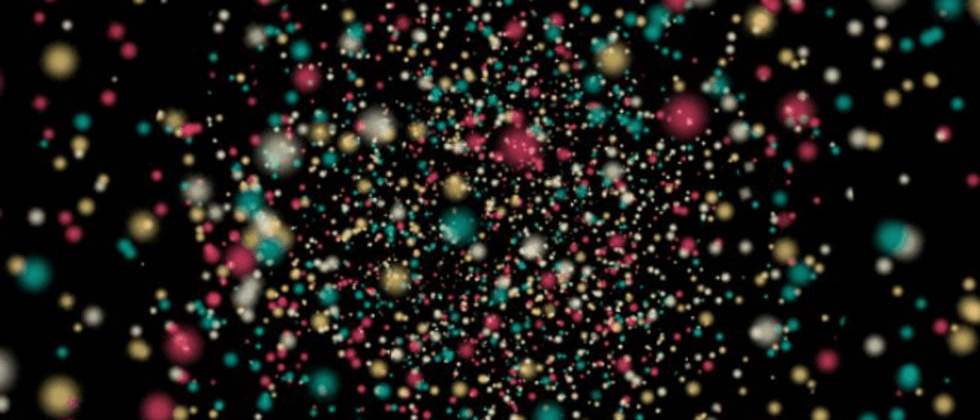
Suppose we have such a graph:

This picture is reserved for future use. Before using this picture, we will first draw such a graph:
<div class="g-container">
  <div class="g-group">
      <div class="item item-right"></div>
      <div class="item item-left"></div>
      <div class="item item-top"></div>
      <div class="item item-bottom"></div>
      <div class="item item-middle"></div>
  </div>
</div>
body {
background: #000;
}
.g-container {
position: relative;
}
.g-group {
position: absolute;
width: 100px;
height: 100px;
left: -50px;
top: -50px;
transform-style: preserve-3d;
}
.item {
position: absolute;
width: 100%;
height: 100%;
background: rgba(255, 255, 255, .5);
}
.item-right {
background: red;
transform: rotateY(90deg) translateZ(50px);
}
.item-left {
background: green;
transform: rotateY(-90deg) translateZ(50px);
}
.item-top {
background: blue;
transform: rotateX(90deg) translateZ(50px);
}
.item-bottom {
background: deeppink;
transform: rotateX(-90deg) translateZ(50px);
}
.item-middle {
background: rgba(255, 255, 255, 0.5);
transform: rotateX(180deg) translateZ(50px);
}A total of 5 sub-elements are set, but looking at the CSS code carefully, 4 of the sub-elements are set to rotateX/Y(90deg/-90deg) , which is rotated by 90° around the X or Y axis. Visually, it is a plane vertical to the screen, so intuitively visually We are not there, we can only see a plane .item-middle .
I set different background colors for the 5 sub-items, and the results are as follows:

It seems to be unremarkable now, and indeed it is.
However, the time to witness the miracle, and this time, we give the parent element .g-container set a minimum perspective , for example, set up a perspective: 4px , look at the results:
.g-container {
  position: relative;
+ perspective: 4px;
}
// ...其余样式保持不变
At this time, the style of painting changed suddenly, and the whole effect became like this:

Since perspective takes effect, the original flat effect becomes a 3D effect. Next, we use the starry sky map prepared above, replace the background color above, and replace all of them with the same image. The magical thing happened:

Because the set perspective is very low, and the transform: translateZ(50px) each item is set relatively large, the picture is stretched very visually. But the whole is full of the entire screen.
Next, we only need to move the perspective, add an animation to the parent element, and change it translateZ()
.g-container{
  position: relative;
  perspective: 4px;
  perspective-origin: 50% 50%;
}

.g-group{
  position: absolute;
  // ... 一些定位高宽代码
  transform-style: preserve-3d;
  + animation: move 8s infinite linear;
}

@keyframes move {
  0%{
    transform: translateZ(-50px) rotate(0deg);
  }
  100%{
    transform: translateZ(50px) rotate(0deg);
  }
}
Take a look, the magical and wonderful starry sky shuttle effect comes out, Amazing:

The disadvantage is that the animation has not been connected indefinitely, and there are big problems at the beginning and the end.
Of course, this does not bother us, we can:
- By superimposing the two groups of the same effect, one group
animation-delayearlier than the other through the negative 06125c057d0e47, so that the two animations are connected (the other group is still moving when one group ends) - Then through the change of transparency, the awkward feeling of
item-middle - Finally, you can control the color change of the picture
hue-rotate
We tried to modify the HTML structure as follows:
<div class="g-container">
  <div class="g-group">
      <div class="item item-right"></div>
      <div class="item item-left"></div>
      <div class="item item-top"></div>
      <div class="item item-bottom"></div>
      <div class="item item-middle"></div>
  </div>
  <!-- 增加一组动画 -->
  <div class="g-group">
      <div class="item item-right"></div>
      <div class="item item-left"></div>
      <div class="item item-top"></div>
      <div class="item item-bottom"></div>
      <div class="item item-middle"></div>
  </div>
</div>
The revised core CSS is as follows:
.g-container{
  perspective: 4px;
  position: relative;
  // hue-rotate 变化动画,可以让图片颜色一直变换
  animation: hueRotate 21s infinite linear;
}

.g-group{
  transform-style: preserve-3d;
  animation: move 12s infinite linear;
}
// 设置负的 animation-delay,让第二组动画提前进行
.g-group:nth-child(2){
  animation: move 12s infinite linear;
  animation-delay: -6s;
}
.item {
  background: url(https://z3.ax1x.com/2021/08/20/fLwuMd.jpg);
  background-size: cover;
  opacity: 1;
  // 子元素的透明度变化,减少动画衔接时候的突兀感
  animation: fade 12s infinite linear;
  animation-delay: 0;
}
.g-group:nth-child(2) .item {
  animation-delay: -6s;
}
@keyframes move {
  0%{
    transform: translateZ(-500px) rotate(0deg);
  }
  100%{
    transform: translateZ(500px) rotate(0deg);
  }
}
@keyframes fade {
  0%{
    opacity: 0;
  }
  25%,
  60%{
    opacity: 1;
  }
  100%{
    opacity: 0;
  }
}
@keyframes hueRotate {
  0% {
    filter: hue-rotate(0);
  }
  100% {
    filter: hue-rotate(360deg);
  }
}
The final complete effect is as follows, the effect of the starry sky shuttle, the entire animation is connected end to end, and can go on indefinitely, with almost no flaws, which is very awesome:

For the complete code above, you can slam here: CSS Inspiration-3D Universe Space-time Shuttle Effect
3D infinitely extended perspective animation
OK, after mastering the above skills, we can easily continue to deform and diverge to achieve a variety of infinitely extending 3D perspective animations.
Here is another very interesting animation using similar techniques:

The principle is roughly the same as the above-mentioned starry sky shuttle. The background image of the 4 walls can be easily drawn using CSS gradients. The next thing is to consider how to make the animation loop indefinitely and control the connection between the beginning and the end.
This effect was first seen in 16125c057d0fe9 16125c057d0feb. Based on this, I have improved and enriched it. For the complete code, you can hit here: CSS Inspiration - 3D infinitely extended perspective animation
Parallax effect
Due to the characteristics of CSS 3D, it is inherently very suitable for making some parallax effects.
The content of this chapter was discussed in another article of mine before - CSS to achieve parallax effect
The principle is:
transform-style: preserve-3dandperspective: [x]pxto the container, then the child elements in this container will be located in 3D space,- Then set a different
transform: translateZ()child elements. At this time, the distance between different elements in the 3D Z axis direction from the screen (our eyes) is also different - Scrolling the scroll bar, because the child elements are set with different
transform: translateZ(), then their scrolling up and down distancetranslateYrelative to the screen (our eyes) is also different, which achieves the effect of scrolling parallax.
The core code representation is:
<div class="g-container">
    <div class="section-one">translateZ(-1)</div>
    <div class="section-two">translateZ(-2)</div>
    <div class="section-three">translateZ(-3)</div>
</div>
html {
height: 100%;
overflow: hidden;
}
body {
perspective: 1px;
transform-style: preserve-3d;
height: 100%;
overflow-y: scroll;
overflow-x: hidden;
}
.g-container {
height: 150%;
.section-one {
transform: translateZ(-1px);
}
.section-two {
transform: translateZ(-2px);
}
.section-three {
transform: translateZ(-3px);
}
}
The summary is that the parent element is set to transform-style: preserve-3d and perspective: 1px , the child element is set to different transform: translateZ , the scroll bar is set, and the effect is as follows:

CodePen Demo -- CSS 3D parallax
Obviously, when the scroll bar is scrolled, the degree of displacement of different sub-elements is visually different, and the so-called scrolling parallax effect is achieved.
Scrolling parallax text shadow/phantom effect/multi-picture display
So, what are some fun effects with the parallax effect of translate3d? The following scrolling parallax text shadow/phantom effect is very interesting:

CodePen Demo -- CSS translate3d Parallax
The other is that we can apply this technique to some large-screen scenarios such as personal homepages and picture displays.
The core is to give each image set different translateZ , to set up a parent element persepective can, so that, in the process of rolling up and down, can appear simple parallax effect:

CodePen Demo -- CSS Scroll Parallax Effect
In the same way, this scrolling parallax can not only act on up and down scrolling, but also for scrolling in the left and right directions:

CodePen Demo -- CSS-Only Horizontal Parallax Gallery By Paulina Hetman
Introduction to other practical scenarios
In this chapter, we will introduce some interesting 3D effects or animations that can be implemented.
404 Rolling Box
page of my own personal website, I use CSS 3D to make a 404 effect:

The core is based on a CSS 3D cube:
- Add a scrolling animation of the cube
- Control the easing function of falling, and the shock animation of landing (in order to make the effect more realistic, the techniques of preparatory action, follow and overlap animation in the design animation are used)
- Control the translation of the cube and the ground digital picture
- Control the infinite loop of the animation
The overall production is still very difficult, but it is really cool to use it on your own 404 page. this effect in 16125c057d1440 Yusuke Nakaya , the complete code you can here: 16125c057d1444 CodePen - Only CSS: 404 Rolling Box
Cube progress bar
Well, the following one still uses the cube. Let's implement a cube progress bar~
First, implement a cube with the following structure:
<div class="demo-cube perspective">
  <ul class="cube">
    <li class="top"></li>
    <li class="bottom"></li>
    <li class="front"></li>
    <li class="back"></li>
    <li class="right"></li>
    <li class="left"></li>
  </ul>
</div>
We can think of this cube as a three-dimensional progress bar container. By controlling the colors of the 6 sides, we can cleverly get a 3D progress bar effect.
Of course, in fact, we don't need so many faces, just 4 faces, just remove the left and right, and then use the gradient to modify the color of each face of the cube, remove the border, the core CSS code is as follows:
.demo-cube {
  position: relative;

  .cube {
    position: absolute;
    top: 50%;
    left: 50%;
    width: 300px;
    height: 100px;
    transform-style: preserve-3d;
    transform: translate(-50%, -50%) rotateX(-33.5deg);

    li {
      position: absolute;
      width: 300px;
      height: 100px;
      background: linear-gradient(90deg, rgba(156, 39, 176, .3), rgba(255, 34, 109, .8) 70%, rgba(255, 255, 255, .6) 70%, rgba(255, 255, 255, .6));
    }
    .top {
      transform: rotateX(90deg) translateZ(50px);
    }
    .bottom {
      transform: rotateX(-90deg) translateZ(50px);
    }
    .front {
      transform: translateZ(50px);
    }
    .back {
      transform: rotateX(-180deg) translateZ(50px);
    }
  }
}
We can get a very cool 3D progress bar effect:

Use CSS Property to animate the 3D progress bar
Of course, the progress bar, it needs a filling animation. Since we are using the gradual progress of the progress bar, we need to control the color percentage change.
Normally, CSS does not support gradual animation, but this is not difficult for us, because we can use CSS @Property.
Simply modify the code:
@property --per {
  syntax: '<percentage>';
  inherits: false;
  initial-value: 0%;
}

.demo-cube .cube {
  .top,
  .front,
  .bottom,
  .back {
    background: linear-gradient(90deg, rgba(255, 217, 34, .6), rgba(255, 34, 109, .8) var(--per), rgba(255, 34, 109, .1) var(--per), rgba(255, 34, 109, .1));
    animation: perChange 6s infinite;
  }
}

@keyframes perChange {
  0% {
    --per: 0%;
  }
  90%,
  to {
    --per: 80%;
  }
}
In this way, we have realized a dynamic 3D progress bar, only need to control the --per CSS custom properties, the effect is as follows:

For those who don’t know much about CSS @Property, you can read this article by the author- CSS @property makes the impossible possible . Its appearance has greatly improved the ability of making various animations.
For the complete code above, you can hit here: CSS Inspiration-3D Cube Progress Bar
in conclusion
Thank you for reading so far. If you read the above content carefully, I believe you will be amazed by the magic of CSS. I hope the content of this article will enable you to:
- Learn about the various uses of CSS 3D
- Inspire you new inspiration and feel the beauty of animation
- Improve your CSS animation production level
Of course, there are still a lot of novel and interesting CSS 3D content, and I still have many interesting demos that have not been posted. Of course, I think the content of this article is sufficient, and I will continue to share the rest next time.
How amazing animations can be made using only CSS? I don't think there is an answer to this question. With the continuous development of the CSS language and the continuous addition of various new features, although some aspects are not comparable to some more professional languages, it also has its own advantages in convenience and ease of learning.
finally
Okay, this concludes this article, I hope it helps you :)
If you want to get the most interesting CSS information, don’t miss my account - 16125c057d17b4 iCSS front-end facts 16125c057d17b6 😄
For more exciting CSS effects, please pay attention to my CSS inspiration
More wonderful CSS technical articles are summarized in my Github - iCSS , which will be updated continuously. Welcome to click a star to subscribe to the collection.
If you have any questions or suggestions, you can exchange more, original articles, limited writing style, and lack of knowledge. If there are any irregularities in the article, please let me know.


**粗体** _斜体_ [链接](http://example.com) `代码` - 列表 > 引用。你还可以使用@来通知其他用户。