This article will introduce a little trick to cleverly achieve the hollow wave effect of text mix-blend-mode
cause
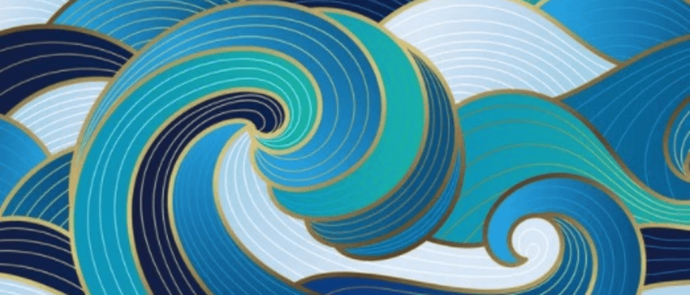
One day, a group of friends chatted with me privately. How to use CSS to achieve the following effects, a text wave effect:
Without even thinking about it, I replied, this is very simple.
Open CodePen proficiently, operate it, fucking, it seems that things are not that simple. It is very tricky to implement it with pure CSS.
Pure CSS to achieve wave effect
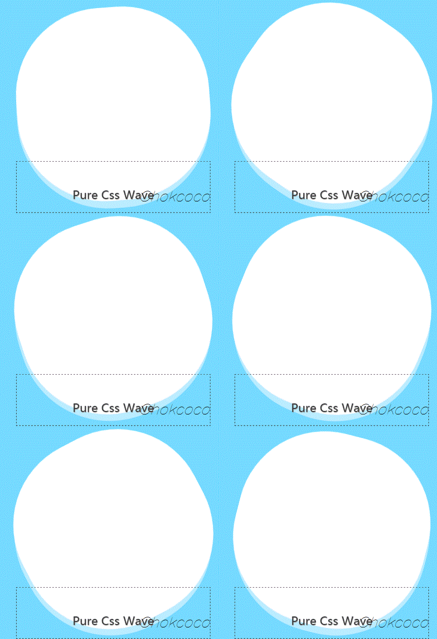
Before entering the topic, let's review first, using CSS to implement waves. If it is not in the hollowed out text, but in a div container, you can use the rolling circle method, similar to this:
The container application overflow: hidden , you can get this effect:
If you don’t understand this technique, you can hit this article: pure CSS to achieve wave effect!
How to apply this effect in text
OK, back to the topic, then how to apply this effect to the text?
What's the problem?
Let's try it first, with black text on a white background, and add this effect:
<div class="g-container">
    <p>TEXT WAVE</p>
</div>
The core CSS pseudo code is as follows:
p {
    background: #fff;
    color: #000;

    &::before,
    &::after {
        content: "";
        position: absolute;
        border-radius: 45% 48% 43% 47%;
        background: rgba(3, 169, 244, .85);
        animation: rotate 10s infinite linear;
    }

    &::after {
        border-radius: 43% 47% 44% 48%;
        animation: rotate 10s infinite .5s linear;
    }
}

@keyframes rotate {
    0% {
        transform: translate(-50%, -50%) rotate(0);
    }
    100% {
        transform: translate(-50%, -50%) rotate(360deg);
    }
}
The effect is like this:
Of course, we can also place it under the text layer, which is more intuitive:
p {
    ...

    &::before,
    &::after {
        ...
      + z-index: -1;
    }
}
Oh, it's too bad, it's impossible to achieve this alone - only the text is hollowed out, and there is a wave effect inside the text.
Try to make the text transparent
We want to try to make the text transparent
- You can use
color: transparentmake the text transparent - Try to use
background-clipachieve
emmm, try them one by one. If the font is set to transparent, because <p> a white background color, the font color will also become white. The whole is nothing but a failure.
What if the background is set to black and background-clip: text ? The font is still black, and the waves still cannot enter the hollow font~
p {
  + background-clip: text;
}
That's it:
Powerful hybrid mode
It seems that this way is not working, and we can only find another way.
In CSS, other colors can be processed, one is the filter filter , and the other is the mixed mode mix-blend-mode . Here, the various filters are flashed in the head quickly, and it should not work. But the mixed mode, you can try it.
There are also blending modes in CSS ( mix-blend-mode , background-blend-mode ). The blending mode is most commonly found in photoshop and is one of the most powerful features in PS. It is currently supported in CSS.
We tried to add a blending mode to the two large circles, and filter out the blue under the white under the current color scheme, that is, the black text on the white background.
mix-blend-mode: lighten was added to the two wavy circles, the blue was successfully filtered out on the white background, and the blue wave effect was only visible on the black font.
Of course, another mixed mode mix-blend-mode: screen can also achieve a similar effect:
So far, through the blending mode, we have cleverly achieved such a wave effect of hollowing out the text. through the characteristics of the blending mode, filter out some of the colors we don't want to see in the effect, and only let the correct color appear in the right place.
The complete code you can slam: CSS Inspiration-Use blend mode overlay to achieve text wave effect
finally
Okay, this concludes this article, I hope it helps you :)
This article does not mix-blend-mode some basic usage of the mixed mode 061513fb752074 in detail, and interested students can study by themselves.
If you want to get the most interesting CSS information, don’t miss my account - 161513fb752093 iCSS front-end facts 161513fb752095 😄
For more exciting CSS effects, please pay attention to my CSS inspiration
More wonderful CSS technical articles are summarized in my Github - iCSS , which will be updated continuously. Welcome to click a star to subscribe to the collection.
If you have any questions or suggestions, you can exchange more, original articles, limited writing style, and lack of knowledge. If there are any irregularities in the article, please let me know.


**粗体** _斜体_ [链接](http://example.com) `代码` - 列表 > 引用。你还可以使用@来通知其他用户。