(Summary) What we only knew after the project experienced a replacement of the ui component library: a total of 21 problem types
introduce
The reason for writing this article is that the author experienced a replacement of the overall ui component library of the project not long ago. I thought that replacing the ui component library was just to change the style and change a few writing methods, but after the real experience, I knew what I encountered. The problems are really rich and varied. I have summarized 21 types of problems during the whole process. I hope you can find out this article and take a look when you have similar "needs".
The scenario I have experienced is that the company has developed a new component library internally. Most of the "usage" and "design concept" of the new component library are consistent with the old component library, and it is an internal library of the company, so it is not convenient to take a screenshot. , In the article, I use antd to show the problems I encountered by analogy. Incidentally, 16166d1541626e ts made great contributions when replacing the component library. Many problems are difficult for developers to directly detect and can only rely on ts .
One: changes in attributes
The attribute is deleted ( ts can be marked red)
For example, the button component previously had a textType to set the custom style of the button, but it was deleted in the new component library. These old special styles need to be confirmed by UI students.
New attributes
autoFocus added to the pop-up box. Whether to focus on the first focusable element by default, if the new attribute is used in the component library to replace an old attribute, then the corresponding relationship between the attributes needs to be found when replacing.
Property renamed ( ts can be marked red)
For example, the confirmation button of the pop-up box was previously called the onConfirm event, and now it is called the onOk event.
Attribute value range changed ( ts can be marked red)
The value range of the size attribute of the old component button big mini small , and the new component library becomes default large . There is a problem of three attributes corresponding to two attributes. At this time, we need to find ui students to decide how to replace it.
Two: Change of return value
Type change ( ts can be marked red)
Our date components onchange parameters returned legacy event is dayjs treated objects, can be directly formatted value for this value, but the new version of the component returns the timestamp, this component replacement when we need to take the initiative Convert it to the following format:
Old version
onChange={(_: string[], date: Dayjs[]) => {
            const startTime = date[0];
            const endTime = date[1];
            // ...
      }}
New edition
onChange={(_: string[], date: number[]) => {
              if (date[0] && date[1]) {
                const startTime = dayjs(date[0]);
                const endTime = dayjs(date[1]);
                // ...
              }
        }}
Quantity change ( ts can be marked red)
For example, the return value was two before, but now the two keys in an object are synthesized and returned to us. At this time, we need to make a structure and use it again.
Three: Changes in restrictions (may be bugs)
InputNumber digital input box constraints have changed, such as setting a minimum value of 1 , when I enter 0 time input box will default to the value into 1 , but even in the new version of the input box I typed 0 time did not put a value into 1 , This leads to all subsequent operations that need to check whether it is 0.
This kind of problem is the most "deadly" , which will cause the original variable to change, and the problem cannot be found without actual operation. We cannot verify many components one by one. For example, many components will only appear in certain circumstances. On the user interface, it is easy for us to miss some points at this time.
Four: display level changes
Not only z-index , the parent level of each component will also lead to different levels. For example, we have a newcomer guide newcomer guide bullet frame is blocked after replacing the new library. ,
When the new and old component libraries are used together, the pop-up box component of the Tooltip prompt box of the new component library can not be displayed when used in conjunction with the tooltip prompt box of the new component library.
This kind of problem is not easy to find. For example, the tooltip does not display this problem. For a person who is not familiar with the business, it is impossible to find that there should be a prompt box. Developers are required to be familiar with the business to find such problems.
Five: bugs in the joint use of components
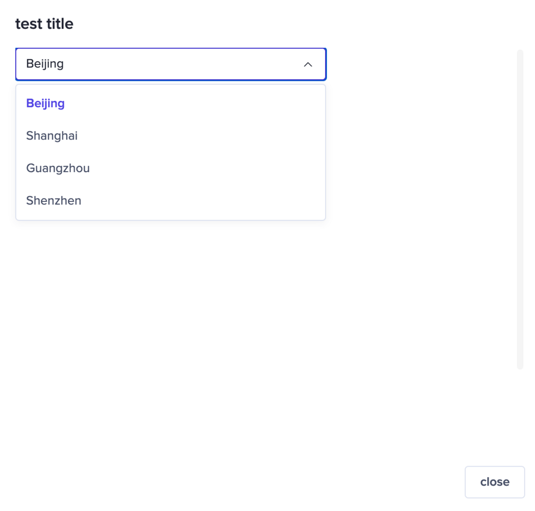
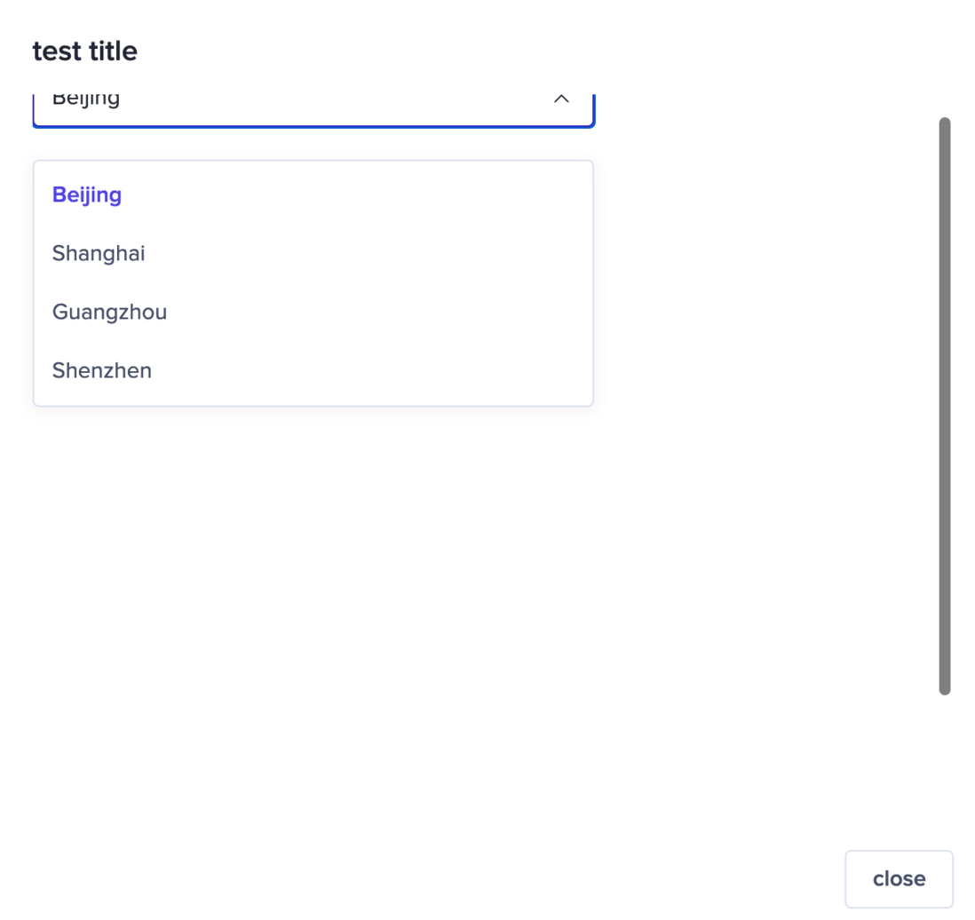
We have a input box component that can be inserted into a select box component, but the new version of the component is not set to this insert component:
Old component
New component
This kind of problem is also tricky, because it does not report an error, but the display is different, which leads to the fact that this error can only be found when you see it on the page.
Six: missing components
The old version of the component library provides lazy loading components and error notification components, but the new version of the component library does not have these two components, then you need to contact the student in charge to see if you can add these two components, if you can’t add them I can only develop one by myself, and this problem is quite awkward, adding a lot of work for no reason.
Seven: Changes in the bottom attributes
table component of the old version of the component library will have the default error error map and empty value map, but the new version does not have these images, so we need to add them manually.
For example, onOk pop-up box component is not passed in, the default is to "close the bullet box" after clicking, but the new version of the component does not have any operation effect if it is not passed. This requires that each of the bullet boxes onOk Add it.
This type of problem is also more difficult to find, because there are no errors but they are everywhere.
Eight: css attribute confusion & style differences
Element css attribute is changed
For example each table table assembly td differences, there is no legacy components to td set special attributes, but the new version of the spreadsheet component is tb set display: flex property, which can put a bunch of styles are thrown into chaos, is simply appalling.
elastic frame assembly footer useless div like wrap label, leading to the parent display: flex effects, such as I defined individually footer a button, the button will be stretched.
This kind of problem is not easy to solve, because students of the new UI library are unwilling to change this underlying design, and the new version of the UI library is already used by other teams. At this time, we need to write a global CSS style to top it. Lost.
The overall style is not processed
The new version of the component library did not add the box-sizing: border-box; attribute to the component, and I did not write *{box-sizing: border-box;} in my current project, which caused the styles in many places to have an offset of about 2px, which seems to be twisted. This kind of problem can only be solved by adding CSS styles. .
Nine: style || className setting is invalid ( ts can be marked red)
This problem was discovered accidentally. Some components of the new version of the UI library do not accept the style parameters, which causes many previous styles to not take effect, but we can't inject styles into it through CSS. This is quite unsolvable, only Can find the corresponding students to expand the range of the received value of the new version of the ui component.
Ten: Change of component label nesting
For example, the pop-up box component, originally the pop-up box component has two layers of div packages, when I want to get the outermost div , I need current element.parentNode?.parentNode, but the nesting relationship of the new version of ui components has changed, and One more level of nesting caused all previous methods to get the outermost element to report errors.
Here also let us realize that it is best not to write dom . The standardized mode should be to use the method provided by the component to obtain any element of the component, and the method of obtaining the element should also be exported when designing the component.
This kind of problem is not easy to find, only when the method of obtaining the parent is really triggered, can the error be reported.
Eleven: Components are not internationalized
This problem is relatively intuitive. When we modify the user's language, the component does not change the language according to the language we selected. After this feature is discovered, let the corresponding student add it.
Twelve: separately written components
There is a special situation. When using the old component library, the function of a certain component cannot meet the development needs. The development classmates at that time wrote a component that was exactly the same as component library. This component may The rules for passing parameters are independent and cannot be seamlessly replaced with new component libraries.
After replacing the new component library globally, in fact the above components have not been replaced. It still maintains the style of the old version of the ui. Because it is written separately, it will not report an error, but the revision of the style requires us to write it separately. , It's also tiring.
This problem is also tricky, because it is really difficult to find. I found that it is not as easy to modify as I thought. The enlightenment to me is that I will use the components provided by the component library for development in the future, and the components written by myself cannot be better. Change.
Thirteen: Change of style variables
For example, the old component library defines red into red-01, red-02, red-03 , which represent the dark and light red colors, and the project code also introduces these variables provided by old component library.
new component library also has its own set of css or scss variables. The naming is completely different from the previous ones. This leads to, for example, that I used red-01 before and now need to be changed to color-obvious . The correspondence between css variables like this may need Write a function cycle comparison, but the bad thing is that their rgba color values are very likely to be completely different, which leads to completely incapable of one-to-one correspondence, and headaches.
This kind of problem can only be compared with ui one by one. The inspiration here is that even a small css variable requires a complete set of naming conventions to design.
Fourteen: Unknown attributes looped out
I talked about above, the range of possible changes of certain properties, such as button of size the range of properties from big mini small , the new version of the component library into a default large , this is the eye can see, but there is a situation Crap.
For example wording here: <button size={btSize}>ok</button> there's btSize is a variable component is passed over the top, then ts may not be an error but it will still value the wrong problem.
To specifically write a method of converting attributes for this situation, such as:
let size = 'default';
if(btSize === 'small' ){
   size = 'large';
}
The button is used as an example here because it is relatively simple, and the actual situation is more difficult to deal with than this.
Fifteen: The split of usage
For example, the pop-up box component old version component library exports a Modal , you can directly <Modal/> or Modal.info() , the new version divides it into the modalFn method and the Modal component.
Many of the previous writings must be disassembled and replaced, and every page must be checked and not missed.
16: Error when using old ui and new ui together
When bomb box assembly time drop-down box components used in combination, if you click the drop-down box components evocative drop-down box, internal bomb box assembly occur 'scroll', drop-down box or drop-down box components remain in place.
The common use of the new and old component libraries is risky, because they may not work with each other at all, and the newly formed students are unwilling to fix this "problem".
Seventeen: Extraction of component functions
For example, when an error occurs in the input box component of the input , we will pass an attribute such errortip='cannot be empty' input , but the new version of the component library will complete this function. Put <FormItem></FormItem> the label 06166d15416a36, which means that if we want the input box to show an error message <Form> and then a layer of <FormItem> , but we actually have many places that are not suitable for this.
The revision of this kind of capability divestiture is generally caused by a different understanding of the business. If the appeal is reasonable, it is best to add this attribute back.
Eighteen: Changes in overall class names
In the css file, this is a problem that must be solved, because we will write some global css styles, for example, an element in a component must be 30px wide, and other attributes, but after replacing the component library, the component class The name has changed completely, we need to change the name.
In js logic, it is possible to get elements based on a certain type. In this case, it is best to change it globally.
Nineteen: Code library quality issues such as ts error
When using a set of code bases, it is good to pull his code locally to have a look, such as whether it is logically rigorous, whether the value is too fault-tolerant, such as xxx.vvv.bbb or xxx?.vvv?.bbb , and it depends on whether his ts type is complete, For example, if you write some any or put a lot of on the page /* eslint-disable */ or // @ts-nocheck, it is recommended to be cautious when connecting.
Twenty: component mounting dom is different
This is a very unique bug . The protagonist is the bullet box component. For example, editing page, a prompt pops up on the 16166d15416afd edit page. If the user page routing changes, the bullet box is automatically destroyed, but the bullet box component does not It will not be destroyed, because it is mounted on body by default, which leads to many bullets cannot be turned off, and the bullets are still on the screen after switching the page.
In this case, either find the corresponding classmates to fix it, or take the initiative to add an operation to destroy the current bullet frame for each operation.
21: Insufficient manpower
Manpower is a very critical issue, especially new component library. Many problems are discovered but cannot be resolved within 2 days. This situation can easily cause "development time tug-of-war", so it is recommended that similar projects need to be in the new The ui library is replaced under the special support of special development students, and we cooperate with it to complete this arduous task.
end
This is the case this time, I hope to make progress with you.


**粗体** _斜体_ [链接](http://example.com) `代码` - 列表 > 引用。你还可以使用@来通知其他用户。