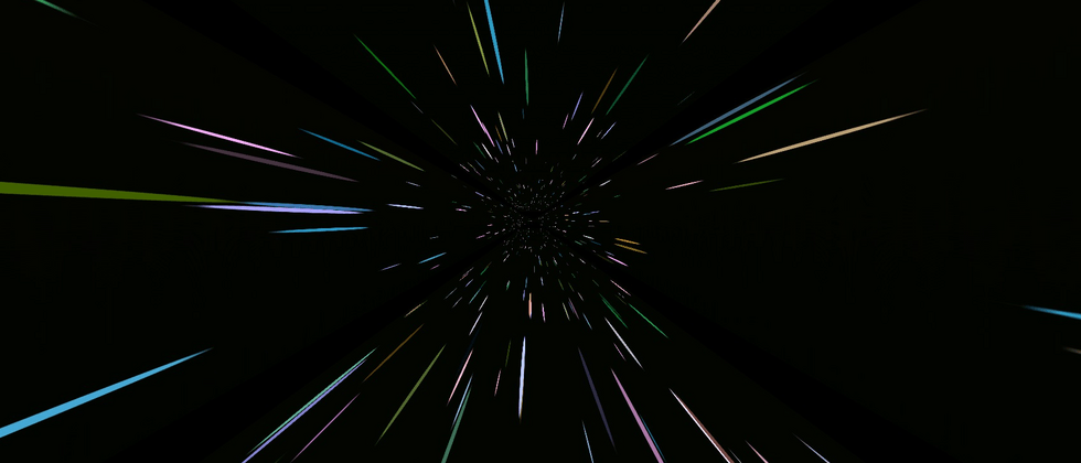
background
I used to log in to Apex at home on weekends and plan to play a few games. During the process of landing on the accelerator, it was discovered that the accelerator had expired.
I have been using the Tencent online game accelerator , but clicking the recharge button prompts that the client has been upgraded recently, and recharge is not supported temporarily (this operation shocked me~). You can only turn your head to download NetEase UU accelerator .
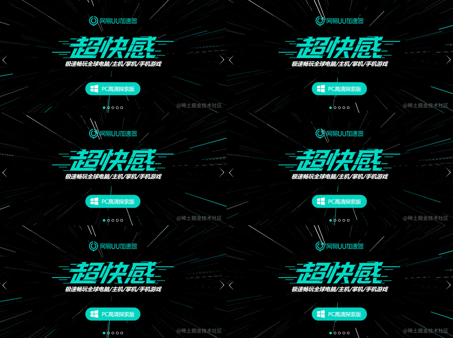
Open the UU accelerator homepage, and what you see is this picture:
In an instant, I was attracted by its background image.
Out of my sensitivity to CSS, I guessed a wave of this implemented with CSS, at least it should be Canvas. I opened the console and was a little disappointed. It turned out to be a .mp4 file:
Look at the Network panel again, this .mp4 file actually needs 3.5M?
emm, I don't want to play games anymore. such a background image, can't CSS handle ?
Use CSS 3D to achieve interstellar 3D shuttle effect
This technique, I’m CSS 3D animation in 1618c803956a7b | How amazing animation can I make with CSS only? also mentioned it, and those who are interested can take a look at it together.
Suppose we have such a graph:
This picture is reserved for future use. Before using this picture, we will first draw such a graph:
<div class="g-container">
  <div class="g-group">
      <div class="item item-right"></div>
      <div class="item item-left"></div>
      <div class="item item-top"></div>
      <div class="item item-bottom"></div>
      <div class="item item-middle"></div>
  </div>
</div>
body {
background: #000;
}
.g-container {
position: relative;
}
.g-group {
position: absolute;
width: 100px;
height: 100px;
left: -50px;
top: -50px;
transform-style: preserve-3d;
}
.item {
position: absolute;
width: 100%;
height: 100%;
background: rgba(255, 255, 255, .5);
}
.item-right {
background: red;
transform: rotateY(90deg) translateZ(50px);
}
.item-left {
background: green;
transform: rotateY(-90deg) translateZ(50px);
}
.item-top {
background: blue;
transform: rotateX(90deg) translateZ(50px);
}
.item-bottom {
background: deeppink;
transform: rotateX(-90deg) translateZ(50px);
}
.item-middle {
background: rgba(255, 255, 255, 0.5);
transform: rotateX(180deg) translateZ(50px);
}A total of 5 sub-elements are set, but look carefully at the CSS code, 4 of the sub-elements are set to rotateX/Y(90deg/-90deg) , which is rotated by 90° around the X or Y axis. Visually, it is a plane perpendicular to the screen, so it is intuitively visual We are not there, we can only see a flat surface .item-middle .
I set different background colors for the 5 sub-items, and the results are as follows:
It seems to be unremarkable now, and indeed it is.
However, the time to witness the miracle, and this time, we give the parent element .g-container set a minimum perspective , for example, set up a perspective: 4px , look at the results:
.g-container {
  position: relative;
+ perspective: 4px;
}
// ...其余样式保持不变
At this time, the style of painting changed suddenly, and the whole effect became like this:
Since perspective takes effect, the original flat effect becomes a 3D effect. Next, we use the starry sky map prepared above, replace the background color above, and replace all of them with the same image. The magical thing happened:
Since the set perspective is very small, and the transform: translateZ(50px) each item is set relatively large, the picture is stretched very visually. But the whole is full of the entire screen.
Next, we only need to move the perspective, add an animation to the parent element, and change it translateZ()
.g-container{
  position: relative;
  perspective: 4px;
  perspective-origin: 50% 50%;
}

.g-group{
  position: absolute;
  // ... 一些定位高宽代码
  transform-style: preserve-3d;
  + animation: move 8s infinite linear;
}

@keyframes move {
  0%{
    transform: translateZ(-50px) rotate(0deg);
  }
  100%{
    transform: translateZ(50px) rotate(0deg);
  }
}
Take a look, the magical and wonderful starry sky shuttle effect comes out, Amazing:
The disadvantage is that the animation has not been connected indefinitely, and there are big problems at the beginning and the end.
Of course, this does not bother us, we can:
- By superimposing the same effect of the two groups, one group
animation-delayearlier than the other group through the negative 0618c803956c63, so that the two animation groups are connected (when one group ends, the other group is still moving) - Then through the change of transparency, the abrupt feeling of
item-middle - Finally, you can control the color change of the picture
hue-rotate
We tried to modify the HTML structure as follows:
<div class="g-container">
  <div class="g-group">
      <div class="item item-right"></div>
      <div class="item item-left"></div>
      <div class="item item-top"></div>
      <div class="item item-bottom"></div>
      <div class="item item-middle"></div>
  </div>
  <!-- 增加一组动画 -->
  <div class="g-group">
      <div class="item item-right"></div>
      <div class="item item-left"></div>
      <div class="item item-top"></div>
      <div class="item item-bottom"></div>
      <div class="item item-middle"></div>
  </div>
</div>
The revised core CSS is as follows:
.g-container{
  perspective: 4px;
  position: relative;
  // hue-rotate 变化动画,可以让图片颜色一直变换
  animation: hueRotate 21s infinite linear;
}

.g-group{
  transform-style: preserve-3d;
  animation: move 12s infinite linear;
}
// 设置负的 animation-delay,让第二组动画提前进行
.g-group:nth-child(2){
  animation: move 12s infinite linear;
  animation-delay: -6s;
}
.item {
  background: url(https://z3.ax1x.com/2021/08/20/fLwuMd.jpg);
  background-size: cover;
  opacity: 1;
  // 子元素的透明度变化,减少动画衔接时候的突兀感
  animation: fade 12s infinite linear;
  animation-delay: 0;
}
.g-group:nth-child(2) .item {
  animation-delay: -6s;
}
@keyframes move {
  0%{
    transform: translateZ(-500px) rotate(0deg);
  }
  100%{
    transform: translateZ(500px) rotate(0deg);
  }
}
@keyframes fade {
  0%{
    opacity: 0;
  }
  25%,
  60%{
    opacity: 1;
  }
  100%{
    opacity: 0;
  }
}
@keyframes hueRotate {
  0% {
    filter: hue-rotate(0);
  }
  100% {
    filter: hue-rotate(360deg);
  }
}
The final complete effect is as follows, the effect of the starry sky shuttle, the entire animation is connected end to end, and can go on indefinitely, with almost no flaws, which is very awesome:
For the complete code above, you can hit here: CSS Inspiration-3D Universe Space-time Shuttle Effect
In this way, we have basically restored the background of the 1618c803956d59 NetEase UU accelerator
Furthermore, I don’t want to use a picture
Of course, there will still be readers complaining about here. Didn't you also use a picture resource here? Can it work without that starry sky map? I'm too lazy to look for this picture.
Of course, CSS YYDS. Here we try to use box-shadow to replace the actual starry sky map, which is also implemented in a div tag, with the help of SASS's loop function:
<div></div>@function randomNum($max, $min: 0, $u: 1) {
@return ($min + random($max)) * $u;
}
@function randomColor() {
@return rgb(randomNum(255), randomNum(255), randomNum(255));
}
@function shadowSet($maxWidth, $maxHeight, $count) {
$shadow : 0 0 0 0 randomColor();
@for $i from 0 through $count {
$x: #{random(10000) / 10000 * $maxWidth};
$y: #{random(10000) / 10000 * $maxHeight};
$shadow: $shadow, #{$x} #{$y} 0 #{random(5)}px randomColor();
}
@return $shadow;
}
body {
background: #000;
}
div {
width: 1px;
height: 1px;
border-radius: 50%;
box-shadow: shadowSet(100vw, 100vh, 500);
}Here, we use SASS to encapsulate a function, using box-shadow to generate the number of points passed in within the height and width of the passed size.
In this way, we can get such a picture to replace the actual sky map:
Let's replace the above picture with the actual starry sky picture, mainly to replace .item , and only list the modified parts:
// 原 CSS,使用了一张星空图
.item {
  position: absolute;
  width: 100%;
  height: 100%;
  background: url(https://z3.ax1x.com/2021/08/20/fLwuMd.jpg);
  background-size: cover;
  animation: fade 12s infinite linear;
}

// 修改后的 CSS 代码
.item {
  position: absolute;
  width: 100%;
  height: 100%;
  background: #000;
  animation: fade 12s infinite linear;
}
.item::after {
  content: "";
  position: absolute;
  top: 0;
  left: 0;
  right: 0;
  bottom: 0;
  width: 1px;
  height: 1px;
  border-radius: 50%;
  box-shadow: shadowSet(100vw, 100vh, 500);
}
In this way, we have achieved such an effect, using pure CSS to achieve the above effect without resorting to additional resources:
CodePen Demo -- Pure CSS Galaxy Shuttle 2
By adjusting the animation time, perspective value, each element translateZ() distance changes, you can get a variety of different perception and effect, the interested reader is based on my own to try the above to try the DEMO.
finally
Okay, this concludes this article, I hope this article is helpful to you :)
Want to get the most interesting CSS information, don’t miss my public - 1618c803956ebf iCSS front-end interesting 1618c803956ec1 😄
More wonderful CSS technical articles are summarized in my Github - iCSS , which will be updated continuously. Welcome to click a star to subscribe to the collection.
If you have any questions or suggestions, you can exchange more, original articles, limited writing style, and lack of knowledge. If there are any irregularities in the article, please let me know.


**粗体** _斜体_ [链接](http://example.com) `代码` - 列表 > 引用。你还可以使用@来通知其他用户。