

This article was first published on the WeChat public "1619381334d20c Shopee Technical Team ".
Preface
This article is based on the overall reconstruction of the WMS (Warehouse Management System) project within the Shopee supply chain team, and summarizes a Web user experience design improvement guide.
Because it is a complete overthrow and refactoring of an existing project, we have been thinking about how to stand in the user’s perspective as much as possible during the entire process, and improve the user’s experience and feelings through front-end design, so as to truly achieve refactoring. The purpose and meaning of.
A Web page or an App, if you want others to use it comfortably and get a good user experience, you may need to include but not limited to:
- Rapid opening speed
- Eye-catching UI design
- Cool animation effects
- Rich personalized settings
- Easy to use, friendly and convenient operation
- Intimate details
- Pay attention to the disabled, good accessibility
- ……
The so-called user experience design is a design method that adheres to the user-centered idea and is designed with user needs as the goal. The design process focuses on user-centeredness, and the concept of user experience enters the entire process from the earliest stage of development and runs through it.
Good user experience design is the result of the joint efforts of the team in every aspect of product development.
This article will mainly start from the page presentation, interaction details, and accessibility , and share some useful experiences accumulated in the actual development process. Through this article, you will be able to:
- Understand how some details affect the user experience;
- Understand how to improve the user experience of the page with the smallest possible development changes;
- Understand some excellent interaction design details;
- Understand the meaning of basic accessibility features and page accessibility;
- Understand the basic methods to improve the accessibility of the page.
1. Page rendering
As far as the display of the entire page and the content of the page are concerned, different display methods have completely different effects.
There are many notable details in this. The following is divided into several main points to explain:
- Adaptive layout
- Arrangement design of key content
- Compatible with different scenarios and exception rollback
- Picture presentation and exception handling
- Appropriate transitions and animations
1.1 Adaptive layout
Let's first look at some layout-related issues.
Layout, the front end needs to plan and think in advance in the process of refactoring the page. Generally, the following issues should be considered clearly:
- For the PC side, is the project a full-screen layout or a fixed-width layout? Are users still using IE?
- For a full-screen layout, what is the minimum width that needs to be adapted?
- For the mobile layout, do you know the distribution of user devices? What version of Android is the least compatible? What version of iOS?
- How should the content be presented?
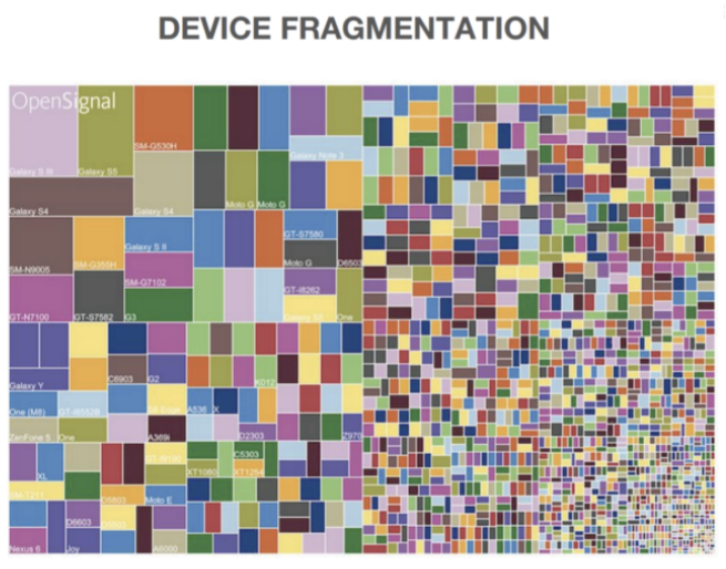
Today, there are a vast array of devices, and the screen sizes of mobile terminals are complicated (the following figure is just the distribution of the screen sizes of various Android devices in 2019):
However, our reconstruction project as a whole is a PC-based ToB project, so here we mainly take the PC side as an example to explain.
For most PC-side projects, the first thing that needs to be considered is the outermost package. Suppose it is .g-app-wrapper .
<div class="g-app-wrapper">
    <!-- 内部内容 -->
</div>
First of all, for .g-app-wrapper , there are several points that we must figure out before the project is developed:
- Is the project a full-screen layout or a fixed-width layout?
- For a full-screen layout, what is the minimum width that needs to be adapted?
For fixed-width layout, it is more convenient, assuming that the width is set to 1200px , then:
.g-app-wrapper {
    width: 1200px;
    margin: 0 auto;
}
Use margin: 0 auto achieve the horizontal centering of the layout. When the screen width is greater than 1200px , the sides are left blank; when the screen width is less than 1200px , a scroll bar appears to ensure that the internal content is not messy.

The modern layout is more of a full-screen layout. In fact, this layout is now more advocated, that is, an adaptive layout that changes with the size and capabilities of the user's device.
The adaptive layout usually has two left and right columns, the left side is fixed width, and the right side is adaptive to the remaining width. There will also be a minimum width. Then, its layout should be like this:
<div class="g-app-wrapper">
    <div class="g-sidebar"></div>
    <div class="g-main"></div>
</div>
.g-app-wrapper {
display: flex;
min-width: 1200px;
}
.g-sidebar {
flex-basis: 250px;
margin-right: 10px;
}
.g-main {
flex-grow: 1;
}
flex-grow: 1 under the flex layout to make .main and contract to take up the remaining space, and use min-width to ensure the minimum width of the entire container.
This is the most basic adaptive layout. For modern layouts, we should consider as many scenarios as possible. Do:

Bottom footer
The following situation is also very common:
There is a footer (footer) part of the page. If the content height of the entire page is less than the height of the window, the footer is fixed at the bottom of the window. If the content height of the entire page is greater than the height of the window, the footer is arranged normally (that is, scrolling is required). You can see the footer until the bottom).
See the effect:

If you can use flex, you can use justify-content: space-between to solve this requirement. Similarly, using margin-top: auto is also very easy to complete:
<div class="g-container">
    <div class="g-real-box">
        ...
    </div>
    <div class="g-footer"></div>
</div>
.g-container {
height: 100vh;
display: flex;
flex-direction: column;
}
.g-footer {
margin-top: auto;
flex-shrink: 0;
height: 30px;
background: deeppink;
}Codepen Demo - sticky footer by flex margin auto
Of course, there are many ways to implement it, and only one recommended solution is given here.
1.2 Arrangement design of key content
The following section shows the key content.
1.2.1 Display of important content and functions
allow the user to attract the attention of the elements of the pre- . If our page has core information or forms that need to be understood and processed by users, place it at the top as much as possible to make it easier for users to obtain this part of information.

Display the information and important functions that users need instead of hiding them.
Similar to high-frequency operations such as navigation and search, you must not let users click multiple times to use them.
1.2.2 Dealing with dynamic content: the text is too long
All text display interfaces that receive back-end interface fields need to be considered comprehensive. The normal situation is as follows, there is no problem:

But have we considered that the text will be too long? Will it wrap or wrap if it's too long?
For single-line text, use single-line omission:
{
    width: 200px;
    white-space: nowrap;
    overflow: hidden;
    text-overflow: ellipsis;
}
Of course, the compatibility is already very good for the long omission of multi-line text:
{
    width: 200px;
    overflow : hidden;
    text-overflow: ellipsis;
    display: -webkit-box;
    -webkit-line-clamp: 2;
    -webkit-box-orient: vertical;
}
1.2.3 Dealing with dynamic content: protecting the boundary
For some dynamic content, we often use min/max-width or min/max-height to reasonably control the height and width of the container.
There are also some details that need to be considered when using them.
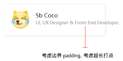
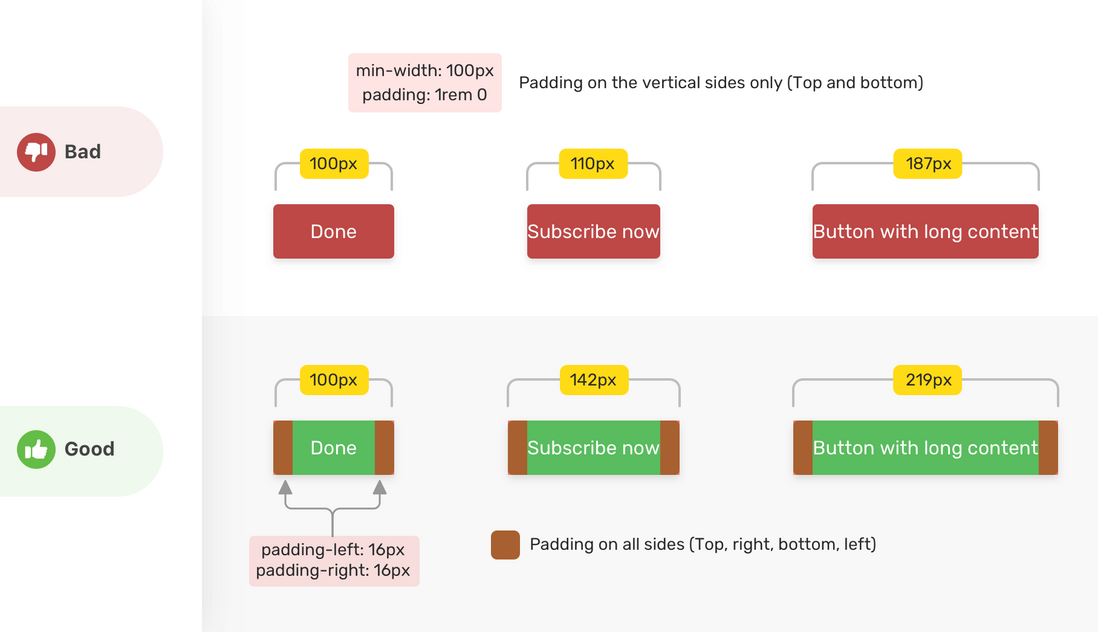
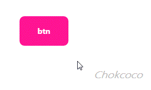
For example, the minimum width of the min-width
.btn {
    ...
    min-width: 120px;
}
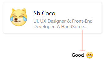
When the content is relatively small, it is okay, but if the content is relatively long, problems are prone to occur. The following picture min-width the situation where 0619381334e27a is used but the button is too long:

Here you need to cooperate with padding:
.btn {
    ...
    min-width: 88px;
    padding: 0 16px
}
Borrow a very good picture Min and Max Width/Height in CSS
1.3 Compatible with different scenarios and exception fallback: display of empty data content
This module is compatible with different scenarios and exception fallback, which is often overlooked.
The page often has list search and list display. Then, since there is a normal situation of data, of course there will be situations where there are no search results or no content to display in the list.
In this case, we must pay attention to the design of the empty data result page; at the same time, we must know that this is also a good place to guide users. For the empty data result page, distinguish clearly:
(1) The data is empty
- The user is not authorized-to inform the user of the reason and solution of the unauthorized access
- No search results-inform users of search results without data, and recommend relevant content if necessary
- Screening without results-generally directly inform the screening of no results
There is no data on the page-there are several directions for copywriting design:
- Tell the user what data will be stored here
- Give users a reason to take the initiative to create data, such as arousing psychological resonance among users through words
- If there is no data on the page that will cause confusion to the user, you can explain the reason to eliminate the confusion of the user
(2) Abnormal state
- Network abnormality-point out that the current status is network abnormality, and give a solution
- Server exception-point out that the current status is server exception, and give a solution
- Loading failure-loading failure is mainly caused by network abnormalities or server abnormalities
- Different situations may correspond to different empty data result pages, with different operation guidance
For example, if the network is abnormal, the user can be guided to refresh the page:
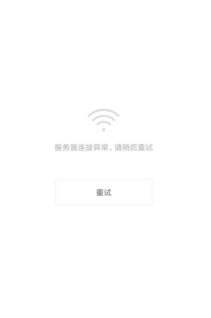
Or it is indeed a zero result. For example, if there is no order information, the user can be guided to create an order (guide consumption):

To sum up, the above have always explained a truth: When developing 1619381334e732, you should not only pay attention to normal phenomena, but also consider various abnormal situations, think comprehensively, and do a good job in handling various possible situations .
1.4 Picture presentation and exception handling
Pictures are very common in our business. But it is not easy to process pictures perfectly.
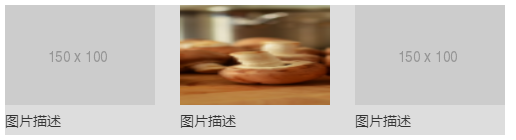
1.4.1 Set the height and width of the picture at the same time
Sometimes the product and design will agree that only pictures of a fixed size can be used. Our layout may look like this:

Corresponding layout:
<ul class="g-container">
<li>
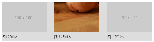
<img src="http://placehold.it/150x100">
<p>图片描述</p>
</li>
</ul>ul li img {
width: 150px;
}Assuming an abnormal size image appears on the back-end interface, the above unprotected layout will have problems:

Therefore, for pictures, we always recommend to write height and width at the same time to avoid layout problems caused by wrong picture size.
ul li img {
    width: 150px;
    height: 100px;
}
In addition, <img> label at the same time, which can occupy the position before the image is loaded, avoiding the rearrangement problem caused by the change of the height and width of the image from the unloaded state to the rendered state.
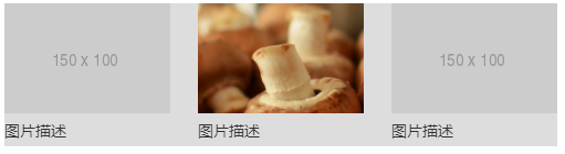
1.4.2 object-fit
Limiting the height and width may also cause problems. For example, the picture is stretched, which is very ugly:
At this time, we can use object-fit , which can specify how the content of the replaceable element (that is, the picture) should adapt to the height and width of its parent container.
ul li img {
    width: 150px;
    height: 100px;
    object-fit: cover;
}
Use object-fit: cover to make the image content fill the entire content frame of the element while maintaining the aspect ratio.
object-fit also has a matching attribute object-position , which can control the position of the picture in its content frame (similar to background-position ), m defaults to object-position: 50% 50% . If you don't want the picture to be displayed in the center, you can use it to change the actual position of the picture.
ul li img {
    width: 150px;
    height: 100px;
    object-fit: cover;
    object-position: 50% 100%;
}
Like this, object-position: 100% 50% indicates that the picture is displayed from the bottom.
Here is a good Demo that can help you understand
object-position:
1.4.3 Consider screen dpr: responsive pictures
Under normal circumstances, there should be no problems with the display of pictures, but we can do better.
On mobile terminals or some high-definition PC screens (such as Apple's Mac Book), the dpr of the screen may be greater than 1. At this time, we may also need to consider using multiple images to adapt to different dpr screens.
It just so happens that the <img> tag provides the corresponding attribute srcset for us to operate.
<img src='photo@1x.png'
   srcset='photo@1x.png 1x,
           photo@2x.png 2x,
           photo@3x.png 3x'
/>
However, this is an older way of writing. srcset adds a new w width descriptor, which needs to sizes , so the better way to write is:
<img
        src = "photo.png"
        sizes = “(min-width: 600px) 600px, 300px"
        srcset = “photo@1x.png 300w,
                       photo@2x.png 600w,
                       photo@3x.png 1200w,
>
Using srcset , we can provide the most suitable pictures for different dpr screens.
1.4.4 Picture loss
Well, when the picture link is okay, it has been processed. Next, you need to consider what should be done when the image link hangs.
There are many ways to deal with it. The best way to deal with it is what I saw in the article "1619381334eeaa Best Practices for CSS Style Processing . Here is a brief talk:
- Use image loading to fail, triggering
<img>elementsonerrorevent, failed to load<img>elements of a new style class; - Using the newly-added style class, in conjunction with
<img>element, while displaying the default bottom image, it can also display thealtinformation of the<img>
<img src="test.png" alt="图片描述" onerror="this.classList.add('error');">img.error {
position: relative;
display: inline-block;
}
img.error::before {
content: "";
/** 定位代码 **/
background: url(error-default.png);
}
img.error::after {
content: attr(alt);
/** 定位代码 **/
}We use the pseudo element before to load the default error map, and use the pseudo element after to display the alt information of the picture:

At this point, the complete image processing is complete, you can here to see the complete Demo: 1619381334f0ab CodePen Demo-Image processing .
1.5 Appropriate transitions and animations
Good page presentation requires appropriate transitions and animations to make the overall interactive experience smoother. Appropriately adding transitions and animations can make users perceive the changes of the page well. They have the following effects:
- Reduce cognitive load
- Prevent change blindness
- Create a better impression in space
- Bring the user interface to life
This piece of content can also be placed in the optimization of interaction design, and readers and friends can understand it.
1.5.1 loading waiting animation
The loading effect that can be seen everywhere on the page is actually such a function that allows users to perceive that the page is loading or some transactions are being processed.

1.5.2 Skeleton screen animation
The layout of the skeleton screen is consistent with the visual presentation of the page, which can guide the user to focus on the point of interest and avoid long waiting.
1.5.3 Smooth rolling: Use scroll-behavior: smooth make rolling silky smooth
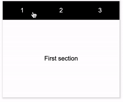
Using scroll-behavior: smooth , you can make the scroll box scroll smoothly instead of jumping abruptly. To see the effect, suppose the following structure:
<div class="g-container">
  <nav>
    <a href="#1">1</a>
    <a href="#2">2</a>
    <a href="#3">3</a>
  </nav>
  <div class="scrolling-box">
    <section id="1">First section</section>
    <section id="2">Second section</section>
    <section id="3">Third section</section>
  </div>
</div>
If you don’t use scroll-behavior: smooth , you just jump and switch suddenly:
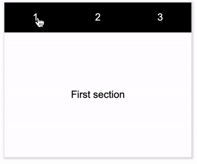
To improve this phenomenon, you can add scroll-behavior: smooth to the scrollable container to achieve smooth scrolling:
{
    scroll-behavior: smooth;
}
1.5.4 Sticky scrolling: use scroll-snap-type optimize the scrolling effect
sroll-snap-type may be regarded as the core attribute style in the new rolling specification.
scroll-snap-type : The attribute defines how a snap point in the scroll container is strictly enforced.
It's a bit difficult to understand just by looking at the definition. Simply put, this attribute specifies whether a container captures the internal scrolling motion, and specifies how to handle the scrolling end state. After the scrolling operation is over, the element stops at a suitable position.
Look at a simple example:

Of course, scroll-snap-type usage, and there are many points that can be controlled and optimized. Due to space limitations, it cannot be expanded one by one.
1.5.5 Control the scroll level to avoid a large number of page rearrangements
This optimization may be a little bit difficult to understand. Need to understand the relevant knowledge of CSS rendering optimization.
Let me talk about the conclusion first. Controlling the scroll level means that should try to keep the z-index of elements that need CSS animation (either element animation or container scrolling) at the top of the page to avoid unnecessary creation by the browser Graphics layer (GraphicsLayer), can well improve the rendering performance .
How do you understand this? One of the factors that triggers the creation of a Graphics Layer layer by an element is:
- The element has a sibling element with a lower z-index and a composite layer.
According to the above points, when we optimize the scrolling performance, we need to pay attention to two points:
- By generating an independent GraphicsLayer, using GPU acceleration to improve scrolling performance;
- If there is no performance problem with scrolling itself, and no independent GraphicsLayer is needed, you should also pay attention to the level of the scroll container to avoid being merged by other elements that created the GraphicsLayer because the level is too high, and passively generate a GraphicsLayer, which affects the overall rendering performance of the page.
1.5.6 Transition animation
When jumping from one module to another, the transition animation comes in handy. Its function is to guide the line of sight to the right place at the right time.
Look at the following example:
In the process of clicking the button to pop up the pop-up window, the pop-up window does not appear abruptly, but enlarges from the clicked place to the middle of the window. This guiding process makes the experience more silky.
1.5.7 Operation animation
This is similar to loading. When we encounter some time-consuming operations, such as downloading, we can customize a special animation to alleviate the irritability and anxiety of users waiting.
The code for the above animation, you can swipe:
Of course, in addition to downloading and waiting, we can also customize special animations for some important operational interactions, such as likes and followings, to make the process more lively and interesting. The following is a thumbs-up animation of a website:
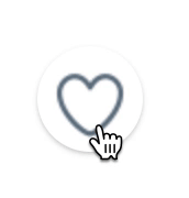
The code for the above-mentioned like animation, you can swipe:
1.5.8 Misunderstandings of using transitions and animations
Reasonable use of animation can add a lot of color to the page, but at the same time avoid stepping into the following pits:
- Animation has no relevance
- Animation for the sake of animation, no purpose
- Too slow and hinder interaction
- Not clear enough
Explain briefly. For example, animation relevance, the logic behind the relevance can help users understand the changes that have just occurred in the interface layout and what caused the changes.
In the figure below, the left side is poorly correlated, and the right side is well correlated:
Another point is that most animations should not be too long and fast enough.
The slow animation produced unnecessary pauses. Transition animations should be kept short because users will see them frequently. Keep the animation duration at 300ms or less.
Look at the demo below, the same transition animation will be triggered frequently, so as far as possible, each animation should not last too long, which can help users save more time.

All in all, animations and transitions should be used appropriately, and it is very important to avoid animation for the sake of animation .
2. Interaction design optimization
The next big part is some details about the interaction.
What is interaction design? Interaction design (Interaction Design, IXD) is defined, the design of artificial systems design behavior that defines the exchange interaction between two or more individuals content and structure, making it cooperate with each other to reach a common Species purpose .
2.1 Web-side interaction
Web-side interaction is centered around the computer, and mainly involves the interaction of two types of devices: keyboard and mouse.
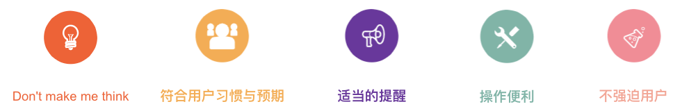
Regarding interaction design, some of the more general guidelines are:
- Don’t make me think
- Meet the user's habits and expectations
- Convenient operation
- Make proper reminders
- Don't force users
2.2 Don’t make me think
There is a book called Don't make me think The core of what it wants to express is to make the product as highly usable as possible, so that users can use the functions of the product clearly without thinking.
So, how can our pages be as highly available as possible?
2.2.1 Use idioms
Use idiomatic usage. When we design a new page, the page location, function settings, and visual elements should be the same as the usual methods, so that users can feel comfortable.
This is not to kill everyone's imagination and make all pages unchanged. According to the form of the product and the audience, most pages are not suitable for all kinds of wild imaginations.
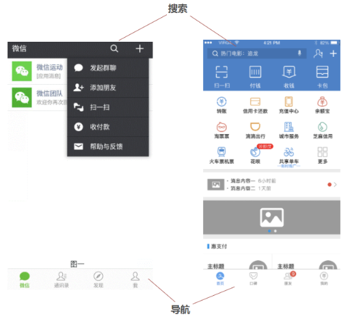
For example, the following is a PC-side page structure, this layout is already very common. When encountering this kind of page, users can find the elements and information they want in the designated area very quickly:

You can compare it with the refactored page of our WMS, the whole is very similar:
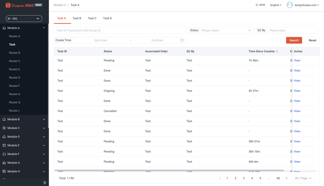
Using idiom settings can let people quickly get started with new and unfamiliar pages or functions.
2.2.2 Reduce visual noise
Another approach is to reduce visual noise and allow users to focus quickly.
For example, the shadow and blur behind the pop-up window are very good means to reduce visual noise.

This is very well understood, and it is also one of the common design methods. Our internal related components and self-developed component libraries have been deposited very well.
2.3 In line with user habits and expectations
Next is meets the user’s habits and expectations. . Its meaning is to reduce the user’s thinking, conform to the user’s habits, and make the user’s experience more comfortable.
Which of the following types of pop-up windows is a better choice?

The buttons available for operation in the three pop-up windows are:
- Cancel and confirm in the lower right corner, and the X in the upper right corner can close the pop-up window;
- Only the cancellation and confirmation in the lower right corner;
- Only the confirmation button.
The better choice should be the first one: there are both cancel and confirm buttons, and the X in the upper right corner can close the pop-up window. Because this best meets the user's habitual expectations.
Look at this pop-up window under Windows:

Most of the Windows pop-up windows have cancel, confirm and the X button in the upper right corner. The benefits of this pop-up window are:
- Visual reason, element balance;
- In line with user habits, most users come from the Windows operating system;
- Interaction consistency, reducing user learning costs;
- Improve the accessibility and accessibility of the page.
2.3.1 Optimizing gestures: different applications in different scenarios cursor
For different content, it is best to give different cursor styles. CSS natively provides a lot of commonly used gestures.
Using different mouse gestures in different scenarios, conforms to the user's habits and expectations , which can well enhance the user's interactive experience.
First of all, for buttons, there are at least three different types of cursor , which are clickable, non-clickable, and waiting:
{
    cursor: pointer;    // 可点击
    cursor: not-allowed;    // 不可点击
    cursor: wait;    // loading
}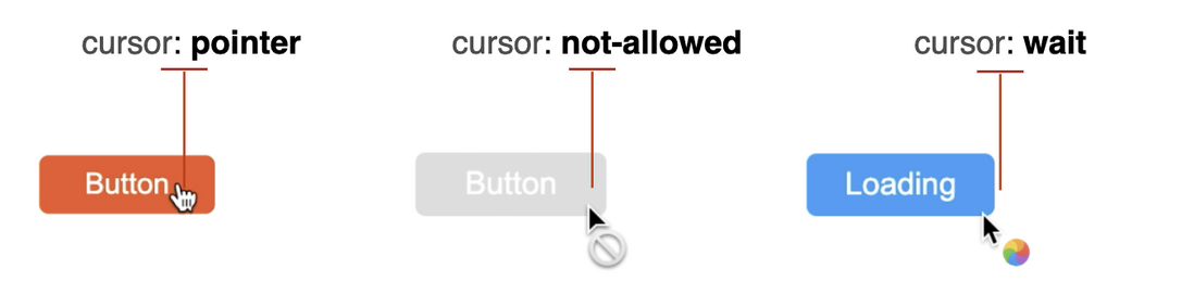
In addition, there are some common usages: For some input boxes, use cursor: text ; for Tips, use cursor: help ; zoom in and out pictures zoom-in , zoom-out etc.:
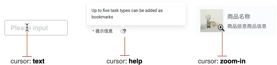
Some commonly used simple columns:
- The button can be clicked:
cursor: pointer - The button is forbidden to click:
cursor: not-allowed - Waiting for Loading status:
cursor: wait - Input box:
cursor: text - The picture viewer can zoom in or out:
cursor: zoom-in/ zoom-out - Tip:
cursor: help
Of course, the actual cursor also supports many kinds, you can MDN or the following CodePen Demo:
CodePen Demo - Cursor Demo。
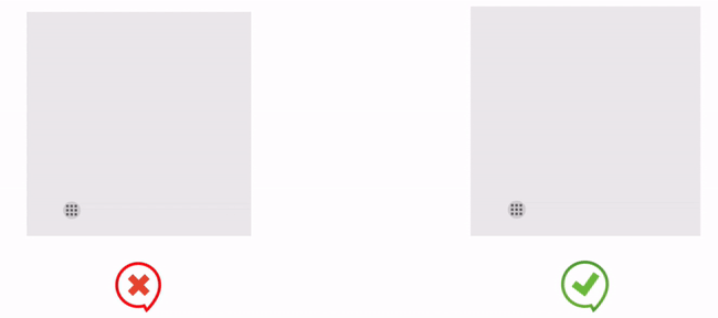
2.3.2 Click area optimization: Pseudo-element expands the click area
The button is a very important part of our web design, and the design of the button is also closely related to the user experience.
Consider a scenario where you are operating the screen on a swaying carriage or with one hand, and sometimes a button can't be clicked.
Making it easier for users to click on the button will undoubtedly improve the user experience and enhance the accessibility of the page. Especially on the mobile terminal, the buttons are usually very small, but due to the design draft or the overall UI style, we cannot directly change the height and width of the button elements.
So, is there any way to increase the click hot zone without changing the original size of the button?
It can be easily achieved with the help of pseudo-elements. Pseudo-elements can also respond to mouse interaction events on behalf of their host elements. We can write:
.btn::before{
  content:"";
  position:absolute;
  top:-10px;
  right:-10px;
  bottom:-10px;
  left:-10px;
}
Of course, this looks a bit strange on the PC side, but it can achieve very good results if it is reasonably used on the mobile side with a small click area:
2.4 Convenient operation
A good system should be smooth to operate. At the same time, it can impress users with some small details.
2.4.1 Quick selection optimization: user-select: all
The operating system or browser usually provides some functions for quickly selecting text. Take a look at the diagram below:
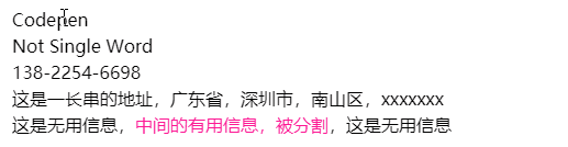
Click twice quickly to select a single word; click three times quickly to select an entire line of content. But if the core content is divided by separators, or becomes a part of hidden in a whole line, it will be more troublesome to select at this time.
With user-select: all , you can wrap the content that needs to be selected once, and the user only needs to click once to select the piece of information:
.g-select-all {
    user-select: all
}
Add this style to the information that needs to be selected at a time. This detail is very easy to use in some scenes that need to be copied and pasted.
In many operation pages of our WMS, it is necessary to frequently copy some basic information from the table, such as the following Location ID , Cell Name , because the complete field uses the separator - , so one click cannot select the entire piece of information, but use user-select: all This pain point can be solved well:
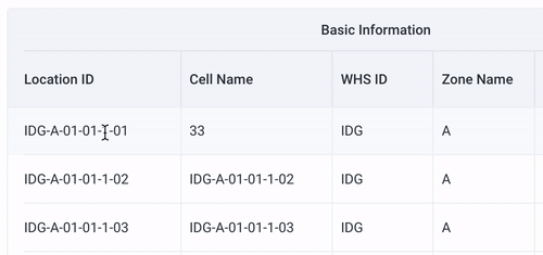
Don't look at it just to reduce the number of clicks of the mouse, but it is the accumulation of these details that can make users feel the developer's intentions more.
CodePen-user-select: all example
2.4.2 Selected style optimization: ::selection
CSS also provides a ::selection pseudo-class, which can control the selected text style (only color , background , text-shadow ) to further deepen the effect.

CodePen-user-select: all && ::selection controls the selected style
2.4.3 Add prohibited selection: user-select: none
If there is a quick choice, there will be its opposite-the forbidden choice.
For some buttons that may be frequently operated, the following embarrassing scenes may appear:
- The quick click of the text button triggers the double-click quick selection of the browser, resulting in the text being selected:
- The quick click of the page turning button triggers the double-click quick selection of the browser:

For this kind of scenario, we need to set the unselectable elements to be unselectable. This can be quickly achieved using CSS:
{
    -webkit-user-select: none; /* Safari */
    -ms-user-select: none; /* IE 10 and IE 11 */
    user-select: none; /* Standard syntax */
}
In this way, no matter how fast the click frequency is, there will be no embarrassment of content being selected:

2.5 Jump optimization
At this stage, Single Page Application (Single Page Application) is widely used, and frameworks such as Vue and React are popular. But some common writing methods are also prone to some minor problems.
For example, when clicking a button or text to perform a route jump, this kind of code often appears:
<template>
    ...
    <button @click="gotoDetail">
        Detail
    </button>
    ...
<template>
...
gotoDetail() {
    this.$router.push({
      name: 'xxxxx',
    });
}
The general logic is to add an event to the button, and then jump to another route after clicking it. Of course, this function itself is not a problem, but it does not take into account the actual use of the user's scene.
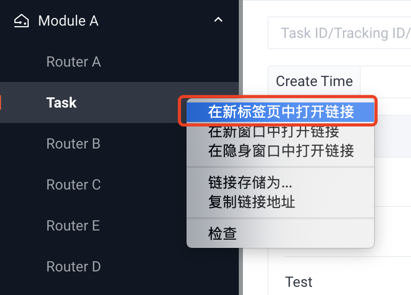
In actual use, users may want to keep the content of the current page and open a new window at the same time. At this time, he will try to click the right mouse button and select to open the page in a new tab. Unfortunately, the above writing method does not support the right mouse button to open a new page.
The reason is that the browser reads the href attribute of the <a> to open the page in a new tab. For the above writing, the browser cannot recognize that it is a link that can be redirected. The simple schematic diagram is as follows:

Therefore, for all routing redirect buttons, it is recommended to use the <a> label, and the built-in href attribute, fill in the redirected routing address. The actual rendered DOM may look like this:
<a href="/xx/detail">Detail</a>In the actual WMS refactoring process, we optimized all the buttons with page jump function, including but not limited to routing menu, breadcrumb navigation, jump button, etc., to meet the different demands of users.
Route menu navigation:
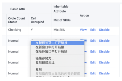
Some buttons in the table jump:
2.6 Form interaction optimization
Input and selection is a high interaction cost operation for users. Here are some small suggestions to reduce user input errors and improve user experience.
2.6.1 Simplify the form as much as possible
Make the form simpler to ensure that users can move on to the next step before going crazy (the more complex the form, the higher the churn rate):
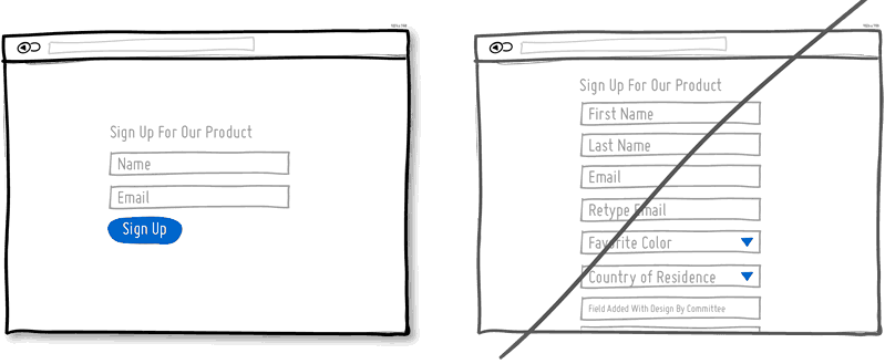
For input items that cannot be omitted, simplify the user's input as much as possible:
- Smart preset default items
- Provide smart association when typing
- For the selection box, concise option information as much as possible
- Use single options instead of drop-down menus
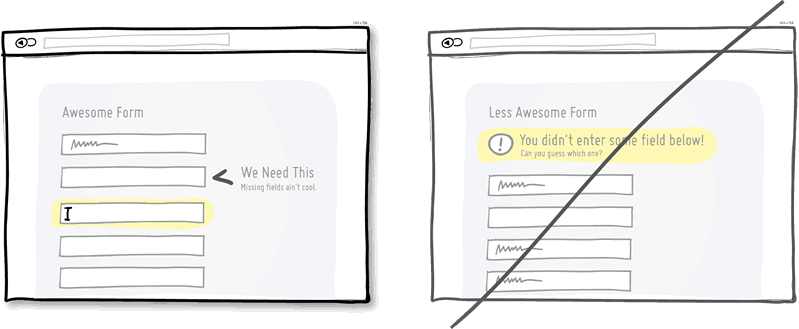
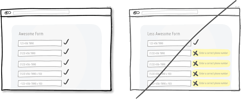
2.6.2 Timely verification
The form is verified in a timely manner, instead of the user filling in a bunch of information and submitting it uniformly, the user is told that the filling is wrong:
2.6.3 Intimate details reminder, calibration is more forgiving
There are also some more useful suggestions that can effectively improve the user experience during the interaction. According to the actual situation, you can consider:
- Add some prompt information to the form to reduce the chance of error
- Try to make the form input more forgiving and make it easier for users to fill in
2.7 Explore first, then express your opinion
This is very interesting. What does it mean to explore first and then make a statement? That is, we don't force users to do things as soon as they come up, such as logging in.
Consider some examples of common websites:
- Video sites like Huya, bilibili, etc., can experience Blu-ray first, and will not be asked to log in after a certain viewing time;
- E-commerce websites only need to log in when payment is made.
The above-mentioned ease of use and first explore and then state , partly derived from " Learn From What Leading Companies A/B Test ", recommended reading.
2.8 Creative interactive animation combined with products
Due to the type of business restrictions, in this area, we don't use it much in practice, but it is also a very useful and important part of enhancing the user experience. I will talk about it briefly below.
This type of interaction is creative interactive animation combined with products. Through customized interaction with a sense of ritual, brand value can be enhanced and users can be deeply impressed.
Creative animations that combine products and businesses need to be explored, polished, and iterated. For example, the top banner of the bilibili official website, in conjunction with some festivals and events, often shows some interesting creative interactive animations:

And this:
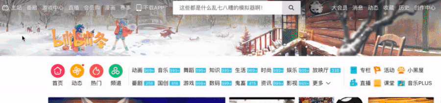
I have seen people discussing bilibili's top banner animation many times in different places, and it can be seen that its animation is successful. A good combination of festivals, facts, and hot spots, as a relatively fixed product to continuously introduce new ones and bring different experiences to users at different times.
2.9 Font optimization
The choice and use of fonts are actually very particular.
In the process of refactoring the WMS project, the global font definition we used is:font-family: Roboto,system-ui,-apple-system,BlinkMacSystemFont,Segoe UI,Oxygen,Ubuntu,Fira Sans,Droid Sans,Helvetica Neue,"sans-serif";。
Here, our designers have some strong restrictions on English fonts. The preferred font is Roboto, and this font package is provided in the system.
If the website is not mandatory, certain fonts must be used. The latest specification recommends that we use the system default font. That is, " : CSS Fonts Module Level 4 the Generic font Families in" new font-family: system-ui keywords. It can automatically select the default system font under this operating system.
Using the system font of a specific operating system by default can improve performance, because the browser or WebView does not have to download any font files, but uses the existing font files. font-family: system-ui font setting is that it matches the font used by the current operating system. For text content, it can be displayed most appropriately.
Give two examples, Tmall's font definition and Github's font definition:
font-family: "PingFang SC",miui,system-ui,-apple-system,BlinkMacSystemFont,Helvetica Neue,Helvetica,sans-serif;: 061938133514ae- Github:
font-family: -apple-system,BlinkMacSystemFont,Segoe UI,Helvetica,Arial,sans-serif,Apple Color Emoji,Segoe UI Emoji,Segoe UI Symbol;
In short, they generally follow the following basic principles:
2.9.1 Try to use the system default font
The main reason for using the system default font is performance. The advantage of the system font is that it matches the current operating system, so its text display effect must be comfortable.
2.9.2 Both Chinese and Western: Western language first, Chinese language second
Chinese or English (Western) must be considered. Since most Chinese fonts also have an English part, but the English part is not very good-looking, and most of the English fonts do not contain Chinese. Therefore, we usually declare the English font first and choose the best English font, so that it will not affect the choice of Chinese font.
2.9.3 Taking into account multiple operating systems
Consider multiple operating systems when choosing fonts. For example, many Chinese fonts under macOS are not pre-installed in Windows. In order to ensure the experience of Mac users, when defining Chinese fonts, first define the Chinese fonts for Mac users, and then define the Chinese fonts for Windows users.
2.9.4 Taking into account the old operating system: ending with the font family serif and sans-serif
When using some very new fonts, consider backward compatibility. Taking into account some extremely old operating systems, using the font family serif and sans-serif endings is always a good choice.
3. Accessibility (A11Y)
Accessibility (also known as "A11Y") is a very important part of a website, but most of the front-end (actually design, front-end, and product) students ignore it.
3.1 What is accessibility
Traditionally we think this is only related to people with disabilities, but improving the accessibility of the site can also benefit other user groups (everyone).
According to the web content accessibility guidelines (ie " Web Content Accessibility Guidelines (WCAG) 2.0 "), web accessibility has the following four basic principles.
(1) Perceive
- Replace non-text content with text
- Multimedia subtitles and other alternatives
- Content can be presented in multiple ways
- It’s easier to watch and listen to the content
(2) Operable
- Functions can be used via keyboard
- Users have plenty of time to read and use content
- Content should not induce seizures and physical reactions
- Users can easily navigate, find content and confirm where they are
- Users can use different input methods except keyboard
(3) understandable
- The text is easy to read and understand
- Content appears and operates in a predictable way
- Users can get help to avoid and correct mistakes
(4) Robustness
- Robust content and reliable explanation
- Content compatible with current and future user tools
- Can be displayed correctly on all platforms and environments
I am lurking in a group called the barrier-free design group, which contains many barrier-free designers and users with certain visual, hearing, and mobility impairments. They often express a point of view in the group, that is, the domestic big Some Web sites and apps have basically not considered the use of people with disabilities (or poor accessibility), which is very worrying.
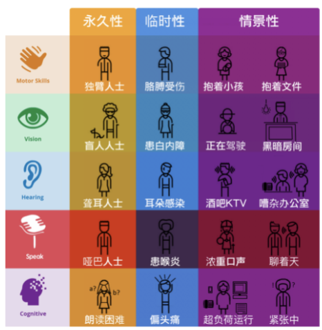
Especially in some websites that emphasize interaction and logic, we need to consider the user's usage habits and usage scenarios from the perspective of high accessibility. For example: If the user does not have a mouse and only uses a keyboard, can we use our website smoothly?
Assuming that the user does not have a mouse, this is not necessarily aimed at people with disabilities. In many cases, the user’s hand with the mouse may be doing other things, such as eating; or in a To B business, such as supermarket checkout and warehouse receipt, it is likely that the user’s hand with the mouse is operating other devices (scanning). Code gun) and so on.
This article will not specifically elaborate on all aspects of accessibility design, but only from some of the details of accessibility design that I think front-end engineers need to pay attention to and can be done at a small cost. Remember, the barrier-free design is more friendly to everyone .
3.2 Color contrast
Color is also an attribute we need to deal with every day. Most visually normal users may not be so sensitive to the color of the page. However, for a small number of color-blind and color-blind users, they will be more sensitive to the color of the website, and poor design will cause great inconvenience to them when they visit the website.
3.2.1 What is color contrast
Have you ever cared about the display of page content, and whether the colors used are appropriate? Can users with color weakness and color blindness see the content normally? Good use of color is beneficial at all times, and it is not limited to users with color weakness and color blindness. When using a mobile phone outdoors, it is easier to read high-definition, high-contrast text that meets barrier-free standards when it is difficult to see under strong sunlight.
A concept is introduced here- color contrast . Simply put, it is the difference in brightness between two colors. When applied to our pages, most of the cases are the contrast between the background color (background-color) and the content color (color).
"The most authoritative Internet accessibility specification- WCAG AA specification stipulates that the color contrast of all important content needs to reach 4.5:1 or above (3:1 or above when the font size is larger than 18), in order to have a better readability."
Take a look at the picture below:

Obviously, the contrast goes from low to high. For the first two examples, let alone visually impaired users, normal users are already hard to see clearly.
Of course, there will be some special cases, such as the placeholder input box, the disabled state of the button, and so on. Therefore, in the process of web page reconstruction, we need to follow this specification as much as possible. But it is not blindly followed, resulting in no room for maneuver.
3.2.2 Tools for checking color contrast
The Chrome browser has supported checking the color contrast of elements since a long time ago. Taking a Table Header in the WMS page as an example, we can check some text that cannot be visually defined whether it meets the standard:

Review the elements, and you can see the contrast between the current text and the background. The following results indicate that there is no problem with this contrast:

Of course, there will also be breadcrumb navigation like this on our page:
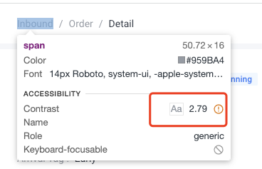
It can be seen that the part where the color contrast does not meet the standard is marked with a yellow exclamation mark.
In addition, by changing the color in the color picker of the Style interface of the review element, you can also visually see the current color contrast:

3.2.3 Don't rely solely on color
In order to ensure the accuracy of accessibility, you should ensure that you do not rely solely on color to display key information at different levels of the system.
Take a look at the following example:
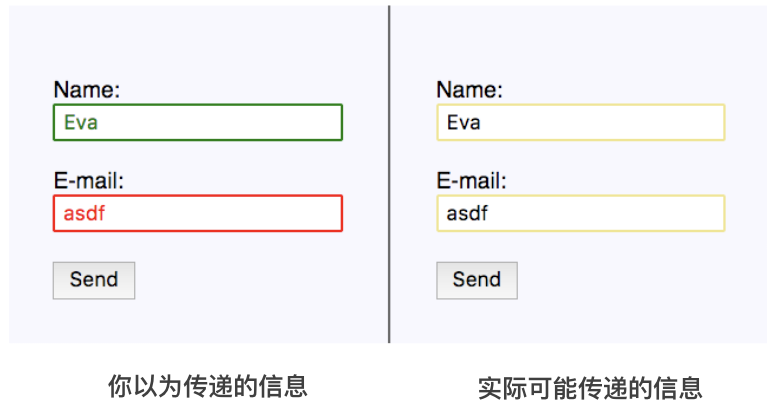
Originally, we expected to use green and red to express right and wrong, but for some visually impaired users, he may not feel this prompt at all.
The correct approach is to use the necessary text and icons to illustrate:

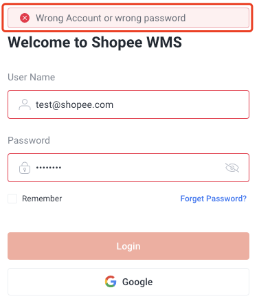
Therefore, in actual applications, we need to use icons that can convey accurate information and text descriptions to express, such as the WMS login error page:
3.3 Focus response
Similar to the homepage of Baidu and Google, after entering the page, the input box will be focused by default:
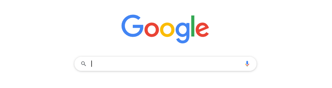
Not all pages with input boxes need to be focused after entering the page, but focus allows users to know exactly where they are currently and what needs to be done. Especially for users who cannot operate the mouse.
The focusable element on the page is called the element , and the focusable element will trigger the focus event of that element. :focus pseudo-class of this element will also be triggered.
Browsers usually use the :focus pseudo-class of the element to add a border to the element to tell the user where the current focused element is.
We can switch the focus Tab The focused element can tell the user the current focus position :focus
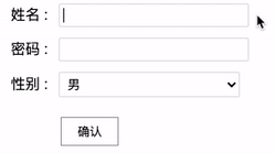
Of course, in addition to the Tab key, for some form pages with multiple input boxes and select boxes, we should also think about how to simplify user operations, for example, when the user presses the enter key, it automatically advances to the next field. Generally speaking, the fewer touches a user must perform, the better the experience. 👍🏻The screenshot below is completely completed by keyboard operations:

Through the :focus pseudo-class of the element and the keyboard Tab key to switch the focus, the user can switch and operate the focus of the page very smoothly without the mouse.
However, in many reset.css , you can often see such a CSS style code. In order to unify the style, the :focus pseudo-class of focusable elements is eliminated:
:focus {
    outline: 0;
}
We give the code for the above operation. Also the inclusion of such a code full keyboard and then click :
Except for the input frame, when using Tab to switch the focus to select or button , because there is no :focus style, the user will feel confused and do not know where the focus of the page is now.
3.3.1 Ensure the non-mouse user experience and use :focus-visible
One of the important reasons for the above results is that the :focus pseudo-class will be triggered as long as the element is focused, regardless of whether the user is using the mouse or the keyboard.
And its own default style is not very acceptable to products or designs, causing many people to replace or directly disable it by changing the color of the border or other methods when the :focus And doing so, from the perspective of accessibility, is undoubtedly disastrous for non-mouse users.
Based on this, in the W3 CSS selectors-4 specification, a very interesting :focus-visible pseudo-class has been added. This selector can effectively display different forms of focus according to the user's input method (mouse or keyboard).
With this pseudo-class, when the user uses the mouse to operate the focusable element, it can be done without displaying the :focus style or making its performance weak; and when the user uses the keyboard to operate the focus, use :focus-visible to make the focusable element get a Strong performance style.
Look at a simple Demo:
<button>Test 1</button>button:active {
background: #eee;
}
button:focus {
outline: 2px solid red;
}Use the mouse to click:

As you can see, when you click with the mouse, the :active pseudo-class of the element is triggered, and the :focus pseudo-class is also triggered, which is not very beautiful. But if you set outline: none it will make the keyboard user's experience very bad. Try to use the :focus-visible pseudo-class to transform it:
button:active {
  background: #eee;
}
button:focus {
  outline: 2px solid red;
}
button:focus:not(:focus-visible) {
outline: none;
}Take a look at the effects, which are clicking the Button with the mouse and clicking the Button with the keyboard to control the focus:

CodePen Demo - :focus-visible example
As you can see, using the mouse to click will not trigger :foucs outline: 2px solid red will only take effect when the focus element is operated on the keyboard and the focus is switched Tab
In this way, we not only ensure the click experience of normal users, but also the focus management experience of a group of users who cannot use the mouse.
It is worth noting that some students may wonder why :not used here instead of directly writing it like this:
button:focus {
  outline: unset;
}
button:focus-visible {
  out


**粗体** _斜体_ [链接](http://example.com) `代码` - 列表 > 引用。你还可以使用@来通知其他用户。