Translator: Frontend Xiaozhi
Source: dev
Author: Joy Shaheb
There are dreams, dry goods, WeChat search [Daiqian World] Pay attention to this Shuawanzhi who is still doing dishes in the early morning.
This article GitHub https://github.com/qq449245884/xiaozhi has been included, the first-line interview complete test site, information and my series of articles.
It's 2021. Let's review the usage of flexbox. There are some properties that are less used to make it easier for everyone to understand. Here we use interesting pictures to explain.
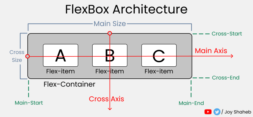
FlexBox architecture
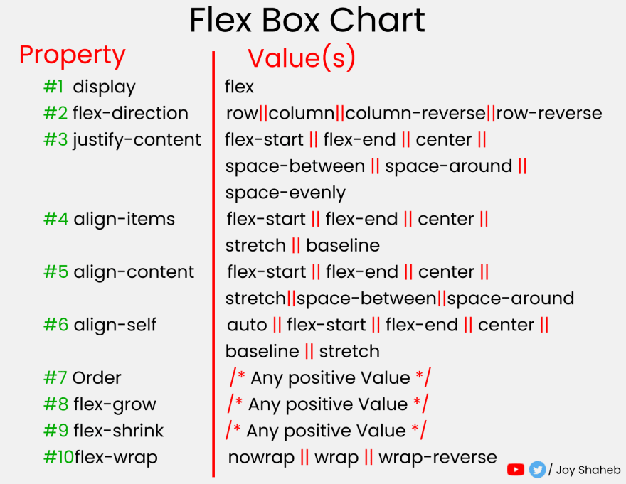
FlexBox chart
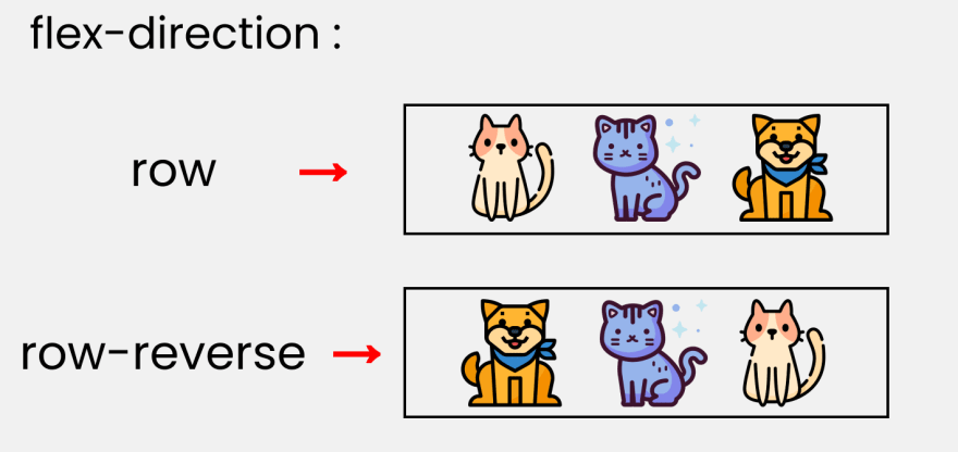
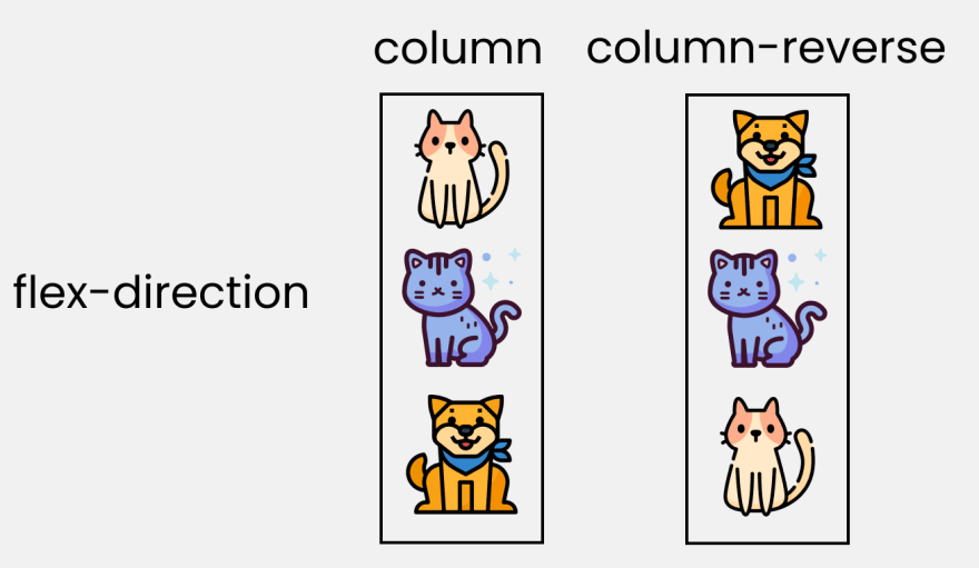
flex-direction
flex-item in the row/column direction of flex-container
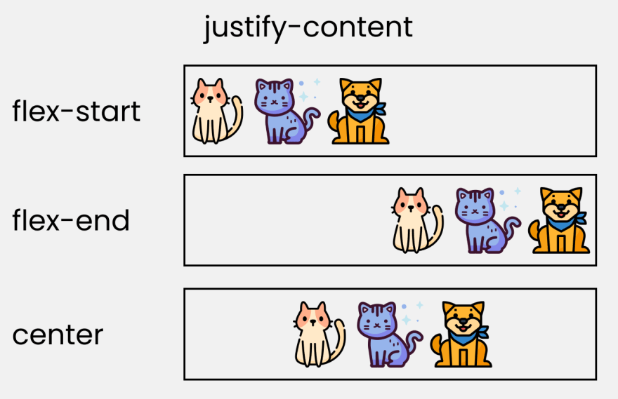
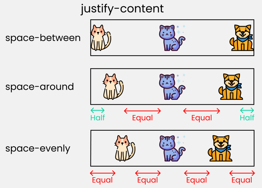
justify-content
justify-content used to set or retrieve the alignment of the flexible box elements in the main axis (horizontal axis) direction
align-content
align-content property sets how the browser allocates space between and around content items along the vertical axis of the flexible box layout and the main axis of the grid layout.
align-items
The difference from justify-content align-items mainly the vertical alignment. The attributes are introduced: flex-start , flex-end , center , initial , inherit .
difference between align-content and align-items:
align-itemssuitable for single line, only top alignment, bottom alignment, centering and stretchingalign-contentsuitable for line breaks (multiple lines) (invalid for single line), you can set alignment, bottom alignment and stretching, and evenly distribute the remaining space and other attribute values.- One-line summary is to find
align-itemsmulti-line findalign-content.
align-self
flex - grow | shrink | wrap
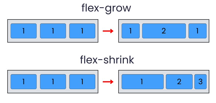
- flex-Grow: depending on the width of the container to increase the flex
flex-itemsize. - flex-shrink The attribute specifies the shrinking rule of the flex element. The flex element shrinks only when the sum of the default widths is greater than the container. The shrinkage size is based on the value of flex-shrink
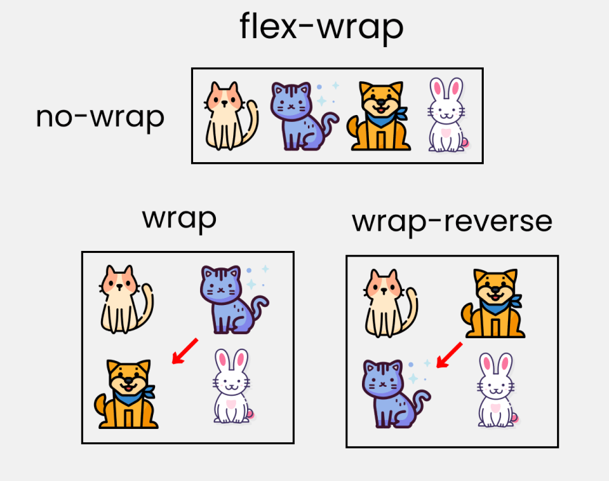
- flex-wrap specifies whether the flex element is displayed in a single line or in multiple lines. If line wrapping is allowed, this attribute allows you to control the stacking direction of the lines.
Shorthand
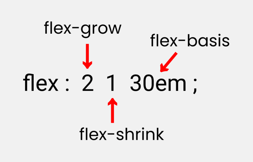
- flex : It is flex-grow , flex-shrink and flex-basis .
- flex-basis : This is similar to
flex-item, but more flexible.flex-basis: 10emsets the initial size of the elastic item to10em, and its final size will depend on the available space,flex-growandflex-shrink.
Finish~, I’m Xiaozhi, I’m going to do the dishes, see you in the next issue!
possible bugs of the 161a4180c75a70 code after deployment cannot be known in real time. In order to solve these bugs afterwards, a lot of time was spent on log debugging. By the way, I would like to recommend a useful BUG monitoring tool Fundebug .
Original: https://dev.to/joyshaheb/flexbox-sheets-in-2021-css-2021-3edl
comminicate
If you have dreams and dry goods, search for [Daily Move to the World] attention to this wise brush who is still doing dishes in the early morning.
This article GitHub https://github.com/qq449245884/xiaozhi has been included, the first-line interview complete test site, information and my series of articles.




**粗体** _斜体_ [链接](http://example.com) `代码` - 列表 > 引用。你还可以使用@来通知其他用户。