In the second half of 2020, there are several pictures on the screen: some people are reading books on their bicycles, some people are using computers while riding, some people have stacks of books on their beds... Students who "use computers while riding" are called On the hot search for "The King of Volumes".
Gradually these classmates graduated, and the roll king took rolls into the society and led other people to roll together. There were more and more people taking rolls, and the misery was unbearable, which led to some repeated wheel building and some useless rolls. The phenomenon of the wheel of meaning emerges.
Building wheels was originally a good thing, but with the emergence of involution, wheel-making has gradually evolved into an extreme. There have been cases of making wheels out of thin air and repeating wheels, which can not serve the business, but also makes the phenomenon of involution More and more serious, the real misery.
Analysis of current business problems encountered, thus generating new ideas and summarize, means the use of technology to enhance productivity, improve development speed, is the real sense of the wheels, but also live volume game.
Scenes
The term CMS (content management system) has been around for a long time and usually refers to a content management system, which is a software system located between the WEB front-end and back-end office systems or processes. In developing cms background, the most commonly used should be the Table of, for example antd of the Table :
This should be the most commonly used component used in the development background management system. Without a Table, it is embarrassing to say that it is a cms system. However, there is a very common problem in a slightly larger business, that is, a data source will have many fields that need to be displayed. If all of them are displayed, there will be a very unsightly and messy feeling, dazzling. At the same time, different people want to see different fields. For example, classmate A wants to see titles 0, 1, 2, and 3, classmate B wants to see titles 1, 2, 3, and 4, and classmate C wants to see titles. 7, 8, 9, 10, etc.
This is a very personalized requirement. If you want the back-end students to participate, it will increase the workload of the back-end students, and the front-end work will not be reduced accordingly. Thanks to the browser's localstorage storage capability, the front-end can be implemented without the participation of back-end students at all.
accomplish
First of all, since it is the Table component of antd, we must realize this requirement based on the existing functions, so we need to set a layer on the basis of the Table component, which can not affect the display of the Table, and can also customize the display columns. Then we can list the requirements:
- Does not affect the display of Table
- Optional custom display columns
- Display columns can be sorted
- No other business impact (this is the main one)
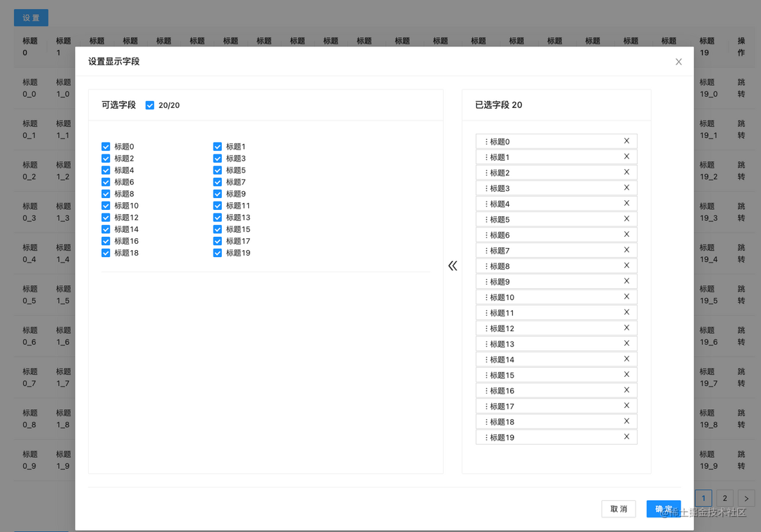
Now that the requirements have been clarified, we can start the whole process. Let's not talk about the specific implementation. We can see the effect after implementation:
polished
Now that the initial requirements have been fulfilled, you can sit back and relax. how can that be possible? Think too much! ! !
Yes, the product later said that there are too many data display columns now, three times more than before. I want to group them when selecting display columns, otherwise they will all be crowded into one densely packed hard to find. 161df95c1b8f32 seriously affects work. The efficiency is !
WTF! The most embarrassing thing is that others say that it affects work efficiency. Why is such a serious problem only mentioned now, and why didn't you ask for it earlier? If you bring it up earlier, it must have been realized long ago, and there will be no problems affecting work efficiency.
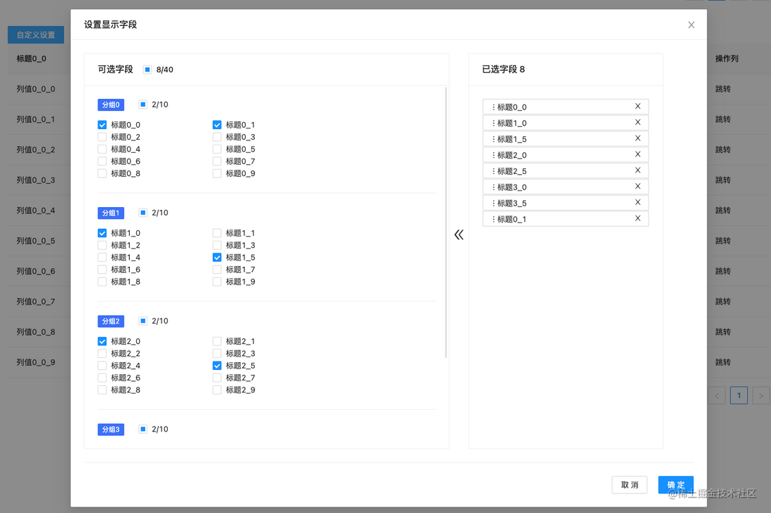
what! ! ! I'm really a duplicitous scumbag, but I know that the little tadpole is the scumbag, and I don't deserve it! ! If you talk too much, you will be in tears. Let’s hurry up and make demands. Take a look at the implementation effect:
Well, perfect, that's how it works. The encapsulation of Table has been modified twice. On the basis of not affecting the previous usage, the ability to support grouping has been added. I am really awesome!
> But happy times are always so short~~
One day, another platform of ours found out, hey, this function of yours is surprisingly easy to use, can you use it for us too? Well, the easiest and most direct way is to copy and paste it. When halfway through copying and pasting, suddenly another person also wants to use this function, and WTMD is very big.
That being said, let's wrap it up as an npm package. When I will, I will publish it as a component package for you, and you can install and use it directly.
npm i manage-tableJust use it.
use
Install
npm i manage-table
or
yarn add manage-table
The manage-table component has a corresponding peerDependencies . If it is not installed, you need to manually install the corresponding dependencies:
"peerDependencies": {
  "@ant-design/icons": "^4.6.4",
  "antd": "^4.12.0",
  "react": "^17.0.0",
  "react-beautiful-dnd": "^13.1.0"
}
How to use -: direct reference, use built-in settings
code show as below:
import ManageTable  from "manage-table";
import './App.css';
import React from "react";

function App() {
  const mockColumns = new Array(50).fill('').map((_item: string, index) => {
    return {
      dataIndex: 'title' + index,
      key: 'title' + index,
      title: '标题' + index,
      show: index % 3 === 0,
    };
  });
  mockColumns.push({
    dataIndex: 'action',
    key: 'action',
    title: '操作',
    show: true,
  });
  return (
    <div className="App">
      <ManageTable name="testTable" columns={mockColumns}/>
    </div>
  );
}

export default App;
The effect is as follows:
Method 2: Customize the header part
code show as below:
import React from "react";
import { Button } from "antd";
import ManageTable from "manage-table";

export default function App2() {
  const mockColumns = new Array(50).fill("").map((_item, index) => {
    return {
      dataIndex: "title" + index,
      key: "title" + index,
      title: "标题" + index,
      show: index % 3 === 0
    };
  });
  mockColumns.push({
    dataIndex: "action",
    key: "action",
    title: "操作",
    show: true
  });
  const ref = React.createRef();
  const handleShowModal = () => {
    ref.current.showModal();
  };
  const SettingHeader = (
    <div style={{ textAlign: "left" }}>
      <Button onClick={handleShowModal}>自定义设置</Button>
    </div>
  );
  return (
    <div className="App">
      <ManageTable
        ref={ref}
        SettingComp={SettingHeader}
        name="testTable2"
        columns={mockColumns}
      />
    </div>
  );
}
The effect is as follows:
Use three: group display
code show as below:
import React from "react";
import { Button } from "antd";
import ManageTable from "manage-table";

const mockGroup = () => {
  const data = new Array(4).fill('').map((_item:string, index: number) => {
    return {
      title: '分组' + index,
      records: new Array(10).fill('').map((_item: string, indx) => {
        return {
          dataIndex: 'title' + index + '_' + indx,
          key: 'title' + index + '_' + indx,
          title: '标题' + index + '_' + indx,
          show: indx % 5 === 0,
        };
      }),
    };
  });
  // 任何一个索引都可以,不必须是0
  data[0].records.push({
    dataIndex: 'action',
    key: 'action',
    title: '操作列',
    show: true,
  })
  return data;
}

export default function AppGroupRef() {
  const ref: any = React.createRef();

  const handleSet = () => {
    ref.current.showModal();
  }

  const SettingHeader = (
    <div style={{textAlign: 'left'}}>
      <Button type="primary" onClick={handleSet}>自定义设置</Button>
    </div>
  );
  return (
    <div className="App">
      <ManageTable ref={ref} SettingComp={SettingHeader} name="testTableGroup" columns={mockGroup()}/>
    </div>
  );
}
The effect is as follows:
other methods
In addition to the above three methods, it also supports the configuration of fixed display, that is, some fields are displayed by default and are not allowed to be sorted and deleted. manage-table is stored in the browser's cache by default, and follows the browser. If you don't want to use the browser's cache, but custom storage , it is also supported.
details as follows:
ManageTable, Table inherited from antd
| parameter name | type | Description | |
|---|---|---|---|
| name | string | The unique key used for storage, must be passed | |
| columns | ManageColumnType[] | GroupManageColumn[] | column data, required |
| ref | The return object of React.createRef() | Add a panel, not required | |
| SettingComp | React.ReactNode | Customize the header, not required | |
| setTitle | React.ReactNode、string | Customize the title of the pop-up window, the default is 'set display field', not required | |
| defaultShowKeys | string[] | The fields displayed by default do not need to be selected or sorted | |
| initialShowKeys | string[] | Initially displayed fields, custom storage | |
| onKeysSelected | (keys: string[]) => void | Storage hook function, used with custom storage |
ManageColumnType, the ColumnType of Table inherited from antd
| parameter name | type | Description |
|---|---|---|
| show | boolean | Whether to display by default |
GroupManageColumn, the ColumnType of Table inherited from antd
| parameter name | type | Description |
|---|---|---|
| title | string | Group name, required |
| records | ManageColumnType[] | column data, required |
write at the end
Feedback and feedback are welcome.
- Open source code repository: manage-table
- npm address: manage-table
2022, let us then volume rise up and stop blind volume, open excellent volume .
It's a holiday now, and I wish you a happy new year in advance~


**粗体** _斜体_ [链接](http://example.com) `代码` - 列表 > 引用。你还可以使用@来通知其他用户。