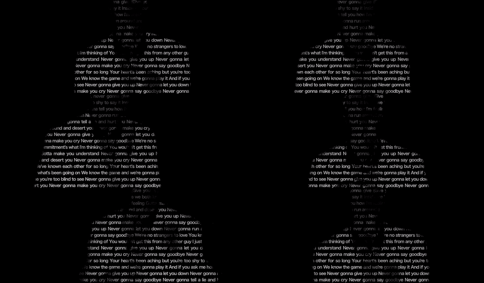
Recently, a classmate asked how to use CSS to achieve the following effects:
It looks like an interesting animation.
Think about it carefully, in order to achieve this kind of effect, there is only one core attribute used background-clip: text .
Interesting background-clip: text
background-clip: text has been mentioned many times before. The core is to use the text in the block as the clipping area to cut out, the background of the text is the background of the block, and the area outside the text will be cut out.
To put it simply, the element of background-clip: text is used, and its background content only retains the area where the text is located. With the transparent text color: transparent , the text can be used to reveal the background.
Using background-clip: text , you can get a lot of very interesting text effects.
Suppose, we have a Gif like this:
We can use this animation and text to achieve a version, the text version of the animation:
<p>Lorem ......</p> p {
color: transparent;
background: url(https://media.giphy.com/media/Ju7l5y9osyymQ/giphy.gif) center/cover;
background-clip: text;
}We achieved this effect:
Interesting, CodePen Demo -- Rick Roll Knockout Text
The above effects and ideas can be applied to the initial effect:
- Implement a background animation
- Make the text transparent when hovering over the text
- let the animation begin
We first need to implement a moving striped background animation, there are many methods, I used here repeating-radial-gradient with CSS @property:
<p></p> @property --offset {
syntax: '<length>';
inherits: false;
initial-value: 5px;
}
p {
background: repeating-radial-gradient(circle at 0 0 , #000 calc(var(--offset) - 5px), #000 var(--offset), #fff var(--offset), #fff calc(var(--offset) + 5px));
animation: move .5s infinite linear;
}
@keyframes move {
to {
--offset: 15px;
}
}You will get a fringe map of this changing animation:
Of course, if you feel that it is troublesome to use CSS to implement a moving image or there will be compatibility problems, you can also use some ready-made Gif images instead, such as such a Gif image as the background of the <p> element:
After having the moving effect, we slightly modified the code, applied background-clip: text , and combined the hover effect of the <p> element. When hovering, change the text from #000 Set as transparent transparent :
 ...
p {
    color: #000;

    &:hover {
        color: transparent;
        background: repeating-radial-gradient(circle at 0 0 , #000 calc(var(--offset) - 5px), #000 var(--offset), #fff var(--offset), #fff calc(var(--offset) + 5px));
        background-clip: text;
        animation: move .5s infinite linear;
    }
}
...
In this way, we have successfully obtained the effect shown in the title image:
CodePen Demo -- BackgroundClip Wave Text
Combine filters and blending modes to collide with different sparks
finished? no!
With the above foreshadowing, we continue to try further, CSS has two very interesting properties, filter filter and blend mode mix-blend-mode . We consider applying them to our effects.
Or this Gif:
We first pass the filter filter: grayscale(1) to process it from color to black and white:
 p {
    background: url(xxx);
    filter: grayscale(1);
}
The processed image will probably look like this:
Based on an image with a black and white background, we then use background-clip: text , and then pass the blending mode mix-blend-mode: hard-light , and, very importantly, we put this effect on the black background :
 body {
  background: #000;
}
p {
  color: transparent;
  background: url(xxx) center/cover;
  background-clip: text;
  filter: grayscale(1);
  mix-blend-mode: hard-light;
}
You will get such a magical effect. By superimposing the blending mode, the light parts of the text will be preserved, and the dark parts will be blended with the black background:
Here, the blending mode mix-blend-mode: hard-light plays a very important role, and if removed, this is the result:
Of course, what we prefer is that the part of the person is displayed, and the background part of the Gif image is hidden, it's perfect!
Here, we continue to optimize the code. We hope to replace the light and dark parts of the original image processed by grayscale() . Just, in filter , there is a invert() Function capable of inverting the color values of the input image.
Therefore, after the grayscale() , cooperate again with the invert(1) function:
 body {
  background: #000;
}
p {
  color: transparent;
  background: url(xxx) center/cover;
  background-clip: text;
  filter: grayscale(1) invert(1);
  mix-blend-mode: hard-light;
}
OK, so far, we have used pure CSS to achieve such an unbelievable text effect:
CodePen Demo - Filter & MixBlendMode & BackgroundClip Text Animation Effect
Using this technique, as long as there are materials, we can let our imagination fly and achieve various similar interesting effects.
finally
Well, this is the end of this article, I hope it helps you :)
If you want to get the most interesting CSS information, don't miss my official account -- iCSS front-end anecdotes 😄
More wonderful CSS technical articles are summarized in my Github -- iCSS , which will be updated continuously. Welcome to click star to subscribe to the collection.
If you have any questions or suggestions, you can communicate more. Original articles are limited in writing and knowledge. If there are any inaccuracies in the article, please let me know.


**粗体** _斜体_ [链接](http://example.com) `代码` - 列表 > 引用。你还可以使用@来通知其他用户。