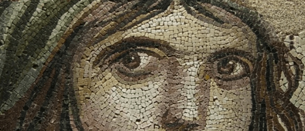
I reposted an article from my friend Vajoy on the public account before -- skillfully using CSS to stylize image mosaics .
The core is to use a very interesting property in CSS -- image-rendering , which can be used to set the image scaling algorithm.
What is image-rendering?
The CSS property image-rendering is used to set the image scaling algorithm. It applies to the element itself, to images in other attributes of the element, and to child elements as well.
The syntax is relatively simple:
 {
    image-rendering: auto;              // 默认值,使用双线性(bilinear)算法进行重新采样(高质量)
    image-rendering: smooth;         // 使用能最大化图像客观观感的算法来缩放图像。让照片更“平滑”
    image-rendering: crisp-edges;  // 使用可有效保留对比度和图像中的边缘的算法来对图像进行缩放
    image-rendering: pixelated;      // 放大图像时, 使用最近邻居算法,因此,图像看着像是由大块像素组成的
}
Among them, image-rendering: pixelated is more interesting and can mosaic a low-precision image.
For example, suppose we have an image of 300px x 300px , we let him convert it to 30px x 30px :
Let's zoom in on the distorted image to 300px x 300px :
On this basis, we set the image to image-rendering: pixelated to get a mosaicked image:
<img src="pic.jpeg?30x30" /> img {
width: 300px;
height: 300px;
image-rendering: pixelated
} image-rendering: limitations of pixelated to achieve mosaic effect
OK, so why do you need to zoom out and zoom in first, and then use image-rendering: pixelated ? Let's make a comparison and set the original image directly image-rendering: pixelated :
Setting it directly to the original image image-rendering: pixelated will only make the image more jagged, without directly producing a mosaic effect.
This also matches the description of image-rendering: pixelated that when zooming in on the image, the nearest neighbor algorithm is used, so the image appears to be composed of large blocks of pixels .
We can only use image-rendering: pixelated to get a mosaic image based on the enlarged blurred image!
Use CSS to shrink the image and then enlarge it?
So, suppose we only have a clear original image, and want to use CSS to get a mosaic effect, is it feasible? Following this line of thought, we can think of:
Can I use CSS to shrink the image and then enlarge it, and then use image-rendering: pixelated ?
no. The picture on the web is very much like a smart object in Photoshop - you can change its size arbitrarily (such as zooming in many times to make it blurry), but when you finally change the picture back to the original size, the picture will return to the original size look like (without any distortion) .
Therefore, if you want to get a blurred image when there is only one original image, you have to resort to Canvas, which is a little troublesome. We just wanted a mosaic effect.
SVG filter overlay to achieve mosaic effect
This can lead to today's protagonist, SVG filter , using the superposition of several layers of SVG filters, in fact, a mosaic effect filter can be realized very easily.
Also, SVG filters can be easily introduced through CSS filters.
The code is actually very simple. SVG defines a filter and uses the overlay effect of multiple layers of filters to achieve a mosaic effect. Then, it is introduced through CSS filter and can be applied to any element:
 <img src="任意无需缩放的原图.png" alt="">
<svg>
  <filter id="pixelate" x="0" y="0">
    <feFlood x="4" y="4" height="2" width="2"/>
    <feComposite width="8" height="8"/>
    <feTile result="a"/>
    <feComposite in="SourceGraphic" in2="a" operator="in"/>
    <feMorphology operator="dilate"radius="5"/>
  </filter>
</svg>
img {
width: 300px;
height: 300px;
filter: url(#pixelate);
}In this way, we get a mosaic effect:
If you just want to use this effect, you don't even need to understand the whole SVG <filter> what exactly does it do, of course, if you are a person who asks to the end, then you need to have a certain SVG foundation, it is recommended Check out my introductions to SVG filters:
- interesting! Powerful SVG filters
- interesting! Generation scheme of irregular border
- Shock! Can you use SVG filters to make emoticons?
Limitations of CSS/SVG Mosaic Implementation
Of course, the limitation of CSS/SVG filters to achieve mosaic is that if you don't want to show the original image to the user, then using this method directly on the client side is equivalent to directly exposing the original image.
Because the CSS/SVG filter method is to mosaic the image at the front end, and the original image is required.
Of course, using the above two techniques to achieve picture mosaic, we can still use it to make some simple interactive effects, like this:
You can find all the code for the above DEMO and SVG filters in these two DEMOs:
At last
Well, this is the end of this article, I hope it helps you :)
If you want to get the most interesting CSS information, don't miss my official account -- iCSS front-end anecdotes 😄
More wonderful CSS technical articles are summarized in my Github -- iCSS , which will be updated continuously. Welcome to click star to subscribe to the collection.
If you have any questions or suggestions, you can communicate more. Original articles are limited in writing and knowledge. If there are any inaccuracies in the article, please let me know.


**粗体** _斜体_ [链接](http://example.com) `代码` - 列表 > 引用。你还可以使用@来通知其他用户。