Author: Ahmad Shadeed
Translator: Front-end Xiaozhi Source: isadeed
If you have dreams and dry goods, you can search for [Great Move to the World] on WeChat and pay attention to this Shawanzhi who is still washing dishes in the early hours of the morning.
This article GitHub https://github.com/qq449245884/xiaozhi has been included, there are complete test sites, materials and my series of articles for interviews with first-line manufacturers.
When you see this title, you may think that Xiao Zhi has made a typo again😂, responsive height design? Are you serious? Because "responsive web design" usually checks browsers across multiple widths and device sizes. We generally adjust for horizontal responsiveness by reducing width, but I rarely see a consideration for vertical responsiveness by reducing browser height. At this time, there may be a little fluctuation in Zhimi's heart, and there are some questions: Do we need to reduce the height of the browser? Yes, we've been talking about it.
When we are designing websites, it is not good to make assumptions without relying on actual data, and the responsibility for horizontal and vertical testing is also very important.
Why test for height?
For a designer, an unreasonable assumption is one of the important factors that ruins a website design. For example, it would be incorrect to assume that a user is definitely browsing a website by using the full width and height of the screen. Instead, we need to consider the worst case.
Jimi, do you understand? The reality is that not all users use their browsers the way we expect them to. I find that the website looks bad when the browser height is lowered.
Browser DevTools
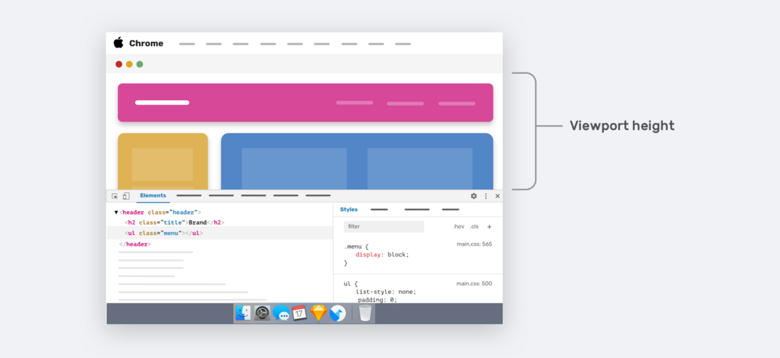
Resizing the browser (vertically) is not the only way to change the viewport height. When we open the browser DevTools, it also takes up the height of the browser.
The arrowed area in the image above represents the height of the current viewport, for smaller laptop screens we will only see a small portion of the web page.
The real question is: can we enhance the user experience when the viewport height is small? Yes, it is possible, let's take a look.
Vertical thinking in CSS
As designers and developers, some of us focus only on width changes in designs and ignore viewport height changes. For example, in development, the UI provides changes to specific components across different viewport widths. But what about different viewport heights?
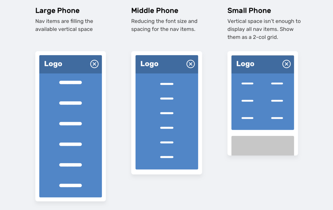
In the image above, we have a navigation menu that adjusts based on the viewport height. . If the viewport size is small (eg, iPhone 5), the navigation items will appear as a two-column grid. This way of thinking is usually discarded, or not optimized until someone says it needs to be done.
The above requirements can be achieved in CSS by using two different ways:
- Vertical media queries
- Viewport units
Vertical Media Queries
Zhimi is sure about using width media queries in CSS.
 @media (min-width: 700px) {
  .element {
    /* do something.. */
  }
}
Less used are vertical media queries, which check the viewport height.
 @media (min-height: 500px) {
  .element {
    /* do something.. */
  }
}

/* or */

@media (orientation: landscape) {
  .element {
    /* do something.. */
  }
}
Viewport Units
Using viewport units can help provide a better experience for the user. For example, control the vertical spacing between elements based on the viewport height.
 .hero__title {
  margin-bottom: calc(10px + 5vh);
}
As shown above, the larger the screen (such as the iMac 27 inches), the bottom margin will become large. We have two ways to solve the problem of excessive margins.
- Media queries
- CSS comparison function
The first way (media queries) is more supported. If the screen is large, we need to set a maximum value for the bottom margin.
 @media (min-width: 2200px) {
  .hero__title {
    margin-bottom: 40px;
  }
}
Another way is to use the CSS clamp() comparison function, clamp() The function of the function is to return a range of values.
 .hero__title {
  margin-bottom: clamp(10px, 5vh, 40px);
}
Use Case 1: Overlapping Content
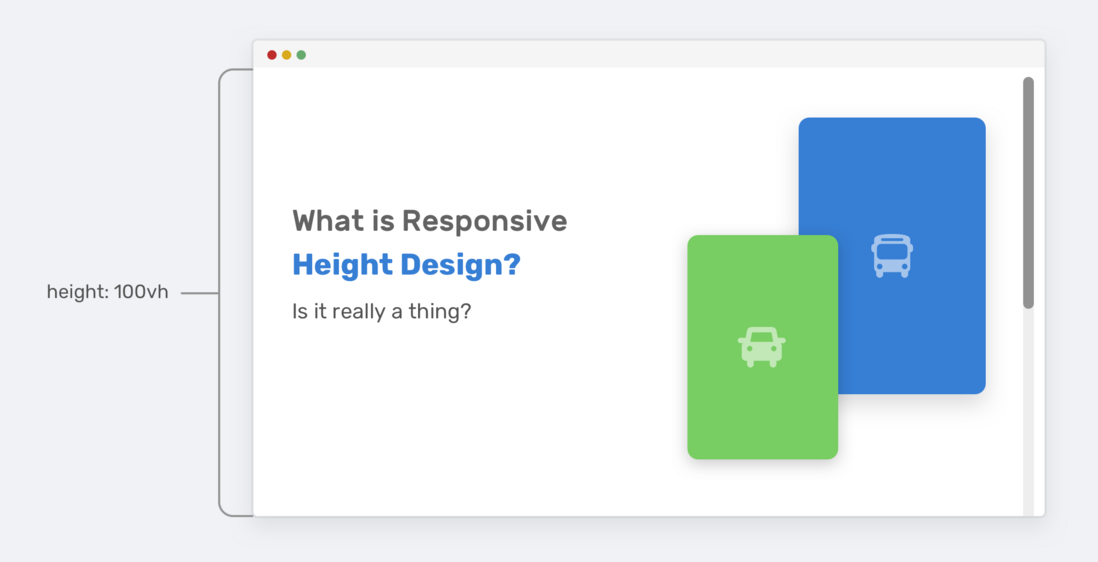
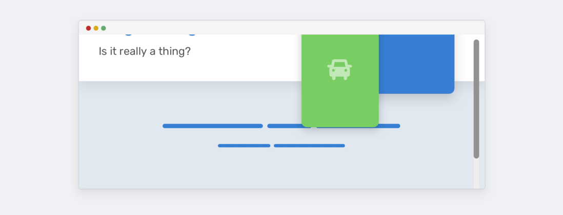
In this example, there is a section area with sections for titles and illustrations, and the section height is equal to 100% of the viewport height.
Everything looks fine until the viewport height gets smaller. The height of the section will not be high enough to accommodate illustrations and text content. So it will overlap with other parts on the page.
Notice how the illustration overlaps the section below. This happens because there is enough vertical space. Take a look at HTML and CSS.
 <div class="hero">
  <div class="hero__wrapper">
    <div class="hero__content"><!-- content --></div>
    <img class="hero__thumb" src="figure.png" alt="" />
  </div>
</div>
css
 .hero {
  height: 100vh;
}

.hero__thumb {
  flex: 0 0 550px;
  width: 550px;
}
Here are a few solutions to such problems:
- Set a fixed size (width and height) for the illustration instead of just the width, the lack of height will continue to have this problem.
-
700pxonly if the viewport height is greater than ---0dd7a0119fecd6c7d7fad29ac035503bheight: 100vh(media query values may vary depending on context).
We can combine the two for a more robust solution.
 .hero__thumb {
  width: 400px;
  height: 300px;
  object-fit: contain; /* To avoid compressing the image */
}

@media (min-height: 700px) {
  .hero {
    height: 100vh;
  }
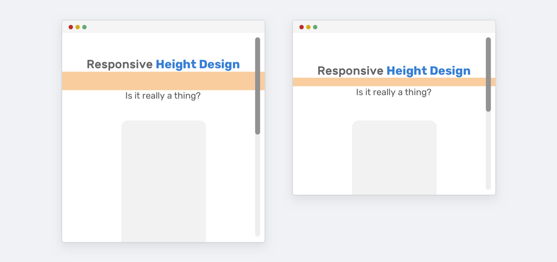
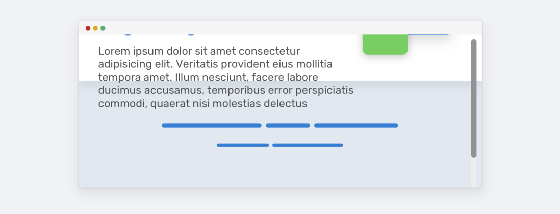
OK, now we agree that vertical media queries are better. However, using 100vh is risky, because even if we limit the size of the illustration, it may not be possible to do the same with the text content. If the text content becomes longer, the same problem occurs again, see the image below:
To fix this, we can use min-height instead of height . This way, if the content gets longer, the height will expand and not overlap.
 @media (min-height: 700px) {
  .hero {
    min-height: 100vh;
  }
}
fixed head
Pinning the header while scrolling is not a bad thing, however, we want to make sure that we only pin the header if the vertical space is good enough for the experience to be good.
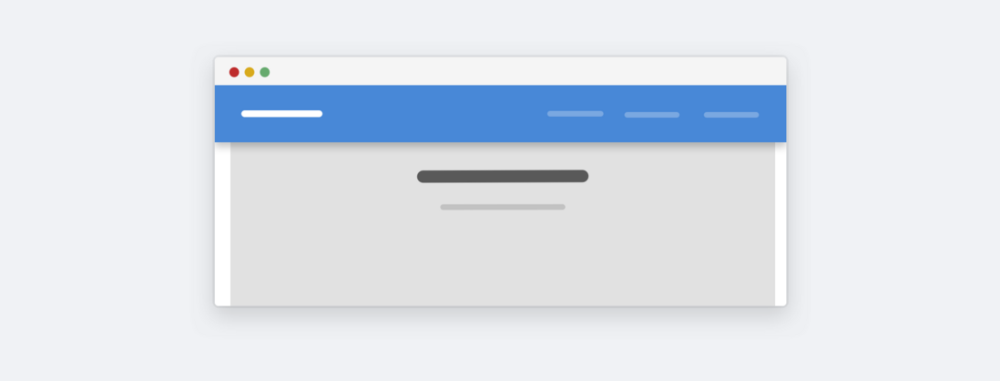
This is a website about landscapes. Here we can see that when the height is too small, the fixed height will take up a lot of space as a whole. Does this really matter to the user? Most of the time it doesn't matter, because the average user wouldn't zoom out to see a website like this. At present, if we want to optimize, we can do it. The idea is to change the fixed positioning to static positioning when the height is determined to be less than a certain height through vertical media query.
 @media (min-height: 700px) {
  .site-header {
    /* position: fixed or position: sticky */
  }
}
Hide less important elements
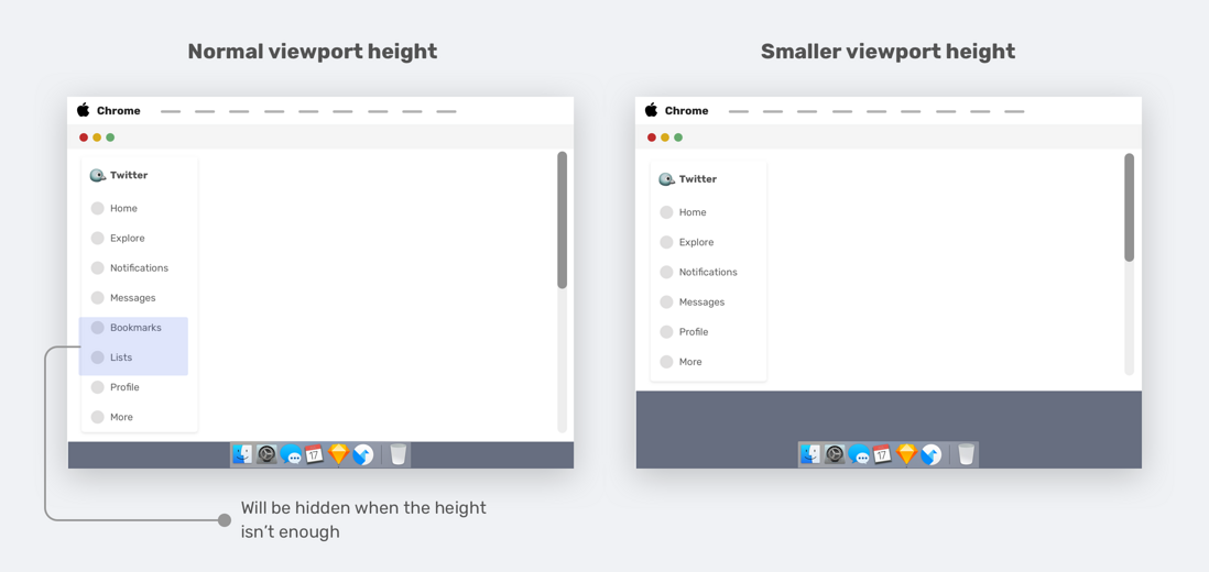
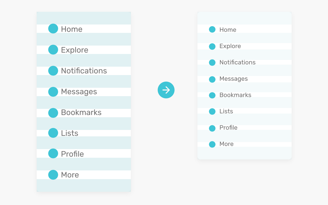
I noticed this pattern on the navigation bar of Twitter.com . The idea is to combine vertical media queries with the Priority+ pattern .
When resizing the viewport height, the less important elements (bookmarks and lists) are removed and appended to the "more" menu, which is a great use case for vertical media queries.
 .nav__item--secondary {
  display: none;
}

@media (min-height: 700px) {
  .nav__item--secondary {
    display: block;
  }
}
Reduce Spacing - Navigation
If our site has sidebars or sidebars, we can reduce some of the vertical spacing between navigation items when the viewport height is small, which also enhances the overall design.
 .nav__item {
  padding-top: 4px;
  padding-bottom: 4px;
}

@media (min-height: 700px) {
  .nav__item {
    padding-top: 10px;
    padding-bottom: 10px;
  }
}
modal box
We know that the modal should at least be centered horizontally. However, sometimes we also need vertical centering, we generally use the following scheme:
 .modal__body {
  position: absolute;
  left: 50%;
  top: 50%;
  transform: translate(-50%, -50%);
  width: 500px;
}
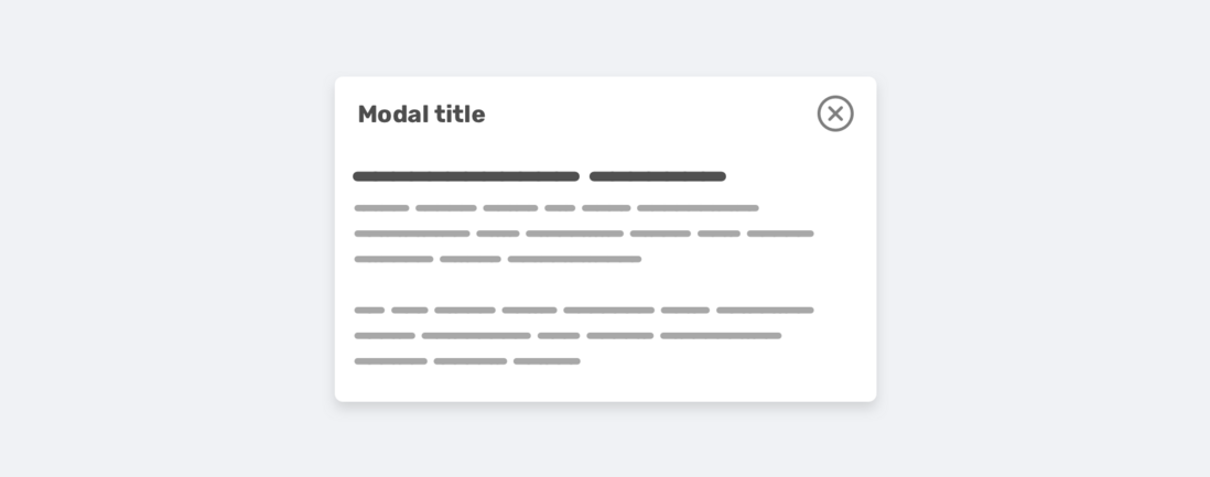
However, there is a problem when the content gets longer, the modal fills the screen vertically and the user won't be able to scroll it.
There are several reasons for this situation:
- Modal box has no height
- Center the modal vertically (this makes the problem faster)
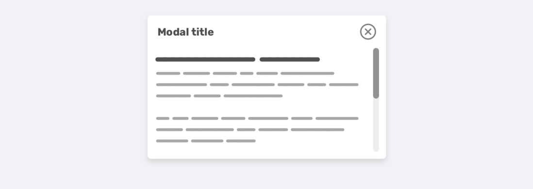
Here is the corrected css:
 .modal__body {
  position: absolute;
  left: 50%;
  top: 3rem;
  transform: translateX(-50%);
  width: 500px;
  min-height: 200px;
  max-height: 500px;
  overflow-y: auto;
}

@media (min-height: 700px) {
  .modal__body {
    top: 50%;
    transform: translate(-50%, -50%);
  }
}
Note that I used min-height and max-height . min-height is to keep the modal looking good even if the content is short, max-height is to limit its height with a specific value instead of adding a fixed height.
Summarize
When designing an experience, it's best to think in terms of width and height. It may be a bit odd to resize your browser vertically, but it has its advantages. In this article, we discussed the importance of vertical testing, how we do it, and finally, presented some examples and use cases that we hope will be useful to Smartmi.
The bugs that may exist in editing cannot be known in real time. In order to solve these bugs afterwards, a lot of time is spent on log debugging. By the way, here is a useful BUG monitoring tool , Fundebug .
Original: https://hadeed.com/article/responsive-design/
comminicate
If you have dreams and dry goods, you can search for [Great Move to the World] on WeChat and pay attention to this Shawanzhi who is still washing dishes in the early hours of the morning.
This article GitHub https://github.com/qq449245884/xiaozhi has been included, there are complete test sites, materials and my series of articles for interviews with first-line manufacturers.



**粗体** _斜体_ [链接](http://example.com) `代码` - 列表 > 引用。你还可以使用@来通知其他用户。