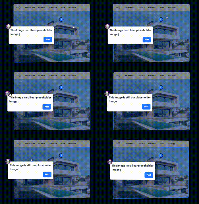
Today, a group of friends asked such a question, how to achieve the following interactive effect of mouse follow:
To briefly analyze, this interaction effect mainly has two cores:
- With the power of CSS 3D
- The rotation of the element needs to be combined with the movement of the mouse
In this article, I will describe how to use pure CSS to achieve similar interactive effects, and use JavaScript to bind mouse events to quickly restore the above effects.
3D rotation of elements in pure CSS
How can I achieve a similar 3D rotation effect without JavaScript, just CSS?
A little trick called positive and negative rotation cancellation or positive and negative rotation cancellation will be used here. Well, the name is very strange, like a mathematical concept.
In animation, rotation is a very commonly used property,
 {
  transform: rotate(90deg);
}
What happens if we add rotations in different directions to elements at different levels?
Let's first assume a scenario where we have a layer of HTML structure like this:
 <div class="reverseRotate">
    <div class="rotate">
        <div class="content">正负旋转相消3D动画</div>
    </div>
</div>
The style is as follows:
.content is our main content, well, now imagine if the parent element .rotate performs a positive linear 360° rotation, the outermost parent element .reverseRotate Perform reverse linear 360° rotation, what will the effect be?
The CSS code is as follows:
 .rotate {
    animation: rotate 5s linear infinite;
}
.reverseRotate {
    animation: reverseRotate 5s linear infinite;
}
@keyframes rotate {
    100% {
        transform: rotate(360deg);
    }
}
@keyframes reverseRotate {
    100% {
        transform: rotate(-360deg);
    }
}
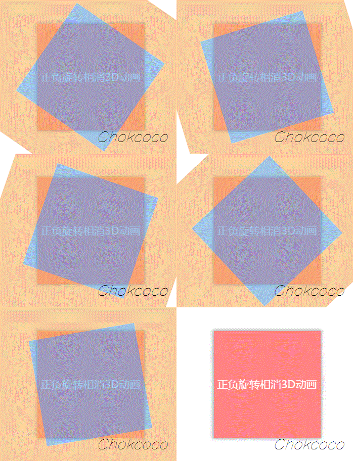
We can get an animation like this (note that the image below is a GIF not a PNG):
magic! Because one forward and one reverse rotation, and the easing function is the same, the whole .content still looks stationary! Note that it is very important that the whole .content is still.
Some readers will scold people when they see this. The author is mentally retarded. Is there no animation when it is still? Where did the animation skills come from?
Don't worry! Although it looks stationary, both ancestors are actually rotating! Underneath the seemingly calm effect, there is actually a surging undercurrent. Selecting the outermost ancestor element with developer tools looks like this:
In this case, let's continue to think, if I add some other animation to a parent element that rotates in it, what will the effect be? It's exciting to think about.
First, let's add CSS 3D transitions to these elements:
 div {
    transform-style: preserve-3d;
    perspective: 100px;
}
Next, try to modify the rotation animation above and add an additional rotateX to the inner rotation:
 @keyframes rotate {
    0% {
        transform: rotateX(0deg) rotateZ(0deg);
    }
    50% {
        transform: rotateX(40deg) rotateZ(180deg);
    }
    100% {
        transform: rotateX(0deg) rotateZ(360deg);
    }
}
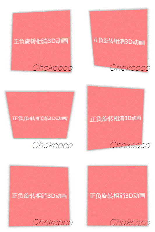
The effect is as follows:
Wow, it needs to be well understood here. Since the content .content layer is static, but in fact the two outer layers are rotating, by setting additional rotateX(40deg) , it is equivalent to superimposing one more animation, due to the positive and negative rotation offset Now, all the whole animation can only see the rotation rotateX(40deg) this animation, which produces the above effect.
In this way, without JavaScript intervention, we simulate the 3D effect shown in the title image. Of course, just like this, the linkage with the user is not enough. If we must combine the mouse movement, we need some assistance from JavaScript.
Implement mouse following 3D rotation with Javascript
Our goal is to achieve such an animation effect:
Here, we actually have two core elements:
- mouse active area
- rotate the object itself
The movement of the mouse in the mouse active area will affect the 3D rotation of the rotating object itself , and the rotation direction can actually be decomposed into the X-axis direction and the Y-axis direction.
Let's take a look, assuming our HTML is structured as follows:
 <body>
    <div id="element"></div>
</body>
Get a graph like this:
Here, the range of body is the entire movable area of the mouse, and it is also the host target of the mousemove event where we added the mouse, and #element needs to rotate with the mouse Rotate the object itself.
Because the whole effect needs to be based on CSS 3D, we first add a simple CSS 3D effect:
 body {
    width: 100vw;
    height: 100vh;
    transform-style: preserve-3d;
    perspective: 500px;
}

div {
    width: 200px;
    height: 200px;
    background: #000;
    transform-style: preserve-3d;
}
The effect is as follows:
Nothing is different. This is because no 3D transformation has been added yet. We add X and Y directions to the element rotate() try it out (note that the default rotation center here is the element center):
 div {
     transform: rotateX(15deg) rotateY(30deg);
}
The effect is as follows, which is so interesting:
Well, next, our goal is to make the element move by combining the mouseover event.
Controls movement in the X direction
Of course, for easier understanding, we split the animation into movements in the X and Y directions. First look at the movement in the X direction:
Here, we need to be bounded by the center of the element:
- When the mouse moves continuously to the right of the center, the element moves around the Y axis, and the value starts from 0 and becomes larger and larger, and the range is (0, +∞)deg
- On the contrary, when the mouse moves continuously to the left of the center, the element moves around the Y axis, and the value starts from 0 and becomes smaller and smaller, and the range is (-∞, 0)deg
In this way, we can get a formula like this:
rotateY = (mouse x coordinate - x coordinate of the upper left corner of the element - half the width of the element) deg
Let's try it out by binding the onmousemove event:
 const mouseOverContainer = document.getElementsByTagName("body")[0];
const element = document.getElementById("element");

mouseOverContainer.onmousemove = function(e) {
  let box = element.getBoundingClientRect();
  let calcY = e.clientX - box.x - (box.width / 2);

  element.style.transform  = "rotateY(" + calcY + "deg) ";
}
The effect is as follows:
Well, the rotation is too exaggerated, so we need to add a multiple to control:
 const multiple = 20;
const mouseOverContainer = document.getElementsByTagName("body")[0];
const element = document.getElementById("element");

mouseOverContainer.onmousemove = function(e) {
  let box = element.getBoundingClientRect();
  let calcY = (e.clientX - box.x - (box.width / 2)) / multiple;

  element.style.transform  = "rotateY(" + calcY + "deg) ";
}
After passing a multiple constraint, the effect is much better:
Controls movement in the Y direction
In the same way, we can also control the movement in the Y direction by using the above method:
 const multiple = 20;
const mouseOverContainer = document.getElementsByTagName("body")[0];
const element = document.getElementById("element");

mouseOverContainer.onmousemove = function(e) {
  let box = element.getBoundingClientRect();
  let calcX = (e.clientY - box.y - (box.height / 2)) / multiple;

  element.style.transform  = "rotateX(" + calcX + "deg) ";
};
The effect is as follows:
Of course, here, we will find that the direction of the element movement is reversed, so we need to do some inversion processing, modify the value of calcX , and multiply it by a -1 . :
let calcX = (e.clientY - box.y - (box.height / 2)) / multiple * -1;Combine movement in X and Y directions
OK, here, we just need to combine the above results. At the same time, what we used above is onmousemove to trigger each animation move. In modern web animations, we prefer to use requestAnimationFrame to optimize our animations to ensure that each frame renders the animation once.
The complete modified code is as follows:
 const multiple = 20;
const mouseOverContainer = document.getElementsByTagName("body")[0];
const element = document.getElementById("element");

function transformElement(x, y) {
  let box = element.getBoundingClientRect();
  let calcX = -(y - box.y - (box.height / 2)) / multiple;
  let calcY = (x - box.x - (box.width / 2)) / multiple;

  element.style.transform  = "rotateX("+ calcX +"deg) "
                        + "rotateY("+ calcY +"deg)";
}

mouseOverContainer.addEventListener('mousemove', (e) => {
  window.requestAnimationFrame(function(){
    transformElement(e.clientX, e.clientY);
  });
});
At this point, we can simply implement the mouse following 3D rotation animation as shown in the title image:
Set smooth entry and exit
Now, there is one last problem, which is that when our mouse leaves the active area, the element's transform will stay at the last frame, and the correct behavior should be reverted to the original state. Therefore, we also need to add some event listeners to smooth the reset of the element.
You can pass a mouseleave event with the element transition .
 div {
    // 与上述保持一致...
    transition: all .1s;
}
mouseOverContainer.addEventListener('mouseleave', (e) => {
window.requestAnimationFrame(function(){
element.style.transform = "rotateX(0) rotateY(0)";
});
});At this point, we can perfectly achieve smooth entry and exit, and the overall effect is as follows:
The complete code, you can click here: CodePen Demo -- CSS 3D Rotate With Mouse Move
At last
Well, it's not really that difficult, is it? Well, this is the end of this article, I hope this article will help you :)
If you want to get the most interesting CSS information, don't miss my official account -- iCSS front-end anecdotes 😄
More wonderful CSS technical articles are summarized in my Github -- iCSS , which will be updated continuously. Welcome to click star to subscribe to the collection.
If you have any questions or suggestions, you can communicate more. Original articles are limited in writing and knowledge. If there are any inaccuracies in the article, please let me know.


**粗体** _斜体_ [链接](http://example.com) `代码` - 列表 > 引用。你还可以使用@来通知其他用户。