One day, there was such a question in the group, how to achieve such a dial scale:
This is actually an interesting question, and there are many ways to do it.
Single label, using conic-gradient to achieve dial scale
The easiest and most convenient way is to use the angular gradient conic-gradient , the code is also very simple, first, we implement a repeating angular gradient:
<div></div> div {
width: 300px;
height: 300px;
border-radius: 50%;
background: repeating-conic-gradient(
#000 0, #000 .8deg, transparent 1deg, transparent calc((360 / 60) * 1deg)
);
} In fact, it is more difficult to understand calc((360 / 60) * 1deg) , because the dial usually has 60 scales in total. The effect is probably like this:
Next, just hollow out the middle. If the background color is white, just superimpose a circle directly. Of course, a better way is to hollow out through the mask attribute:
 {
    background: repeating-conic-gradient(
        #000 0, #000 .8deg, transparent 1deg, transparent calc(360 / 60 * 1deg)
    );
    mask: radial-gradient(transparent 0, transparent 140px, #000 140px)
}
In this way, we get a dial scale:
This is how it can be achieved using a single tag, of course, the disadvantages are also obvious:
- Serious jaggedness, a common problem with gradients
- Due to the angular gradient used, the scale is top-heavy. The further inward, the narrower the width (the larger the scale, the more obvious the difference)
Implemented using multiple tags
If you don't mind using too many labels, it's usually easier to think of a way to use 60 labels, plus a rotation implementation:
 <div class="g-container">
        <div class="g-item"></div>
        // ... 一共 60 个
        <div class="g-item"></div>
    </div>
.g-item {
position: absolute;
width: 4px;
height: 12px;
background: #000;
left: 0;
top: 0;
transform-origin: 0 150px;
}
@for $i from 1 through 60 {
.g-item:nth-child(#{$i}) {
transform: rotate(#{($i - 1) * 6deg});
}
}Like this, we use SASS's for syntax to reduce the amount of repetitive code through 60 div tags, and batch realize that each element gradually rotates around a point by a certain angle, and a dial scale can also be realized:
The advantage of this scheme is that the thickness of each scale is the same, and there will be no sawtooth.
Reduce the number of tags with -webkit-box-reflect
Of course, the disadvantage of the above scheme is that it is a bit too extravagant to use 60 labels to complete such a simple graph.
We want to optimize the number of tags as much as possible. At this point, we can easily think of -webkit-box-reflect , the reflection effect attribute.
-webkit-box-reflect is a very interesting property that gives CSS the ability to mirror what our elements were originally drawn on.
The syntax of -webkit-box-reflect is very simple, the most basic usage is like this:
 div {
    -webkit-box-reflect: below;
}
Among them, below can be below | above | left | right means bottom, top, left, right, that is, there are 4 directions to choose from.
Suppose we have the following image:
<div></div> div {
background-image: url('https://images.pokemontcg.io/xy2/12_hires.png');
} Add -webkit-box-reflect: right , which is the reflection on the right:
 div {
    background-image: url('https://images.pokemontcg.io/xy2/12_hires.png');
    -webkit-box-reflect: right;
}
The effect is as follows, generating a mirrored element to the right of an element:
With -webkit-box-reflect: right we can at least reduce from 60 tags to 15 tag usage. Simply nest two layers.
Let's simply change the HTML structure:
 <div class="g-parent">
    <div class="g-container">
        <div class="g-item"></div>
        // ... 一共 16 个
        <div class="g-item"></div>
    </div>
</div>
This time, we only need to implement a 1/4 circle scale:
 @for $i from 1 through 16 {
    .g-item:nth-child(#{$i}) {
        transform: rotate(#{($i - 1) * 6deg});
    }
}
We can get a graph like this:
Based on this graph, we only need to reflect once to the left and then once downward:
 .g-container {
    -webkit-box-reflect: below;
}
.g-parent {
    -webkit-box-reflect: left;
}
The effect is as follows:
The general effect comes out. Of course, there are some problems with the four scales on the left, bottom and right at 0:00, 3:00, 6:00 and 9:00. However -webkit-box-reflect also provides distance adjustment function, and then simply modify the code:
 .g-container {
    -webkit-box-reflect: below 4px;
}
.g-parent {
    -webkit-box-reflect: left -4px;
}
This time, the effect is the final effect we want:
We managed to save 3/4 the number of tags with the help of -webkit-box-reflect . Full code: CodePen Demo -- Clock ticks
-webkit-box-reflect with decoupage art
At this point, I can't help but think that this method of folding in half, folding in half, mirroring and mirroring again is very similar to the art of origami when we were young .
So, based on such a template:
 <div class="g-parent">
    <div class="g-container">
        <div class="g-item"></div>
    </div>
</div>
.g-container {
-webkit-box-reflect: below;
}
.g-parent {
-webkit-box-reflect: left;
} I only need to draw the contents of .g-item and pass it twice -webkit-box-reflect mirror, and then I can get a paper-cut graphic .
And how to get random interesting irregular graphics?
clip-path is a good choice. We randomly crop a rectangle by clip-path :
.g-item {
width: 150px;
height: 150px;
background: #000;
clip-path: polygon(25% 0%,71% 66%,59% 0%,79% 23%,95% 4%,100% 40%,77% 100%,38% 100%,47% 71%,36% 30%,23% 60%,0% 100%,5% 37%);
}The effect is as follows:
The effect after two mirroring is as follows:
Does it make sense? You can use it at random clip-path try several times, you can get different effects:
CodePen Demo -- Pure CSS Page Cutting
-webkit-box-reflect with clip-path with mask
However, the above figure looks too simple. There are several reasons. One is that the number of folds and angles are not enough, the number of folds and the folds of different angles are lacking, and the second is that the graphics are not responsible enough.
I was reminded of a similar paper-cutting article I saw before - Paper Snowflakes: Combining Clipping and Masking in CSS .
On the basis of the above, a mask is also used to cut the graphics more finely.
Let's do it again, still the same structure, of course, in order to get more responsible graphics, we set 4 .g-item :
<div class="g-parent">
<div class="g-container">
<div class="g-item"></div>
<div class="g-item"></div>
<div class="g-item"></div>
<div class="g-item"></div>
</div>
</div> First, set up a clip-path cut graphics:
.g-item:nth-child(1) {
width: 150px;
height: 150px;
background: #000;
clip-path: polygon(17% 41%,6% 39%,16% 91%,18% 78%,56% 11%,28% 71%,99% 67%,25% 65%,69% 72%,46% 28%,90% 76%,67% 34%,48% 30%,79% 36%,59% 15%,23% 92%,16% 1%,32% 81%,72% 38%,50% 59%,71% 98%,66% 87%,83% 14%,36% 71%,49% 7%,9% 25%,52% 76%,10% 83%,17% 41%);
}The effect is as follows:
This picture may be particularly strange, no problem, let's continue.
If we divide a rectangle, counting from the lower left corner, into 4 parts, then each part is 90° / 4 = 22.5° , and we hope to get one of them by cutting:
We can use mask to complete this cutting:
.g-item:nth-child(1) {
width: 150px;
height: 150px;
background: #000;
clip-path: polygon(.....);
mask: conic-gradient(from 0turn at 0 100%, #000, #000 22.5deg, transparent 22.5deg, transparent);
}The above graph is cut into this:
OK, based on this, we can get the same second graph, but we add a rotateY(180deg) to it:
.g-item:nth-child(2) {
width: 150px;
height: 150px;
background: #000;
clip-path: polygon(.....);
mask: conic-gradient(from 0turn at 0 100%, #000, #000 22.5deg, transparent 22.5deg, transparent);
transform: rotateY(180deg);
}The effect is as follows:
We then pass rotateZ() to rotate the second graphic by a certain angle, so that it fits together with the first one:
.g-item:nth-child(2) {
clip-path: polygon(.....);
mask: conic-gradient(from 0turn at 0 100%, #000, #000 22.5deg, transparent 22.5deg, transparent);
transform: rotateY(180deg) rotateZ(-45deg);
}You get a mirror image with an oblique angle:
Because .g-item is cut into 4 parts, so the 3rd and 4th graphics can be done in the same way. In this way, the effect of the whole .g-item is as follows:
Open again -webkit-box-reflect , the whole graphic effect is as follows:
In this way, a paper-cut graphic was born!
Of course, in order to get different effects, we can use JavaScript to randomly generate various parameters in CSS. The complete code is probably like this:
<div class="g-parent">
<div class="g-container">
<div class="g-item"></div>
<div class="g-item"></div>
<div class="g-item"></div>
<div class="g-item"></div>
</div>
</div> .g-container,
.g-parent {
position: relative;
display: flex;
width: 150px;
height: 150px;
}
.g-item {
position: absolute;
top: 0;
left: 0;
bottom: 0;
right: 0;
background: #000;
transform-origin: 0 100%;
clip-path: var(--polygon, polygon(40% 0%,0% 91%,52% 100%,0% 37%,77% 23%,77% 76%,43% 22%,55% 88%,100% 100%,100% 10%));
}
.g-item {
mask: conic-gradient(from 0turn at 0 100%, #000, #000 22.5deg, transparent 22.5deg, transparent);
}
@for $i from 1 through 5 {
.g-item:nth-child(#{$i}) {
transform: rotateZ(calc(22.5deg * #{$i - 1}));
}
}
.g-item:nth-child(2) {
transform: rotateY(180deg) rotateZ(-60deg);
}
.g-item:nth-child(4) {
transform: rotateY(180deg) rotateZ(-105deg);
}
 .g-container {
    -webkit-box-reflect: below;
}
.g-parent {
    -webkit-box-reflect: left;
} const ele = document.querySelectorAll('.g-item');
document.addEventListener('click', function(e) {
let num = Math.floor(Math.random() * 30 + 10);
const maskR = Math.floor(Math.random() * 22.5 + 22.5 ) + 'deg';
const r1 = Math.floor(Math.random() * 100) + '%';
const r2 = Math.floor(Math.random() * 100) + '%';
let polygon = 'polygon(' + r1 + ' ' + r2 + ',';
for (let i=0; i<num; i++) {
const newR1 = Math.floor(Math.random() * 100) + '%';
const newR2 = Math.floor(Math.random() * 100) + '%';
polygon += newR1 + ' ' + newR2 + ','
}
polygon += r1 + ' ' + r2 + ')';
[...ele].forEach(item => {
item.setAttribute('style', `--polygon:${polygon};-webkit-mask:conic-gradient(from 0turn at 0 100%, #000, #000 ${maskR}, transparent ${maskR}, transparent)`);
});
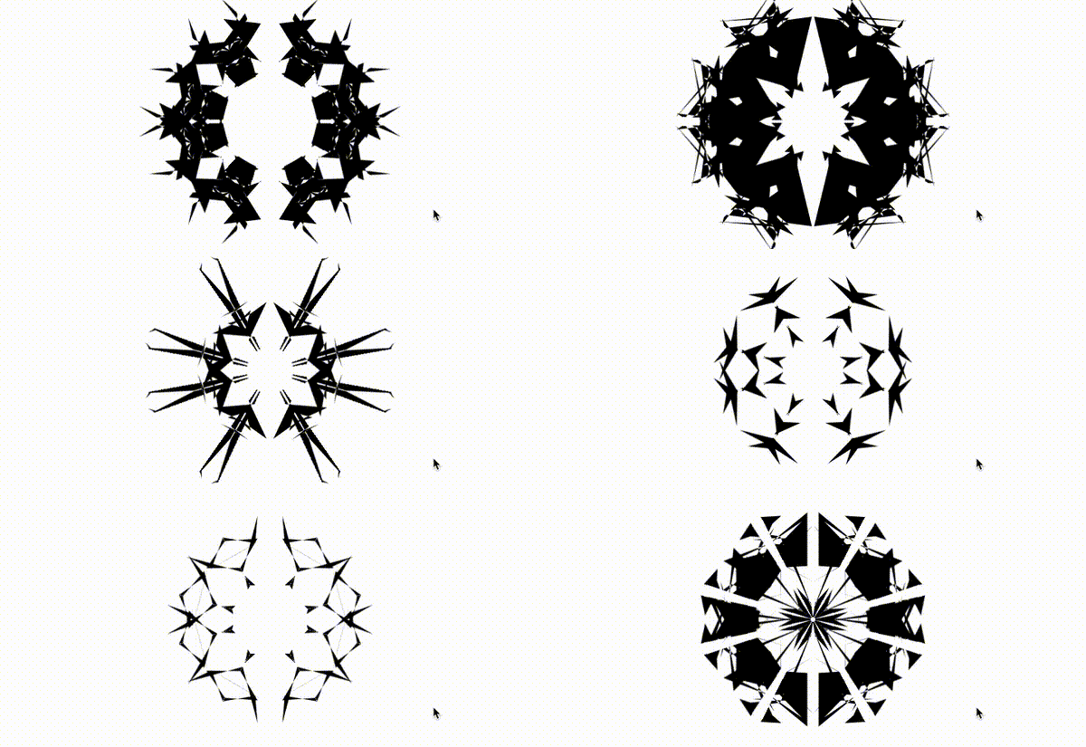
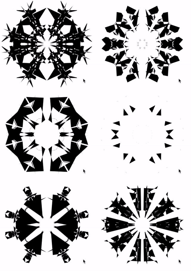
});This way, every time we click the mouse, we get a different random cutout pattern:
Check out this simple recorded GIF:
The complete code, you can bash here CodePen Demo -- Pure CSS Art Page Cutting
At last
This concludes this article, I hope it helps you :)
If you want to get the most interesting CSS information, don't miss my official account -- iCSS front-end anecdotes 😄
More wonderful CSS technical articles are summarized in my Github -- iCSS , which will be updated continuously. Welcome to click star to subscribe to the collection.
If you have any questions or suggestions, you can communicate more. Original articles are limited in writing and knowledge. If there are any inaccuracies in the article, please let me know.


**粗体** _斜体_ [链接](http://example.com) `代码` - 列表 > 引用。你还可以使用@来通知其他用户。