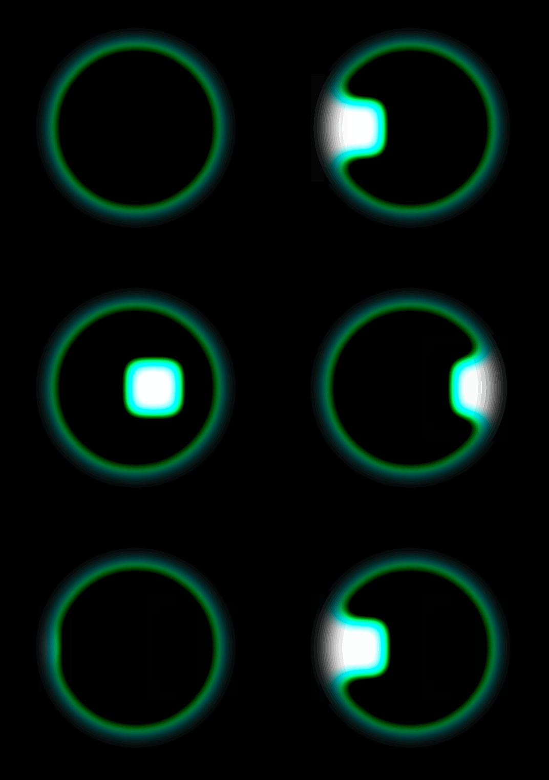
Hello everyone, I am Zero One . Today I will share with you a magical property in CSS: filter , why is it called magical? As my title said, I suddenly found that it can help us easily achieve wall-penetrating effects , similar to this👇
It looks like what we see in sci-fi movies when we pass through a shuttle door, really cool! However, this effect is not difficult for developers, because only two properties are set
The super filter properties in CSS derived from this example, what other awesome properties are there? Take a look!
Attributes supported by filter
Borrowing an example from MDN, filter supports the following attributes:
 filter: blur(5px);
filter: brightness(0.4);
filter: contrast(200%);
filter: drop-shadow(16px 16px 20px blue);
filter: grayscale(50%);
filter: hue-rotate(90deg);
filter: invert(75%);
filter: opacity(25%);
filter: saturate(30%);
filter: sepia(60%);
These properties can be used individually or in combination , for example:
filter: contrast(175%) brightness(3%);ps: Attributes may work wonders when used in combination!
case
This article will introduce some magical cases. I will probably not explain the principle of each attribute clearly, because I am not very clear.
blur
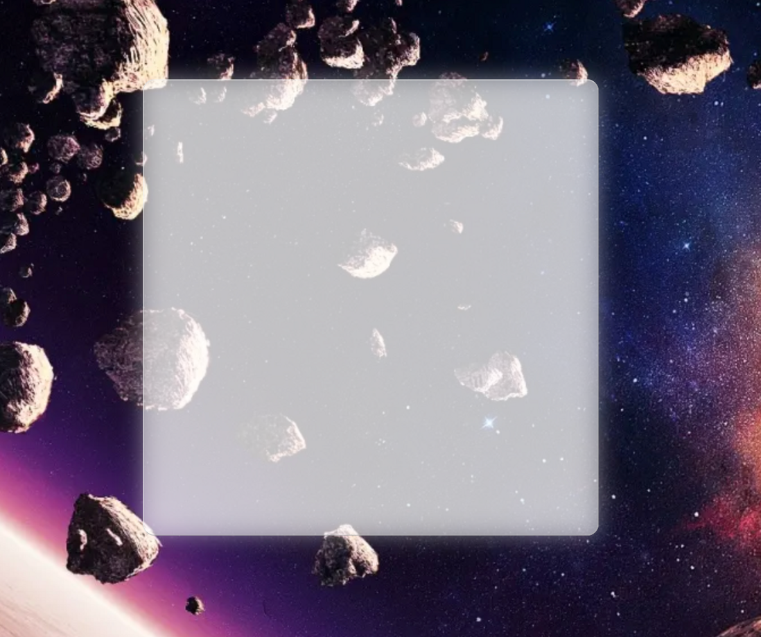
blur The attribute is usually used quite a lot, mainly for Gaussian blur , and the frosted glass effect that has been particularly popular in recent years can be achieved through this:
 <style>
  .blur {
    width: 400px;
    height: 400px;
    border-radius: 10px;
    background: rgba(255, 255, 255, 0.5);
    position: relative;
  }

  .blur::before {
    content: "";
    position: absolute;
    inset: 0 0 0 0;
    background: inherit;
    filter: blur(10px);
  }
</style>

<div class="blur"/>
The effect is as follows:
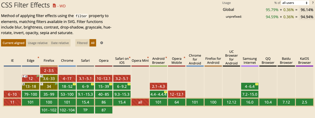
In fact, the effect of this kind of frosted glass is not very good, and it may not meet the requirements of UI. If you want a good frosted glass, you can use backdrop-filter to achieve, but the latter is not as compatible as the former.
brightness
brightness attribute is used to modify the brightness . The value can be a percentage or a number ( 0.5 = 50% ), the default value is 1 , but cannot be negative. When the value is closer to 0 , the screen will be blacker. When it is equal to 0 , the entire screen will almost become pure black; the value can theoretically tend to be infinite, when it reaches a certain value value, the picture is almost pure white
What can it be used for? There is a very common effect that everyone must have seen:
I wonder if you thought about how to achieve this when you saw this effect at the time? Haha, in fact, one attribute is enough!
 <style>
.brightness {
  width: 100px;
  height: 100px;
  border-radius: 8px;
  cursor: pointer;
  background: #333;
  font-size: 45px;
}

.brightness:hover .icon {
  filter: brightness(1.3);
}
</style>

<div class="brightness">
  <img src="apple.png" class="icon"/>
</div>
contrast
contrast can be used to adjust the contrast of the image , this word is somewhat professional, designers are often used, in simple and easy-to-understand terms, contrast = the whitest color value / the blackest color value in the image , according to this formula can be understood as:
- The greater the contrast, the stronger the white (brighter) and the weaker (darker) the black, the whiter the image;
- The smaller the contrast, the weaker the white (dark) and the stronger the black (white), the darker the image;
The value of contrast() can be written as a percentage or a numerical value ( 0.5 = 50% ), the default value is 1 , the value can be infinite, so the picture will be brighter , but cannot be negative
After a simple understanding of the concept, let’s see the effect in practice:
It can be seen that when the value is greater than 0 and less than 1, the picture is covered with a gray mask; when the value is greater than 1, many bright elements in the picture are brighter, and many dark elements are darker
This property doesn't seem to be useful, it doesn't make the image more graphic, and it doesn't make the image more refined, does it? I think so! But you must know that contrast and brightness the two attributes are strongly related to UI design, which reminds me of an image adjustment in PS, I switched to the English version of PS for everyone have a look:
It just corresponds to the two setting attribute values of image adjustment in PS
Everyone knows that when it comes to front-end performance optimization , in fact, the biggest optimization that can be perceived is in pictures , and the ROI of other optimization points is almost not as high as image optimization.
Then is it possible: use PS to reduce the brightness and contrast of the image to reduce the quality of the image , and then use contrast and brightness to improve the brightness and contrast of the image, so as to How to restore the original effect of the picture?
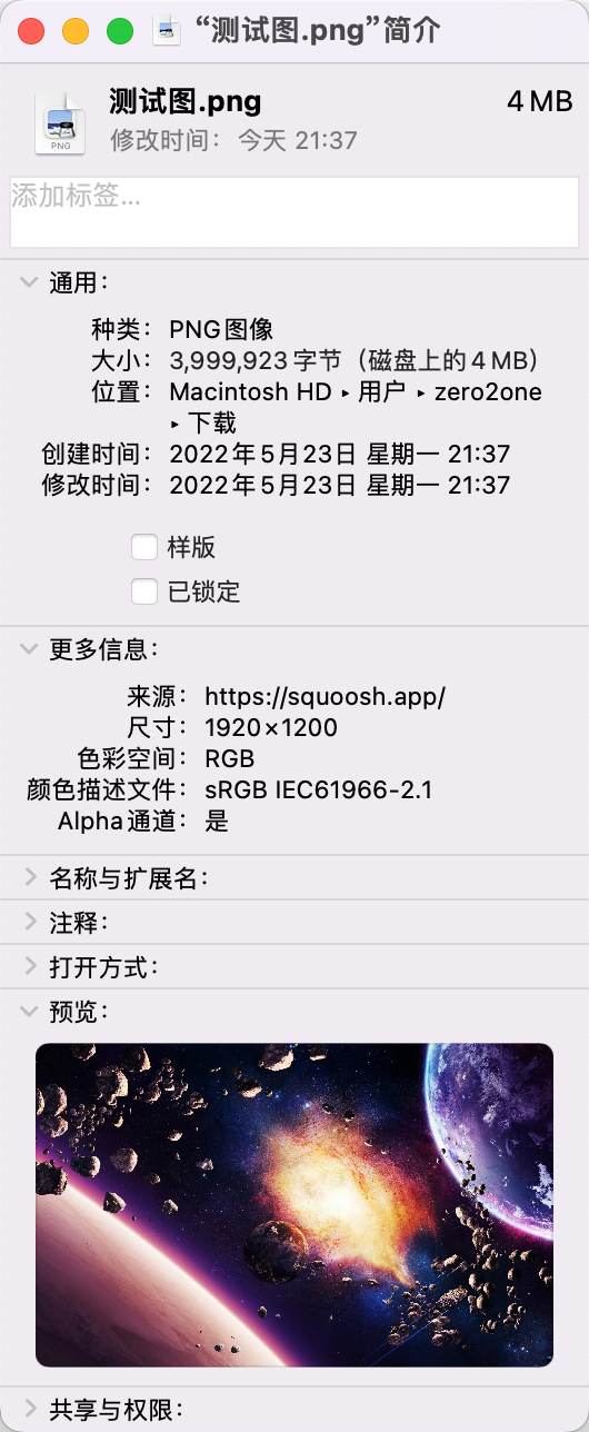
Let's first see if reducing the brightness and contrast of the picture can reduce the quality. For this, I specially found a high-definition picture of Gundam 4M :
Then use PS to appropriately reduce its brightness and contrast, and be sure to choose "old version", because only the optimization rules of brightness and contrast in this mode are similar to our CSS.
Take a look at the modified image size
You can see that some properties are adjusted casually, and the size of the picture is approximately reduced 1M
Can it be restored to the original picture effect and quality?
Fine tune properties in the console:
filter: brightness(1.2) contrast(1.7);The result is as follows:
It can be seen that there is almost no difference, and I think the loss of the image to the naked eye is within an acceptable range. Instead, I feel that it is more visual than the original image. Maybe this is the magic of contrast!
This is only the effect of reducing the contrast a little bit, and the image volume has decreased 25% . I won't discuss how much the size of the image can be optimized, but at least 25% has a lot of room for optimization. nice
In addition, the combination of some attributes of the filter mentioned above will have miraculous effects, including contrast , which can be used together with blur to achieve the wall penetration effect mentioned at the beginning of this article.
 <style>
body {
  width: 100vw;
  background-color: black;
  height: 100vh;
  display: flex;
  justify-content: center;
  align-items: center;
}

.container {
  width: 100px;
  height: 100px;
  border: 4px solid aquamarine;
  background-color: #222;
  overflow: hidden;
  border-radius: 50%;
  font-size: 36px;
  filter: blur(6px) contrast(6); /* 主要靠这行代码 */
  display: flex;
  justify-content: center;
  align-items: center;
}

.box {
  width: 1em;
  height: 1em;
  transform: translate(0px, 0px);
  background-color: aquamarine;
  animation: move 2s linear infinite;
}

@keyframes move {
  from {
    transform: translateX(-100px);
  }

  to {
    transform: translateX(100px);
  }
}
</style>

<div class="container">
  <div class="box"></div>
</div>
This is achieved:
Sigh again CSS awesomeness
drop-shadow
drop-shadow drop-shadow set the shadow effect to the image, the way of use is actually the same as box-shadow , the difference is: Mark each edge with a reference; box-shadow can only add shadow effects to the entire outline of the element. Use a picture to show the difference between the two:
grayscale
Whenever there are some social natural and man-made disasters in China that have a relatively large impact, many websites will put their pages in gray to express their condolences. At that time, many people were analyzing how to implement the function of "graying the webpage". In fact, the implementation of filter grayscale is the easiest and fastest.
Let's just find a webpage, take NetEase Cloud as an example, let's look at the effect of a normal page first:
We gave it body plus the graying attribute:
 body {
  filter: grayscale(1);
}
The effect of graying the page is complete
hue-rotate
hue-rotate Used to adjust the hue of the element, the concept of hue can be seen in HSL, namely:
- H: Hue
- S: Saturation
- L: Brightness
The process of changing the hue is the same as the following figure:
The unit of the value of hue-rotate is angle ( deg ), and every 360deg a transformation cycle
What's the use of this? For the likes in the live broadcast room, there will be a lot of floating objects on time, such as:
We can change the color of each heart by modifying the value of filter: hue-rotate(0deg)
Here I think of another CSS property, that is counter-reset , use it to initialize a counter, and then use the counter function to get the current count and assign it to hue-rotate , Does this make it possible to automatically change the color? (Of course I haven't tried it yet, just some thoughts while writing this post)
invert
invert is used to flip the image, in fact, I can't explain what flipping the image is, but I can use another example to explain it to you
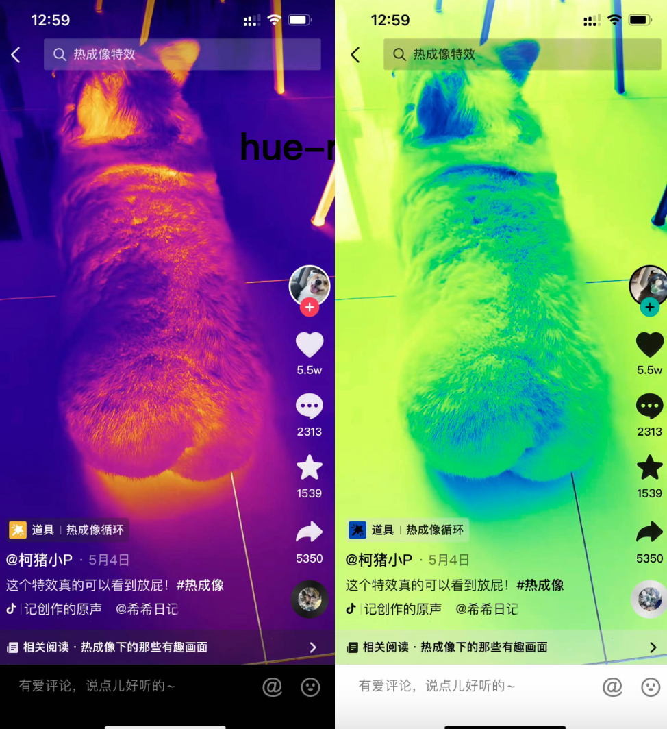
The left side of the picture is the thermal imaging special effect that has been very popular recently in filter: invert(1) , which can present all the things that are photographed with the effect of thermal imaging. How did the thermal imaging look like before
So, I believe everyone knows that, invert is exactly the same as the color flip function in our mobile phone, let me show you
Sometimes I use it invert this filter will have unexpected effects. For example, in my previous article , I added a flip effect to the Douyin Logo I drew, and it became a brand new Logo. Isn't Douyin going to invite me to design it?
the remaining
Other properties not mentioned are either relatively simple, and you can see how to use them at a glance; or they are not used very often and are relatively unpopular; if you are interested, you can go to MDN to check it yourself, or try it yourself
At last
This article starts with a more interesting effect, and then goes to understand other related properties, from which many other knowledge points are extended, and a lot of ideas and thoughts are exposed. This is my own complete idea, so writing the article is also in this order and logic
It's over, I can't hide my identity as Chetuzai. I need to use PS in many places in this article. I have to remember some of the content, otherwise I can't write this article.
I hope this article is helpful to you~ I am writing the article with my heart, I hope you will not be stingy with your likes👍🏻 oh~
I am Zero One , sharing technology, not just the front end! See you next time~






**粗体** _斜体_ [链接](http://example.com) `代码` - 列表 > 引用。你还可以使用@来通知其他用户。