Sass application to achieve theme switching
background
There are several different schemes for implementing theme switching, such as using CSS variables, using JavaScript to dynamically load the corresponding theme style files, etc. This article mainly talks about how to use Sass to achieve theme switching.
Pre-knowledge
Understand the basic use of Sass
- variable
- mixin
- map
Nature
As a CSS preprocessor, Sass needs to be compiled into CSS before it can be recognized and parsed by browsers. Therefore, it is not possible to use Sass directly in the browser to achieve dynamic switching similar to CSS variables. Essentially, if there are several themes in the project, it is necessary to define several theme styles in advance and introduce them all.
ideas
First, we need to add a theme logo to the top-level element of the application to identify the current theme and to apply the corresponding theme style later. The identifier can be a data attribute, a class, or an id, and the data attribute is used here.
 <html>
  <div class="app" data-theme="light"></div>
</html>
Then, every time the theme is switched, by updating the flag, the page will apply the corresponding theme style defined in advance in the style file.
 .app {
  &[data-theme='light'] {
    color: #333;
  }

  &[data-theme='dark'] {
    color: #fff;
  }
}
accomplish
Basic Edition
Based on the nature and idea of theme switching, we can implement a simple theme switching by hardcoding.
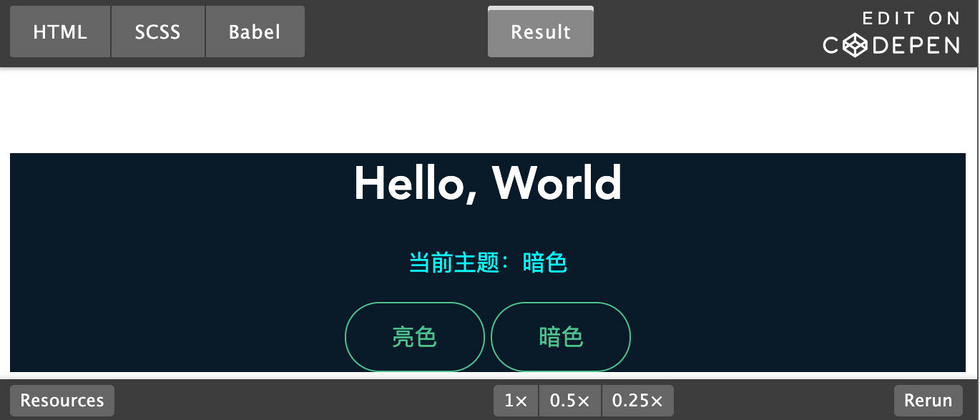
 <div id="app" class="app">
  <h1 class="title">Hello, World</h1>
  <p class="subtitle">当前主题:<span id="theme-current">亮色</span></p>
  <button class="theme-switch light" data-theme="light">亮色</button>
  <button class="theme-switch dark" data-theme="dark">暗色</button>
</div>
First add a theme logo to the application. Here I add a data attribute data-theme to the body element to indicate the current theme. The default is light
 <body data-theme="light">
  <div class="app"></div>
</body>
Then define all theme styles in advance:
 // 所有主题样式
$bg-color-light: #ffffff;
$bg-color-dark: #091a28;
$title-color-light: #363636;
$title-color-dark: #ffffff;
$subtitle-color-light: #4a4a4a;
$subtitle-color-dark: cyan;

.app {
  // 默认主题样式(light主题)
  background-color: $bg-color-light;

  // dark主题
  [data-theme='dark'] & {
    background-color: $bg-color-dark;
  }
}

.title {
  color: $title-color-light;

  [data-theme='dark'] & {
    color: $title-color-dark;
  }
}

.subtitle {
  color: $subtitle-color-light;

  [data-theme='dark'] & {
    color: $subtitle-color-dark;
  }
}
Finally, when we click on a different theme button, the theme logo on ---76142c1392cbf81a869eacfda377b67a--- will be updated body data-theme , so that the corresponding theme style in the style file will be applied.
For the complete code and implementation effect, please refer to Codepen:
SASS realizes theme skinning/theme switching-basic version by zhouqichao ( @Tom_chao )
However, the implementation is a bit rough, and there are several small problems:
- In each CSS selector that needs to apply the theme style, it is tedious to write the style required by the corresponding theme.
- If there are multiple themes, the amount of code can be greatly increased, and many are duplicate "template code"
In response to these problems, we can use some features of Sass to implement an advanced version of theme switching.
Advanced Edition
First of all, for the problems exposed by the basic version. We need to make a small tweak to the Sass variable. Here we encapsulate the theme style into a map format, and each element in the map corresponds to the style under different themes.
 // 所有主题样式
$bg-color: (
  // 亮色
  light: #fff,
  // 暗色
  dark: #091a28
);

$title-color: (
  light: #363636,
  dark: #ffffff
);

$subtitle-color: (
  light: #4a4a4a,
  dark: cyan
);
In response to the problem of repeated template code and cumbersome code, there is a feature in Sass mixin , which can be used.
Next, we have to encapsulate a mixin to solve the tedious problem of basic version 1-handwritten code.
这里#{} Sass中的插值表达---1b3f4c851d4252db05a1f9659c243041---和map-get方法, #{} JavaScript中的计算属性,可以动态设置属性名, map-get The map-get method is used to get the value corresponding to an attribute from the map.
 @mixin themify($key, $valueMap) {
  // 默认主题
  #{$key}: map-get($valueMap, 'light');

  // dark主题
  [data-theme='dark'] & {
    #{$key}: map-get($valueMap, 'dark');
  }
}
themify light , dark主题样式,这样我们在选择器里,只include That's it.
 .app {
  @include themify('background-color', $bg-color);
}

.title {
  @include themify('color', $title-color);
}

.subtitle {
  @include themify('color', $subtitle-color);
}
Is the code more concise now? Save yourself the tedious template code by hand!
For the problem of "multi-theme template code will be more", it is very easy to solve. Just simply modify the mixin and add the corresponding theme style.
 @mixin themify($key, $valueMap) {
  // light主题
  #{$key}: map-get($valueMap, 'light');

  // dark主题
  [data-theme='dark'] & {
    #{$key}: map-get($valueMap, 'dark');
  }

  // dark1主题
  [data-theme='dark1'] & {
    #{$key}: map-get($valueMap, 'dark1');
  }

  // dark2主题
  [data-theme='dark2'] & {
    #{$key}: map-get($valueMap, 'dark2');
  }
}
Of course, we can also optimize the mixin, we can encapsulate the theme into a list format, and then simplify the mixin by traversing the theme:
 @mixin themify($key, $valueMap) {
  // theme list
  $themes: light, dark;

  @each $theme in $themes {
    [data-theme=#{$theme}] & {
      #{$key}: map-get($valueMap, $theme);
    }
  }
}
This looks so much cooler.
For the complete code and implementation effect, please refer to Codepen:
SASS realizes theme skinning/theme switching - advanced version by zhouqichao ( @Tom_chao )
Summarize
As a popular CSS preprocessor, Sass provides interpolation expressions #{} and map types and other features, which provide a lot of convenience in implementing theme switching.
Of course, there are still many points that can be optimized for Sass to achieve theme switching. Here are two common ones:
If there are multiple theme styles that need to be applied, you need to write each one again
@include, it feels a little troublesome, can you just write it once@include?.app { @include themify('background-color', $bg-color); @include themify('color', $text-color); // ... } // 希望可以只写一遍@include .app { @include themify( ( 'background-color': $bg-color, 'color': $text-color ) ); }If you also need to use
!importantto cover some styles that cannot be applied due to weight problems (such as using an external UI library, the external UI library uses!important, you need to override this style), how solve?// 这里提供一个思路,可以添加一个参数$important @mixin themify($key, $valueMap: null, $important: false) { // xxx }


**粗体** _斜体_ [链接](http://example.com) `代码` - 列表 > 引用。你还可以使用@来通知其他用户。