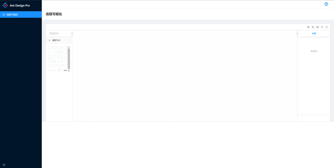
This series mainly describes the development of a custom process visualization function, using Ant Design Pro as the scaffolding, AntV/xflow as the visual development framework, customizing custom nodes, adding custom attributes to nodes and connections, and using formliy to generate custom form pairs Edit node properties.
This article mainly introduces the overall page and the functions of each control of xflow.
Preparation before development
We choose Ant Design Pro + umijs3.x as the scaffold we developed. umi4 is already available for early adopters, but it is not stable. We will stabilize and upgrade umi4 later. First, build the scaffolding. It is recommended to use pnpm.
 mkdir designable-xflow && cd designable-xflow
yarn create @umijs/umi-app
yarn
The basic scaffolding is completed, then install xflow, and formliy
yarn add @antv/xflow @formily/core @formily/react @formily/antd In this way, the basic libraries we use are all installed, and then we will transform the main view.
First, create a new main directory config/config.ts , copy the contents of the .umirc.ts file to config.ts , and then delete the corresponding route .umirc.ts , ecc600d4
config/config.ts:
 import { defineConfig } from 'umi';

export default defineConfig({
  nodeModulesTransform: {
    type: 'none',
  },
  layout: {},
  routes: [
    {
        path: '/',
        redirect: '/xflow',
      },
      {
        name: '流程可视化',
        path: '/xflow',
        icon: 'SmileOutlined',
        component: '@/pages/Xflow',
      },
  ],
  fastRefresh: {},
});
Copy a copy of the xflow column from the antv official website to the pages directory (pages/Xflow), link it, and start the service
yarn run start But the home page you see at this time is messy, and the CSS import is missing. Add it in pages/Xflow/index.tsx
 + import '@antv/xflow/dist/index.css'
import './index.less'
src new under global.css , add
@import '~antd/dist/antd.css';)At this time, we can see that our page is the same as the official website. The official website is still relatively comprehensive, but it is only limited to display. We need to customize the components when using them formally, such as what a component represents, and what are the attributes under the component. Those properties can be edited, whether components can be connected to each other, etc. The official list cannot meet so many scenarios, so we need to customize the components for development. The next few blog posts will answer and explain these situations one by one. , look forward to it.
Address of this article: link
This article github address: link
github demo address: link


**粗体** _斜体_ [链接](http://example.com) `代码` - 列表 > 引用。你还可以使用@来通知其他用户。