In the process of developing the official website for the company, there will be a mouse-over effect involving some pictures. After the mouse is hovered, the original picture will be changed. It will simply fade out, zoom in and out, and pan left and right can no longer meet the expectations of the product manager. I always feel that it is not amazing enough, not creative enough. In fact, as a developer, I will not be satisfied with this ordinary daily animation interaction effect. When looking for a new idea, I found that based on CSS mask-image can achieve many good effects. This article will realize four kinds of pictures based on this attribute. Transition animation effect.
Pre-knowledge point mask-image
mask-image CSS property used to set the image of the mask layer on the element. The default value is none , which is an unmasked image. Therefore, similar to the --- border attribute in the border-style attribute, it is an attribute value that must be set to have an effect. Note that since this attribute is not fully supported at present, some browsers need to add the -webkit- prefix to use.
mask-image Mask supports a wide range of image types, which can be url() Static image resources, formats including JPG, PNG and SVG are supported; they can also be dynamically generated Images, such as those drawn using various CSS3 gradients. Syntactically supports all kinds of CSS3 gradients, as well as url() function, image() function, and even element() function. It also supports multiple backgrounds, so theoretically, using mask-image we can mask out any graphics we want, which is very powerful.
The syntax is as follows:
 /* <mask-source> value */
mask-image: url(masks.svg#mask1);

/* <image> values */
mask-image: linear-gradient(rgba(0, 0, 0, 1.0), transparent);
mask-image: image(url(mask.png), skyblue);

/* Multiple values */
mask-image: image(url(mask.png), skyblue), linear-gradient(rgba(0, 0, 0, 1.0), transparent);
The example demonstrates the effect of adding the mask-image attribute to a plain text element with a gradient background.
 .mask {
  -webkit-mask-size: contain;
 -webkit-mask-image: url(https://p6-juejin.byteimg.com/tos-cn-i-k3u1fbpfcp/161ced10bf344eb085c34cefd8958dd1~tplv-k3u1fbpfcp-watermark.image?);
}
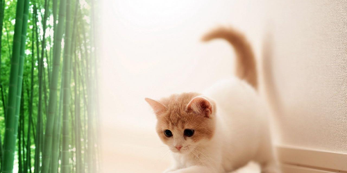
The two images are merged into one image in a gradient manner.
 .scene-2 {
  background-image: url(https://p3-juejin.byteimg.com/tos-cn-i-k3u1fbpfcp/fd9e83460a5645ccb78dc1c8efb86871~tplv-k3u1fbpfcp-watermark.image?);
  -webkit-mask-image: linear-gradient(to right, transparent 8%, #fff 30%);
}
As shown in Figure 1 above, use the mask-image attribute to set a png format customer service icon, the entire element will only display the content area of the png image, and other areas will disappear. As shown in Figure 2, use the mask-image property to set the gradient color, so that the two images are blended together in a gradient overlay.
Presumably everyone can see the main function of mask-image e7eb0ee7f99bbe56c155114af1b0710c---. CSS mask attribute is mask: xxx when it is used. Now with the normalization of this attribute, mask mask-\*的缩写,除了mask-image ,用法和CSS background的, For specific attribute values, see the detailed explanation of mask mask layer .
 mask-mode

mask-repeat

mask-position

mask-clip

mask-origin

mask-size

mask-type

mask-composite
After introducing the main pre-knowledge points, the next step is to enter the specific animation effect and implementation process.
effect one
For the transition effect of switching between two pictures, a transparent icon is positioned in the middle before the animation starts. After the animation starts, the icon continues to enlarge until the icon is enlarged to the full screen. At this time, it transitions to the second picture. The whole process is quite cool. Based on the above prerequisite knowledge points, you can quickly think of the corresponding implementation. Here you need to use several other attributes. The usage is similar to background :
-
mask-size: As shown in the animation, the png icon in the middle is enlarged from small, you need this attribute to control the size change of the icon -
mask-position: If the icon is always kept in the horizontal and vertical center position to enlarge, you need the starting position of this attribute image -
mask-repeat: Similar tobackground, do not setno-repeaticon will repeat the entire interface
The animation effect diagram is as follows:
The core code is as follows:
 .scene-2 {
  background-image: url(https://assets.codepen.io/77020/sw-shape-zoom-scene-2.jpg);
  -webkit-mask-image: url(https://assets.codepen.io/77020/sw-jedi-crest.svg);
  -webkit-mask-size: 10%;
  -webkit-mask-position: center;
  -webkit-mask-repeat: no-repeat;
}

.scenes:is(:hover, :focus) .scene-2 {
  animation: scene-transition 4s cubic-bezier(1, 0, 1, 1) forwards;
}

@keyframes scene-transition {
  100% {
    -webkit-mask-size: 1800%;
  }
}
At this time, the overall animation effect is basically completed, but there are still details to continue to optimize. The picture in the icon has been seen before the animation starts, which is not clear and beautiful compared to the whole interface, so you need to set the brightness of the second picture by default. When the animation progresses to After a certain stage, it will be fully displayed.
code show as below:
 .scene-2 {
  filter: brightness(0%);
}

@keyframes scene-transition {
  25% {
    filter: brightness(100%);
  }
  100% {
    filter: brightness(100%);
  }
}
Code online preview:
https://code.juejin.cn/pen/7121173655316332580
effect two
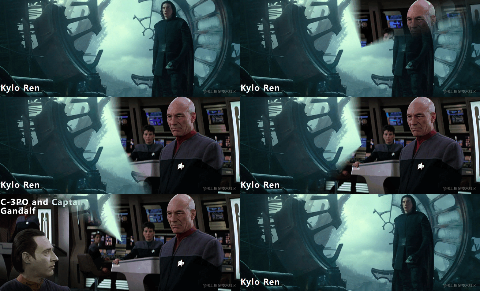
As shown in the renderings, the tapered gradient is used here conic-gradient , through a complete tapered gradient transition picture. Similar to Example 2 above, except that the linear-gradient linear gradient is changed to conic-gradient conical gradient, and the transition effect of the picture is completed by controlling the angle of the conical gradient. An example of the animation effect is as follows :
The core code is as follows:
 @property --angle {
  syntax: '<angle>';
  inherits: true;
  initial-value: -10deg;
}

.scene-2 {
  background-image: url(https://assets.codepen.io/77020/sw-clock-wipe-scene-2.jpg);
  z-index: -1;
  -webkit-mask-image:
    conic-gradient(
      #fff 0deg,
      #fff calc(var(--angle) - 10deg),
      transparent calc(var(--angle) + 10deg),
      transparent 360deg
    ),
    conic-gradient(
      transparent 340deg,
      #fff 360deg
    );
}
.scenes:is(:hover, :focus) .scene-2 {
  z-index: 1;
  animation: scene-transition 2s linear forwards;
}

@keyframes scene-transition {
  to { --angle: 370deg; }
}
Code online preview:
https://code.juejin.cn/pen/7121174793981788196
effect three
This effect is changed from the tapered gradient of the second effect to a radial-gradient radial gradient, which controls the range of the gradient from completely invisible to covering the entire element. An example of the animation effect is as follows:
The core code is as follows:
 @property --radius {
  syntax: '<percentage>';
  inherits: true;
  initial-value: -5%;
}

@keyframes scene-transition {
  to { --radius: 105%; }
}

.scene-2 {
  background-image: url(https://assets.codepen.io/77020/sw-iris-wipe-scene-2.jpg);
  -webkit-mask-image: radial-gradient(
    circle,
    #fff calc(var(--radius) - 5%),
    transparent calc(var(--radius) + 5%)
  );
}

.scenes:is(:hover, :focus) .scene-2 {
  animation: scene-transition 2s linear forwards;
}
Code online preview:
https://code.juejin.cn/pen/7121179125821210654
effect four
This effect is the same as the effect in Example 2, using a linear-gradient linear gradient transition picture, here mask-size is set to twice the width, and the first half is set to a transparent color, then you still see the first picture. . When triggering the animation, change mask-position from left to right , the animation effect example is as follows:
The core code is as follows:
 .scene-2 {
  background-image: url(https://assets.codepen.io/77020/sw-horizontal-wipe-scene-2.jpg);
  -webkit-mask-image: linear-gradient(
    to right,
    transparent 47.5%,
    #fff 52.5%
  );
  -webkit-mask-size: 210%;
  -webkit-mask-position: left;
}

.scenes:is(:hover, :focus) .scene-2 {
  -webkit-mask-position: right;
  transition: -webkit-mask-position 2s linear;
}
Code online preview:
https://code.juejin.cn/pen/7121181551152332814
at last
This article is based on CSS mask-image to achieve four kinds of image transition effects, I believe these effects can make your boss shine and make your project cool. If you find it useful at the end, remember to like it and save it, maybe you will use it someday.
Focus on front-end development, share dry goods related to front-end technology, public account: Nancheng Front-end (ID: nanchengfe)
refer to
mask-image:
https://developer.mozilla.org/en-US/docs/Web/CSS/mask-image
codepen: https://codepen.io/lonekorean/details/eYVrWoq
Detailed explanation of mask mask layer: https://blog.csdn.net/qq_32682137/article/details/83751176
Detailed explanation of the mask-image property of CSS: https://www.php.cn/css-tutorial-389418.html


**粗体** _斜体_ [链接](http://example.com) `代码` - 列表 > 引用。你还可以使用@来通知其他用户。