This article will mainly share my understanding of the low-code platform, and look at the design of the low-code platform from multiple perspectives and problems. I think the core of the low-code platform lies in model design, including control model, component model, canvas model and so on . Hope after reading this article, you will know:
- What is the underlying logic of the core of the low-code platform?
- Why do common low-code platforms include "control area", "layout area" and "property editing area"?
- What is the nature of the controls, components, and canvases of the low-code platform?
- How to make low-code platforms support cross-platform?
- How to make low-code platforms support custom data sources?
So let's get started.
1. The low-code platforms you have seen
In recent years, various low-code products have appeared in China, which play an important role in reducing costs, increasing efficiency and improving quality . The business scenarios of low-code platforms are becoming more and more extensive: custom forms, page production, event detail pages, workflow scenarios, data reports, large-screen data reports, data tables, whiteboard notes, and more. There are also many mature low-code products: Aliyida , Tencent Cloud , Baidu Aishu, Qingliu, Jeecg Boot , Ma Liang and so on.
The following figure shows Tencent's open source tmagic platform, which is our most common low-code platform layout:
(This picture comes from: tmagic )
It includes three core modules:
- Control area : Display the controls supported in the platform. Users can display the UI component styles corresponding to the controls by dragging the controls to the layout area;
- Layout area : It is used to carry the UI components corresponding to the controls. Users can lay out each UI component and visually check the page effect;
- Property editing area : used to display the configuration content supported by the control, and can customize the UI components corresponding to each control more flexibly.
So, why are various products adopting this layout?
2. Think about low-code platform design from a different perspective
When solving problems, we often use two methods:
- Top-down method : starting from the goal, dismantling and refining the problem, and finding a solution;
- Bottom-up method : Summarize all kinds of scattered information to get the correct method and conclusion.
Let's try to think about the design of a low-code platform with a top-down approach :
Usually, before the team decides whether to develop a low-code platform, it will go through brainstorming, inspiration discussions, and business needs analysis, and then determine the original requirements for developing a low-code platform.
Suppose such a scenario:
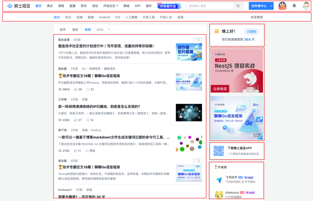
The homepage layout of the Nuggets community is relatively simple. When you need to add or adjust some modules, you need to change the project code, package, test, and publish. At this time, if there is a homepage design platform that allows operators to freely adjust the page layout, you can also Adjust different homepage layouts for different festivals and events.
Based on such a scenario, we use the top-down approach , starting from the goal, dismantling and refining the problem, and finding a solution.
1. Set goals
Our target requirement is to be able to flexibly layout the community homepage:
2. Dismantling and refining the problem
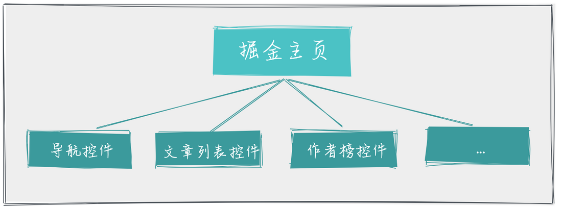
If you want to implement a nuggets homepage with a flexible layout, you need to extract the modules in the homepage into each independent control:
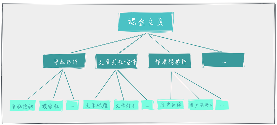
If each control needs to be flexibly configurable, we also need to be able to configure any part of the control:
3. Find a solution
According to the analysis of the first two steps, we can determine the approximate solution:
- Need to implement a design platform that supports free drag and drop layout;
- The platform supports dragging and dropping different controls to the page;
- Each control supports different custom configurations;
- The designer supports exporting page structure, and the renderer supports rendering page content.
So we have the following plan:
This is why common low-code platforms have "control area", "layout area" and "property editing area".
Usually the interaction logic is as follows:
- Drag a control from the "control area" into the "layout area", and render the control into a corresponding component;
- Select a component to display all properties that support configuration of the component in the "Property Configuration Area";
- Modify the properties of the "Property Configuration Area" to update the style of the component in the "Layout Area".
This is the simplest process.
3. Think of a more general low-code model
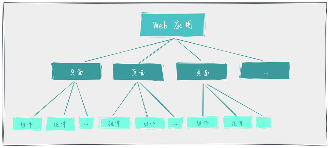
The page created by the low-code platform is not necessarily a single page in essence, but can also be a web application composed of multiple pages. Therefore, we can abstract the above example into a more general low-code platform model:
This model defines the page structure created by the low-code platform, and the final rendering is to render the page by the corresponding renderer.
This is a bit like a VNode tree.
(Image source: https://v3.cn.vuejs.org/ )
For Vue, the core problem to be solved is "how to create VNode" and "how to render VNode".
Next we define the following structure in the form of a TypeScript interface:
It can be found that the relationship between single-page applications and multi-page applications lies in that by adding path configuration for single-page applications, multiple single-page applications are combined into multi-page applications.
At this point we have a more general low-code model and define the structure of each layer using TypeScript interfaces.
It can be seen that the core of the low-code platform lies in the model design, which defines the model of each part.
Fourth, the controls in the control area are not so simple
1. What are the controls?
The control is essentially a standard JSONSchema object, which is used to describe the final rendered component . In the low-code platform, dragging the control to the layout area will display the corresponding component style.
Take "User Information Control" as an example:
 const UserInfo = {
    name: '用户信息控件',
    type: 'UserInfoComponent', // 指定渲染的组件名称
    config: [
        {
            label: '头像',
            type: 'input',
            value: 'https://a.com',
        },
        {
            label: '昵称',
            type: 'input',
            value: 'pingan8787'
        }
    ]
}
Usually we define a type (or other names) in the control object to specify the name of the component rendered by the control . For example, in Vue, you can use the type value to dynamically render components in the form of dynamic components <component :is={type} /> .
A control is like a specification for a component, it just describes the component, what it looks like, what behavior, configuration and other information it has.
2. What are the advantages of controls?
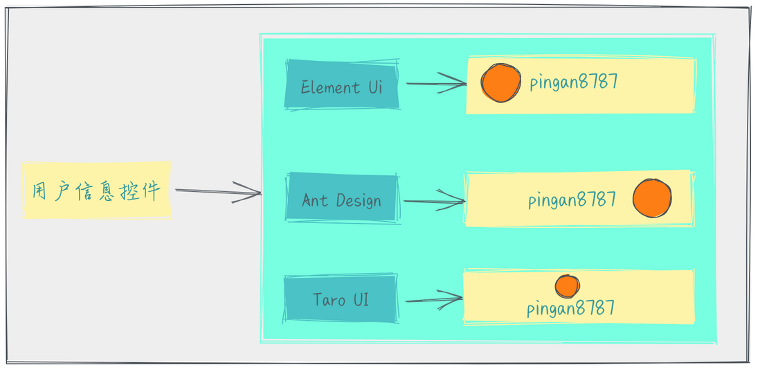
Controls are defined as standard JSON objects , and there are other advantages such as: cross-platform adaptation of controls can be achieved, and different components can be rendered on different platforms/component libraries . The target platform just needs to render different components according to the model.
3. How does the control implement dynamic loading of remote components?
A common solution is to specify the address of the remote component for each control (such as setting the path property), and when the control starts to be dragged, send a request to get the remote component:
 const UserInfo = {
    name: '用户信息控件',
    type: 'UserInfoComponent', // 指定渲染的组件名称
    path: 'https://a.com/UserInfoComponent.js', // 远程组件的地址
    config: [
        {
            label: '头像',
            type: 'input',
            value: 'https://a.com',
        },
        {
            label: '昵称',
            type: 'input',
            value: 'pingan8787'
        }
    ]
}
Taking Vue as an example, when a remote Vue component is obtained, it can be registered and used through the dynamic component provided by Vue.
The complete process is as follows:
- Start dragging the "Control Area" control, and initiate a request to obtain the remote component from the server;
- When the remote component is obtained, it is registered in the project;
- Release the control to render the component content to the "canvas area".
Of course, considering the performance optimization of the editor, to avoid sending a request to get the component file every time you drag and drop, we can optimize it like this:
- Use the request cache, if it is a repeated request, read the result of the last request from the cache;
- Send requests to common basic components in advance and save them locally;
- The requested component is cached locally, and the cached result is read the next time the same component is requested;
- and many more
5. The canvas in the canvas area is not so simple
1. What is a canvas?
The essence of the canvas is also a standard JSON object, which is the data source we will use to render the page, and usually contains the structure and configuration information of the entire page. The canvas is updated when a control is dragged into the canvas and the component configuration is updated.
We simply construct a model based on the Nuggets homepage (without considering the multi-page situation):
 const Juejin = {
    title: '掘金主页',
    favicon: './favicon.icon',
    components: [
        {
            name: '用户信息控件',
            type: 'UserInfoComponent',
            config: [
                {
                    label: '头像',
                    type: 'input',
                    value: 'https://a.com',
                },
                {
                    label: '昵称',
                    type: 'input',
                    value: 'pingan8787'
                }
            ]
        }
    ]
}
In the above model, each component in the canvas is defined and stored in the components array. Each component contains its own name , type , config and other information, when the renderer renders, you can:
- Render the components in the configuration area according to
type; - Render the label text of the configuration area form according to
label; - According to
valuethe value of the rendering configuration area form.
2. Canvas also has rich configuration
For the canvas model, the most important thing should be the component list, that is, the previous components array. For each component, the most important information includes:
- Event model information: contains some events bound to the component (such as event name, etc.);
- Animation model information: Contains some animation effects (such as rotation, enlargement, etc.) bound by the component;
- UI style model information: contains some UI styles bound to the component (such as background color, font size, etc.);
- Data/Data Source Model Information: Contains some data source-related configurations (such as data source interface addresses, etc.) bound to the component.
Taking " Event Model Information " as an example, when a button is configured on the page, the button can often do the following:
- open the link;
- Open the popup;
- Open the APP;
- refresh page;
- send request;
- and many more.
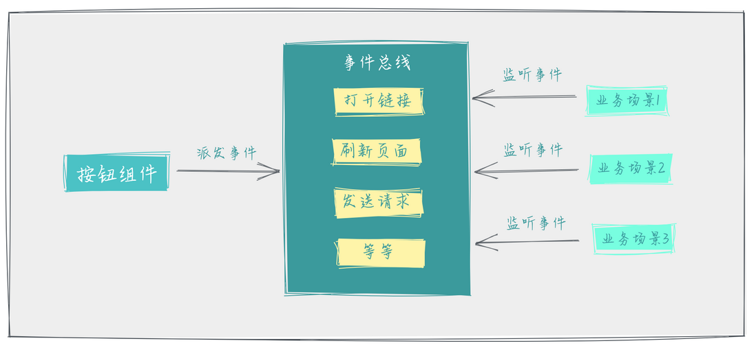
At this point, the button can trigger a lot of behaviors. If each event processing logic is written in the component, the component will be bloated and coupled in the component, and the maintainability will be poor.
In order to reduce the coupling between components and event processing logic, we can add a layer between components and event processing logic, namely the event bus:
Implement common components to dispatch events to the event bus, monitor events in different business scenarios, and execute specific event processing logic.
Through the event bus, the two parties that dispatch events and monitor events are decoupled from each other. After the decoupling is completed, cross-platform functions can also be realized. For dispatching the same event, it is only necessary to monitor the event on different platforms to realize different processing logics, namely Yes .
6. Data source design
The so-called "data source" refers to the data source in the low-code platform. Usually, data sources can be divided into two categories according to business requirements:
- Static data source : The data is bound in the page configuration. In the final effect page, the data in the page configuration is directly used, and there is no need to obtain data through the interface;
- Dynamic data source : Generally, the interface that saves the data source is in the configuration, and the data is not bound. In the final effect page, the client needs to send a request to obtain the data.
1. The process of static data source
In the low-code design platform, the platform first requests data, and the user selects the specified data and saves it in the page configuration.
For example, when we already have a banner list interface, we need to select one of them and add it to the layout area:
Proceed as follows:
- The user selects "Carousel Control" in the "Control Area" and drags it into the "Layout Area";
- Click the "Carousel Control" component in the "Layout Area" to open the "Properties Configuration Area";
- Select "Select Banner" in "Attribute Configuration Area", the platform sends a request to get the banner list from the server;
- Open the "select banner popup" to display the banner list, and the user can select the desired banner image;
- Click "OK" to close the "Select Banner" pop-up box, and insert the data in the "Carousel Control" component of the "Layout Area" to complete the selection.
In the "Select Banner" pop-up box, the user selects the specified data and saves it to the page configuration. When accessing the final generated effect page, the selected banner image will be displayed directly.
2. The process of dynamic data source
The dynamic data source is more flexible than the static data source. After the user specifies the data source interface, when the interface data changes, the final effect page can dynamically change the displayed content.
For example, when we already have a banner list interface, we can add different banners in the management background, and the final effect page can display the new banner, and the user only needs to specify the banner list interface during design:
Proceed as follows:
- The user selects "Carousel Control" in the "Control Area" and drags it into the "Layout Area";
- Click the "Carousel Control" component in the "Layout Area" to open the "Properties Configuration Area";
- Select "Configure Banner" in "Attribute Configuration Area", configure "Interface Address" and "Translation Rule";
- After the selection is complete, click "OK", close the "Select Banner" pop-up box, and save the configured "Interface Address" and "Translation Rule" data in the "Layout Area" page configuration, and the configuration is complete.
- When the user accesses the final effect page, the page will first call the configured "interface address" to obtain the remote banner list;
- The data returned by the interface is converted into all data formats of the component through the "conversion rule".
In this way, the final effect page can display the latest data every time and achieve complete dynamics.
3. Add data source adapter
When two highly coupled logics need to be decoupled, they can be decoupled by adding adapter methods. Therefore, on the data source side, adapters can also be added to decouple "UI components" and "interface data".
The ideal state should be:
- UI components only expose configurations and methods supported by components, without paying attention to what business uses the component;
- Interface data also does not need to pay attention to what components the data is used by.
Therefore, we added data adapters for "static data source" and "dynamic data source" respectively. The process is as follows:
- static data source
In step 4, the data returned by the interface will go through "Data Adapter 1" to convert the interface data into the unified parameters of the "Select Banner" popup component. Similarly, in step 6, the data structure returned by the popup component is converted into the data structure of the parameters required by the "banner component" through "Data Adapter 2".
- dynamic data source
In step 6, the data returned by the interface will go through the "Data Adapter" to convert the interface data into the unified parameter data structure of the "banner component".
In fact, to sum up, it is to convert the data structures of various sources into the parameter model of the component through various data adapters. The benefits are also clear:
- When replacing the data source, it is only necessary to connect the interface according to the component parameter model to realize various data adapters without changing the original logic;
- When replacing the UI component library, you only need to connect the UI components according to the component parameter model to implement various data adapters without changing the original logic.
4. Summarize data source design
According to the previous scheme, we have the main direction for the data source. The main core is: by defining the component interface model and the adapter model, we can easily develop any components and adapters. According to the defined model, other developers can also Can be very convenient to develop.
7. Summary
The role of the low-code platform is to reduce costs, increase efficiency and improve quality. The core lies in model design, reducing the coupling degree of each function point, and allowing the platform to support cross-platform .
This article introduces the design ideas of the low-code platform through the top-down method , starting from the goal, dismantling and refining the problem, and finding a solution . Later, I analyze my understanding of several core modules of the low-code platform one by one, and focus on the model design and configuration of the core modules.
This article is my own understanding and summary after several low-code platforms. I hope it will be helpful to you. The future of low-code platforms is infinite.
This is my first time writing low-code related articles. If there are any mistakes, please correct me~~









**粗体** _斜体_ [链接](http://example.com) `代码` - 列表 > 引用。你还可以使用@来通知其他用户。