Particle animation, as the name suggests, is an animation constructed from a large number of particles on the page. Traditional particle animation is mainly implemented by Canvas and WebGL.
Of course, the main reason for not using HTML + CSS is that particle animation usually requires more particles, and if you use HTML + CSS, it will require too many DOM elements, which leads to the use of HTML + CSS to build particle animation in the There is no advantage in performance.
Of course, if only from an effect point of view, particle animations built with CSS can also be very impressive.
In this article, I will try to use CSS to build particle animations.
If you want to do good work, you must first sharpen your tools
OK, drawing CSS particle animations requires good tools first. This article will continue to use CSS-Doodle to complete all the functions. But please note that CSS-Doodle can be understood as a syntactic sugar library, all the effects done with it can be reproduced with CSS + HTML (maybe some will add a little SVG).
Simply put, CSS-doodle is a Web-Component based library. Allows us to quickly create pages based on CSS Grid layout, and provides various convenient instructions and functions (random, loop, etc.), allowing us to obtain different CSS effects through a set of rules. You can simply take a look at its home page -- Home Page of CSS-doodle , and it only takes 5 minutes to get started quickly.
Build Particles with CSS-Doodle
To achieve particle animation, the first step, we need to get a lot of particles. Implementing it with CSS means we need a lot of DOM.
With the help of CSS-Doodle's Grid layout syntax, we can quickly get a lot of DOM, of course, there are many ways.
Now let's say we need 10,000 particles, we only need to implement a 100x100 Grid layout. Using CSS-Doodle, the syntax is as follows:
 <css-doodle grid="100x100">
    :doodle {
        @size: 100vw 100vmin;
    }

    position: absolute;
    top: 50%;
    left: 50%;
    width: 2px;
    height: 2px;
    background: #000;
    border-radius: 50%;
</css-doodle>
Briefly explain the above code:
-
grid="100x100"represents the realization of a 100x100 Grid layout -
@size: 100vw 100vminindicates that the height and width of the Grid layout are 100vw and 100vh respectively, that is, occupying the entire screen - The rest of the code is easy to understand, it will be assigned to each Grid item, which is equivalent to 10,000 Grid items are a 2x2 sphere, and positioned in the middle of the page
The whole effect is as follows:
You read that right, because all the particles are stacked at one point, so there is really only one point.
At this point, we have 10,000 particles clustered together.
Implement 2D particle effects
With 10,000 particles clustered together, we can add any different properties to each particle to get a variety of different particle effects.
In order to make the particles clear, the first step is to spread the particles. Here we only need to change the top and left positioning in the above code (you can also use transform):
 <css-doodle grid="100x100">
    // ...其他与上述保持一致
    top: @r(1%, 100%);
    left: @r(1%, 100%);
    // ...其他与上述保持一致
</css-doodle>
In CSS-Doodle, the @r() method can be used to obtain random numbers, here is to obtain random numbers within 1% ~ 100% Here, what we do is to make the top and left of each particle randomly fall on 1% ~ 100% , so that we can see different particle distributions clearly:
Well, here, the beauty has not been reflected.
Don't worry, let's try to randomly zoom in and out each particle, and give them a different color:
 <css-doodle grid="100x100">
    // ...其他与上述保持一致
    background: hsl(@r(1, 255, 3), @r(10%, 90%), @r(10%, 90%));
    transform: scale(@rn(.1, 5, 3));
</css-doodle>
In this way, our particle becomes like this:
OK, it looks like that. Of course, how can particle animation be without animation? In the next step, we need to make particles move, because animation needs to use transform: translate() , but we used ---88722e7ab9afdf14e8521da530cea012 scale() above, in order to To reduce the amount of code, here I will hand over the scaling operation to the zoom attribute to implement, so that the complete code is as follows:
 <css-doodle grid="100x100">
    :doodle {
        @size: 100vw 100vmin;
        perspective: 10px;
    }

    position: absolute;
    top: @r(1%, 100%);
    left: @r(1%, 100%);
    width: 2px;
    height: 2px;
    background: #000;
    border-radius: 50%;
    background: hsl(@r(1, 255, 3), @r(10%, 90%), @r(10%, 90%));
    transform: rotate(@r(360deg)) translate(@r(-50, 50)vmin, @r(-50, 50)vmin);
    animation: move 3s infinite linear alternate;
    zoom: @rn(.1, 5, 3);
    @keyframes move {
        100% {
            transform: rotate(0) translate(0, 0);
        }
    }
</css-doodle>
The effect is as follows:
It looks pretty good, but since the animation time of all particles is the same, the start frame and end frame of the animation are very obvious. Let's remodel it animation :
 <css-doodle grid="100x100">
  - animation: move 3s infinite linear alternate;
  + animation: move @r(5, 15)s infinite @r(-10, 0)s @p(linear, ease-in, ease-in-out) alternate;
</css-doodle>
In this way, the animation time, negative delay time (starting early), and animation easing are all set to be random for each particle, so that the overall effect will be much better, and there will be no obvious pauses or flaws:
The complete code, you can click here: CSS Doodle - CSS Pattern Effect
Of course, we can completely change the color scheme. The black background color is matched with box-shadow() , so that every element shines brightly. In this way, we get such an effect:
The complete code, you can click here: CSS Doodle - CSS Pattern Effect
Perlin noise combined with 3D to achieve particle motion
Remember how we talked about Perlin noise in our article on building beautiful CSS graphics with noise?
Perlin noise is based on randomness, and on this basis, the easing curve is used for smooth interpolation, so that the final noise effect tends to be more natural.
Its function is to make the randomness we generate not completely random, but to have a certain regularity like the changes in the texture of wood and the ups and downs of mountains!
Based on Perlin noise, we introduce CSS 3D on the basis of 2D particle animation to realize 3D particle animation.
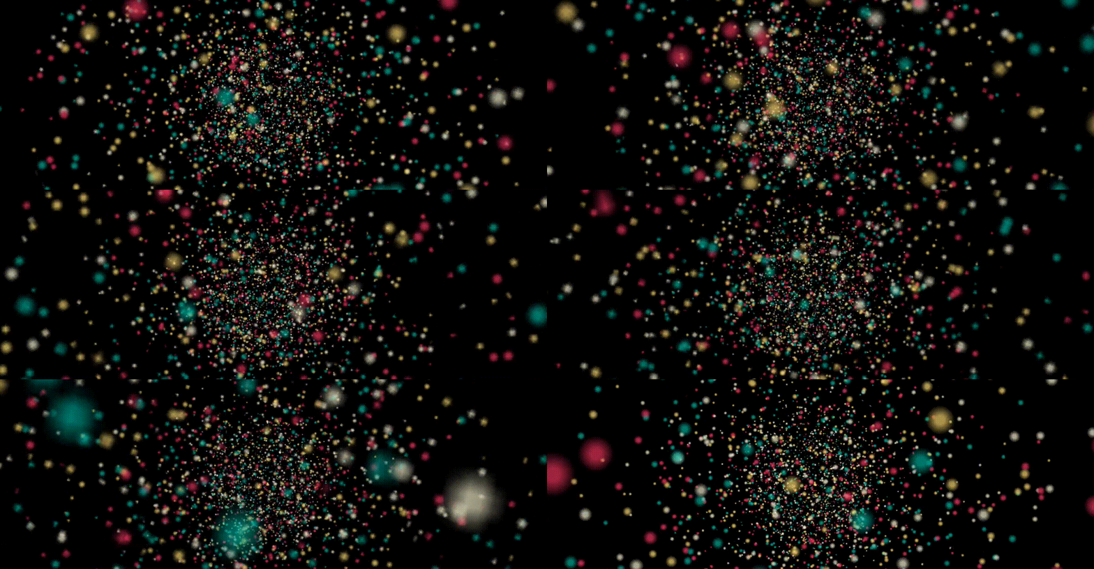
Let's see, at this point, instead of randomly positioning each particle, we use Perlin noise to distribute our particles:
Yes, in CSS Doodle, we can use@rn()instead of@r()to make random results associated based on the positional relationship of Grid items.
 <css-doodle grid="100x100">
    :doodle {
        @size: 100vw 100vmin;
        perspective: 10px;
    }
    :container {
        perspective: 100px;
        transform-style: preserve-3d;
    }
    position: absolute;
    top: 0;
    left: 0;
    width: 2px;
    height: 2px;
    border-radius: 50%;
    left: 50%;
    top: 50%;
    background: hsl(@rn(1, 255, 3), @rn(50%, 90%), @rn(50%, 90%));
    transform: scale(@rn(1, 10, 3)) translate3d(@rn(-50, 50, 3)vw, @rn(-50, 50, 3)vh, @rn(-100, 20)px);
</css-doodle>
In the 3D scene, we use Perlin noise to layout our particle system, so that there is a certain correlation between the colors and positioning between them. In itself, every random time is a wonderful painting, feel it:
Of course, it's not over yet, we're going to get them moving. What to add? In fact, adding anything is very NICE. Here, we try to make them move up and down regularly. Of course, we also need to use Perlin noise , so the complete code will become:
 <css-doodle grid="100x100">
    :doodle {
        @size: 100vw 100vmin;
        perspective: 10px;
    }
    :container {
        perspective: 50px;
        transform-style: preserve-3d;
    }
    position: absolute;
    top: 0;
    left: 0;
    width: 2px;
    height: 2px;
    border-radius: 50%;
    left: 50%;
    top: 50%;
    background: hsl(@rn(1, 255, 3), @rn(50%, 90%), @rn(50%, 90%));
    transform: scale(@rn(1, 10, 3)) translate3d(@rn(-50, 50, 3)vw, @rn(-50, 50, 3)vh, @rn(-100, 20)px);
    animation: move @rn(5, 15, 3)s infinite @rn(-20, -10, 3)s linear alternate;
    box-shadow: 0 0 1px #fff, 0 0 5px #fff;
    @keyframes move {
        100% {
            margin-top: 500px;
        }
    }
</css-doodle>
OK, what will it be like? let's see:
It can be seen that the particle effect generated by Perlin noise is more real and looks more sensual.
The complete code, you can click here: CSS Doodle - CSS Pattern Effect
Of course, after mastering this trick, we can try other animations that add other properties, then maybe we will get something like this:
The complete code, you can click here: CSS Doodle - CSS Pattern Effect
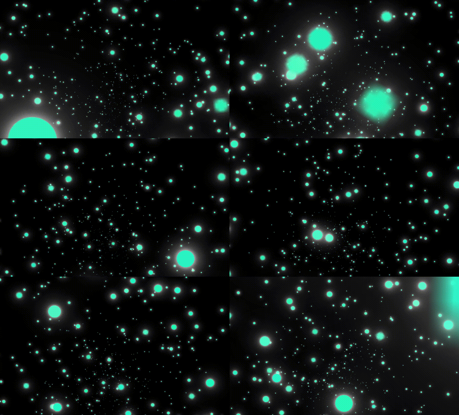
Or, we try to achieve another sense of time and space travel:
 <css-doodle grid="30x30">
    :doodle {
        @size: 100vw 100vmin;
    }
    :container {
        perspective: 500px;
        transform-style: preserve-3d;
        transform: rotate3d(@r(-1.5, 1.5), @r(-1.5, 1.5), @r(-1.5, 1.5), @r(0, 30)deg);
    }
    position: absolute;
    top: 0;
    left: 0;
    width: 2px;
    height: 2px;
    border-radius: 50%;
    top: @r(50, 50)%;
    left: @r(50, 50)%;
    background: hsl(@rn(160, 170, 3), @r(90%, 99%), @rn(50%, 70%));
    animation: move @r(5, 30)s infinite @r(-30, -15)s @p(linear, ease-in, ease-in-out);
    transform: scale(@rn(.1, 1)) rotate(0) translate3d(@r(-60vmin, 60vmin), @r(-60vmin, 60vmin), @r(-1500, -2000)px);
    box-shadow:
    0 0 0.5px #fff,
    0 0 2px #fff,
    0 0 5px #fff;
    @keyframes move {
        100% {
            transform: scale(10) rotate(1080deg) translate3d(0, 0, @r(710, 850)px);
        }
    }
</css-doodle>
The effect is as follows:
The complete code, you can click here: CSS Doodle - CSS Pattern Effect
The author of the CSS-Doodle library, Mr. Yuan Chuan, also has a lot of 3D particle animations, one of which is:
Full Code CSS Doodle - Seeding By yuanchuan
In fact, there are many properties suitable to be added to the entire particle system. This article is just a guide, and only tried a few properties in CSS. Yes, CSS can also achieve these cool particle motion effects. If you are also tempted, you might as well come down and try it yourself. I believe you will love CSS.
at last
This concludes this article, I hope it helps you :)
More wonderful CSS technical articles are summarized in my Github -- iCSS , which is continuously updated. Welcome to click a star to subscribe to the collection.
If you have any questions or suggestions, you can communicate more. Original articles are limited in writing and knowledge. If there are any inaccuracies in the article, please let me know.


**粗体** _斜体_ [链接](http://example.com) `代码` - 列表 > 引用。你还可以使用@来通知其他用户。