Wechat search [Great Relocation to the World], I will share with you the front-end industry trends, learning methods, etc. as soon as possible.
This article GitHub https://github.com/qq449245884/xiaozhi has been included, there are complete test sites, materials and my series of articles for interviews with first-line manufacturers.
If there is a text and a button, we want the text to stick on top and the button to stick to the bottom! It seems easy to do with CSS Flex.
 // HTML
<div className="layout">
  <p>Lorem ipsum dolor sit amet...</p>
  <button>Sign Up</button>
</div>

// CSS
.layout {
  display: flex;
  flex-direction: column;
  justify-content: space-between;
  min-height: 100vh;
}
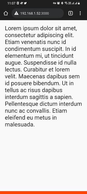
Check the effect on the real machine:
Cool! Git add, git commit, git push, oh yeah!
Is there anything wrong with this?
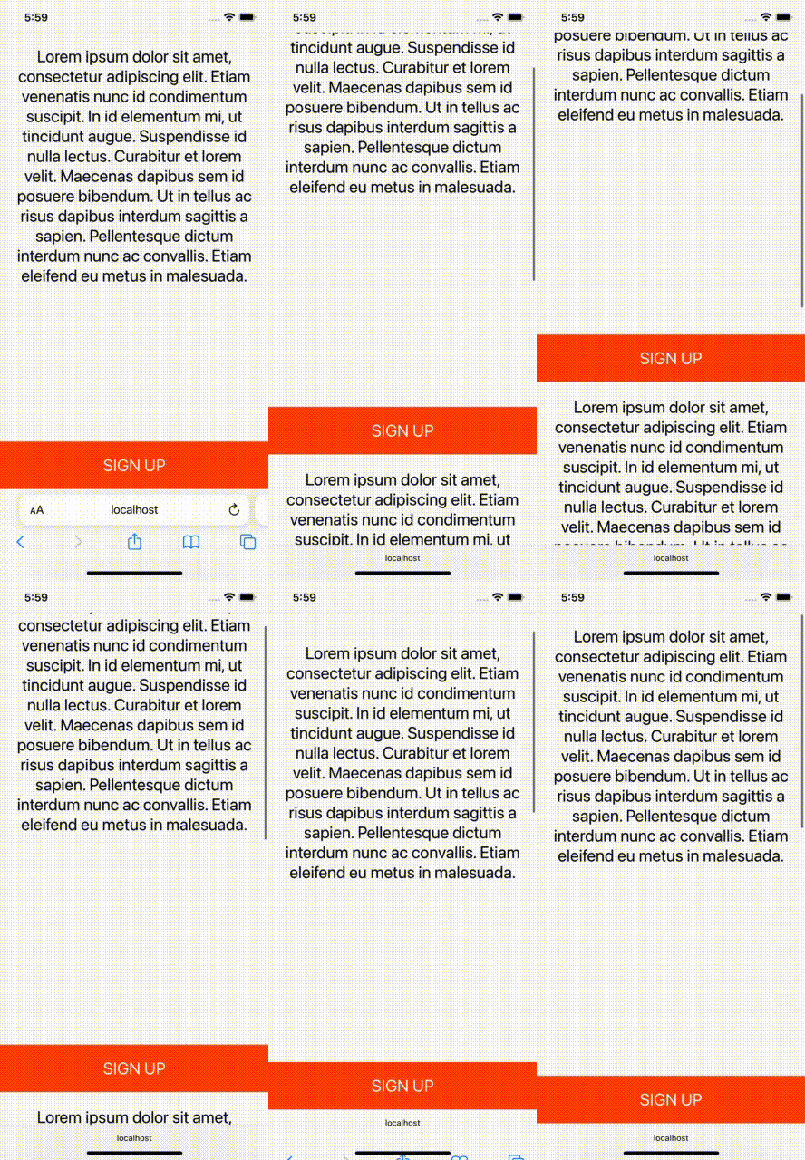
Of course, there is! To see this problem, you need to view your app on a real phone or emulator. Tested on the iPhone 13 (iOS 15.2) used in this article, here are the results:
What, where did the bottom button go?
By the way, it doesn't even work as expected on Android phones.
Why does the 100vh issue happen on mobile devices?
I did some research on this issue and found out why. The short answer is that the browser's toolbar height is not taken into account. If you want to dig into why this is happening, this Stack Overflow thread is helpful.
How to fix 100vh issue on mobile?
The first suggestion is to use as little vh as possible. For example, in the code above, you can use a sticky button and avoid using vh units.
 // HTML
<div className="layout">
  <p>Lorem ipsum dolor sit amet...</p>
  <button>Sign Up</button>
</div>

// CSS
.layout {
  display: flex;
  flex-direction: column;
  justify-content: space-between;
  min-height: 100vh;
}
.layout button {
  position: sticky;
  bottom: 0;
}
Effect:
It also works fine in landscape mode:
To be honest, the result is good, but you can't always solve the problem of 100vh with the sticky element.
Fix 100VH issue on mobile using only CSS
, the purpose of using vh is to simply create sections equal to the height of the viewport. This is common when you are building landing pages, for example. In these cases, position sticky will not help, here is the fill-available attribute. It's easy to use, just remember to use the prefix and fallback value.
 .layout {
  min-height: 100vh;            /* fall-back */
  min-height: -moz-available;
  min-height: -webkit-fill-available;
  min-height: fill-available;
}
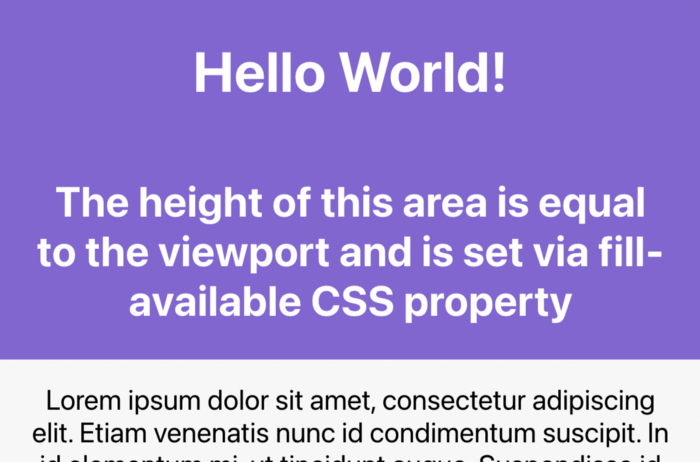
Effect:
Also, when you rotate the device, it also updates the height, which is great!
Fixing the 100vh problem with fill-available was really straight forward, but I ran into some issues while investigating this solution.
1. HTML type declaration problem
The page has a <!DOCTYPE html> statement that will make fill-available not work properly on Chrome.
doesn't even work on android browsers:
So, to fix this, the doctype statement had to be removed from the page.
2. Vertical padding issue on Safari
min-height ( height ) fill-available的元素上添加垂直padding (bottom 和top),Safari浏览器上会导致Problem, the height will not be correct.
To fix this, just wrap your content inside another div element and you're done:
 // HTML
<div class="screen">
  <div class="content">
    ...
  </div>
</div>

// CSS
.screen {
  background-color: mediumpurple;
  min-height: 100vh;
  min-height: -moz-available;
  min-height: -webkit-fill-available;
  min-height: fill-available;
}
.content {
  color: #fff;
  display: flex;
  flex-direction: column;
  justify-content: center;
  height: 100%;
  padding: 30px;
}
3. fill-available cannot be used with calc()
One thing to note is that ---06c7cb75d510d8b49287c45bcc15747e--- cannot be used under the calc() fill-available attribute. Therefore, the following CSS rules will not take effect:
min-height: calc(-webkit-fill-available / 2);For example, if you need to have half the available height on the element, you must use JavaScript.
Fix 100vh issue on mobile with JavaScript
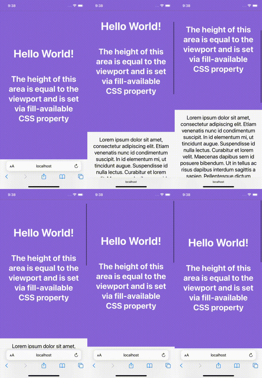
You can use the innerHeight attribute of the window to set the element height (or minHeight ) to window.innerHeight as follows:
 <!DOCTYPE html>
<html lang="en">
<head>
  <style>
    ...
  </style>
</head>
<body>
<div id="intro">
  <h1>Hello World!</h1>
  <h2>The height of this area is equal to...</h2>
</div>
...
<script>
  (function () {
    const el = document.getElementById('intro');
    el.style.minHeight = window.innerHeight + 'px';
  })();
</script>
</body>
</html>
Effect:
Next, another way to spend is introduced. Some developers like to define a CSS variable based on the inner height of the window and use that variable to design the elements they need. code show as below:
 // 以像素为单位计算1vh值
// 基于窗口的内部高度
var vh = window.innerHeight * 0.01;

//  将CSS变量设置为根元素
// 相当于1vh
document.documentElement.style.setProperty('--vh', vh + 'px');
In CSS:
min-height: calc(var(--vh) * 100);The last thing is to recalculate this value when the window is resized or the device orientation is changed:
 function calculateVh() {
  var vh = window.innerHeight * 0.01;
  document.documentElement.style.setProperty('--vh', vh + 'px');
}

// 初始计算
calculateVh();

// 调整大小时重新计算
window.addEventListener('resize', calculateVh);

// 在设备方向改变时重新计算
window.addEventListener('orientationchange', calculateVh);
In my opinion, you should start with a CSS solution.
The bugs that may exist after the code is deployed cannot be known in real time. In order to solve these bugs afterwards, a lot of time is spent on log debugging. By the way, I recommend a useful bug monitoring tool , Fundebug .
Author: Mehdi Namvar Translator: Front-end Xiaozhi Source: mediun
Original: https://ilxanlar.mdium.com/you-shouldnt-relyon-css-100vh-and-here-s-why-1b4721e74487
comminicate
If you have dreams and dry goods, you can search for [Great Move to the World] on WeChat and pay attention to this Shawanzhi who is still washing dishes in the early hours of the morning.
This article GitHub https://github.com/qq449245884/xiaozhi has been included, there are complete test sites, materials and my series of articles for interviews with first-line manufacturers.


**粗体** _斜体_ [链接](http://example.com) `代码` - 列表 > 引用。你还可以使用@来通知其他用户。