Author: Matt Maribojoc
Translator: Frontend Xiaozhi
Source: stackabuse
If you have dreams and dry goods, search on [Moving to the World] attention to this brushing wit who is still doing dishes in the early morning.This article GitHub https://github.com/qq449245884/xiaozhi has been included, the first-line interview complete test site, information and my series of articles.
One way to prevent people from leaving our website is to add visual feedback to let them know that our page is loading and not broken. The visual feedback also attracts people's attention, so the waiting time seems to be much shorter than that of a static screen.
Whether adding fine-tuning animations or adding actual progress bars, providing beautiful visual elements can improve the performance of the website and make the visitor experience better.
For Vue developers, there are a lot of similar libraries for us to use.
In this article, share 6 of my favorites.
1. Vue Simple Spinner
github: https://dzwillia.github.io/vue-simple-spinner/examples/
As the name suggests, this is a very simple component, but still very powerful. Vue Simple Spinner provides a customizable loading style. Using props, we can control the corresponding style:
- Size
- Background and foreground colors
- Speed
- Label Text
- Much more…
Installation command:
npm install vue-simple-spinner --save. Then, import it into the component, declare it in the template, and then change the required props:
<template>
   <vue-simple-spinner size="medium" />
</template>
<script>
import VueSimpleSpinner from 'vue-simple-spinner'
export default {
   components: {
      VueSimpleSpinner
   }
}
The effect is as follows:
2. Vue Radial Progress
github address: https://github.com/wyzantinc/vue-radial-progress
If you want a real progress bar instead of a rotating animation, Vue Radial Progress is a great library.
Vue Radial Progress can set the number of steps and the step the user is currently in in the progress bar. Then, fill a certain percentage of the progress bar based on the amount completed.
With smooth animation, customizable functions, and an SVG-based filling system, this library will be very powerful when you have an asynchronous process with multiple discrete steps.
installation:
npm install --save vue-radial-progressIn addition, the library uses component slots to make it easy to add text inside the circle
<template>
  <radial-progress-bar :diameter="200"
                       :completed-steps="completedSteps"
                       :total-steps="totalSteps">
   <p>Total steps: {{ totalSteps }}</p>
   <p>Completed steps: {{ completedSteps }}</p>
  </radial-progress-bar>
</template>

<script>
import RadialProgressBar from 'vue-radial-progress'

export default {
  data () {
    return {
      completedSteps: 0,
      totalSteps: 10
    }
  },

  components: {
    RadialProgressBar
  }
}
</script>
3.Vue Loading Overlay
github: https://github.com/ankurk91/vue-loading-overlay
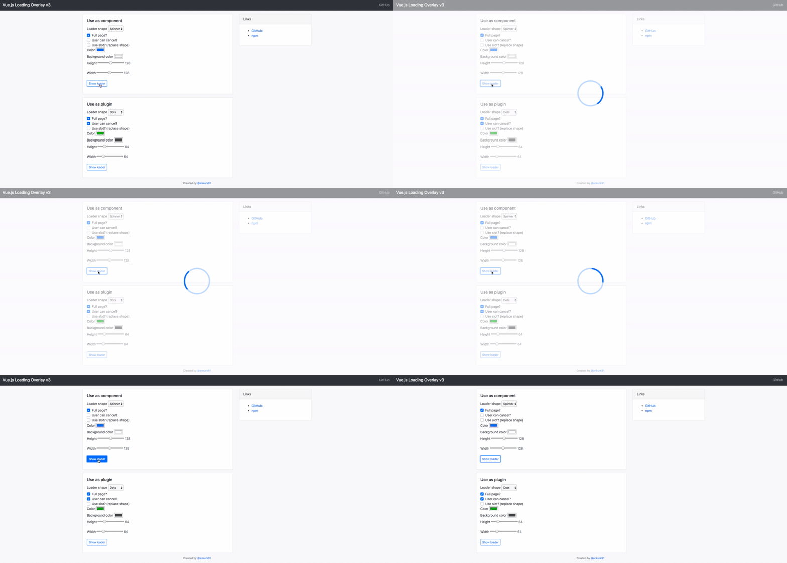
Vue Loading Overlay is an ideal solution for full screen loading components. For example, this library is useful if the application contains some kind of dashboard and you want to wait until all the data is loaded before letting the user click around.
Another useful feature of this library is that when loading, the user clicks on the mask to cancel the loading, and trigger an event, we can use the event to cancel any running tasks.
Adding this feature allows users to decide for themselves when tasks take too long to load and exit. This means they do not have to leave the page.
Installation command:
npm install --save vue-loading-overlayThe following is an example of using Loading Overlay library:
<template>
    <div class="vld-parent">
        <loading :active.sync="isLoading"
        :can-cancel="true"
        :on-cancel="onCancel"
        :is-full-page="fullPage"></loading>

        <label><input type="checkbox" v-model="fullPage">Full page?</label>
        <button @click.prevent="doAjax">fetch Data</button>
    </div>
</template>

<script>
    // Import component
    import Loading from 'vue-loading-overlay';
    // Import stylesheet
    import 'vue-loading-overlay/dist/vue-loading.css';

    export default {
        data() {
            return {
                isLoading: false,
                fullPage: true
            }
        },
        components: {
            Loading
        },
        methods: {
            doAjax() {
                this.isLoading = true;
                // simulate AJAX
                setTimeout(() => {
                  this.isLoading = false
                },5000)
            },
            onCancel() {
              console.log('User cancelled the loader.')
            }
        }
    }
</script>
4. Vue Progress Path
github address: https://github.com/Akryum/vue-progress-path
Vue Progress Path is one of the most popular loading libraries. Created by Guillaume Chau, a member of the Vue Core team, this is one of my favorite tools.
Using SVG, Vue Progress Path will create a shaped progress bar. It comes with several built-in shapes, but the most powerful feature is the ability to deliver our own SVG shapes-which means unlimited possibilities.
Use npm i --save vue-progress-path to add it to the project, and then use to add the file globally to the src/main.js file.
import 'vue-progress-path/dist/vue-progress-path.css'
import VueProgress from 'vue-progress-path'

Vue.use(VueProgress, {
  // defaultShape: 'circle',
})
Now, let's see how to add a progress path to the component.
<loading-progress
  :progress="progress"
  :indeterminate="indeterminate"
  :counter-clockwise="counterClockwise"
  :hide-background="hideBackground"
  shape="semicircle"
  size="64"
/>
There is also a good place in this library. You don't need to pass props to change the style. You can edit the style directly with CSS code:
.vue-progress-path path {
  stroke-width: 12;
}

.vue-progress-path .progress {
  stroke: red;
}
5. Vue Loading Button
github address: https://github.com/shwilliam/vue-loading-button
Vue Loading Button is a simple and effective way to show the user that some content is loading.
All it does is add a spinner animation when the button is clicked. But with smooth animation, it can create a seamless appearance and make the website popular.
installation:
npm install --save vue-loading-buttonExample:
<template>
   <VueLoadingButton aria-label='Send message' />
</template>
<script>
import VueLoadingButton from 'vue-loading-button'

export default {
  components: {
    VueLoadingButton,
  }
}
</script>
6. TB Skeleton
github address: https://github.com/anthinkingcoder/tb-skeleton
TBSkeleton's experience is very good. However, this requires quite cumbersome code and reasonable planning elements.
I think the best way to understand this is to write an example.
First, use npm install --save tb-skeleton install. Then, add the following content to the src/main.js file.
import skeleton from 'tb-skeleton'
import  'tb-skeleton/dist/skeleton.css'
Vue.use(skeleton)
Below is an example of a skeleton component from the TBSkeleton document.
<template>
  <div>
    <skeleton :theme="opacity" :shape="radius" :bg-color="#dcdbdc">
     <tb-skeleton  width="30%" :aspect-ratio="1"  :shape="circle" bg-color="#eee"></tb-skeleton>
     <tb-skeleton  width="30%" :aspect-ratio=".3"></tb-skeleton>
     <tb-skeleton  width="30%" :aspect-ratio=".3"></tb-skeleton>
   </skeleton>
  </div>
</template>
<script>
  import {TbSkeleton,Skeleton} from 'tb-skeleton'
  export default {
    components: {
      TbSkeleton,
      Skeleton
    }
  }
</script>
As you can see above, if you want to use this library, it takes some time and cost, but it can be used in some requirements that require an excellent user experience.
~ Finished, I’m Shuawanzhi, I’m going to do it, see you in the next issue~
possible bugs after 160a30a922d5e0 code deployment cannot be known in real time. In order to solve these bugs afterwards, a lot of time was spent on log debugging. By the way, I would like to recommend a useful BUG monitoring tool Fundebug .
Original: https://learnv.co/2020/02/6-vue-loader-animaon-libraries-to-reduce-your-bou
communicate with
If you have dreams and dry goods, search on [Daily Move to the World] Follow this brushing wit who is still doing dishes in the early morning.This article GitHub https://github.com/qq449245884/xiaozhi has been included, the first-line interview complete test site, information and my series of articles.


**粗体** _斜体_ [链接](http://example.com) `代码` - 列表 > 引用。你还可以使用@来通知其他用户。