The following content is the basics of css (1)
1. How to solve the problem that the hover event becomes invalid after a mark is clicked?
Change the order of the CSS attributes of the a tag:
(Love and hate principle) link -> visited -> hover -> active
- a:link: unvisited style
- a:visited: visited style
- a: hover: the style when the mouse is moved up
- a:active: the style of mouse press
Write it like this:
It can solve the problem of a:link style being covered by a:visited style.
In CSS, if the same element is defined for different conditions, it is appropriate to put the most general conditions on the top and down in order to ensure that the bottom is the most special condition (which can be understood as style coverage).
In this way, when the browser displays the element, it will verify the conditions from the special to the general, step by step.
for example:
I want the color of unvisited links to be blue, floating links to green, and visited links to red:
first case: the order I defined is a:visited-red, a:hover-green, a:link:blue, then you will find: when you put the mouse on the unvisited blue link, It does not turn green, only when it is placed on the red link that has been visited, the link will turn green.
The second case: I adjusted the CSS definition order to: a:link, a:visited, a:hover, at this time, no matter whether the link you mouse over has been visited or not, it will turn green.
This is because a link passed by a mouse has two attributes of a:link、a:hover at the same time.
- In the first case, a:link is the closest to it, so it first satisfies having a:link in [a:link, a:hover] at the same time, and abandons the repeated definition of a:hover (hover style is covered by link Up).
- In the second case, whether the link has been visited or not, it must first check whether it meets the standard of a:hover (that is, whether there is a mouse passing over it). If it is satisfied, it will turn green. If it is not satisfied, it will continue to search upwards. Until a definition that satisfies the conditions is found.
kinky skills-remember the correct order : (lvha) ==> LV OK (take the first letter)
2. Responsive layout
From the current situation, there are fewer scenarios where pc and h5 use a set of responsive codes. Most of them are pc and h5 each maintain a set of codes.
1. Use CSS3 media query @media to query
@media screen and (max-width:980px ) {
 body{
 background-color: red;
 }
}
2.flex layout
The flexbox layout model is a new layout method proposed in the css3 specification.
Purpose : Provide a more efficient way to lay out, align, and allocate space for items in the container
Advantage : This layout mode has been supported by mainstream browsers and can be used in web application development.
3. Flex layout
Flex (Flexible Box) layout is called "flexible layout", which can provide maximum flexibility for the layout of web pages, instead of the usual float layout, and any container can set the Flex layout.
Note : After setting the Flex layout, the Float layout of the child elements will be invalid
3-1 Four Concepts in Flex
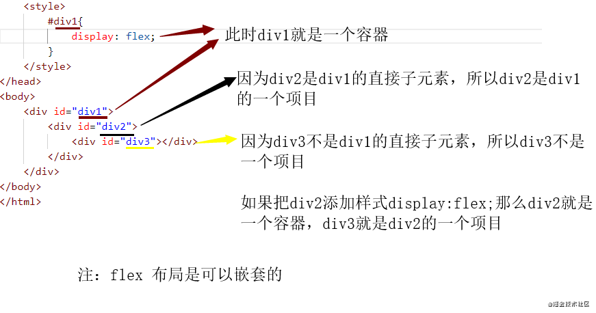
- container : If you add display: flex; to a label, then the label is a container
- item : The direct child element in the container is called the item (it must be a direct child element)
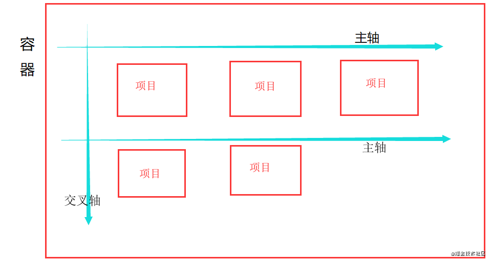
- Spindle : The default sorting direction of items is the spindle (the default arrangement is horizontal, and a container can have multiple spindles)
- cross axis : the axis perpendicular to the main axis is the cross axis
Figure 1
Figure 2
3-2 Properties of the container
- Flex-direction
attribute determines the direction of the 160a520fa5f9e2 main axis - Flex-wrap - Attributes determine how to
shorthand for flex-direction and flex-wrap- justify-content -
horizontal alignment - align-items -
vertical alignment - align-content - determines the
multiple spindles 160a520fa5fa76
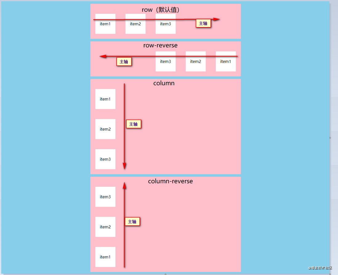
1. Flex-direction (the attribute determines the direction of the main axis)
- row (default value): The main axis is horizontal, and the starting point is at the left end of
- row-reverse: The main axis is in the horizontal direction, and the starting point is at the right end of
- column: The main axis is in the vertical direction, and the starting point is at the upper end of
- column-reverse: The main axis is in the vertical direction, and the starting point is at the lower end of
2.Flex-wrap (attributes determine how to wrap when items cannot be lined up)
- norwrap (default): do not wrap
- wrap: wrap, the first line is at the top
- wrap-reverse: wrap, the first line is below
3. Flex-flow (attributes are shorthand for flex-direction and flex-wrap)
- flex-flow: flex-direction || flex-wrap;
4.justify-content (along the main axis-generally horizontal alignment)
- flex-start; (default value), items are aligned to the left
- flex-end: align items to the right
- center: center alignment
- space-between: the items are aligned at both ends, and the space between the items is equal
- space-around: equal intervals on both sides of each item
5.align-items (attributes determine how items are aligned on the cross axis-generally vertical alignment)
- flex-start from top to bottom
- flex-end from bottom to top
- center squeezed together and displayed in the center
- stretch stretch (when setting stretch this property, you can not set the height and baseline alignment for the child elements)
Note: You must set the height of the current container to work
6. align-content (the attribute determines the alignment of multiple spindles)
- stretch (default): the axis occupies the entire cross axis
- flex-start: align with the starting point of the cross axis
- flex-end: align with the end of the cross axis
- center: align with the midpoint of the cross axis
- space-between: align with both ends of the cross axis, and the space between the axes is divided equally
- space-around: the space on both sides of each axis is equal
3-3 Project Properties
Project properties
- order
- flex-grow
- flex-shrink
- flex-basis
- flex
- align-self
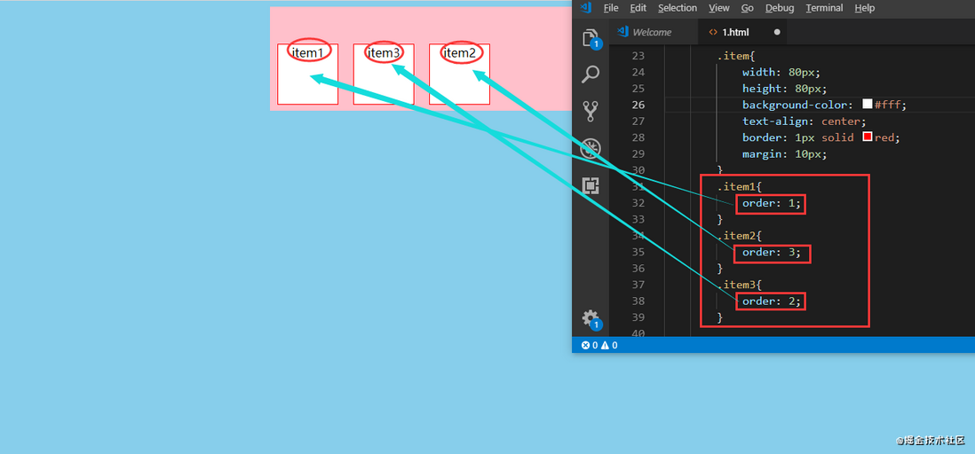
(1) order (the attribute defines the order of the items. The smaller the value, the higher the arrangement, the default is 0)
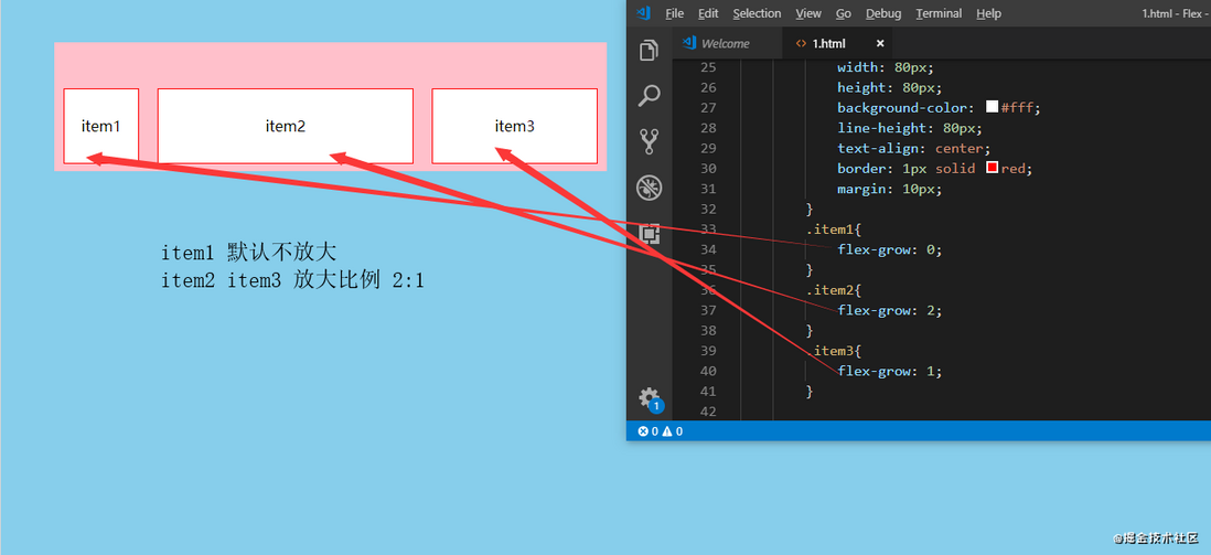
(2) flex-grow (the property defines the zoom ratio of the item, the default is 0, that is, if there is remaining space, it will not zoom)
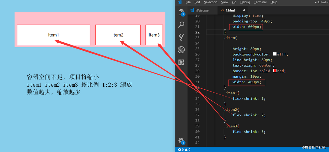
(3) flex-shrink (the attribute defines the reduction ratio of the item, the default is 1, that is, if the space is insufficient, the item will shrink)
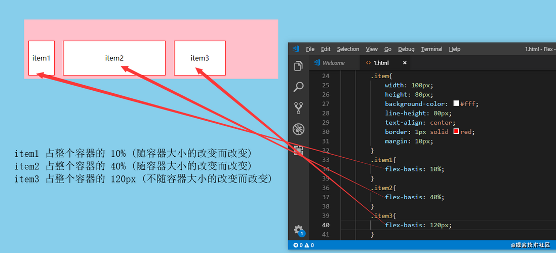
(4) flex-basis (the property defines the main axis space occupied by the item before the extra space is allocated. The browser calculates whether the main axis has extra space based on this property. Its default value is auto, which is the original size of the item, or it can be Set xx px, the project will occupy a fixed space)
(5) flex (attributes are shorthand for flex-grow, flex-shrink and flex-basis, the default value is 0 1 auto. The latter two attributes are optional)
flex: none | [ <'flex-grow'> <'flex-shrink'>? || <'flex-basis'> ];
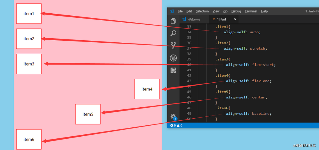
(6) align-self (the attribute allows a single item to have a different alignment from other items, and can override the align-items attribute. The default value is auto, which means inheriting the align-items attribute of the parent element. If there is no parent element, it is equivalent On stretch)
align-self: auto | stretch | flex-start | flex-end | center | baseline;
4. Ways to make the element disappear
- visibility: hidden The element is hidden, but
will not change the layout of the, butwill not triggerevent that the element has been bound to - Run the display: none the hidden elements, and will
change the pagelayout, can be understood as to the pagethe element deleted - z-index=-1 the element, and
will not change the layout of the, it can be understood that other elementspressed underneath - opacity: 0 , the element is hidden, but
will not change the layout of the, and if the element has been bound to some events, such as the click eventcan also be triggered, often used to set the image opacity to 0, and then Add a click event, click to upload the file - position: absolute ; Set a large negative value for the left position, so that the element is positioned outside the visible
area; - transform: scale(0) ; Set an element to
zoom infinitely small, the element will not be visible, and the original position of the element will be retained; - <div hidden="hidden"> HTML5 attribute, the effect is the same as display: none;, but this attribute is used to record the state of an element;
- height: 0 ; Set the element height to 0 and eliminate the border;
- filter: blur(0) ; CSS3 property, the larger the value in parentheses, the greater the degree of Gaussian blur of the image, and reaching a certain level can make the image blur
kinky tricks : hide outside the transparent area, zoom and hold the height 0
What is the difference between rgba and opacity transparency :
- rgba() only acts on the
color or background color of the element itself,has no effect on the content of the element. - While opacity acts on the color or background color of the element itself, it also acts on the transparency of the content within the element.
5. css box model
In css, there are two box models, which can be switched by box-sizing:
- When set to content-box , it belongs to the
standard box model. When setting the width and height,only contains content, not padding and border; - When set to border-box , it belongs to the
IE box model. When setting the width and height,includes content, padding and border.
- Standard (W3C) box model: width =
content width (content) + border + padding + margin - Low version IE box model: width =
content width (content + border + padding) + margin
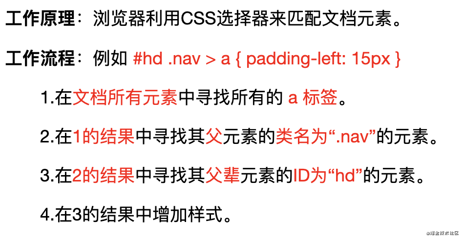
6. How to parse the selector
Style system starts from the key selector, right to left to find , if the situation does not appear to match the rules will give up, otherwise they will be left until the match is completed.
Therefore, when writing styles, you should try to choose ID selector or class selector as the key selector, and reduces the level of styles and reduces consumption.
7. Selector
7-1 Selector classification
- id selector (#myid)
- Class selector (.myclass)
- Tag selector (div, h1, p)
- Wildcard selector (*)
- Adjacent selector (h1 + p)
- Child selector (ul> li)
- Descendant selector (li a)
- Attribute selector (a[rel="external"])
- Pseudo-class selector (:link, :visited, :active, :hover, :before, :after)
7-2 Selector priority
| Selector category | Description | Weights | Weight |
|---|---|---|---|
| !important | Mandatory use of this style | Highest weight | Highest weight |
| Inline style | style = "" | (1.0.0.0) | 1000 |
| id selector | #id | (0.1.0.0) | 100 |
| Class selector | .id | (0.0.1.0) | 10 |
| Element selector | div | (0.0.0.1) | 1 |
Wildcard> Inheritance> Browser Default
7-3 New pseudo-classes in css3
:first-child matches the first child element in the parent element
E:first-child It means : as long as the E element is the first child element of its parent, select it. It needs to meettwo conditions, one isfirst child, and the other isthis child element is exactly E.
following 2 interpretations are all wrong :- Misunderstanding 1: Think that E:first-child selects the first child element of the E element.
- Misunderstanding 2: Think that E:first-child selects the first E element of the parent element of the E element.
- :last-child matches the last child element in the parent element
:nth-child(n) matches the nth child element in the parent element (n can be a number, a keyword, or a formula)
- Select all rows for parameter n
- When the parameter is n+i, it means that all the items below from the i-th row are selected, such as n+3, all the items below are selected from the third row
- When the parameter is -n+i, it means the first i elements are selected, for example -n+6 means the first 6 elements are selected
- 2n indicates that the multiple of 2 rows are selected, and the even rows are selected
- 2n+1 means to select odd rows
- 3n means that every 3 rows are selected once
- odd means odd, even means even
- :nth-last-child(n) matches the nth sibling element from the bottom
- :nth-of-type(n) matches the nth sibling element of the same type
- :root root element
- :not(selector)
7-4 How does the selector work?
Query from right to left
8. The difference between pseudo-classes and pseudo-elements
Both are describing things that are not in the text flow.
- Wherein a pseudo-class
represents a single colon, when the element is in a certainstate, is added for the elementstyle, such as hover a tag; - Pseudo-elements with
represents a double colon, for compatibility with older browsers, sometimes represented by a single colon, the role iscreated not in the text flowelements, and add style, such as :: before, before the specified element Add elements.
9. BFC
BFC refers to formatting context
9-1 When an element forms BFC:
- The layout of its internal elements will not affect external elements
- The layout of external elements does not affect internal elements.
9-2 How to form BFC
- Root element
- Floating elements: float values other than none
- Absolutely positioned elements: position (absolute, fixed)
- display is inline-block, table-cells, flex
- Table element
- overflow Values other than visible (hidden, auto, scroll) [most commonly used]
9-3 Principles of BFC/Layout Rules of BFC
- The sub-elements inside the BFC, in the vertical
, the margins will overlap. - BFC is a separate
in the page, and the outer elements will not affect the inner elements, and vice versa. - The BFC area does not overlap with the float box area next to it. (It can be used to remove the impact of floating).
- When calculating the height of the BFC, the floating
also participates in the calculation.
9-4 Application of BFC
- Solve margin overlap
- When the margin overlaps between the parent element and the child element, the solution: create a BFC for the child element or the parent element
- BFC area does not overlap with float area
- Clear float
10. Positioning
10-1 Basic meaning
- For relative positioning, set the position of the element to relative, and the element is positioned relative to the content box of
itselfstill occupies the original space of; - Absolute positioning, set the position of the element to absolute, and position the element relative to the padding box of the ancestor element
first positionnot static. Element 160a520fa615c0 does not occupy the original positionspace; - Fixed positioning, set the position of the element to fixed, the element is positioned relative to the top of the
browser window,does not occupy the original position space
10-2 Horizontally centered
general scheme :
elements: the parent element is a block-level element, set text-align:center to the parent element, and the parent element is not a block-level element, first set the parent element to a block-level element, and then set text-align:center to the parent elementpictureclear:both; display:block; margin:autoto the picture;
detailed plan :
Option 1:- Set the width, whoever needs to be centered, set
margin:0 auto; - The width is variable. The default width of the child element is the same as the width of the parent element. Set the child element
display:inline-block; ordisplay:inlineto convert it into an inline block element/inline element, and settext-align:center
- Set the width, whoever needs to be centered, set
Plan two: use positioning attributes- Set the absolute positioning of the child element, and set the relative positioning of the parent element,
left: 50%; margin-left: 50px(half the width of the child element-fixed width), ortransform: translateX(-50%)(variable width)
- Set the absolute positioning of the child element, and set the relative positioning of the parent element,
plan three: use flexbox layout to achieve (the width may vary)- Parent element set
display: flex; justify-content: center;
- Parent element set
10-3 Vertically centered
- Single-line inline elements: set
line height = the height of the parent element - Multi-line inline elements: parent element set
display:table-cell; vertical-align:middle(line level, block level, picture are all killed) Block-level elements:
- Solution 1: Set the absolute positioning of the child element, set the relative positioning of the parent element, set the child element: top: 50% and
margin-top: half the height of the child element (height fixed), ortransform:translateY(-50%); (height variable) - Solution two: flex layout, set
display:flex; align-items:centerto the parent element; (line level, block level, image are all killed)
- Solution 1: Set the absolute positioning of the child element, set the relative positioning of the parent element, set the child element: top: 50% and
10-4 Horizontal and vertical centering
known height and width
- Solution 1: Set the absolute positioning of the child element, set the relative positioning of the parent element, and set the child element
left:0; right:0; top:0; bottom:0; margin:auto - Solution 2: Set the absolute positioning of the child element, set the relative positioning of the parent element, and set the child element to 160a520fa61be7 top:50%;left:50% (the upper left corner is centered vertically), margin-top:
-Half the width of the child element
element with unknown height and width
- Solution 1: (Positioning attribute) Set absolute positioning for child elements, set relative positioning for parent elements, set child elements
top:50%;left:50%(upper left corner vertically centered),transform:translate(-50%,-50%)(offset according to its own positioning) - Option 2: (flex layout) parent element definition
display:flex; justify-content:center; align-items:center;
10-4 float
clear float :
- The parent box defines
height (height); - After the last floating element
add a divempty tag, and add the styleclear: both; - Add style
overflowparent tag containing floating elements as hidden/both; - The parent div defines
zoom;
best way :
clearfix:after{/*伪元素是行内元素 正常浏览器清除浮动方法*/
        content: "";
        display: block;
        height: 0;
        clear:both;
        visibility: hidden;
So, what is the role of clear:both;? ? ?
- clear is a positioning property in CSS, which specifies which side of the element does not allow other elements to float. Then clear: both means that elements are not allowed to float on the left and right sides.
- The clear attribute can only work on block-level elements. This is the function of clearing the display: block in the floating style.
- In addition,
visibility: hidden; height: 0; As long as the value of content is empty, it doesn't matter whether it is written or not.
11. Layout
11-1 Fixed width on both sides, adaptive in the middle
float, set the left float on the left side and set the right float on the right side. The middle will automatically adapt.Absolute positioning The left side is set to absolute positioning, left: 0px. The right is set to absolute positioning, right: 0px. Set absolute positioning in the middle, and both left and right are 300px. The width in the middle will be adaptive.flexbox layout, set the container in the left, middle, and right to display: flex, set the width on both sides, and then let the middle flex = 1.table layout, set the width of the entire container to 100%, set the three parts to be tables (display: table-cell), and then set the left cell to 300px and the right cell to 300px. The cell in the middle will adapt.Grid layout grid set the container to a grid layout with a width of 100%, set the grid to three columns, and set the width of each column.
12. Margin overlap
Rules for overlapping margins
- When the two margins
are both positive, take the maximum of the two; - When the margin
are all negative values, take the one with the larger absolute value, and then shift from the 0 position in the negative direction; - When
is positive and negative, first take out the largest absolute value in the negative margin, and then add it to the largest margin in the positive margin value, that is, take the absolute value of the sum
There are four main solutions for margin overlap:
- adjacent sibling elements margin-bottom and margin-top overlap . You can set one of them as BFC;
- parent-child element margin-top overlap . You can add border-top | padding-top to the parent element to separate parent and child elements, or set the parent element to BFC;
- parent element height auto, parent-child element margin-bottom overlap , in the second case solution, you can also set height, min-height, max-height for the parent element;
- margin-top and margin-bottom of the element without content overlap . You can set border | padding | height for the element
13. Draw a triangle with css
.triangle {
  width: 0;
  height: 0;
  border-width: 100px;
  border-style: solid;
  border-color: tomato transparent transparent transparent;  //3边透明,一边不透明
}
strange tricks-remember the number of transparent borders : 3 dots and a line (a total of 4 lines, 3 of them become dots, that is, they become transparent, and the other side is still a line, that is opaque)
14. Achieve single-line and multi-line text overflow and add ellipsis
- Single line overflow:
p {
  overflow: hidden;
  text-overflow: ellipsis;
  white-space: nowrap;
}- Multi-line overflow:
overflow: hidden;
display: -webkit-box;
-webkit-box-orient: vertical;
-webkit-line-clamp: 3;  //3行溢出
15. Common units
- px: absolute unit, the page is displayed in precise pixels
- em: relative unit, the reference point is the font size of the parent node. If the font-size is defined by itself (the browser default font is 16px), 1em is not a fixed value in the entire page
- rem: relative unit, can be understood as "root em", calculated relative to the font size of the root node html, CSS3 new attributes, chrome/firefox/IE9+ support
- vw: viewpoint width, the width of the window, 1vw is equal to 1% of the width of the window
- vh: viewpoint height, the height of the window, 1vh is equal to 1% of the height of the window
- vmin: the smaller of vw and vh
- vmax: the larger of vw and vh
- %:percentage
16. What properties of CSS can be inherited?
Font family attributes: such as font, font-family, font-size, font-weight, font-styleText series attributes: such as color, text-indent (text indent), text-align (text horizontal alignment), line-height, word-spacing (word spacing)- Element
visibility: visibility Table layout attributes: caption-side, border-collapse, border-spacing, empty-cells, table-layoutList attributes: list-style-type, list-style-image, list-style-position
17. What are the new features of CSS3?
- Selector (E:last-child matches the last child element E of the parent element.);
- Rounded corners (border-raduis);
- Multi-column layout;
- Shadow (shadow) and reflection (reflect);
- Text effects (text-shadow);
- Text rendering (text-decoration);
- Linear gradient (gradient);
- Rotate (rotate) / zoom (scale) / tilt (skew) / move (translate);
- Media inquiries (@media);
- RGBA and transparency;
- @font-face attribute;
- Multiple background images;
- Box size;
strange tricks : media query box model, rotating rounded corners (gradient) shadow
18. Why initialize CSS styles?
Because of the browser’s compatibility issue, different browsers have different default values of tag. If the browser’s CSS is not initialized, it will cause differences in the display of the same page in different browsers.
19. What are the ways to optimize CSS and improve performance?
- Multiple css can be combined, and minimize http requests
- When the attribute value is 0, no unit is added (margin: 0)
- Put the css file on the top of the page (CSS will block rendering, the browser will not render any processed content until the CSS file request, download, and parsing are completed. If you place it below, when the html structure is rendered, it will be parsed css, it will re-render again, causing the page to flicker)
- Avoid descendant selectors and avoid chain selectors that are too long
- Use compact syntax (margin: 8px 6px 7px 5px;)
- Use semantic naming for easy maintenance (belonging to optimization)
- Use as little as possible! Impotrant, you can choose other selectors
- Follow the box model rules
skills : merge abbreviations to shorten the chain, and semantics follow the box model
20. What is the difference between reflow (reflow) and redraw?
reflow (rearrangement) , reflow: When part (or all) of the render tree changes due to the element size , layout, hidden, etc., it needs to be rebuilt;
repaint : When some elements in the render tree need to update attributes, and these attributes only affect the appearance of the , style, and does not affect the layout, it is called repaint, such as color change, etc. .
Note: Each page needs to trigger at least one rearrangement + redraw, and rearrangement (reflow) will redraw.
Conditions that trigger rearrangement (reflow):
- Add or delete visible dom elements;
- The position of the element has changed;
- The size of the element has changed, for example, the margins, width and height and other geometric properties have changed;
- Content changes, such as picture size, font size change, etc.;
- Page rendering initialization;
- The size of the browser window changes, such as when the resize event occurs;
skills : Reflow is understood as flow, and flow will naturally cause changes in layout; redrawing can be understood as surface painting, so it is just a change in appearance.
21. What is the difference between border:none and border:0?
first is the performance difference :
- {border: 0;}: Set the border to 0 pixels. Although it is not visible on the page, it is understood according to the default value of
. The browser still renders the border-width/border-color, which is already occupied byMemory value - {border: none;} is understood as border-style: none. boder:0; renders one more border-width:0
, which is why the performance ofis higher than border:0;
compatibility difference :
{border:none;} When the border is "none", it seems to be invalid for IE6/7, and the border still exists. When the border is "0", all browsers will hide the border uniformly.
21. What are BFC, IFC, GFC, FFC?
- Block formatting context (BFC)
block-level formatting context; - Inline formatting context (IFC)
inline formatting context; - Grid formatting context (GFC)
grid layout formatting context; - Flex formatting context (FFC)
adaptive formatting context
22. The CSS property overflow property defines how to deal with the content of the overflow element content area?
- scroll : There will definitely be a scroll bar;
- auto : A scroll bar appears when the content of the child element is larger than the parent element;
- visible : The overflow content appears outside the parent element;
- hidden : overflow hidden;
23. What is the difference between the style tag before and after the body?
 top-down when the page loads.
Put the style tag before the body in order to load the style  first.
If it is written after the body tag, because the browser  the html document line by line at 160a520fa6274e, when the style sheet written at the end of the document is parsed,
It will cause the browser  stop the previous rendering. After the  loaded and the parsing style sheet is completed, the  will be re-rendered. The FOUC phenomenon (  page flickering) may occur under Windows IE.
24. Is the vertical percentage relative to the height of the container?
Generally speaking, the percentage unit of the child element is based on the parent element.
But margin and padding are exceptions. The element's height is relative to the container's height, but the element's margin and padding are relative to the container's width.
25. The difference between clientHeight, offsetHeight, scrollHeight, offsetTop, scrollTop
- Webpage visible area height : document.body.clientHeight
- full text of the webpage is high : document.body.scrollHeight
- visible area of the webpage (including the height of the sideline) : document.body.offsetHeight
- page being scrolled : document.body.scrollTop
- high screen resolution : window.screen.height
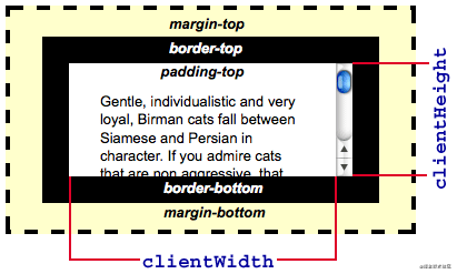
Each HTML element has clientHeight offsetHeight scrollHeight offsetTop scrollTop It is difficult to figure out the difference between what they mean by words alone.
summarized the rules by reading their documents as follows :
clientHeight and offsetHeight attributes have nothing to do with the scrolling and position It represents the height of the element, where:
(1)clientHeight:
- The height of elements including
paddingbut notborder, horizontal scroll bar, and margin. Forinlineelements of this property has been0, units px, read-only elements.
(2)offsetHeight:
- Including
padding, border, horizontal scroll bar, but not including themarginof the element of 060a520fa62994. For inline elements, this attribute is always 0, unit px, read-only element.
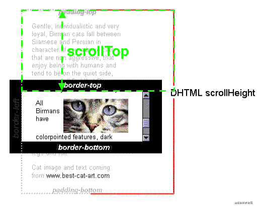
Next discuss the situation when there is a scroll bar :
When the child element of this element is higher than the element and overflow=scroll , this element will scroll. At this time:
(3)scrollHeight:
- Because the child element is higher than the parent element, the parent element does not want to be
the child element as high as the scroll bar is displayed. During the scrolling process, part of the 160a520fa62a46 element is hidden. The scrollHeight includes.height. - The height of the visible part is actually clientHeight, which is constant
scrollHeight>=clientHeightIt is meaningful to discuss scrollHeight when there is a scroll bar, and scrollHeight==clientHeight is always established when there is no scroll bar. Unit px, read-only element.
(4)scrollTop:
- When
has a scroll bar, the distance that thescroll bar scrolls down is the height of the covered part at the top of theWhenhas no scroll bar,scrollTop==0always established. The unit is px, which can be read and set. .
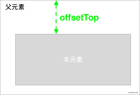
(5)offsetTop:
- The current distance between the
element and the top of the nearest parent elementthere is a scroll bar. Unit px, read-only element.
26. How to create an equilateral square within a parent element of unknown width
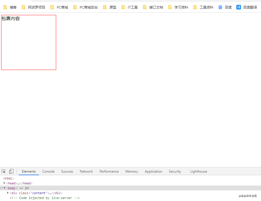
1. Use padding
<html>
    <head>
        <meta charset="utf-8" />
        <title>新标签页</title>
    </head>
    <script></script>

    <body>
        <div class="content">
            <div class="son">包裹内容</div>
        </div>
    </body>
        <style>
        .content {
            /* width: 100px;
            height: 100px; */
        }
        .son {
            width: 10%;
            padding-bottom: 10%; /* padding百分比相对父元素宽度计算 */
            height: 0;
            border: 1px solid red;
        }
    </style>
</html>
effect of as follows 160a520fa62bc6:
Effect picture
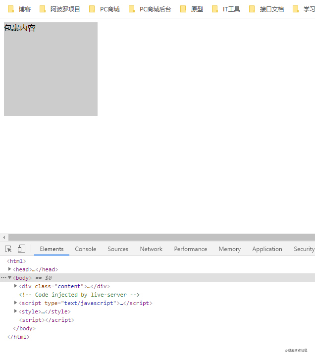
2.padding-bottom+:after+absolute
<html>
    <head>
        <meta charset="utf-8" />
        <title>新标签页</title>
    </head>
    <body>
        <div class="content">
            <div class="son">包裹内容</div>
        </div>
    </body>
    <style>
        .content {
            width: 10%;
            background: #ccc;
        }

        .content:after {
            content: '';
            display: block;
            padding-bottom: 100%;
        }

        .son {
            position: absolute;
            width: 100%;
            height: 100%;
        }
    </style>
    <script></script>
</html>
as follows:
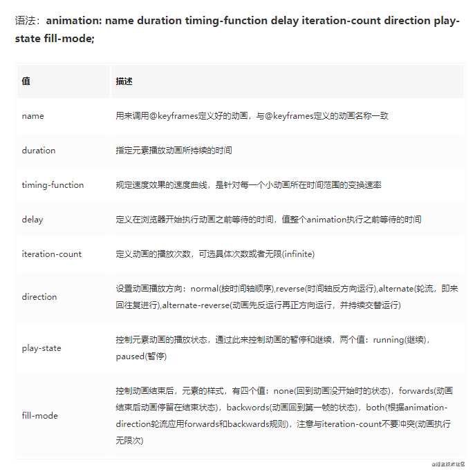
27. css animation
| Attributes | meaning |
|---|---|
| animation | Used to set animation properties, it is a shorthand property, contains 6 properties |
| transition | The style used to set the element is excessive, which has a similar effect to animation, but the details are very different |
| transform | It is used to rotate, scale, move or tilt the element, and has nothing to do with the animation of setting the style, it is equivalent to the color used to set the "appearance" of the element |
| translate (mobile) | Translate is just an attribute value of transform, that is, move. |




**粗体** _斜体_ [链接](http://example.com) `代码` - 列表 > 引用。你还可以使用@来通知其他用户。