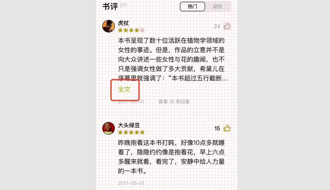
Recently, a colleague asked me about such an interaction. When there is a lot of text (more than 5 lines), a "full text" link appears, indicating that there is more content. After clicking it, you will jump to a new page. The effect is as follows
So, is there a way to achieve it without using js? I was intrigued as soon as I saw it. It seemed a bit similar to the CSS Implementing Multi-line Text "Expand and Collapse" (juejin.cn) But this time the layout is much simpler. After a long time of interaction, I found that it can be perfectly realized, and it is a completely different idea. Let’s take a look.
1. Layout
There is nothing to study about the layout, just write it normally, and there is no need for floating. The implementation is as follows
<div class="wrap">
  <p class="text">CSS的 margin-bottom 属性用于设置元素的底部外边距,允许设置负数值。一个正数值将让它相对于正常流与邻近块更远,而负数值将使得更近。</p>
  <a class="link">全文</a>
</div>
Then add some styles, -webkit-line-clamp achieve multi-line truncation
.wrap {
  background: #fff;
  border-radius: 8px;
  padding: 15px;
  box-shadow: 20px 20px 60px #bebebe,
    -20px -20px 60px #ffffff;
}

.text{
  overflow: hidden;
  text-overflow: ellipsis;
  text-align: justify;
  display: -webkit-box;
  -webkit-line-clamp: 3; /*多行超出省略*/
  -webkit-box-orient: vertical;
  line-height: 1.5;
}
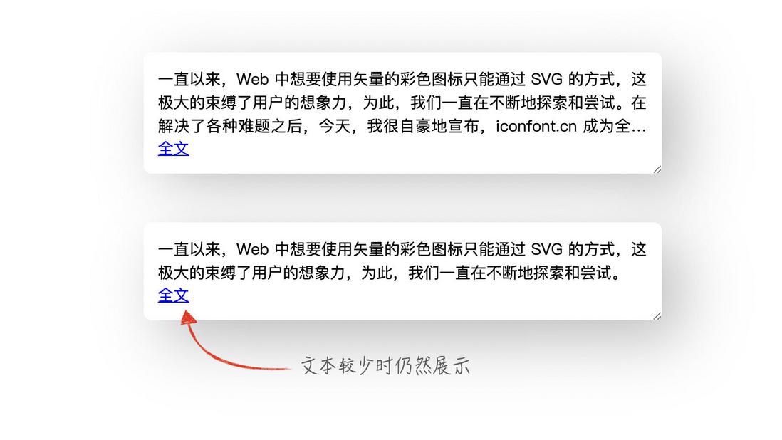
Can get this effect
Obviously, the link below has always existed. So, how does CSS distinguish between these two situations?
Second, imperfect realization
At first, I quickly thought of a way to achieve it, as follows
At the end of the text, use an element cover the link below, which can be implemented ::after
.text::after{
  content: '';
  position: absolute;
  display: block;
  width: 100%;
  height: 50px; /*只要能盖住链接就行*/
  background: red;
}
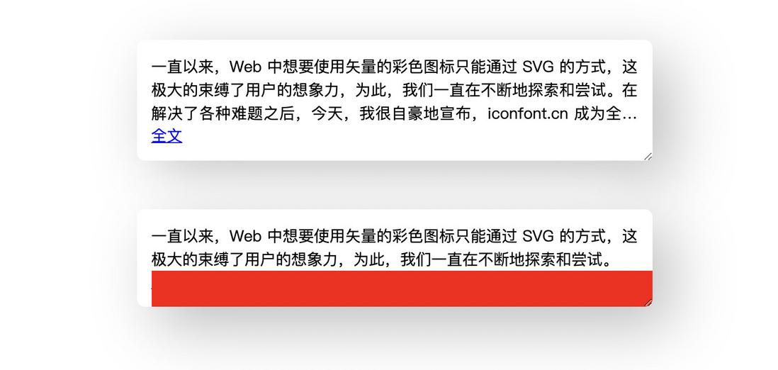
The effect is as follows
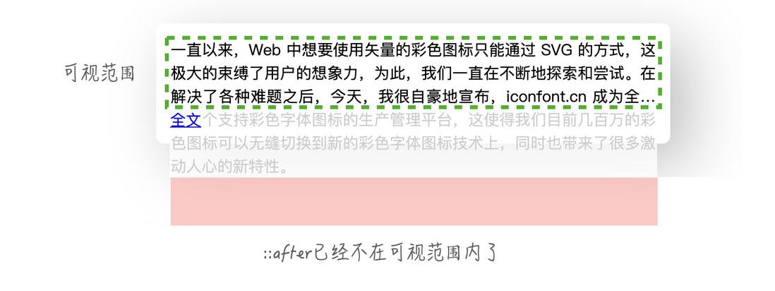
Note that to achieve the above, as at the time of setting absolute positioning, and is not set top value, ::after back still followed in the text. Therefore, when the text is out of ::after already outside the visible range, so the link below will not be covered. It actually looks like this
Finally, change the color of the cover to the same background color.
.text::after{
  background: inherit; /*继承父级的背景*/
}
The complete code can be accessed auto expand cover (codepen.io)
So why is it imperfect?
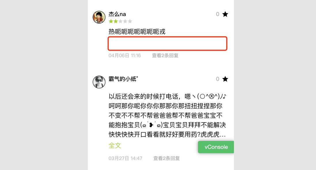
Careful friends may have discovered that when the link is not displayed, the space below is still occupied. When I gave this realization to a colleague, it really was like this
Three, perfect realization
Although there is nothing wrong with the function, it is definitely difficult to accept visually. Comparing the difference between the two cases carefully, it is not difficult to find that the height of the two cases is different (😂When there is less text, the height of one line of links is less by default), so you can think about how to reduce the height of the container? Here I think of the negative margin , which is realized as follows
First of all, absolute positioning must not be used anymore
.text::after{
  content: '';
  /*position: absolute;*/
  display: block;
  height: 50px; /*随便给一个高度,也可以为0*/
  background: red;
}
You can give any height here, and it can also be 0. For the convenience of the color, 50px is given, and a background color is added.
In this way, the effect when there is less text is as follows (it is out of bounds when there is more text, it will not be affected)
Then, to ::after set a negative margin-Top , assuming that the height of the link is 20, then you need to move up their own height plus 20, that is,
.text::after{
  /*其他样式*/
  margin-top: -70px; /*50 + 20*/
}
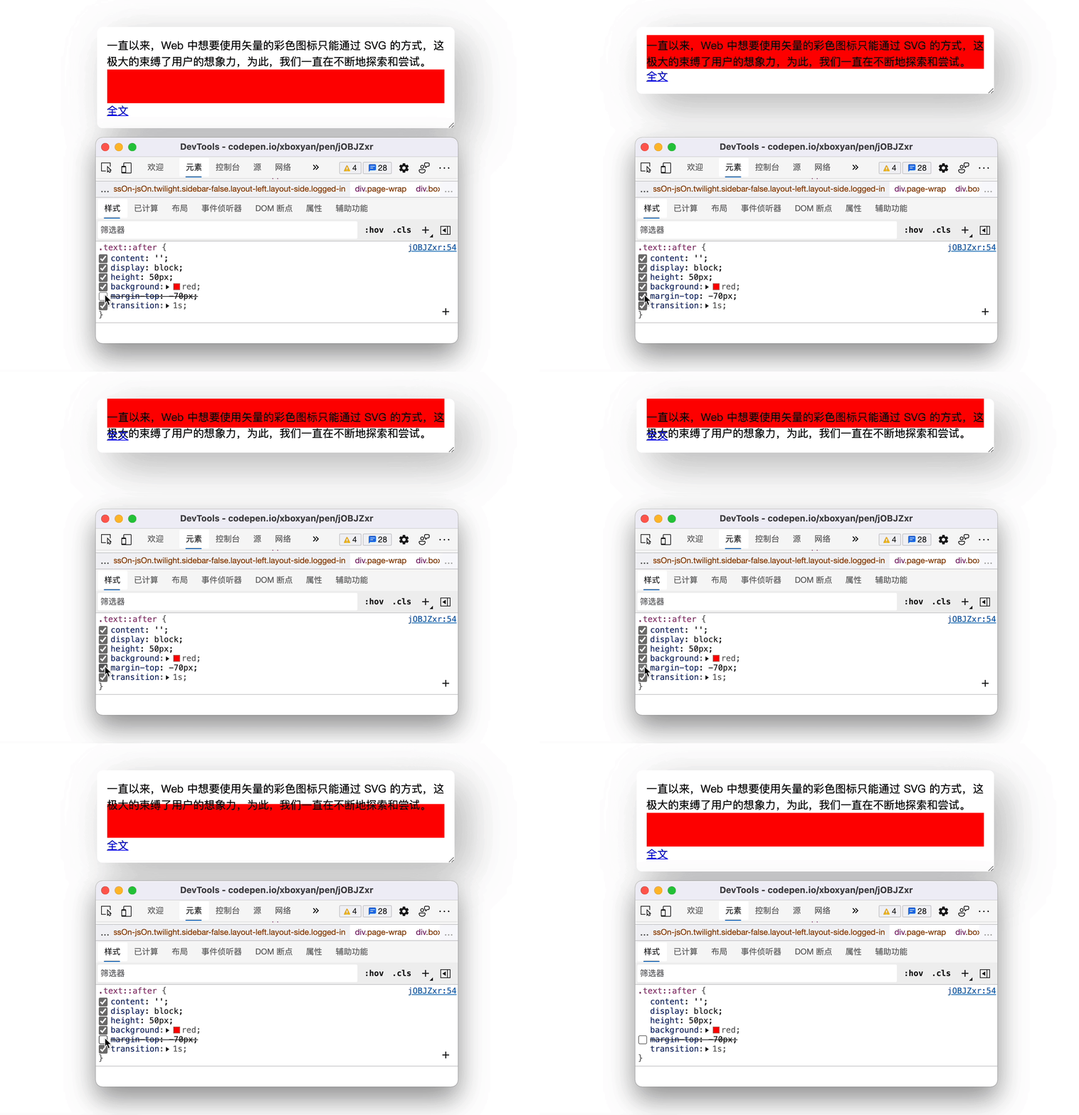
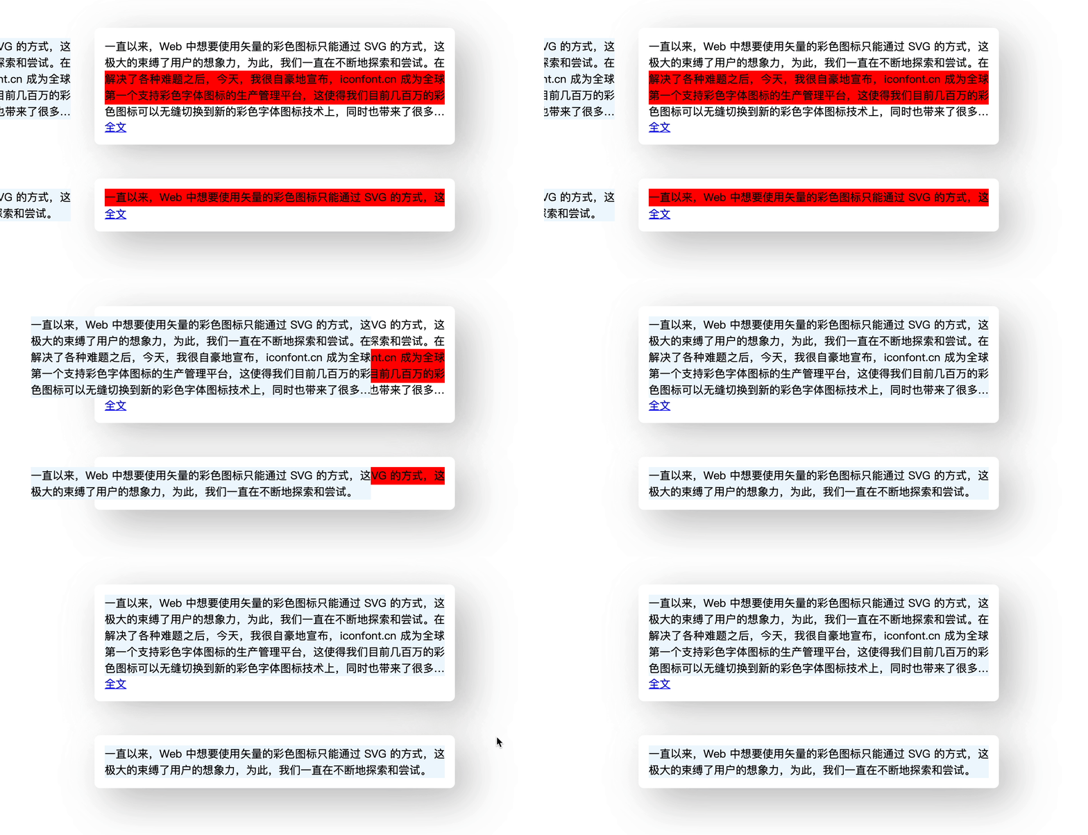
It can be found that the height of the entire container has been subtracted from the height of the link. The demonstration is as follows
<div class="wrap">
  <p class="text">CSS的 margin-bottom 属性用于设置元素的底部外边距,允许设置负数值。一个正数值将让它相对于正常流与邻近块更远,而负数值将使得更近。</p>
  <p class="copy">CSS的 margin-bottom 属性用于设置元素的底部外边距,允许设置负数值。一个正数值将让它相对于正常流与邻近块更远,而负数值将使得更近。</p><!--新加一层标签-->
  <a class="link">全文</a>
</div>
.text .copy{
/*相同的样式*/
}
.copy{
position: absolute;
left: 0;
top: 0;
width: 100%;
height: 100%;
}The principle is as follows
This is perfect. Although there is an extra layer of label, it can also be generated with pseudo elements
<div class="wrap">
    <p class="text" title="CSS的 margin-bottom 属性用于设置元素的底部外边距,允许设置负数值。一个正数值将让它相对于正常流与邻近块更远,而负数值将使得更近。">CSS的 margin-bottom 属性用于设置元素的底部外边距,允许设置负数值。一个正数值将让它相对于正常流与邻近块更远,而负数值将使得更近。</p>
    <a class="link">全文</a>
</div>
.text::before{
content: attr(title); /*其他样式*/
}The complete code can be viewed auto expand margin (codepen.io)
Four, summary and explanation
Even if it's just a small interaction, it also contains a lot of CSS tips, so there is no need to worry about compatibility. Except for line-clamp , all other attributes are fully compatible. To sum up the following points
- Make full use of CSS cover and overflow hiding, many special effects can be used
- Absolute positioning is still in the default text flow position when left or top is not used
- Negative margin can change the size of the container
Perhaps in the future there will be a text beyond the pseudo-category, such as :trunk , so that many related interactions can be easily realized. But before that, it can still be realized by various blindfold simulations. Although some are not concise enough, it is the unique fun of CSS, isn't it? Finally, if you think it’s pretty good, if it’s helpful to you, please like, bookmark, and forward ❤❤❤





**粗体** _斜体_ [链接](http://example.com) `代码` - 列表 > 引用。你还可以使用@来通知其他用户。