
Demo address: V6 visual large-screen editor
A few months ago I wrote an article about developing a visualization large-screen production platform . It briefly summarized some design ideas and effect demonstrations of the visualization large-screen building platform. In this article, I will how 160f6353890fdd Design the theme of the large-screen visualization engine , and introduce the implementation principle in detail.
In accordance with my usual writing style, I will list the outline of the article below so that everyone can read and study selectively and efficiently:
- Quickly understand data visualization
- How to design a general large-screen build engine
Realization of the core functions of the large-screen build engine
- Drag and drop implementation
- Material center design
- Dynamic renderer implementation
- Configuration panel design
- Overview of Control Center
- Function-assisted design
- Later planning and future prospects of the visualized large screen
You can easily navigate to the position you want to see quickly according to the article navigation on the right, and then we start to enter the text.
Quickly understand data visualization
When it comes to data visualization, surely we more or less a little contact, talk from a technical level , is the most intuitive front-end visualization framework, such as:
- echart
- antv
- Chart.js
- D3.js
- Vega
These libraries can help us make visual charts easily.

talk from a practical point of , its main significance is to help users better analysis and presentation of data . So when it comes to data visualization, it is more about dealing with various charts. Through data -> chart combination -> visualization page , it constitutes the topic we are going to study today- design visualization large screen Build engine .
How to design a general large-screen build engine
Speaking of " engine ", the word may be inexplicably tall. In fact, in Internet technology, we often hear various related terms, such as " browser rendering engine ", " rule engine " , " image recognition engine " and so on, I think the essence of engine provides a set of reliable mechanisms to provide the system with a steady stream of productivity . So what we are talking about today is " visualization large-screen build engine ", in essence, it also provides a set of building mechanisms to support us in designing various complex visualization pages.
In order to make it easier for everyone to understand the visualization construction, I will show two pages of the visualization large screen here, to analyze the components of the visualization large screen with you:


Of course, the content and form displayed on the large screen in practical applications are far more complicated than this. From the above figure, we can extract two intuitive features of the large screen page:
- Visualization component set
- spatial coordinate relationship
Because our visualized large-screen carrier is a page, it is html , so there is another feature: event/interaction . In summary, we have summarized the essential elements of a large visual screen:

As long as we fully understand the composition and characteristics of the large visualization screen, we can better design the visualization large screen construction engine . Based on the above analysis, I designed a basic engine architecture diagram:

Next, I will take everyone to disassemble and implement the above build engine.
Realization of the core functions of the large-screen build engine
As the saying goes: "A good disassembly is half the success." any complex task or system, as long as we can disassemble it into many small sub-modules, we can solve it well and realize it . (Learning is also same)
Next, we will solve several core sub-modules of the above basic engine one by one:
- drag and drop implement
- Material Center Design
- dynamic renderer implements
- configuration panel design
- Control Center Overview
- Function Aided Design
Drag and drop implementation
The drag and drop device is the core module of the visual construction engine, and it is also used to solve the problem of " spatial coordinate relationship " in the above-mentioned large-screen page feature. Let's first look at the implementation effect:
![uploading...]()
For the implementation of drag and drop technology, we can use the native js achieve it, or use a third-party mature drag and drop library, such as:
- DnD
- React-Dragable
- react-moveable
I also open sourced a lightweight free drag library rc-drag , the effect is as follows:

For its technical implementation, please refer to my other article: easily teach you how to handle component drag, zoom, multi-control point expansion and drag data reporting . You can also do secondary expansion and packaging based on this.
The basic prototype code of our drag and drop device is as follows:
export default function DragBox(props) {
    const [x, y, config] = props;
    const [target, setTarget] = React.useState();
    const [elementGuidelines, setElementGuidelines] = React.useState([]);
    const [frame, setFrame] = React.useState({
        translate: [x, y],
    });
    React.useEffect(() => {
        setTarget(document.querySelector(".target")!);
    }, []);
    return <div className="container">
        <div className="target">拖拽内部组件, 比如图表/基础组件等</div>
        <Moveable
            target={target}
            elementGuidelines={elementGuidelines}
            snappable={true}
            snapThreshold={5}
            isDisplaySnapDigit={true}
            snapGap={true}
            snapElement={true}
            snapVertical={true}
            snapHorizontal={true}
            snapCenter={false}
            snapDigit={0}
            draggable={true}
            throttleDrag={0}
            startDragRotate={0}
            throttleDragRotate={0}
            zoom={1}
            origin={true}
            padding={{"left":0,"top":0,"right":0,"bottom":0}}
            onDragStart={e => {
                e.set(frame.translate);
                // 自定义的拖拽开始逻辑
            }}
            onDrag={e => {
                frame.translate = e.beforeTranslate;
                e.target.style.transform = `translate(${e.beforeTranslate[0]}px, ${e.beforeTranslate[1]}px)`;
                // 自定义的拖拽结束逻辑
            }}
        />
    </div>;
}
The above is just to achieve the basic drag and drop function, we need to save the drag position information in order to achieve the effect of " with " in the preview. The location information and other attributes will be stored in the DSL data of the component, which will be described in detail in the following content.
For further in-depth dragging, we can also set reference lines, alignment lines, , etc., and can do different business logic in different periods of dragging (such as 160f6353891598 onDragStart and onDragEnd These Moveable all provide corresponding api support, you can refer to it.
Material center design
The material center mainly provides " raw materials " for large screen pages. In order to design robust and universal materials, we need to design a set of standard component structure and property protocols. And in order to facilitate material management and query, we also need to classify the materials, my classification is as follows:
- visualization component (bar chart, pie chart, bar chart, map visualization, etc.)
- modified components (pictures, carousels, modified materials, etc.)
- text component (text, text marquee, text board)
The specific material library is demonstrated as follows:

Here I take the implementation of a visual component as an example:
import React, { memo, useEffect } from 'react'
import { Chart } from '@antv/g2'

import { colors } from '@/components/BasicShop/common'

import { ChartConfigType } from './schema'

interface ChartComponentProps extends ChartConfigType {
  id: string
}

const ChartComponent: React.FC<ChartComponentProps> = ({
  id, data, width, height,
  toggle, legendPosition, legendLayout, legendShape,
  labelColor, axisColor, multiColor, tipEvent, titleEvent,
  dataType, apiAddress, apiMethod, apiData, refreshTime,
}) => {
  useEffect(() => {
    let timer:any = null;
    const chart = new Chart({
      container: `chart-${id}`,
      autoFit: true,
      width,
      height
    })

    // 数据过滤, 接入
    const dataX = data.map(item => ({ ...item, value: Number(item.value) }))
    chart.data(dataX)

    // 图表属性组装
    chart.legend(
      toggle
        ? {
          position: legendPosition,
          layout: legendLayout,
          marker: {
            symbol: legendShape
          },
        }
        : false,
    )

    chart.tooltip({
      showTitle: false,
      showMarkers: false,
    })

    // 其他图表信息源配置, 方法雷同, 此处省略
    // ...

    chart.render()

  }, [])

  return <div id={`chart-${id}`} />
}

export default memo(ChartComponent)
The above is the realization mode of our basic materials. The visualization component uses g2 . Of course, you can also use the familiar echart , D3.js etc. Different materials have both the general props and the proprietary props , depending on how we define the material Schema .
Before designing Schema , we need to clarify the attribute division of components. In order to meet the flexibility and versatility of component configuration, I made the following division:
- Appearance attributes (component width and height, color, label, display mode, etc.)
- data configuration (static data, dynamic data)
- events/interactions (such as click, jump, etc.)
With the above division, we can easily design the desired universal Schema . Let's first take a look at the configuration panel after implementation:

These properties are based on our terms defined schema configuration items, by parsing engine dynamically rendered, the relevant parsing engine and configuration panel, I will tell you in the following sections.
Let's first look at the schema structure of the component:
const Chart: ChartSchema = {
  editAttrs: [
    {
      key: 'layerName',
      type: 'Text',
      cate: 'base',
    },
    {
      key: 'y',
      type: 'Number',
      cate: 'base',
    },
    ...DataConfig, // 数据配置项
    ...eventConfig, // 事件配置项

  ],
  config: {
    width: 200,
    height: 200,
    zIndex: 1,
    layerName: '柱状图',
    labelColor: 'rgba(188,200,212,1)',
    // ... 其他配置初始值
    multiColor: ['rgba(91, 143, 249, 1)', 'rgba(91, 143, 249, 1)', 'rgba(91, 143, 249,,1)', 'rgba(91, 143, 249, 1)'],
    data: [
      {
        name: 'A',
        value: 25,
      },
      {
        name: 'B',
        value: 66,
      }
    ],
  },
}
editAttrs represents the editable attribute list, config is the initial value of the attribute, of course, you can also design a similar general schema according to your own preferences.
Through the above-designed standard components and standard schema , we can produce various materials in batches and efficiently, and can easily integrate any third-party visualization component library.
Dynamic renderer implementation
We all know that many elements in a page will affect the overall loading speed of the page, because the browser needs to consume CPU / GPU to render the page. For visual pages, each visual component needs to render a large number of information elements, which will undoubtedly have a significant impact on page performance, so we need to design a mechanism to allow components to be loaded on the canvas asynchronously, rather than one-time Load dozens of hundreds of components (in this case, the page will have a lot of white screen time, and the user experience will be extremely degraded).
The dynamic loader provides such a mechanism to ensure that the loading of components is asynchronous. On the one hand, it can reduce the page size, and on the other hand, users can see page elements earlier. At present, we are familiar with many dynamic loading mechanisms. Vue and React ecosystems provide out-of-the-box solutions (although we can use webpack design such dynamic models by ourselves, here in order to improve writing efficiency, we directly package based on ready-made solutions ). Let's first look at the process of dynamically rendering components:

In the above demonstration, you can see in detail that after dragging a component icon from the component menu on the left onto the canvas, the real component starts to load and render.
Here we umi3.0 provided dynamic function to minimize achieve a dynamic renderer. If you are not familiar with umi eco-friend, do not worry, after reading my principles and implementation process, you can use any familiar dynamic loading mechanism to achieve it Up. The implementation is as follows:
import React, { useMemo, memo, FC } from 'react'
import { dynamic } from 'umi'

import LoadingComponent from '@/components/LoadingComponent'


const DynamicFunc = (cpName: string, category: string) => {
  return dynamic({
    async loader() {
      //  动态加载组件
      const { default: Graph } = await import(`@/components/materies/${cpName}`)

      return (props: DynamicType) => {
        const { config, id } = props
        return <Graph {...config} id={id} />
      }
    },
    loading: () => <LoadingComponent />
  })
}

const DynamicRenderEngine: FC<DynamicType> = memo((props) => {
  const {
  type,
  config,
  // 其他配置...
  } = props
  const Dynamic = useMemo(() => {
    return DynamicFunc(config)
  }, [config])

  return <Dynamic {...props} />
})

export default DynamicRenderEngine
Is it very simple? Of course, we can also design more complex and powerful dynamic renderers according to our own business needs.
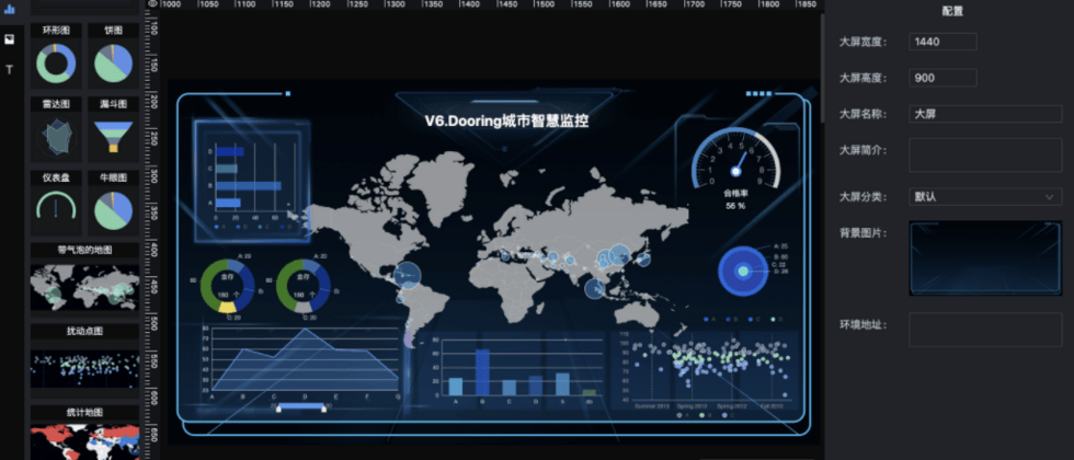
Configuration panel design
The premise of implementing the configuration panel is to Schema structure. In the introduction of component library implementation, we introduced schema . Based on this case structure, we realize the dynamic configuration panel .

As can be seen from the above figure, a core element of the dynamic configuration panel is the form renderer . The purpose of the form renderer is to dynamically render the corresponding form items attrs I wrote an article earlier that introduced the technical implementation of the form designer in detail. If you are interested, you can also refer to it: Dooring Visualization: Implementing a Dynamic Form Designer from Zero .
Here I will simply implement a basic form renderer model:
const FormEditor = (props: FormEditorProps) => {
  const { attrs, defaultValue, onSave } = props;

  const onFinish = (values: Store) => {
    // 保存配置项数据
    onSave && onSave(values);
  };

  const handlechange = (value) => {
    // 更新逻辑
  }

  const [form] = Form.useForm();

  return (
    <Form
      form={form}
      {...formItemLayout}
      onFinish={onFinish}
      initialValues={defaultValue}
      onValuesChange={handlechange}
    >
      {
        attrs.map((item, i) => {
        return (
          <React.Fragment key={i}>
            {item.type === 'Number' && (
              <Form.Item label={item.name} name={item.key}>
                <InputNumber />
              </Form.Item>
            )}
            {item.type === 'Text' && (
              <Form.Item label={item.name} name={item.key}>
                <Input placeholder={item.placeholder} />
              </Form.Item>
            )}
            {item.type === 'TextArea' && (
              <Form.Item label={item.name} name={item.key}>
                <TextArea rows={4} />
              </Form.Item>
            )}
            // 其他配置类型
          </React.Fragment>
        );
      })}
    </Form>
  );
};
If you want to see a more complete configuration panel implementation, you can refer to the open source project H5-Dooring | H5 visual editor
We can look at the final configuration panel implementation effect:

Control Center Overview & Function Aided Design
control center is mainly at the business layer and does not involve too many complicated technologies, so I will briefly introduce it here. Because some of the information displayed on the large-screen visualization page may be private data, and only some people want to see it, we need to control the access to the page. Secondly, due to the internal business strategic requirements of the enterprise, various verifications, status checks, data update frequency, etc. may be performed on the page, so we need to design a set of control center to manage. The most basic is access control, as follows:

function assisted design mainly optimized for some user operations, such as shortcut keys, canvas zoom, large-screen quick navigation, undo and redo, etc. This can be improved according to specific product requirements. You can also refer to the implementation when designing and building products later.
Later planning and future prospects of the visualized large screen
In order to achieve a visualized large-screen engine that is more expressive and meets more scenarios, we need to improve the scalability of the engine on the one hand, and improve the material ecology on the other hand. Secondly, as long as we keep pace with the times, we need to provide more intelligent scene functions, such as Set up burial sites, data early warning, etc. The specific plan is as follows:
- Rich component materials, support 3D components, geospatial components, etc.
- Set up a buried point to facilitate the analysis of components later
- Realize data source, event mechanism closed loop
- Support user-defined components
If you are interested in visual construction or low-code/zero-code, you can also refer to my previous articles or share your thoughts and experiences in the comment area.


**粗体** _斜体_ [链接](http://example.com) `代码` - 列表 > 引用。你还可以使用@来通知其他用户。