Prelude
A front end, when you get married, you need a wedding invitation. Which websites (Wedding Anniversary, Yiqixiu) generated on the Internet, the style and animation effect feel very good, but the company logo, advertising pop-ups, loading speed, and custom layout all make me work (qiang) industry (po) The front (zheng) end (huanzhe) felt that this demand would definitely not pass the product acceptance.
In addition to this is a simple wedding invitation structure, this is more of an appetizer for front-end entry H5 performance optimization.
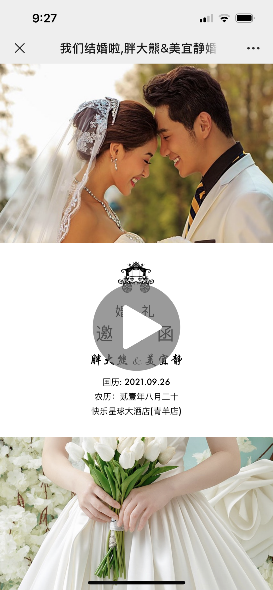
Check the effect, open the mobile browser, you can click: Demo
Warehouse address: Invitation-Demo
The pictures are all from the Internet, if there is any infringement, please contact to delete;
Architecture design
Frame selection
Which low-code output invitation letters on the market are basically based on juery; for me, a young front-end who has not experienced juery, IE, or jQuery architecture design, basically not; native JS, it is impossible. ; React is my best solution with a shuttle, it is easy to write, and I have the most accumulation;
Basically pure React, without relying on any other third-party libraries, plus a React-Router and animation library;
<AnimatedRouter>
  <Route path="/home" exact component={Home} />
  <Route path="/guide" exact component={Guide} />
  <Route path="/location" exact component={Location} />
  <Route path="/bridge" exact component={Bridge} />
  <Route path="/bridgeRoom" exact component={BridgeRoom} />
  <Redirect to="/" component={Home} />
</AnimatedRouter>
Architecture design
Traditional designs, such as Wedding Anniversary and Yiqixiu, mostly use anchor-based single-page design, which is different from SPA. It is a very pure single page before, which can be understood as the predecessor of SPA, which is all page content. They all exist in one html at the same time, and one or more pages are displayed through visibility or scrolling, which makes the code intuitive.
  <body>
    <header>
      <a href="#first">1</a>
      <a href="#sec">2</a>
      <a href="#thi">3</a>
    </header>
    <content>
      <div id="first">这是第一页</div>
      <div id="sec">这是第2页</div>
      <div id="thi">这是第3页</div>
      <div id="for">这是第4页</div>
    </content>
  </body>
When I click 2, it will jump to page 2, and when I click 3, it will jump to page 3. The id is here as a kind of marking mark.
SPA is also a hash, but the anchor point is changed to a different way of playing. It dynamically uninstalls and remounts the content on a node every time the hash is switched. There is no situation where the content exists at the same time. Compared with the single page above:
Disadvantages: The switching between pages is not so smooth, if no special treatment is done, the switching will appear very blunt;
Advantages: more in line with modern front-end development habits
Interaction difference: The anchor page switch is more about sliding up and down; while the switching of spa can be up and down, or left and right, depending on the developer's processing method;
So as you can see in the frame selection section, I have a total of 5 pages. In order to switch between pages smoothly, I used the react-transition-group component to handle my page transitions.
In addition, in order to make the invitation letter more like an invitation letter, I used a slideshow-style auto-play, which supports manual sliding after playing.
autoPlay = async () => {
  // 开始自动播放;
  await wait(() => { this.props.history.push('/bridge'); }, WAIT_TIME);
  await wait(() => { this.props.history.push('/bridgeRoom'); }, WAIT_TIME);
  await wait(() => { this.props.history.push('/guide'); }, WAIT_TIME);
  await wait(() => { this.props.history.push('/next'); }, WAIT_TIME);
  await wait(() => { this.props.history.push('/location'); }, WAIT_TIME);
  // 加滑动操作指示箭头
  touchArrow.create({ startHash: ['/', '/home' ], endHash: '/location' });
  // 开启滑动
  touchManage(this.props.history);
}
So on these basis, I can write an invitation letter as freely as writing an ordinary front-end application.
other
Because the invitation is to be made and played automatically, then music is definitely indispensable, otherwise the sense of substitution of the invitation will be greatly reduced.
Playing music is actually a very simple operation. In this era where copyright is king, it is the most difficult to play your favorite song.
In addition, in order to introduce fewer tripartite libraries and reduce the size of the package, I used pure handwriting js and css to implement the sliding gesture operation detection and loading animation.
Style optimization
As a wedding invitation, in addition to choosing beautiful pictures of the wedding couple, the style of the web page itself also needs to be well-designed.
For basic style layout and composition, you can refer to some ready-made works on wedding chronology and picture monsters. After all, others rely on this to eat, so I have to bow my head in design.
Page turning animation
As discussed in the Architecture Design and Design section, the page switching of the spa, if no special treatment is done, will appear very blunt when switching, so I introduced the react-transition-group component, the component design is very comprehensive, you can customize it according to your needs Transition animation
The components are very simple to use, just customize the css animation.
Picture entry animation
Because of the picture, I have done compression processing and prelaod when the page is loaded, so I basically don’t need to consider the problem of picture load, just consider the issue of entry. Those who have done ppt will know that the entry animation can improve the level of your presentation. , The invitation is the same.
Font style
Generally speaking, we use a default font, as an invitation letter, the effect of the whole page will be rather blunt, so the best way is to go online to choose a font that satisfies you, and then set it in css;
@font-face {
  font-family: special;
  src: url('./font.ttf');
}
body {
  font-family: special;
}
Load optimization
The internet
If your packaged static resources are put in github pages, it will definitely be very slow. Therefore, if you have money, buy a better static resource service, or oss. Here I strongly recommend Alibaba Cloud. If there is a winner, you can directly get a CDN acceleration.
Personally, I deploy it in an integrated manner. Static resources are deployed on the Alibaba Cloud server. Media resources such as pictures are all placed on oss. In addition, my domain name has http2 enabled. This configuration can basically ensure that the first screen is opened in seconds.
Preloading
Because all my resources are placed on oss, the overall architecture is designed with page turning, so preload is used to load in advance.
<link rel="preload" href="https://doddle.oss-accelerate.aliyuncs.com/strong/font.ttf" as="font" />
<link rel="preload" href="https://doddle.oss-accelerate.aliyuncs.com/strong/top.jpeg" as="image" />
<link rel="preload" href="https://doddle.oss-accelerate.aliyuncs.com/strong/btm.jpeg" as="image" />
In this way, it can basically guarantee that the next page, the picture will not be loading, and it will be opened in seconds.
Picture processing
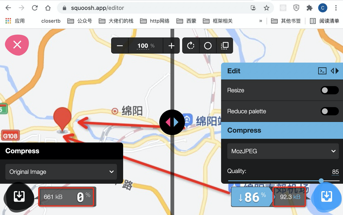
Generally, a wedding photo, the size of the picture is above 8M, if you load it directly, your invitation will be messed up when others open it, so the picture size compression is very important. Here I recommend a website. The front end must be collected: squoosh , basically the image size can be reduced by more than 80%.
In addition to the previous preload, the picture can basically be opened in seconds;
Font handling
Because the font source file is 5M, it will definitely be slow to load, so font-spider is used for compression. After processing, the general file size is about 100kb;
Steps:
- Install font-spider plugin globally
npm i font-spider -gThe character compression of font-spider is actually based on the characters and font styles of the html page, so the current development method (html content is written in js), character compression basically does not do much; so only extract the content in js first Put it in an empty html, and then compress; in order to simplify this project, I wrote a command, you only need to run a command to complete the compression:
- Run command
npm run fontAutomated character extraction ideas, you can check the code in my warehouse.
other
Here is the most important reminder, because most of our invitations are sent to relatives and friends via WeChat. You must go through Tencent’s safe cut first. There are two things I need to do in my memory: 1. The domain name is best https, and it is domestic; 2. The root path of the domain name contains serialized files issued by Tencent. When I first sent the invitation letter, I found that I could not access it, so I identified it as a scam, and then I communicated with the other party via email before unblocking it:
At this point, I finally finished writing what I planned to write 5 months ago, and I hope this sharing will help you a little bit. Write an invitation letter by yourself. Although tossing, you can fully express yourself and your wife is satisfied. It feels very worthwhile.


**粗体** _斜体_ [链接](http://example.com) `代码` - 列表 > 引用。你还可以使用@来通知其他用户。