button is the most widely used HTML element, it is recommended to use it whenever there is a click interaction. However, most websites still use div , such as a blog, almost always div
Since it is a button, why not use button directly? Here are 5 reasons to use buttons
1. Disabled features
button support is disabled. This is also the disabled form elements, you can directly set the 061adbbd05e7c6 attribute to achieve the effect of disabling
<button disabled>按钮</button>Moreover, this disabling not only disables mouse clicks, but also disables keyboard access, which is a true disabling
If you need to change the banned style, you need to pass the :disabled pseudo-class instead of the disabled attribute
button:disabled{

}
/*不推荐*/
button[disabled]{

}
Because sometimes button is disabled, not necessarily from itself, it may be because of parent elements, such as fieldset
<fieldset disabled>
    <button>按钮</button>
    <button>按钮</button>
</fieldset>
As you can see, when fieldset is disabled, all the included form elements are disabled. These form elements themselves do not have the disabled attribute, so to disable a button, you must pass the :disabled pseudo-class
In addition, in div , it is generally implemented by pointer-events: none; , but this can only disable the mouse behavior
div.disabled{
  pointer-events: none;
}
Of course, for div , this method is sufficient, because div itself will not be focused on
Second, the box model and centering characteristics
button default box attribute is border-box , open to further expansion, virtually all of the properties box form elements are border-box .
So, you don’t need to set this when you set the specific size of the button.
button{
  padding: 5px 10px;
  width: 100%;
  box-sizing: border-box; /* 不需要 */
}
Then, the button is vertical and horizontal centering.
Almost all buttons are centered, so you don’t need to set any centering properties to achieve the horizontal and vertical centering effect.
button{
  width: 100px;
  height: 100px;
  text-align: center;  /* 不需要 */
  line-height: 50px;  /* 不需要 */
}
Three, keyboard access
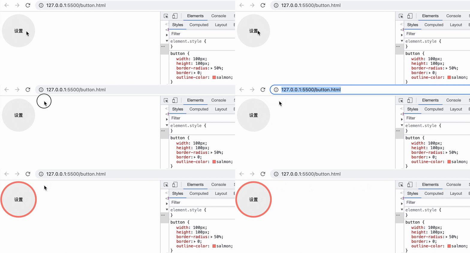
button supports keyboard access. When using the tab key to switch the focus, there will be an obvious focus prompt ( outline ). And in the focused state, through the keyboard enter or space key can trigger the button click event
(The following is the keyboard operation, use tab focus, and then use enter or space to trigger the click)
So, in order to maintain visibility of keyboard access, it’s best not to do this
button{
  outline: 0; /* 最好不要这么做 */
}
By default, this outline will only appear when the keyboard is focused, and the mouse click will not focus. If you need to change the color of the focus, you can only change outline-color , which will not affect the default timing of the browser.
button{
  outline-color: salmon;
}
Best not to change the entire outline , this will lead to either a mouse click or keyboard focus focus will appear outline (generally do not like to design a mouse click has outline )
/* 最好不要这么做 */
button:focus{
  outline: 1px solid salmon;
}
If you want to fully control the keyboard focus style, you can use this pseudo-class :focus-visible , the compatibility is slightly worse
button:focus-visible{
  outline: 5px solid salmon;
}
Four, form characteristics
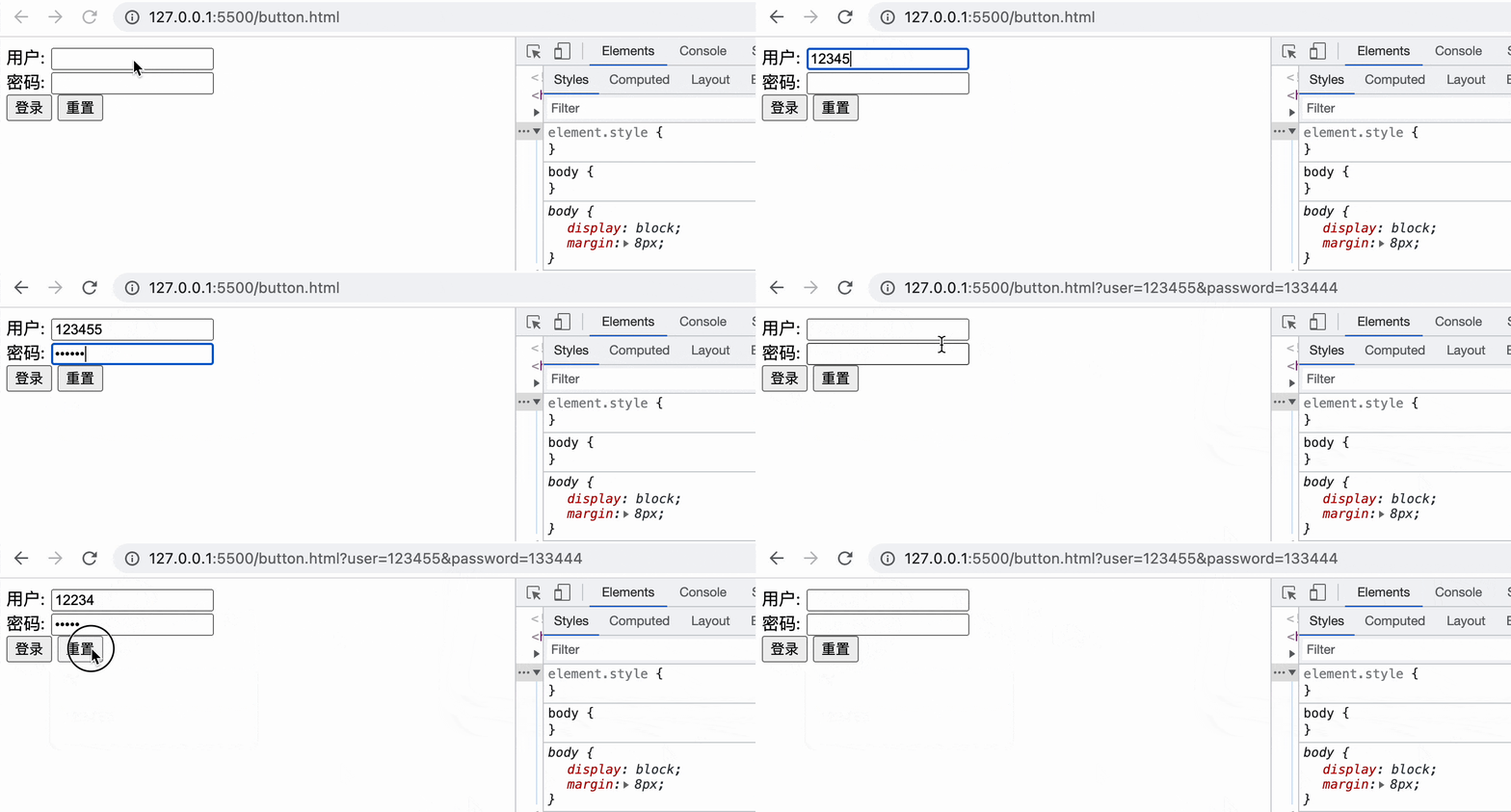
button some form features. Reasonable use of these features can achieve a lot of interaction without js, such as such a form
<form>
    <label>用户: </label><input name="user" required><br>
    <label>密码: </label><input name="password" type="password" required><br>
    <button type="submit">登录</button>
    <button type="reset">重置</button>
</form>
Which, type="submit" natural supports form submission, which is triggered form of submit events, but also support Enter login, so the experience is very good, and have finished the username and password, you can tap directly enter login.
type="reset" can perform the reset of the form. Note that here is reset , not clear , which may be understood as a better restoration. Then this feature has been applied in this article before: CSS for search-related interaction
If you do not use button , you may need more javascript to achieve similar functions, and there may be unknown bugs
Five, screen reading
button supports screen reading access by default. For example, using the narration that comes with macOS, when you read a button, you can clearly understand that it is a button and the text inside.
If it is a div , if you want to achieve this effect, you may need
- In order to
div, you need to add thetabindex=0attribute - In order for
divbe recognized as a button, the attributerole="button"
Sometimes there are more extreme situations, you can directly use the background image as a button without text, and you need the following operations
- In order for the
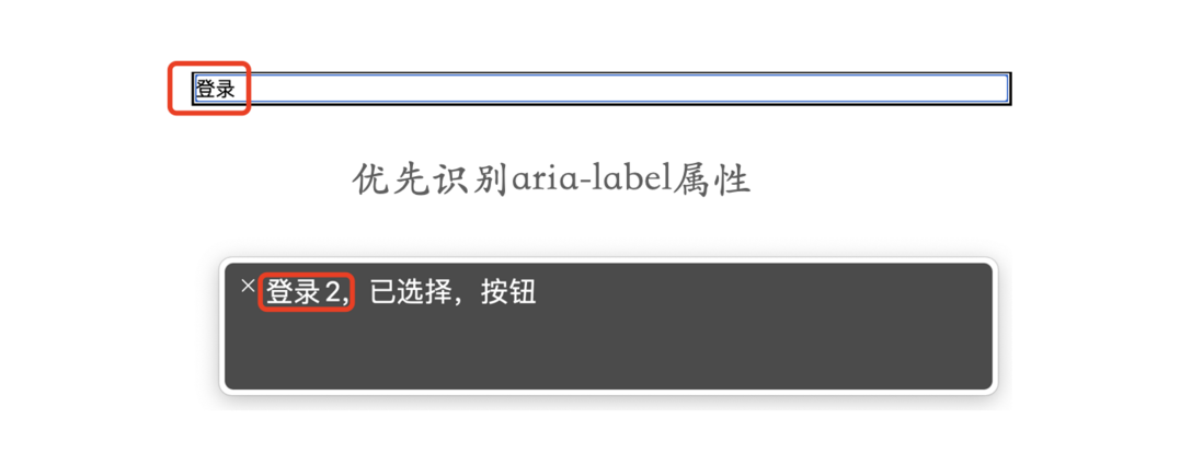
divto be recognized, the attributearia-label
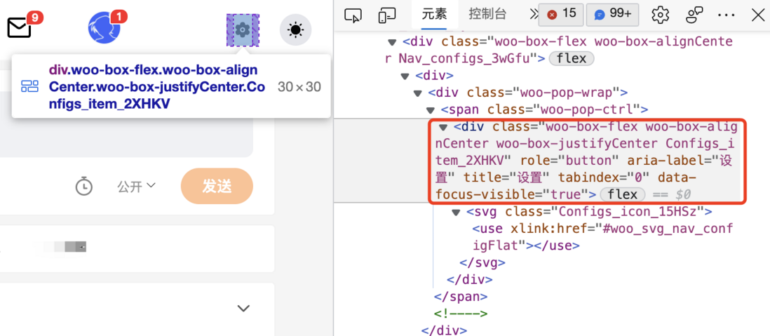
<div tabindex="0" role="button" aria-label="登录2">登录</div>In this way, screen reading can basically be accessed normally
That’s right, the way the article begins is like this. Let’s review these numerous attributes.
Since it is so troublesome, why not just use button ?
6. Why not use button
The following are some of my personal conjectures
buttonhas inconsistent style performance in various browsersbuttoncannot contain certain tags or will be invalid, such asatags- For historical reasons, I used
divachieve it before, so I don’t want to toss - I don’t know that
buttonhas so many useful features - I don’t care about it, it can be realized, my
jsis very strong - No keyboard access or screen reading is required in the actual project
- Encapsulation of some third-party component libraries
Seven, summary and explanation
button element from the style and function, and also guesses some button is not used. Here is a summary:
buttonsupports the disabling feature, and customizes the disabling style:disabledbuttondefault box model isborder-boxbuttondefault horizontal and vertical centering in 061adbbd05fa60buttonsupports keyboard access. In the focused state, click eventsenterorspacebuttonkeyboard focusoutlinecanoutline-color, you can also customize the keyboard focus style:focus-visiblebuttonsupportsentersubmission form in the formbuttonhas a reset function in the formbuttonsupports screen reading by default
Although there are so many useful features, there are still many reasons why they are not used in actual development. But no matter how it was before, from now on, as long as you encounter the "button", the first priority is button . You don't need to do too much modification to unknowingly improve the user experience. Finally, if you think it’s not bad, if it’s helpful to you, please like, bookmark, and forward ❤❤❤




**粗体** _斜体_ [链接](http://example.com) `代码` - 列表 > 引用。你还可以使用@来通知其他用户。