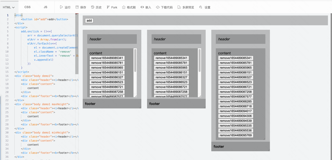
I was asked the other day, "How to fix elements to the bottom of the container" . (I wanted to give him the demo address directly, but I couldn't find it, so let's make it up today)
Ideas & Ideas
If it is the bottom of the page, we can directly position: fixed;bottom: 0; based on browser positioning.
But the effect he wants is based on the parent container , so we have to use other means to locate
-
relativeto limitabsolute, thenbottom: 0, but it will cause abnormal display when the content is too long. So we need to do inner scrolling. - If doing internal rolling, then we just need to be able to prop open the box. No need for absolute positioning
Implemented using flex
- The parent uses flex layout, and the columns are arranged vertically.
- Parent height (height, maxHeight),
.contentchildflex:auto;automatically open. Or.contentdo height limit. Footer can use absolute plus padding. Or rely entirely on the document flow layout
 .demo1{
      position: relative;
      padding-bottom: 40px;
      display: inline-flex;
      flex-direction: column;
  }
  .demo1 .footer{
      position: absolute;
      bottom: 0;
      left: 0;right: 0;
      margin: 0;
  }
  .demo1 .content{
      overflow: auto;
  }
calc implementation
If we don't use flex, then we can use calc to subtract the header and footer space.
 <style>
    .demo3{
        position: relative;
    }
    .demo3 .content{
        overflow: auto;
        max-height: calc(100% - 40px);
    }
</style>
absolute implementation
If calc is not very compatible, you can also use absolute to get all elements out of the document flow.
 <style>
    .demo4{
        position: relative;
    }
    .demo4 .header,.demo4 .footer{
        position: absolute;
        margin: 0;
        top:0;left:0 ;right:0;
    }
    .demo4 .footer{
        top: auto;
        bottom: 0;
    }
    .demo4 .content{
        overflow: auto;
        height: 100%;
        padding-top: 30px;
        padding-bottom: 30px;
        margin: 0;
        box-sizing: border-box;
    }
</style>
**粗体** _斜体_ [链接](http://example.com) `代码` - 列表 > 引用。你还可以使用@来通知其他用户。