Welcome to my public account: front-end detective
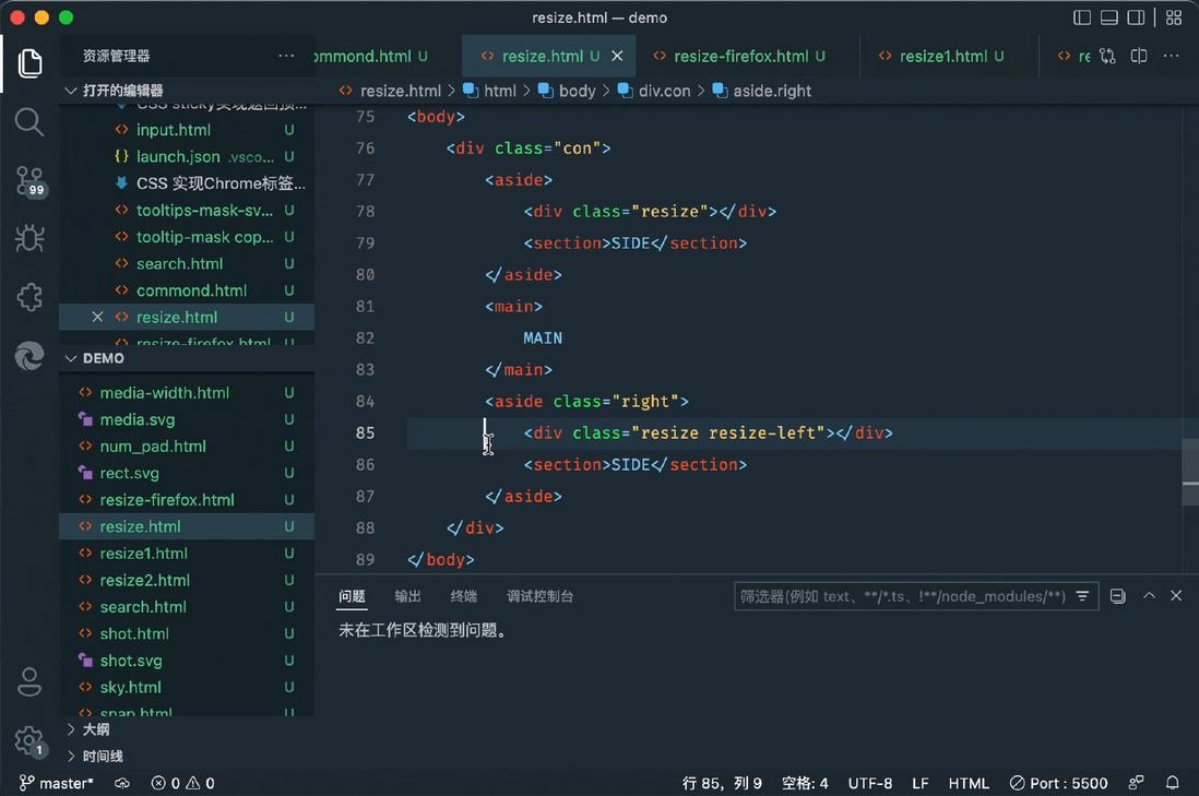
Many page layouts, especially those of tools such as editors, visualization platforms, etc., will provide the function of dragging and dropping to adjust the size of each column in order to make full use of the screen space, such as vscode
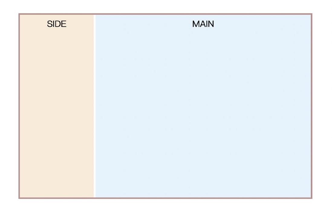
In the abstract, it is actually such a layout
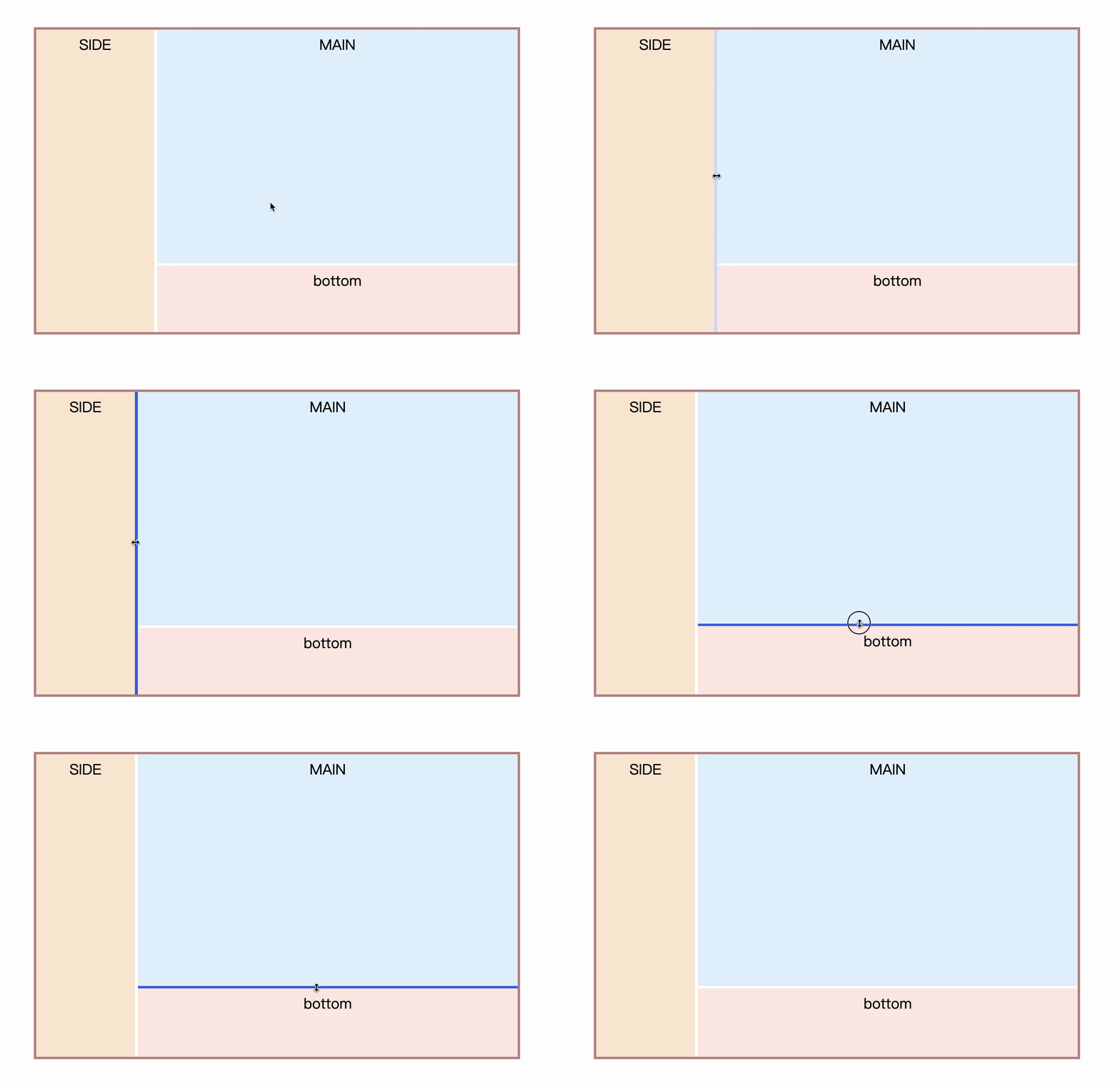
You can also see the actual effect first: CSS Stretchable Column Layout 2 (codepen.io)
Is it very flexible? In fact, pure CSS can also achieve such an effect, let's take a look
1. Basic realization principle
Achieving this effect requires the help of the resize feature, which can naturally achieve the element stretching feature. The most common one is textarea , which can be stretched by default
<textarea></textarea> However, what we need here is not textarea , but ordinary elements. It is also very easy for ordinary elements to achieve this effect, just add the resize attribute in the case of overflow not visible
 .resizable {
  resize: both;
  overflow: scroll;
}
The principle is so simple, so how to use it?
2. Customize the resize in the lower right corner
Although it seems to be stretchable, the stretchable range is too small. How to increase the stretchable range? There are two ideas here:
- Customize via pseudo-elements
- Enlarge the container as a whole
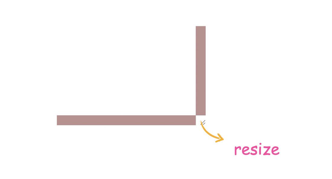
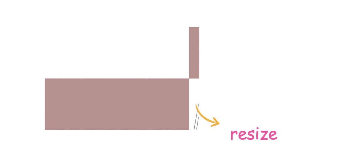
Let's talk about the first idea. To define the size, you first need to understand what resize means? After a simple test, it was found that in chrome, resize is actually the junction of the horizontal and vertical scroll bars , such as setting the size of the scroll bar directly
 ::-webkit-scrollbar {
  width: 20px;
  height: 20px;
  background-color: rosybrown;
}
Now make the scrollbar height a little bigger
 ::-webkit-scrollbar {
  width: 20px;
  height: 100px;
  background-color: rosybrown;
}
You can see resize also changed
When the height of the scroll bar is large enough, the right side becomes the whole bar that can be stretched
 ::-webkit-scrollbar {
  width: 20px;
  height: 100vh;
  background-color: rosybrown;
}
Then, this diagonal stripe can be modified with pseudo-element ::-webkit-resizer
 div::-webkit-resizer{
  background-color: royalblue;
}
But unfortunately, this method is only suitable for -webkit- browser, so firefox will not work.
Let’s take a look at the second idea: overall enlargement.
The overall enlargement mentioned here refers to the enlargement of the entire container through transform , so that the lower right corner resize will also be enlarged, for example
 div{
  width: 300px;
  height: 20px;
  transform: scaleY(100);/*足够大的放大倍数*/
  overflow: scroll;
  resize: horizontal;
}
This can also achieve the purpose of stretching the entire side.
Let's take a look at the practical application
Three, two-column stretch layout
Step by step, first implement a two-column layout. like this
Usually this type of layout has certain constraints, such as here MAIN is an adaptive space, SIDE is a fixed size, first quickly write the layout and style
 <div class="con">
  <aside>
    SIDE
  </aside>
  <main>
    MAIN
  </main>
</div>
The key styles are as follows
 .con{
  display: flex;
}
aside{
  width: 200px;
}
main{
  flex: 1;
}
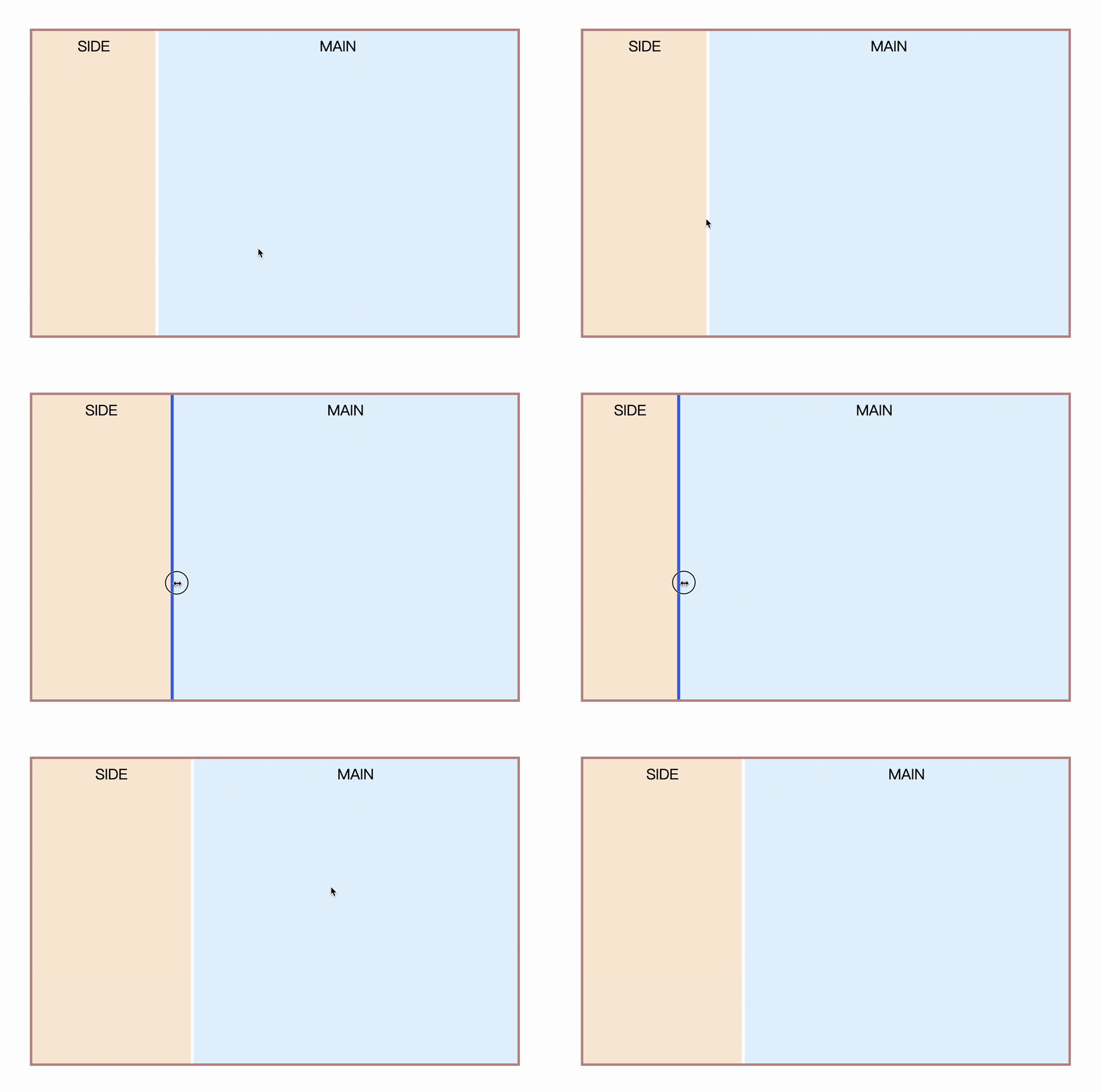
So, how to make the left sidebar drag and drop to the right? It's very simple, put the stretchable element just now into the sidebar, let the width be determined by the stretched element inside (flex child elements naturally support this feature), and the content is implemented with absolute positioning overlay. The implementation is as follows
 <aside>
  <div class="resize"></div>
  <div class="line"></div>
  <section>SIDE</section>
</aside>
Since the firefox of resize cannot be customized, there is a single label to simulate the stretched axis
 aside{
  position: relative;
  overflow: hidden;

}
.resize{
  width: 200px;
  height: 16px;
  transform: scaleY(100);
  overflow: scroll;
  resize: horizontal;
  opacity: 0;
}
.line{
  position: absolute;
  top: 0;
  right: 0;
  width: 4px;
  bottom: 0;
  background-color: royalblue;
  opacity: 0;
  transition: .3s;
  pointer-events: none;
}

.resize:hover+.line,
.resize:active+.line{
  opacity: 1;
}
This achieves the function of stretching the left sidebar
Four, three-column stretch layout
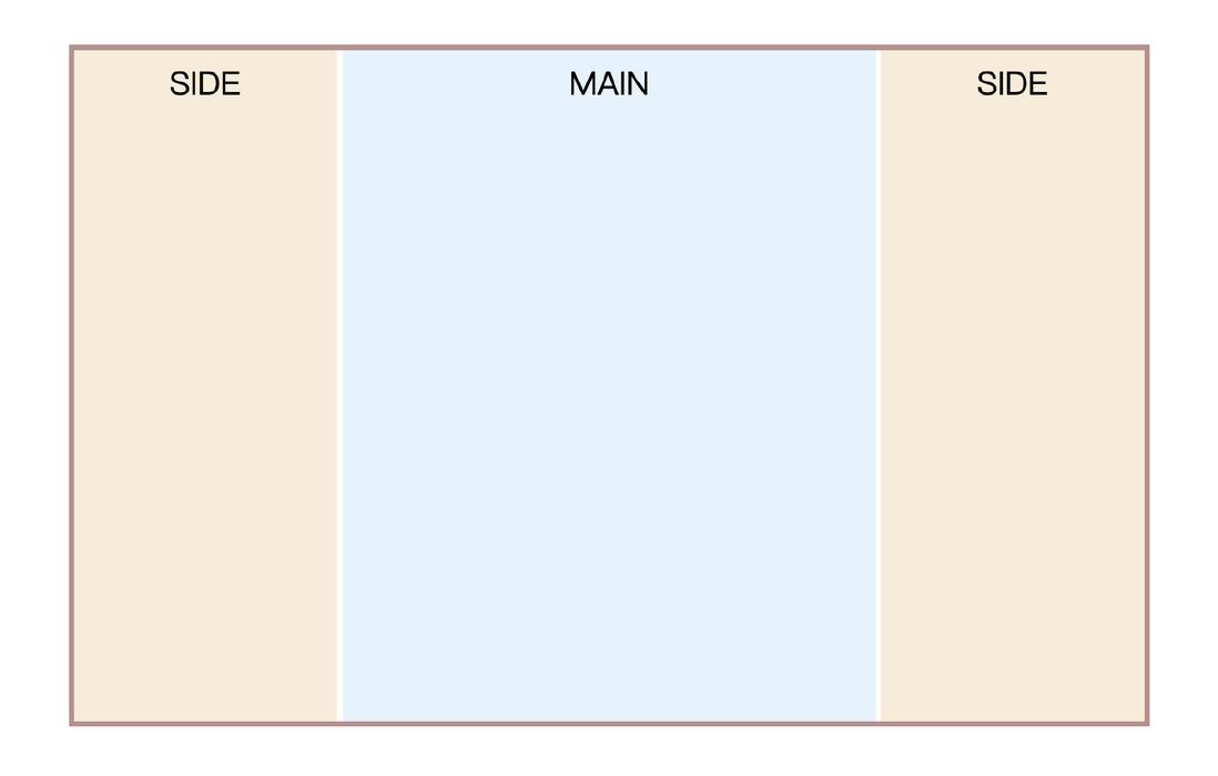
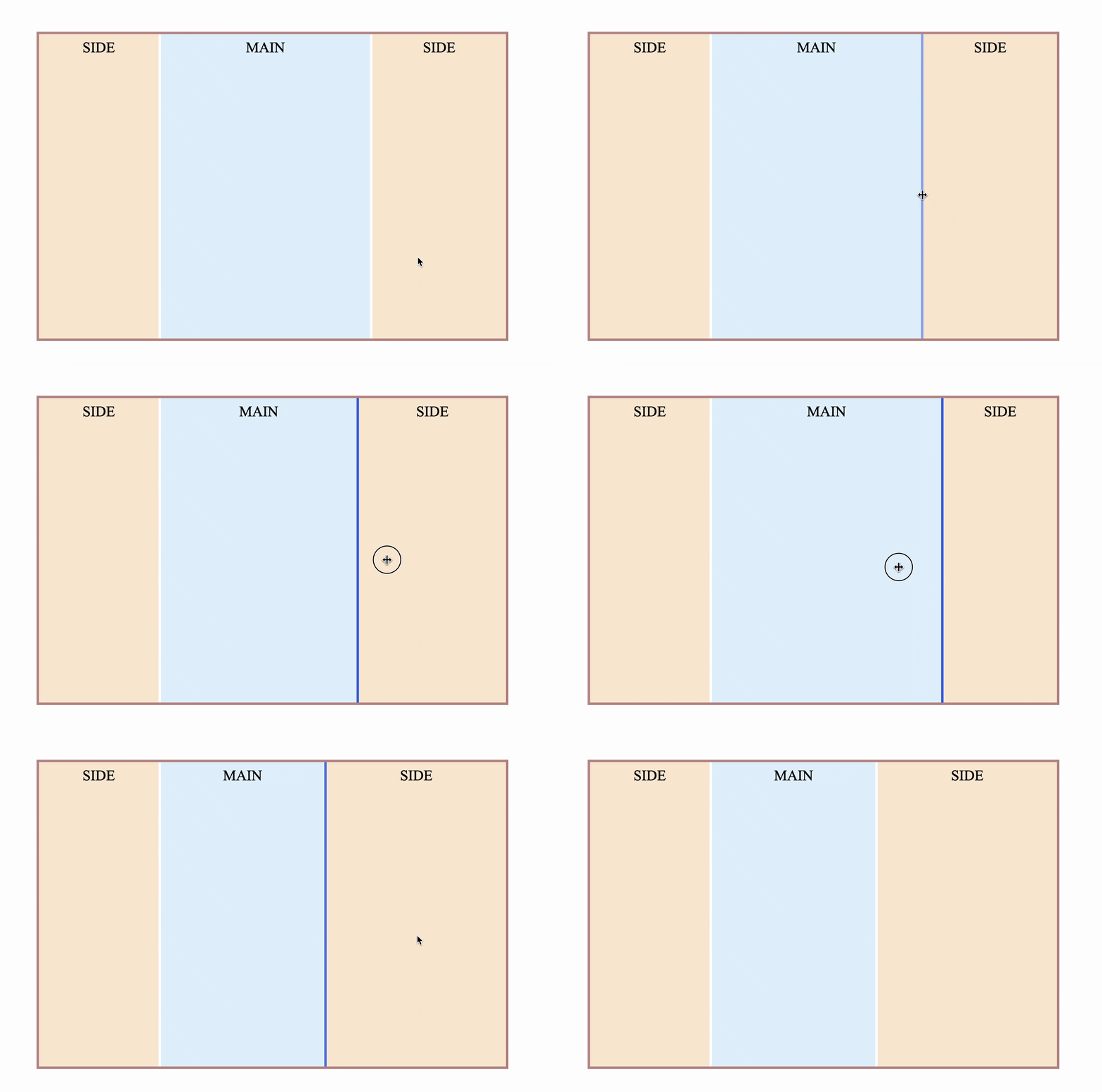
Sometimes there will be sidebars on both sides, and the middle part is adaptive, as follows
How is this achieved? First follow the idea of two-column layout
 <div class="con">
  <aside>
    <div class="resize"></div>
    <div class="line"></div>
    <section>SIDE</section>
  </aside>
  <main>
    MAIN
  </main>
  <aside class="right">
    <div class="resize"></div>
    <div class="line"></div>
    <section>SIDE</section>
  </aside>
</div>
However, there will be an obvious problem. Since resize is on the right side , if it is placed on the right sidebar, it will definitely be the opposite. increase, not intuitive
Is there any way to make resize come to the left?
The first thing that comes to mind is that by flipping the transformation , flipping in the horizontal direction can be achieved by scaleX(-1) , and the combination is
 .right .resize{
  transform: scale(-1, 100);
}
Works well under Chrome
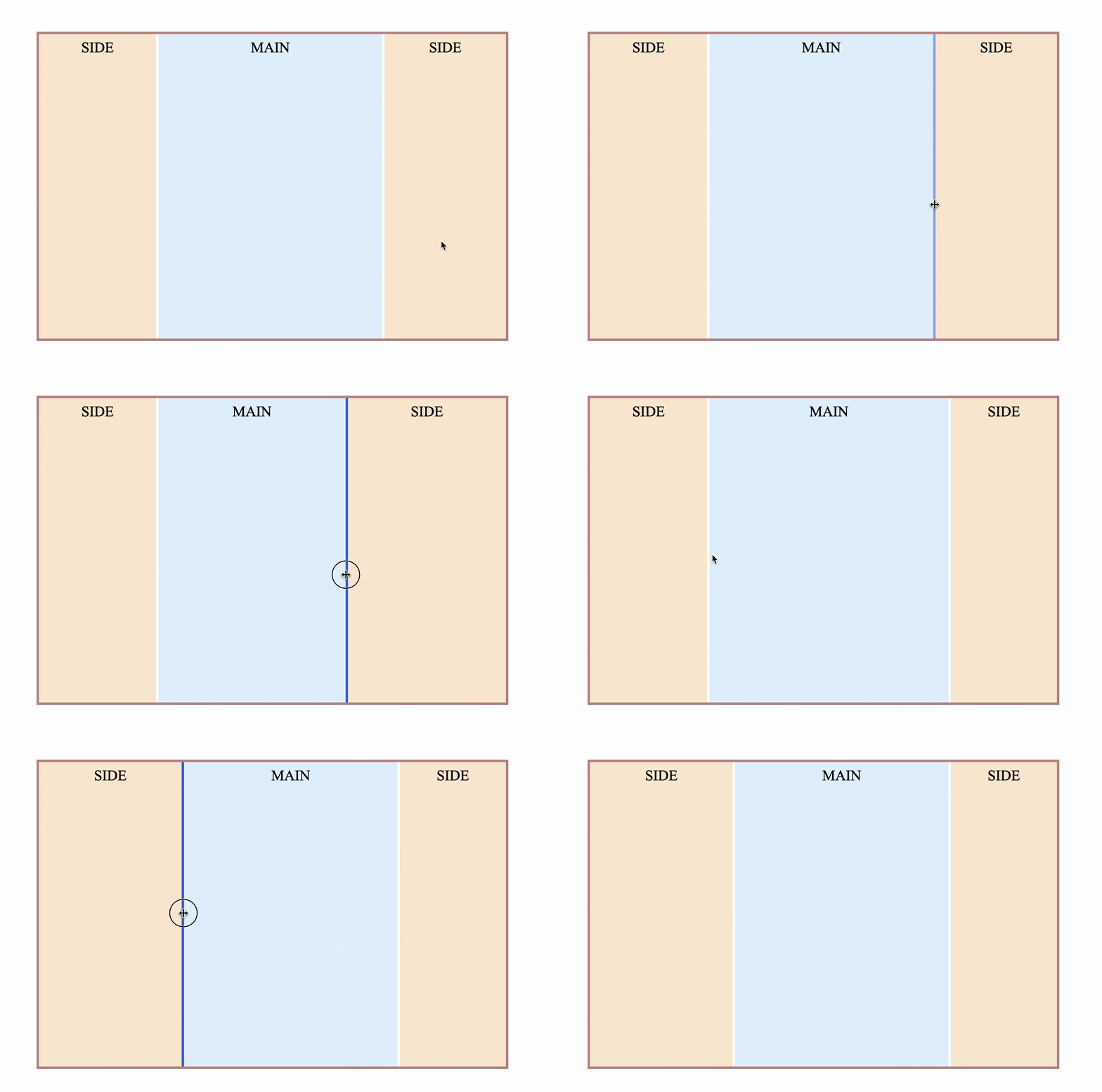
However, Firefox is a bit weird
Drag to the right, and the width of the right sidebar increases instead. The reason is that on Firefox, the horizontal flip of transform only changes the visual effect, but does not change the interaction behavior. Is there any way to really change the position of resize ?
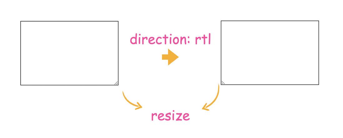
There really is, but you can only change the position in the horizontal direction through the direction attribute. This is a property that can change the flow of document direction, some languages are from right to left, so after setting, resize also changed from right to left.
So the implementation is
 .right .resize{
  direction: rtl;
}
In this way, Chrome and Firefox are normal
The complete code can be accessed at: CSS Stretchable Column Layout (codepen.io) or CSS Stretchable Column Layout (juejin.cn)
5. Other combined column effects
The combined column effect is indispensable in the vertical direction.
The columns in the vertical direction are similar to those in the horizontal direction, and you only need to zoom in enough in the horizontal direction.
 .resize-top{
  width: 16px;
  resize: vertical;
  transform: scaleX(100);
}
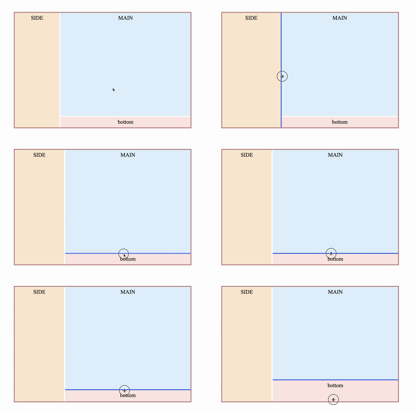
Now you can try to achieve the layout effect at the beginning of the article
 <div class="con">
  <aside>
    <div class="resize"></div>
    <div class="line"></div>
    <section>SIDE</section>
  </aside>
  <main>
    <div class="main">
      MAIN
    </div>
    <footer>
      <div class="resize resize-top"></div>
      <div class="line"></div>
      <section>bottom</section>
    </footer>
  </main>
</div>
However, there is a defect that it is impossible to move resize from the bottom to the top by direction or other means.
It can only be achieved by transform: scale(-1, 100); , which results in a poor experience of vertical stretching in Firefox. The effect is as follows
Chrome works perfectly:
Firefox performed poorly:
The complete code can be accessed at: CSS Stretchable Column Layout 2 (codepen.io) or CSS Stretchable Column Layout 2 (juejin.cn)
Continue to adjust, you can also achieve such a layout effect
The complete code can be accessed at: CSS Stretchable Column Layout 3 (codepen.io) or CSS Stretchable Column Layout 3 (juejin.cn)
6. To summarize
The above has achieved 4 common column stretching effects through pure CSS, which can basically meet the common layout requirements. Is it very practical? Some key points are summarized below
- The implementation principle is the CSS resize property
- The condition for resize to take effect is that overflow cannot be visible
- Resize is actually the intersection of horizontal and vertical scroll bars under Chrome. Changing the scroll bar size can change the resize size.
- resize can also be achieved by scaling the overall container
- Resize is in the lower right corner by default, and can be flipped horizontally to the lower left corner. Chrome supports stretching perfectly, but Firefox does not.
- You can also change the way the document flows through the direction, changing the resize from the lower right corner to the lower left corner
- Resize in the vertical direction can only be achieved by transform flipping, so Firefox has a poor experience
Although Firefox is slightly flawed in the vertical direction, if you don't have much need for compatibility, such as internal company projects, Electron applications, etc., then use it with confidence and don't be constrained by compatibility. Finally, if you think it's good and helpful to you, please like, bookmark, and forward ❤❤❤
Welcome to my public account: front-end detective







**粗体** _斜体_ [链接](http://example.com) `代码` - 列表 > 引用。你还可以使用@来通知其他用户。