Welcome to WeChat public account: front-end detective
Introduce a CSS animation synthesis tips. First look at the effect
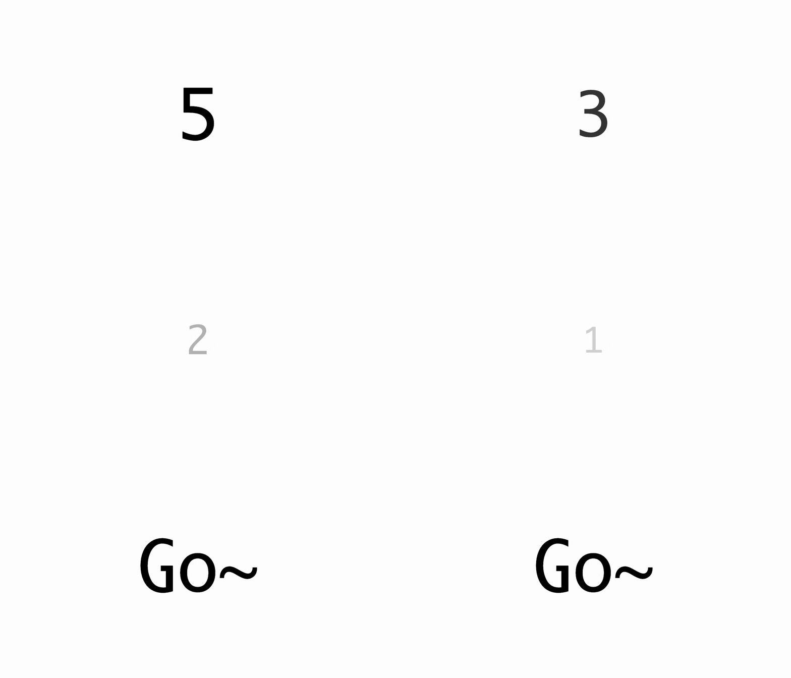
This is a very "dynamic" countdown effect, which is usually more common in the opening of some activities. After analyzing the entire animation process, it is not difficult to find that there are the following types of animations
- change in numbers
- Zoom out and zoom in
- Transparency change
I don't know if my friends can observe it? Let's take a look at the specific implementation
A change in numbers
Let's first look at the changes in numbers.
This trick is in the previous article: Still using timers? CSS can also be used for the first time in electronic clocks , here is another introduction
In the past, changes in numbers may require creating multiple labels and then changing the displacement to achieve
 <count-down>
    <span>5</span>
  <span>4</span>
  <span>3</span>
  <span>2</span>
  <span>1</span>
</count-down>
This method requires creating multiple tags, which is slightly cumbersome and not easy to expand. Now there's a cleaner way to do it, and that's CSS @property . What is this for? To put it simply, you can customize the properties. In this example, you can make the numbers transition and animate like colors . You may not understand much. Just look at the example.
Suppose the HTML is like this
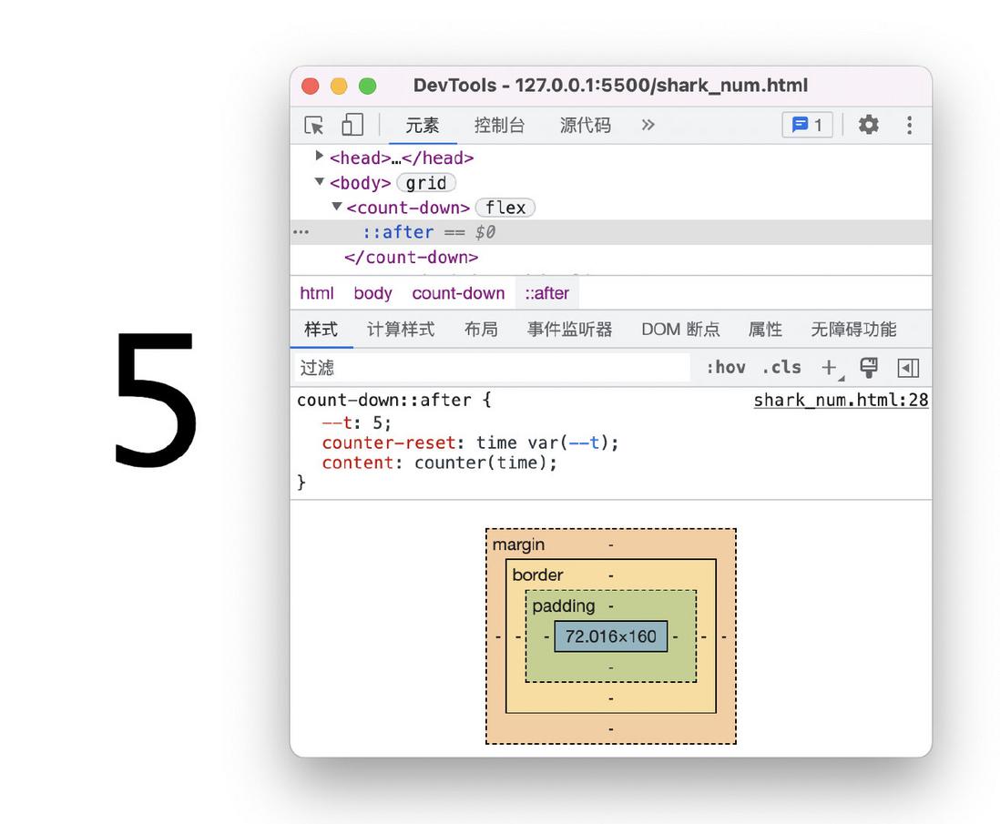
<count-down style="--t: 5"></count-down>Then we render the numbers to the page through CSS variables, here we need to use pseudo elements and counters
If you are interested, you can refer to this article: Tips: How to display CSS var variable values with the help of the content attribute
 count-down::after{
  counter-reset: time var(--t);
  content: counter(time);
}
The effect is as follows
How to make this number change? Can use CSS animation
 @keyframes count {
    to {
        --t: 0
    }
}
count-down::after{
    --t: 5;
    counter-reset: time var(--t);
    content: counter(time);
    animation: count 5s forwards;
}
The effect is as follows
The effect now is only that after 5 seconds, the number has changed from 5 to 0, and there is no such stage change as 5 => 4 => 3 => 2 => 1. Then the most important step comes, add the following custom properties
 @property --t {
    syntax: '<integer>';
    inherits: false;
    initial-value: 0;
}
Yes, just add this small piece of CSS and the effect will come out
Isn't it amazing? It can be understood that, after being defined by @property , this variable --t itself can be animated separately, just like the color change.
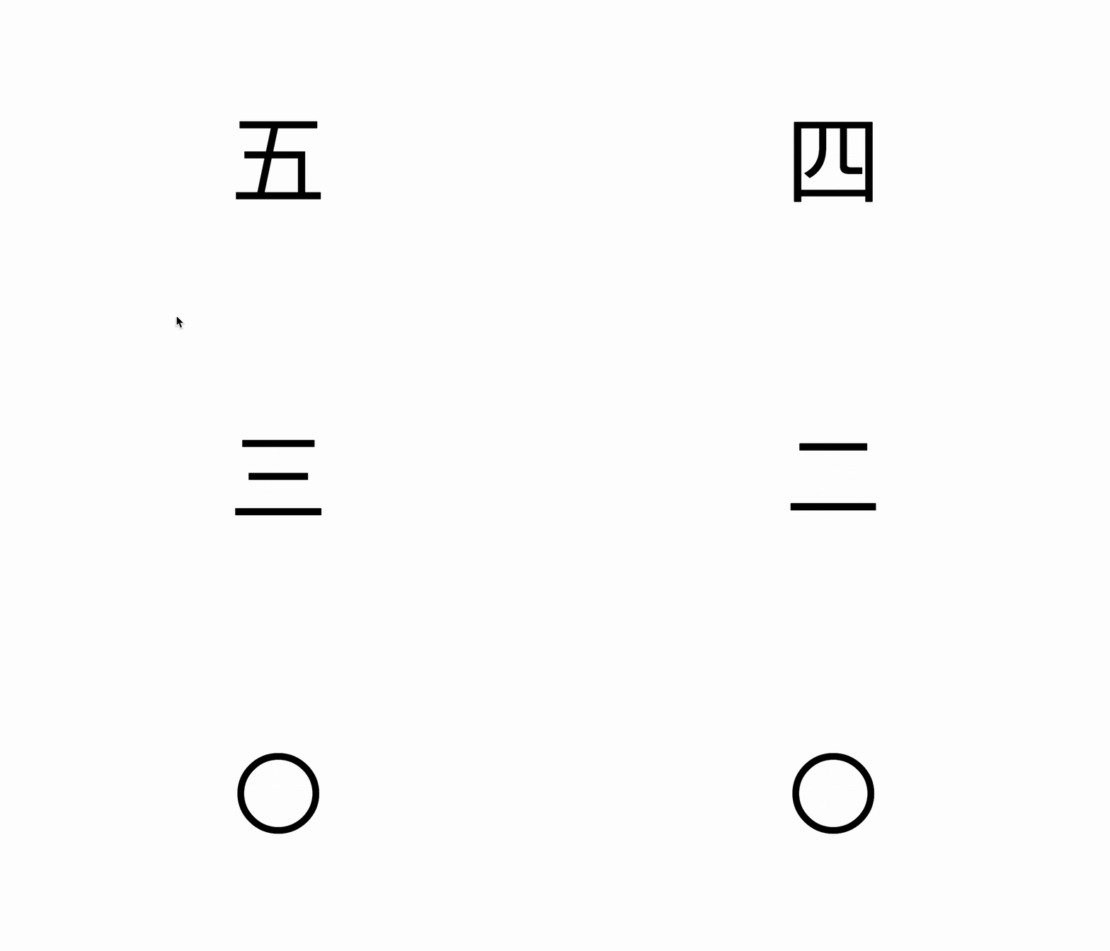
In addition, the advantage of using the counter is that you can change the type at will. For example, if you change the Arabic numerals above to Chinese counting, you only need to change the type of the counter.
The complete type can refer to: list-style-type
 count-down::after{
    --t: 5;
    counter-reset: time var(--t);
    content: counter(time, cjk-decimal); /*中日韩十进制数*/
    animation: count 5s forwards;
}
The effect is as follows
Is it very convenient?
The end of the countdown
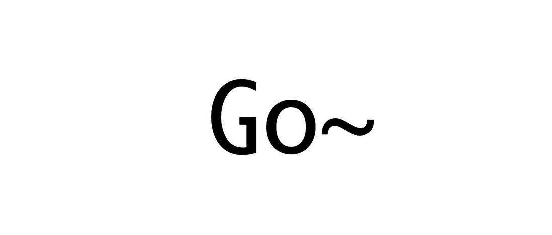
The last end of the counter above is "0", obviously we need some specific hint, such as "Go~"
How to change the state of the last frame? There are two ways here:
- Overlay with animation
- Override by counter
Let's first look at the first way, this is easier to understand, redefine an animation, after the countdown is over, reset the last frame
 @keyframes stop {
    to {
        content: 'Go~';
    }
}
count-down::after{
    --t: 5;
    counter-reset: time var(--t);
    content: counter(time);
    animation: count 5s forwards,
    stop 5s step-end forwards;
}
· The effect is as follows
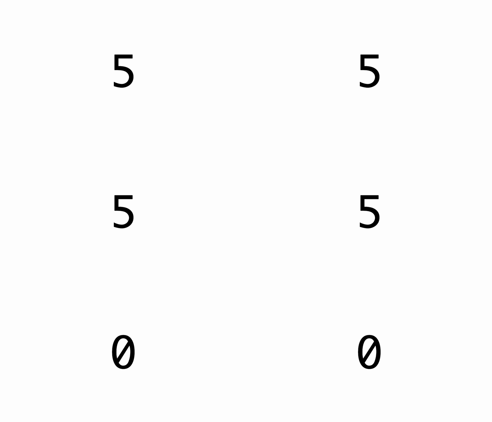
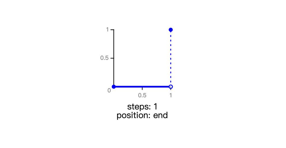
Note that the animation function here is step-end , why is this? step-end can also be written as steps(1,end) , you can understand that there are only two states in the entire animation. During the running process, both are the initial state, and the state is changed only when the last frame is reached. The following It's a screenshot from MDN
Let's look at the second way, which is achieved by customizing the counter. The principle is actually somewhat similar to JS thinking. When the number is 0, let the counter specify a special value. The specific implementation is as follows
 @counter-style stop {
    system: cyclic;
    symbols: "Go~";
    range: 0 0;
}
Here is a brief explanation. There is a range attribute, which indicates the range of the counter. Since only 0 needs to be specified here, it is the interval 0 0 . Then there is system , which means the computing system, here is cyclic , which means to recycle a set of characters provided by the developer, which is defined by symbos . Then symbos represents the calculation symbol, that is, the character displayed in detail, which is specified here as Go~ .
The content of this part of the custom counter is relatively complex and relatively new. If you are interested, you can refer to this article by Zhang Xinxu: CSS @counter-style rules in detail
then the application
 count-down::after{
      /**/
    counter-reset: time var(--t);
    content: counter(time, stop); /*自定义计数器*/
}
This can also achieve the same effect, and the implementation is more elegant
3. Zoom and Transparency Changes
These two animations are actually carried out at the same time and can be placed in one animation
 @keyframes shark {
    0%{
        opacity: 1;
        transform: scale(1);
    }

    50%{
        opacity: 0;
        transform: scale(0.4);
    }
}
Then set the animation duration to 1s and loop 5 times
 count-down::after{
    --t: 5;
    counter-reset: time var(--t);
    content: counter(time);
    animation: count 5s steps(5) forwards,
    shark 1s 5;
}
The effect is as follows
Is it a little awkward? Because the change of the number is sudden, you need to hide the change of the number until the transparency is 0. In order to achieve this effect, you only need to delay the flashing animation by 0.5 seconds.
 count-down::after{
    --t: 5;
    counter-reset: time var(--t);
    content: counter(time);
    animation: count 5s steps(5) forwards,
    shark 1s .5s 5; /*延迟 0.5s*/
}
It's more natural
However, there is still room for optimization. For example, digital animations are a bit too coherent now. If you want numbers to stay for a while after they appear, or you want them to appear slower and disappear faster , what should you do? In fact, this is much easier than imagined, just need to change the key frame position, as follows
 @keyframes shark {
    0%{
        opacity: 1;
        transform: scale(1);
    }

    20%{
        opacity: 0;
        transform: scale(0.4);
    }
}
At the same time, the delay time also needs to be changed to 0.8 seconds, the effect is as follows
This achieves the effect shown at the beginning of the article
The following is the key point~ The complete code is as follows
 @property --t {
    syntax: '<integer>';
    inherits: false;
    initial-value: 0;
}
@counter-style stop {
    system: cyclic;
    symbols: "Go~";
    range: infinite 0;
}
html,body{
    margin: 0;
    height: 100%;
    display: grid;
    place-content: center;
}
count-down{
    display: flex;
    align-items: center;
    justify-content: center;
    font-family: Consolas, Monaco, monospace;
    font-size: 120px;
}
count-down::after{
    --t: 5;
    --dur: 1;
    counter-reset: time var(--t);
    content: counter(time, stop);
    animation: count calc( var(--t) * var(--dur) * 1s ) steps(var(--t)) forwards,
    shark calc(var(--dur) * 1s) calc(var(--dur) * .8s) calc(var(--t));
}
@keyframes count {
    to {
        --t: 0;
    }
}
@keyframes shark {
    0%{
        opacity: 1;
        transform: scale(1);
    }

    20%{
        opacity: 0;
        transform: scale(0.4);
    }
}
You can also visit the online example: CSS count-down(runjs.work)
RunJS , front-end code creation and sharing online.
In addition, there is a small easter egg in the demo, click to rerun the animation, the implementation is as follows
 count-down:active::after{
    animation: none;
}
4. Other animation effects
In addition to scaling effects, there can also be some displacement animations, such as this
 @keyframes shark {
    0%{
        opacity: 1;
        transform: translateY(0);
    }

    20%{
        opacity: 0;
        transform: translateY(100px);
    }
}
The effect is as follows
Is it a little strange? The animation is not coherent enough, one time down and the next up, is there any way to disappear and appear from top to bottom? Of course, it is also possible to achieve the following
 @keyframes shark {
    0%{
        opacity: 1;
        transform: translateY(0);
    }

    20%{
        opacity: 0;
        transform: translateY(100px);
    }

    21%{
        opacity: 0;
        transform: translateY(-100px);
    }
}
A very "adjacent" keyframe is added here, which means that in a transparent state, the displacement is "quickly" changed, so that the animation when the number appears is from top to bottom, and the whole is smoother. The effect is as follows
You can also adjust the zoom effect in the front to make it bigger and more shocking when it comes out.
 @keyframes shark {
    0%{
        opacity: 1;
        transform: scale(1);
    }

    20%{
        opacity: 0;
        transform: scale(.4);
    }

    21%{
        opacity: 0;
        transform: scale(5);
    }
}
The effect is as follows
Of course, there are other effects, such as rotation, bevel, etc., which requires your imagination~
V. Summary and Explanation
The above is the whole content of this article, a simple little animation, have you learned it? The following summarizes the implementation points:
- Complex animations can be broken down into multiple simple animations
- The change of the number can be realized by changing the displacement through multiple labels
- CSS counters can render numeric variables to the page
- CSS @property to animate CSS variables like a color change
- The advantage of CSS counter is that you can change the type at will, such as Chinese count
- The end of the countdown is the number 0 by default, the last frame can be reset by another animation
- You can render a counting symbol into a specified character by customizing the CSS counter
- The scaling and transparency changes are done at the same time and can be placed in an animation
- The change of numbers needs to be arranged when the transparency is 0, otherwise the changes of numbers are very abrupt
- Numbers appearing and disappearing animations can add an adjacent keyframe for quick homing
The article uses some relatively new properties, such as @property, and custom counters, but it doesn't matter, other solutions are also mentioned in the article. The overall idea of animation is unchanged. How to observe and decompose animation is the most important. important. Finally, if you think it's good and helpful to you, please like, bookmark, and forward ❤❤❤
Welcome to WeChat public account: front-end detective






**粗体** _斜体_ [链接](http://example.com) `代码` - 列表 > 引用。你还可以使用@来通知其他用户。