Any front-end component library, whether it is the famous tdesign, ant-design or element-ui in the industry, they all have their own set of icons. After observation, it is found that these icons are basically stable when the component library is released, and there are few adjustments, so they can always be stored in the git warehouse of the component library.
However, the component library used by our current business is gradually built according to business needs, and the icons inside are constantly updated. For a long time, we also adopted the method of putting icons into the library and maintaining them together with the component library. For each new icon added by the design team, it is necessary to entrust the component library developer to let the icon enter the library, submit it, release the version, and update the component library version on the business side. The problem brought about by this approach is that the operation is cumbersome and inefficient, and it will also cause the version number of the component library to skyrocket.
In order to solve this problem, an idea is to decouple the component library and the icon library, maintain them separately, and combine them when they are used. tdesign does just that:
https://tdesign.tencent.com/vue-next/components/icon
But this is still a bit troublesome, even the npm library of the icon also has maintenance costs, and it is necessary to design and export the icon, add it to the git warehouse and publish it; the business side must also update the icon library in time.
Is there a way to save the steps mentioned above? Let's expand on how we did it.
Solutions
The overall idea is to follow the concept of "decoupling", so that the component library and the icon library are independent of each other. First, let's analyze the relationship between our business and icons.
1. In our business, icons are all in SVG format, which can be placed on CDN.
2. These icons have different categories, such as "basic icons", "audio and video icons" and so on.
3. In the actual operation of the business, these icons will basically be used. Before this, the method of full introduction was adopted, so tree-shaking can be ignored.
Based on the above three background relationships, our icons can be uploaded to the CDN piece by piece according to the classification.
As shown in the figure above, icons of type "media" are grouped together and stored in the CDN in the form of JSON. Other types of icons are also stored in the same way.
Our component library is developed based on Vue, and the icon component in <q-icon> name . A manifest object is maintained inside the component, which stores all the icon resources. These icon resources are imported from JSON files through dynamic import:
 async beforeCreate() {
  for (const cate of iconCates) {
    const { default: icons } = await import(`./manifest/${cate}.manifest.json`);
    this.manifest = { ...this.manifest, ...icons };
  }
  this.getSvgIcon();
}
It can be seen that the JSON file introduced here is stored locally in the component library, and it seems that it cannot overcome the problem of "the icon is updated, and the component library should also be updated at the same time". Is this really true? Let's put this problem aside for a while, and look at what the component library looks like after being packaged from another angle.
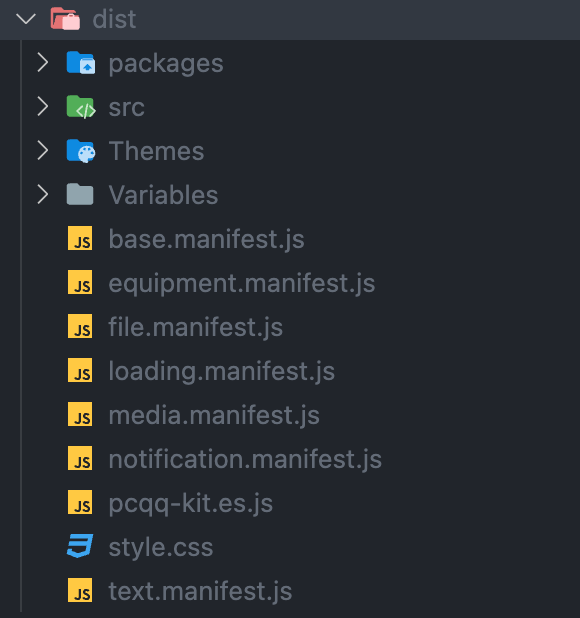
Our component library is developed based on Vite and its packaging is also based on this. After the component library is built, it is output to the dist directory to see what it has:
It can be seen that the JSON file entered through the dynamic imoprt in the code becomes the corresponding js file after being packaged. Let's open one of them:
It turns out that the packaging tool simply converts a JSON file into a js file that exports objects.
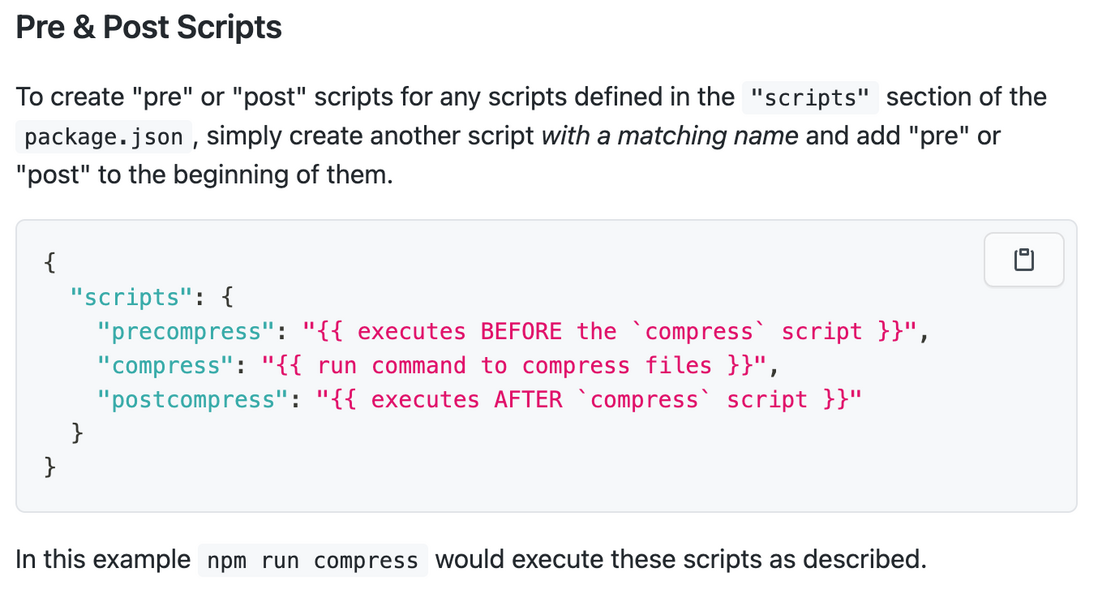
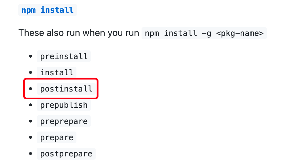
Since our component library is also provided to the business side in the form of an npm package, it means that when the business side uses npm install to install the component library, it will actually trigger a series of npm script Lifecycle hook. Regarding the content of npm script life hook, you can check the official document https://docs.npmjs.com/cli/v8/using-npm/scripts , here is an excerpt we need to use:
Execute on the business side npm install after the component library is installed, it will trigger the postinstall hook in the component library. We can pull the latest icon JSON file in this hook, compile it into js and put it in the correct directory of the component library. Through this method, when the business side installs the component library, the latest icon library has been pulled.
Icon management system
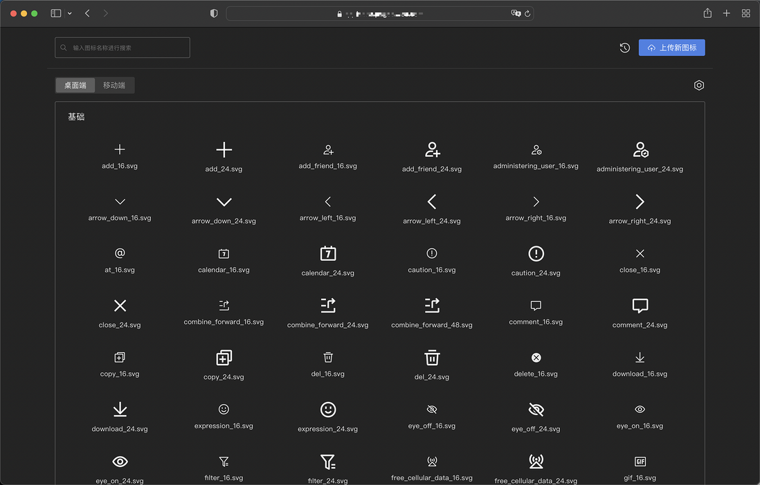
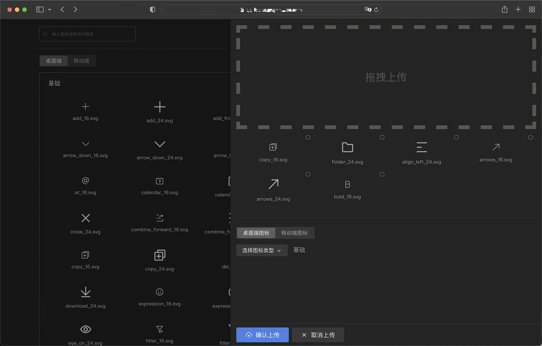
In the past, the newly added icons needed to be correctly placed in a certain directory of the component repository, and the referenced files and description documents had to be manually rewritten before they could be merged into the trunk and published. The process was very cumbersome. Based on the latest ideas, we hope that the icon can be completely maintained by the design team, and whether it is added, modified or deleted, it does not need to have any intersection with the component library. Based on this requirement, I spent two days building an icon maintenance system:
Design students can upload the icon by dragging and dropping, and with a few options, the icon can be submitted.
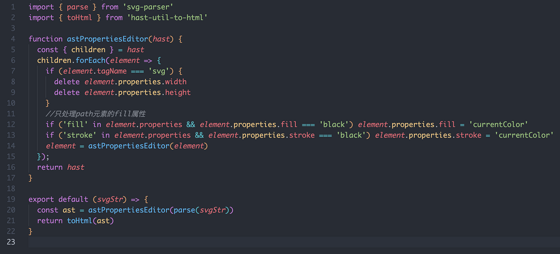
Here's an interesting piece of content. The designer poured out SVG icons through Figma, which by default have their width, height and color written to death. If it is used directly on the business side, there will be problems. Therefore, before the icons are submitted, they must be modified to delete or rewrite the hard-written attributes.
As shown in the figure, this SVG icon is written with a width and height of 12px and a color of black. These attributes should be removed. For efficient and elegant processing, I first parsed the XML file of this icon into HAST (Hypertext Abstract Syntax Tree), modified it based on this HAST, and then restored it to XML. The specific code is as follows:
After solving the problem of icon uploading, this system can of course also be used to delete some icons:
Component library postinstall hook
The component library triggers the logic of pulling the latest icon library JSON file through the postinstall hook, and compiles the JSON file into a js file:
npm script Add a postinstall command:
In this way, when npm install is executed on the business side, the latest icon library resources can be pulled.
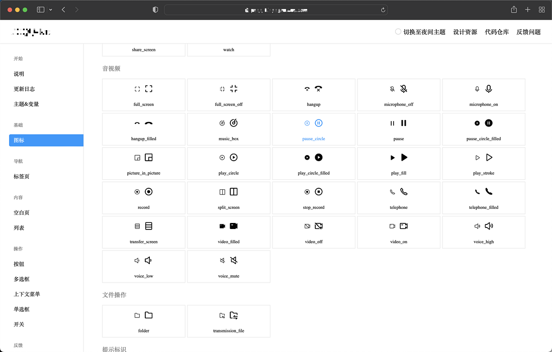
For the documentation of the component library, it is also possible to pull the JSON files of these icons in real time to display:
end
This solution is not very powerful, but it is very convenient for our application scenarios. Although there is no need to consider tree-shaking based on business considerations, "I can use it, but you can't do it." If possible, I hope that tree-shaking can be supported, and I need to spend some time to study how to break it.
In addition, there may also be a problem that offline business is affected due to the online modification of the icon. This problem is relatively easy to solve, just remove the icon from the document, but not really remove it from the CDN. But I haven’t done it now, mainly because the maintainer is within our team, and if there is a problem, just shout in the group, but if this scheme is to be promoted, it is still necessary to do a good job of these compatibility schemes.
When you are done, please like it~






**粗体** _斜体_ [链接](http://example.com) `代码` - 列表 > 引用。你还可以使用@来通知其他用户。