Welcome to my public account: front-end detective
It's so hot today, if you don't believe me, read the title
Today's ҈ day ҈ really ҈ is ҈ hot ҈ change ҈ ҈!
You can also view the screenshot below
I believe everyone can see such a "heated" title recently. So, how is this achieved? Can CSS achieve a similar effect? Let's take a look
1. Chrysanthemum characters 488
First of all, the realization of this type of character effect is very simple. The essence is to insert a special "flower character", and you can see its real appearance on the console.
The long chrysanthemum-like characters here are very special and cannot be typed under normal circumstances. They can only be entered by copying or some special input methods. We can also separate this string as follows
Through the conversion, with the help of Zhang Xinxu's online conversion tool, you can see that the Unicode value is 488
So, in HTML, you can also enter manually by escape characters ҈
<h2>今҈天҈真҈是҈热҈化҈了҈~</h2>The same effect can also be obtained
2. Generated by pseudo elements
What should I do if I want the page to display the "heated" style, but the copied text is normal?
First, you need to split the text and wrap it with tags, as follows
[...'今天真是热化了'].map(el => `<span>${el}</span>`).join('')The result is as follows
<h2><span>今</span><span>天</span><span>真</span><span>是</span><span>热</span><span>化</span><span>了</span></h2> Then, add a daisy character \488 after each tag via pseudo-element
 span::after{
  content:'\488'
}
Look, it works
In this way, there will be no special characters in the page, and it is more friendly to search engines
3. Generated by text decoration
The above method of passing pseudo elements is almost the same as the original implementation method, but each character needs to be wrapped with a layer of labels, which is slightly cumbersome. Is there a way not to split it? It can also be simulated, that is, with the help of text decoration attributes: text-emphasis
If you are interested, you can refer to this article by Zhang Xinxu: Emphasize text using CSS text-emphasis
Suppose the HTML is like this
<p>今天真是热化了~</p> Then set the decorative attributes, the copy is the chrysanthemum character just now \488
 p{
  text-emphasis: '\488';
}
The effect is as follows
Now there are two questions
- How to change the size of the chrysanthemum character?
- How can I make this daisy character superimposed on the title?
The size of text-emphasis is related to the font and size of the original text. In Chinese characters, it is about 1/2 of the text, so in order not to affect the size of the original title, a pseudo element can be used here to generate a copy of the same , the specific method is
<p title="今天真是热化了~">今天真是热化了~</p>Then use pseudo-elements to dynamically generate attributes, text decoration is also placed on pseudo-elements, and set absolute positioning
 p::before{
  position: absolute;
  content: attr(title);
  text-emphasis: '\488';
}
To distinguish, pseudo-elements are given special colors
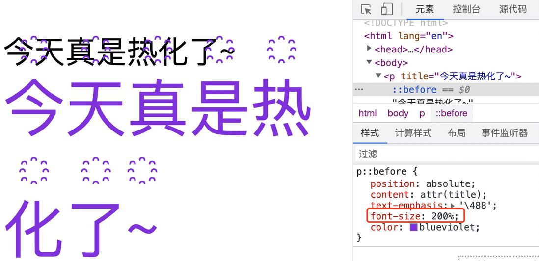
Then, enlarge the pseudo-element font size to 2 times the original size
 p::before{
  position: absolute;
  content: attr(title);
  text-emphasis: '\488';
  font-size: 200%;
}
Now the text wraps because it is too big, it doesn't matter, you can reduce the character spacing, use letter-spacing to achieve
 p::before{
  position: absolute;
  content: attr(title);
  text-emphasis: '\488';
  font-size: 200%;
  letter-spacing: -.5em;
}
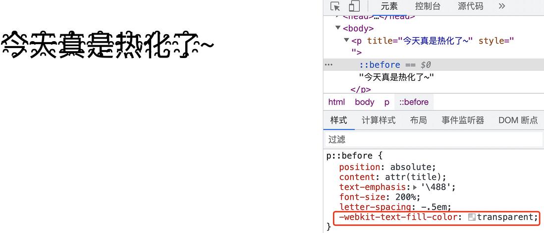
The title generated by the pseudo element is hidden below, and the text color can be set to transparent. By default, the decoration color follows the text color, so additional settings may be required
 p::before{
  text-emphasis: '\488' #000;
  color: transparent;
}
Here, I prefer to use color fill to achieve
 p::before{
    -webkit-text-fill-color: transparent;
}
The effect is as follows
The advantage of this is that the inheritance of the original color can be maintained, such as changing the color in the outer layer
The complete code above can be accessed online demo: CSS hot-word (runjs.work)
RunJS , front-end code creation and sharing online.
Fourth, to summarize
The above is the whole content. It mainly introduces a special character and its application in HTML, and then simulates a similar effect through CSS. The following summarizes the main points of implementation.
- The heated text essentially inserts a special character
- The Unicode value of this special character is
488 - This special character can be inserted into HTML through pseudo-elements, but each character needs to be wrapped in a tag
- You can also generate special characters through the text decoration attribute
text-emphasis - The color of the text decoration is inherited from the text color by default
Of course, text decoration is not a perfect method here. It cannot wrap lines, and there is also a problem with English support. It is recommended to use the first pseudo-element generation method for specific content. Finally, if you think it's good and helpful to you, please like, bookmark, and forward ❤❤❤
Welcome to my public account: front-end detective


**粗体** _斜体_ [链接](http://example.com) `代码` - 列表 > 引用。你还可以使用@来通知其他用户。