This article will explore some interesting text animations in the context of multi-line text.
Compared with single-line text, the scene of multi-line text will be more complicated, but in actual business, there are also many multi-line text, but its effect processing will be more difficult than that of single-line text.
Fade in single-line and multi-line text
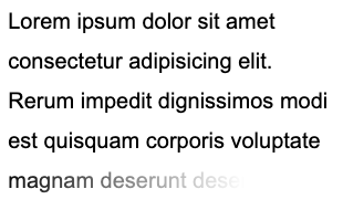
First, let's look at an example where we want to implement the fade-out of such a single-line text:
Using mask , you can easily achieve this effect, just need:
<p>Lorem ipsum dolor sit amet consectetur.</p> p {
mask: linear-gradient(90deg, #fff, transparent);
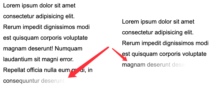
}But what if, the scene becomes multi-line? We need to make the last line of the multi-line text fade out and adapt to different multi-line scenarios:
This is a little more complicated, but there are multiple ways to do it.
First let's look at the way to use background .
Implemented using background
A trick will be used here, that is display: inline inline element background display form and display: block block-level element (or inline-block flex , grid ) are inconsistent.
Just look at an example:
 <p>Lorem .....</p>
<a>Lorem .....</a>
Note here that the <p> element is a block-level element , while the <a> is an inline element .
We uniformly add a gradient background color from green to blue to them:
 p, a {
  background: linear-gradient(90deg, blue, green);
}
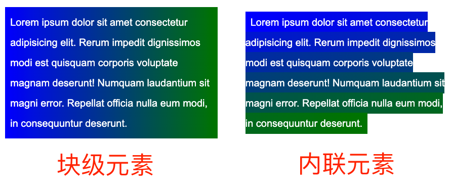
Take a look at the effect:
What does that mean? The difference is obvious. The background of block-level elements is a gradient as a whole, while each line of inline elements has a different effect, and the whole is connected and connected to form a whole.
Based on this feature, we can construct such a layout:
<p><a>Mollitia nostrum placeat consequatur deserunt velit ducimus possimus commodi temporibus debitis quam</a></p> p {
position: relative;
width: 400px;
}
a {
background: linear-gradient(90deg, transparent, transparent 70%, #fff);
background-repeat: no-repeat;
cursor: pointer;
color: transparent;
&::before {
content: "Mollitia nostrum placeat consequatur deserunt velit ducimus possimus commodi temporibus debitis quam";
position: absolute;
top: 0;
left: 0;
color: #000;
z-index: -1;
}
}It needs to be explained here:
- To take advantage of the
backgroundfeature of the actual inline element, we need to wrap the actual text inside the inline element<a> - The actual text is hidden using
opacity: 0, the actual displayed text uses the pseudo-element of the<a>element, and its level is set to-1, the purpose is to allow the background of the parent element to cover it -
<a>The gradient of the element is from transparent to white, use it to cover the actual text displayed by the pseudo element below, and realize the fading of the text
In this way, we can get such an effect:
Here, the <a> element's gradient is from transparent to white, and the text behind is gradually covered with white.
If I change the gradient to go from black to white (with some transparency on the black and white of the gradient for ease of understanding), you can quickly see what's going on:
 a {
    background: linear-gradient(90deg, rgba(0,0,0, .8), rgba(0,0,0, .9) 70%, rgba(255, 255, 255, .9));
}
The complete code, you can click here: CodePen Demo -- Text fades away
Of course, this solution has many problems, such as using z-index: -1 , if the parent container is set with a background color, it will fail, and it is not easy to accurately locate the last line. Therefore, a better way is to use mask to solve.
Use mask to achieve
Then, if we use mask , the problem will become simpler. We only need to implement two mask areas in one mask a9c968d70183582d903315e273b726c4--- area, one with To accurately control the last row, a block is used to control the transparency of the rest.
There is also no need to specially construct HTML:
<p>Lorem ipsum dolor sit amet ....</p> p {
width: 300px;
padding: 10px;
line-height: 36px;
mask:
linear-gradient(270deg, transparent, transparent 30%, #000),
linear-gradient(270deg, #000, #000);
mask-size: 100% 46px, 100% calc(100% - 46px);
mask-position: bottom, top;
mask-repeat: no-repeat;
}The effect is as follows:
The core lies in the entire mask related code. As mentioned above, the mask divides the entire area into two parts for control:
In the lower part, we use mask to do a right-to-left fade. And using mask-position positioning, and the calculation of calc, no matter how many lines of text, it is applicable! It should be noted that the 46px here means the line height of a single line of text plus the distance of padding-bottom . Can fit any number of lines of text:
The complete code, you can click here: CodePen Demo -- Text fades away 2
Add animation effects
Well, after reading the static, let's implement a kind of dynamic text fading and disappearing.
The overall effect is that when the mouse Hovers to the text, the entire text gradually disappears line by line. Like this:
The core here is that it needs to adapt to different numbers of lines, different widths, and the text disappears line by line.
The core here will still use the features of the inline element background . In this article, we introduced such a technique in the article on the wonderful use of background to achieve fancy text effects .
Fade the entire text from one color to another :
 <div class="button">Button</div>
<p><a>Lorem ipsum dolor sit amet consectetur adipisicing elit. Mollitia nostrum placeat consequatur deserunt velit ducimus possimus commodi temporibus debitis quam, molestiae laboriosam sit repellendus sed sapiente quidem quod accusantium vero.</a></p>
a {
background:
linear-gradient(90deg, #999, #999),
linear-gradient(90deg, #fc0, #fc0);
background-size: 100% 100%, 0 100px;
background-repeat: no-repeat;
background-position: 100% 100%, 0 100%;
color: transparent;
background-clip: text;
}
.button:hover ~ p a {
transition: .8s all linear;
background-size: 0 100px, 100% 100%;
} It needs to be explained here. Although color: transparent is set, the text is still colored by default. The default text color is given by the first layer of gradient background: linear-gradient(90deg, #999, #999), linear-gradient(90deg, #fc0, #fc0) , which is this layer : linear-gradient(90deg, #999, #999) .
When the hover is triggered, linear-gradient(90deg, #999, #999) this layer of gradient gradually disappears, and another layer of linear-gradient(90deg, #fc0, #fc0)` gradually appears, so as to achieve the above effect.
CodePen -- background-clip text fade effect
Well, we can learn from this technique to realize the fading and disappearing of the text. One layer is the actual text, and the other layer is the mask for animation. In this layer of animation, the text itself is set to color: transparent , so that we can only see the change of the background color. .
The rough code is as follows:
 <p>
    <a class="word">Mollitia nostrum placeat consequatur deserunt.</a>
    <a class="pesudo">Mollitia nostrum placeat consequatur deserunt.</a>
</p>
p {
width: 500px;
}
.word {
position: absolute;
top: 0;
left: 0;
color: #000;
}
.pesudo {
position: relative;
background: linear-gradient(90deg, transparent, #fff 20%, #fff);
background-size: 0 100%;
background-repeat: no-repeat;
background-position: 100% 100%;
transition: all 3s linear;
color: transparent;
}
p:hover .pesudo,
p:active .pesudo{
background-size: 500% 100%;
} Among them, .word is the text layer actually displayed at the bottom, and pesudo is the background layer stacked above, when hovering, the background change of the upper element is triggered, and the lower part is gradually blocked. text, and can be applied to texts of different lengths.
Of course, the above scheme will have a little flaw, we can't make the overall animation time of text of different lengths consistent. When the number of copies is not much different, it is acceptable as a whole. When the difference is large, the duration of transition-duration needs to be set separately.
The complete DEMO, you can poke: CodePen -- Text fades away Animation
at last
Well, this is the end of this article, I hope it helps you :)
More wonderful CSS technical articles are summarized in my Github -- iCSS , which will be updated continuously. Welcome to click star to subscribe to the collection.
If you have any questions or suggestions, you can communicate more. Original articles are limited in writing and knowledge. If there are any inaccuracies in the article, please let me know.


**粗体** _斜体_ [链接](http://example.com) `代码` - 列表 > 引用。你还可以使用@来通知其他用户。