In this article, I will introduce you to a technique that uses several CSS techniques to the extreme, using pure CSS to implement a jigsaw puzzle.
This tip comes from Temani Afif 's CodePen CSS Only Puzzle game . A jigsaw puzzle fully implemented in CSS.
What we have to do is to restore the scattered picture fragments into a complete picture, like this:
Note that this is completely implemented by CSS, let's break down the core difficulties:
- How to make an element draggable?
- How to drag and drop an element from a fixed position to another position?
- The most difficult thing is that based on (2), drag the element and release it. Only when it is released at a specific position, the element will be fixed to the new position, otherwise, it will return to the original position.
Oh No, the above (2) and (3) don't seem like problems that simple CSS can solve.
So, in the end is how clever collocation, combination, can finally use CSS to achieve such an effect? Let's break down the process step by step.
Drag and drop elements using the draggable attribute
Based on the first point above, how to make an element draggable is the easiest solution.
In HTML5, a new attribute draggable is added to the tag, and after setting it to true , the element dragging effect can be realized.
In simple terms:
 <div>draggable false</div>
<div draggable="true">draggable true</div>
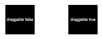
We implement two divs like this, the second of which sets draggable="true" :
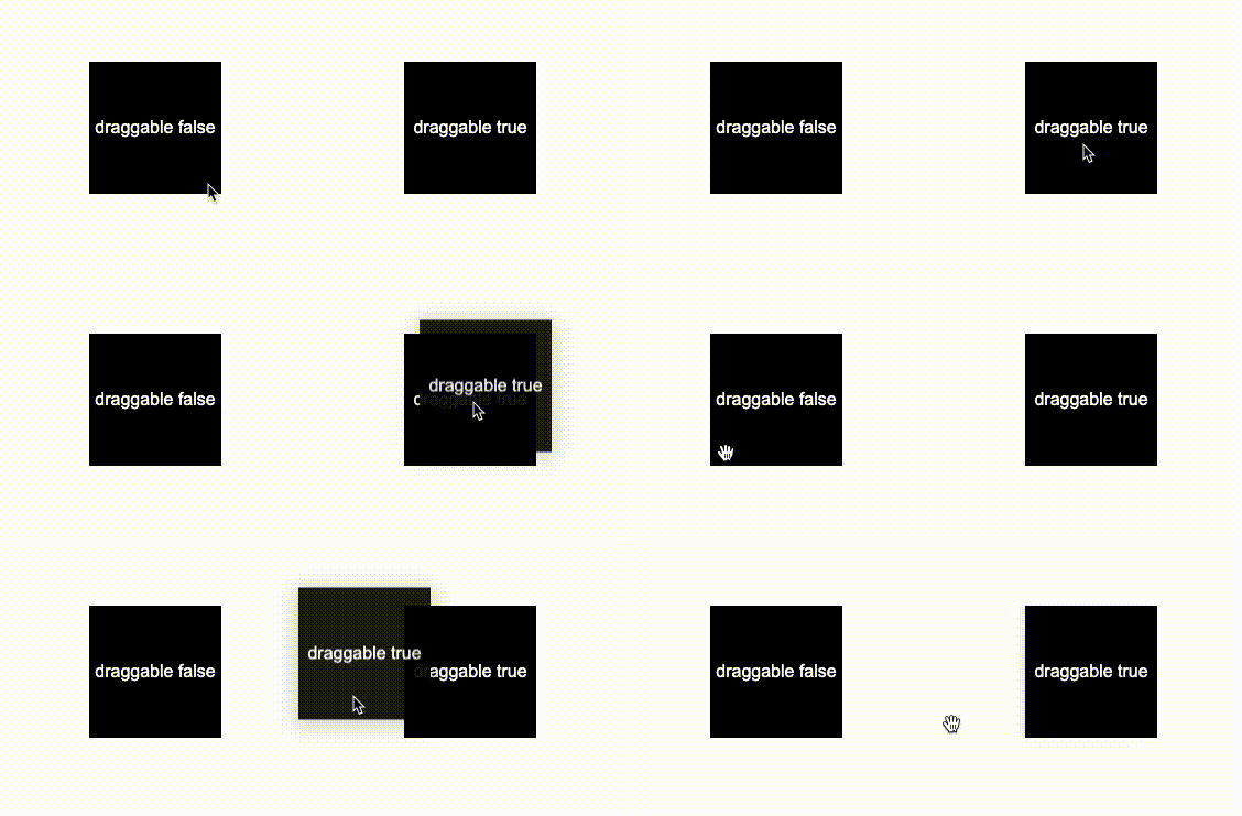
The element with draggable="true" is set, and you can drag the element by holding down the mouse for a long time:
In this way, the dragging problem is solved. CodePen Demo -- HTML draggable Demo
Move an element from position A to position B
OK, the next difficulty is how to move the element from position A to position B.
The core here is the clever application of the transition element.
Let's look at an example. If there is an element that has been offset translate(120px, 120px) , when we hover the element, let it return to its original position:
 div {
    transform: translate(120px, 120px);
}
div:hover {
    transform: translate(0, 0);
}
The effect is as follows:
The interesting thing here is:
- When we hover the element, the element returns to its place
- Due to the return of the element, the hover state is lost, it returns to the original state, and then the hover state is re-triggered. Repeatedly, you will see violent beating.
Then, is there a way to make it reset and not jump back?
Yes, we can make the whole transition very slow by setting a very large transition-duraiotn and a very large transition-delay :
 div {
    transform: translate(120px, 120px);
    transition: 999999s 999999s;
}
div:hover {
    transform: translate(0, 0);
    transition: 0s;
}
This way, after the element is reset, it never jumps back (in theory):
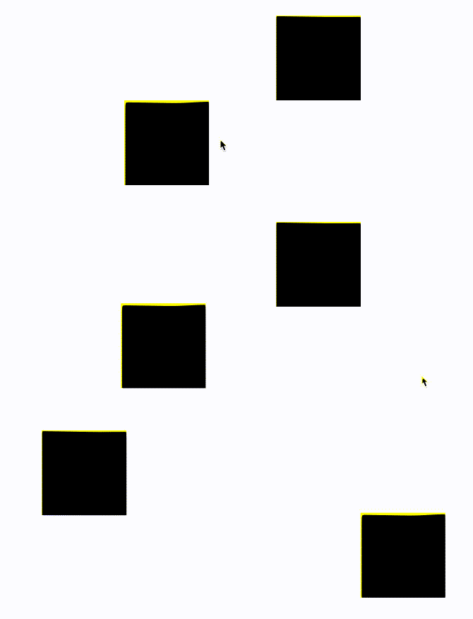
If we set the above transition: 999999s 999999s , the transition duration and transition delay time** are set to be shorter, for example, if they are both set to 2s transition: 2s 2s , the effect is as follows:
That way, you should have a rough idea of what's going on.
Implement triggers through the :active pseudo-class
Of course, only the above knowledge is not enough.
First of all, the movement of the element is not triggered by the hover, but needs to be dragged to a specific position and the drag effect of the mouse is released to realize the movement of the element. And, the element can only move if it is released at a specific location.
How is this accomplished? Here, we also need to bubble through the event .
Let's simply modify the code, add a parent element to the element, and add a markup element:
 <div class="g-wrap">
    <div class="g-flag">FLAG</div>
    <div class="g-box" draggable="true"></div>
</div>
.g-flag:hover ~ .g-box {
transform: translate(0, 0);
transition: 0s;
}
.g-box {
width: 120px;
height: 120px;
background: #000;
transform: translate(120px, 120px);
transition: 9999s 9999s;
} Among them, .g-flag is a trigger we implemented. We no longer use the hover element itself to achieve the movement of the element, but the special trigger of the hover to achieve the movement of the element, which should be well understood:
it is good! The most crucial step is here !
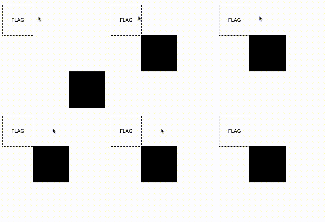
We need to pass the bubbling of the event. When we start to drag the .g-box element itself, our trigger will appear, and set a very short dwell time, so that the moment the mouse is dropped, the trigger is triggered Element reset.
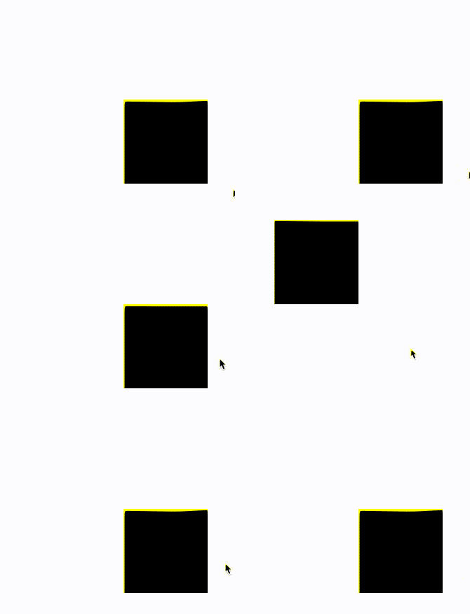
What does that mean? Take a look at the renderings:
The core code is as follows:
 <div class="g-wrap">
    <div class="g-flag">FLAG</div>
    <div class="g-box" draggable="true"></div>
</div>
.g-wrap {
position: relative;
width: 120px;
height: 120px;
}
.g-box {
width: 120px;
height: 120px;
background: #000;
transform: translate(120px, 120px);
transition: 9999s 9999s;
}
.g-flag {
position: absolute;
width: 0;
height: 0;
top: -100px;
left: -100px;
transition: 0 0.5s;
}
.g-wrap:active .g-flag {
border: 1px dashed #000;
width: 100px;
height: 100px;
}
.g-flag:hover ~ .g-box {
transform: translate(0, 0);
transition: 0s;
} The very core point used here is that in the process of dragging the .g-box element, its :active event is triggered, and at the same time, this event will bubble to its parent element .g-wrap on. Using the bubbling of events, we can let the element display the trigger during the dragging process, and trigger the hover event of the trigger immediately after the mouse is released, so that the element moves from position A to position B, which is really wonderful Unspeakable!
Finally, we only need to make the position of the trigger consistent with the position we want the element to go to, and then we can realize the principle of the puzzle:
A complete demo of dragging and dropping a single element from point A to point B, you can click here: CodePen Demo -- HTML draggable Demo
Implement Scrabble Puzzles
After mastering the above principles, the above jigsaw puzzles are easily solved. If you are interested, you can take a look at its source code: CSS Only Puzzle game . Most of the work that remains is to cut the complete image into different copies and place them randomly in different positions.
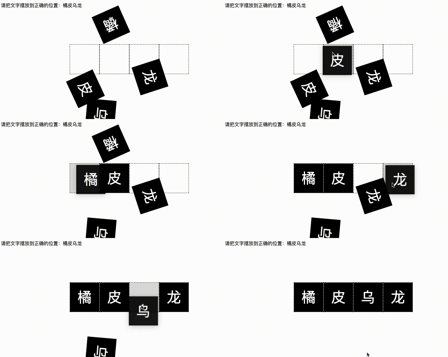
Here, with the help of the same principle, I will give a similar DEMO, a simple scrabble game, and give the complete code:
 <p class="source">请把文字摆放到正确的位置:橘皮乌龙</p>
<div class="g-container">
    <div class="g-wrap">
        <div class="g-flag"></div>
        <div class="g-box" draggable="true">橘</div>
    </div>
    <div class="g-wrap">
        <div class="g-flag"></div>
        <div class="g-box" draggable="true">皮</div>
    </div>
    <div class="g-wrap">
        <div class="g-flag"></div>
        <div class="g-box" draggable="true">乌</div>
    </div>
    <div class="g-wrap">
        <div class="g-flag"></div>
        <div class="g-box" draggable="true">龙</div>
    </div>
</div>
.g-container {
display: flex;
width: 400px;
height: 100px;
}
.g-wrap {
position: relative;
margin: auto;
width: 100px;
height: 100px;
border: 1px dashed #000;
box-sizing: border-box;
}
.g-flag {
position: absolute;
top: 0;
left: 0;
width: 0;
height: 0;
background: rgba(0, 0, 0, .15);
}
.g-box {
width: 100%;
height: 100%;
background-color: #000;
cursor: grab;
color: #fff;
text-align: center;
line-height: 100px;
font-size: 48px;
}
.g-wrap:active .g-flag {
width: 100%;
height: 100%;
}
@for $i from 1 to 5 {
.g-wrap:nth-child(#{$i}) .g-box {
transform:
rotate(#{random(180)}deg)
translate(#{random(400) - 150}px, #{random(100) + 60}px);
}
}
.g-box {
transition: 99999s 999999s;
}
.g-flag:hover + .g-box {
transform: translate(0, 0);
transition: 0s;
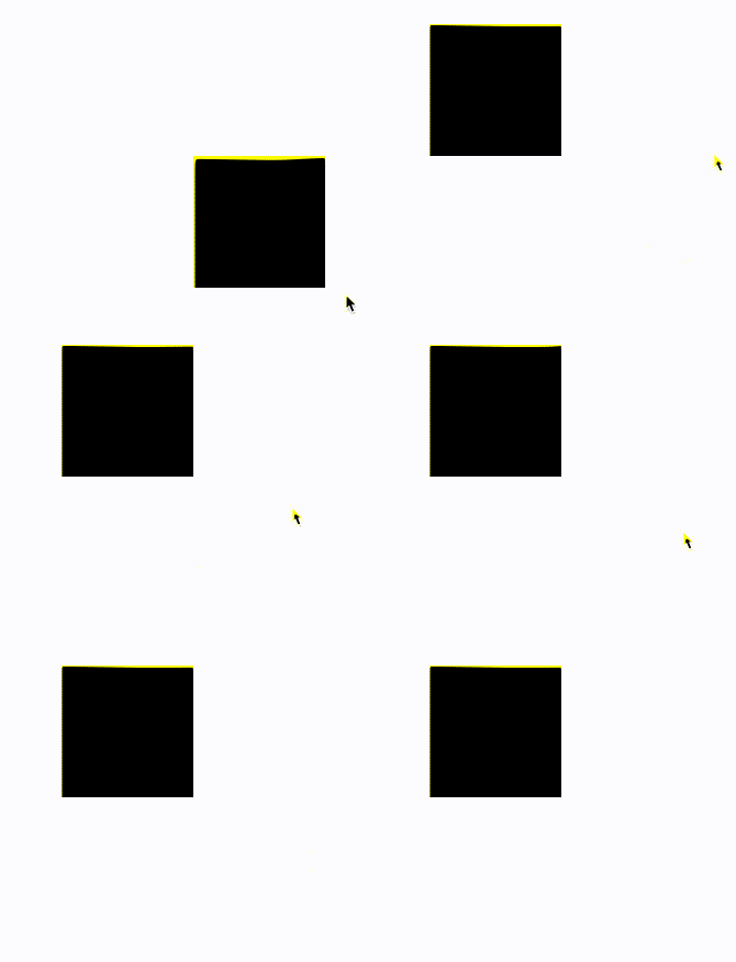
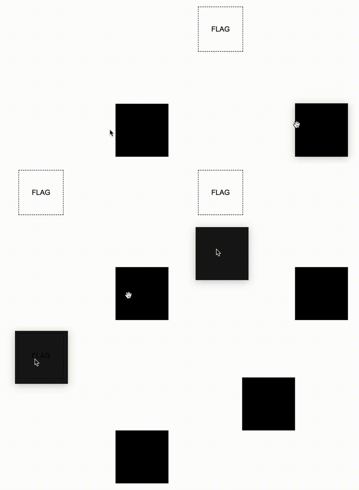
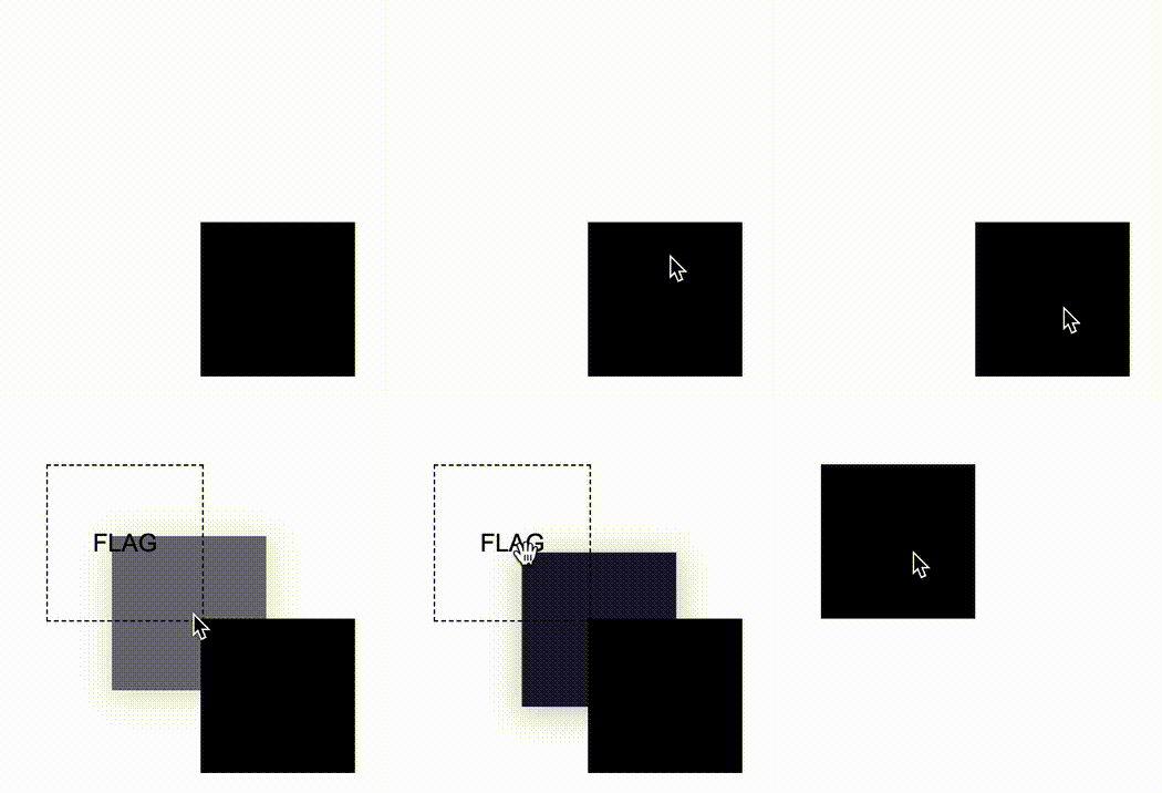
}In order to facilitate understanding, every time you drag and drop an element, the position to be placed will be highlighted. Of course, this prompt effect can be completely removed:
For the complete demo, you can also click here CodePen Demo -- Pure CSS Spelling game
In the above code, we use SASS to quickly realize the random placement of the text of different blocks, adding a certain randomness. At the same time, the use of SASS reduces the workload of some repetitive codes.
at last
Well, it's not really that difficult, is it? Well, this is the end of this article, I hope this article will help you :)
More wonderful CSS technical articles are summarized in my Github -- iCSS , which will be updated continuously. Welcome to click star to subscribe to the collection.
If you have any questions or suggestions, you can communicate more. Original articles are limited in writing and knowledge. If there are any inaccuracies in the article, please let me know.


**粗体** _斜体_ [链接](http://example.com) `代码` - 列表 > 引用。你还可以使用@来通知其他用户。