
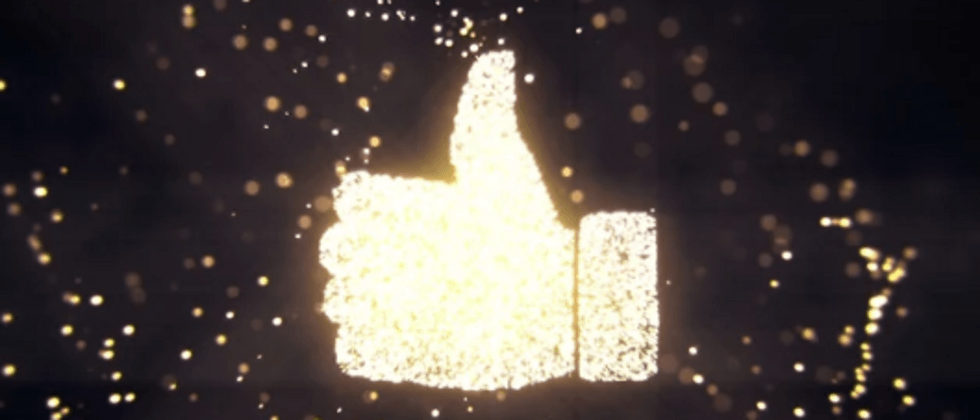
On various short video interfaces, we often see like animations like this:

Very interesting, and interesting interactions make users more willing to interact.
So, is it possible to implement such an interesting like animation using pure CSS ? That is of course necessary. In this article, we will use transition to complete such a like animation using only CSS.
Realize the continuous rise of different expressions
If this whole set of animations is implemented using pure CSS. We first need to implement an infinite loop animation with a large number of different expressions floating upwards .
Like this:

This whole is relatively easy to implement. The core principle is the same animation, setting different transition-duration , transition-dalay , and the rotation angle within a certain range.
We first need to implement multiple expressions, a DOM tag into a random expression.
We can manually add one by one:
 <ul class="g-wrap">
    <li>😀</li>
    <li>❤️</li>
    <li>👏</li>
    // ... 随机设置不同的表情符号,共 50 个
    <li>...</li>
</ul>
Of course, I personally find this too cumbersome. I am used to using SASS's loop function and random function, and using pseudo-elements content to randomly generate different expressions. Like this:
 <ul class="g-wrap">
    <li></li>
    <li></li>
    <li></li>
    // ... 共50个空标签
</ul>
$expression: "😀", "🤣", "❤️", "😻", "👏", "🤘", "🤡", "🤩", "👍🏼", "🐮", "🎈", "💕", "💓", "💚";
.g-wrap {
position: relative;
width: 50px;
height: 50px;
}
@for $i from 1 to 51 {
li:nth-child(#{$i}) {
position: absolute;
top: 0;
left: 0;
width: 50px;
height: 50px;
&::before {
content: nth($expression, random(length($expression)));
position: absolute;
font-size: 50px;
}
}
}This way, we get 50 emotes superimposed on top of each other:

Because the transparency is 1, only the top few expressions can be seen. In fact, there are 50 different expressions superimposed here.
The core here is content: nth($expression, random(length($expression))) , we use the random and length and nth methods of SASS to randomly add the expressions in the $expression list to the before pseudo-elements of different li within the content.
Next, we need to make them move .
This is simple, just add an infinite transform: translate() animation:
 @for $i from 1 to 51 {
    li:nth-child(#{$i}) {
        animation: move 3000ms infinite linear;
    }
}
@keyframes move {
    100% {
        transform: translate(0, -250px);
    }
}
The effect is as follows:

OK, since the 50 elements are stacked together, we need to distinguish the animations, we add random animation durations to them, and give them different negative transition-delay values:
 @for $i from 1 to 51 {
    li:nth-child(#{$i}) {
        animation: move #{random() * 2500 + 1500}ms infinite #{random() * 4000 / -1000}s linear;
    }
}
@keyframes move {
    100% {
        transform: translate(0, -250px);
    }
}
The effect is as follows:

The effect is very close to what we want! There is a little jump here, which needs to be understood move #{random() * 2500 + 1500}ms infinite #{random() * 4000 / -1000}s linear here is a large piece of code:
-
#{random() * 2500 + 1500}msGenerate a random number between 1500ms ~ 4000ms, indicating the duration of the animation -
#{random() * 4000 / -1000}sGenerate a random number between -4000ms ~ 0s, indicating a negative animation delay, the purpose of this is to make the animation progress in advance
If you don't know the function of the negative transition-delay , you can read this article of mine--in-depth CSS animationAt this point, it is still not random enough. We will randomly add a smaller rotation angle to make the overall effect more random:
 @for $i from 1 to 51 {
    li:nth-child(#{$i}) {
        transform: rotate(#{random() * 80 - 40}deg);
        animation: move #{random() * 2500 + 1500}ms infinite #{random() * 4000 / -1000}s linear;
    }
}
@keyframes move {
    100% {
        transform: rotate(0) translate(0, -250px);
    }
}
Here transform: rotate(#{random() * 80 - 40}deg) 's function is to randomly generate a random number between -40deg ~ 40deg to generate a random angle.
So far, we have got this effect:
Use transition to turn decay into magic
to here. Many students may not understand that it is obvious that a like produces one expression at a time. Why do you need to generate so many continuously moving expression effects at one time?
This is because CSS cannot directly click once and generate an expression, so we need to change the way of thinking.
If these expressions are always in motion, but when they are not clicked, their opacity is 0, what we need to do is to change them from opacity: 0 to opacity: 1 when we click opacity: 1 .
To achieve this, we need to cleverly use transition .
Let's take an expression as an example:
- By default its transparency is
opacity: 0.1 - When clicked, its transparency instantly becomes
opacity: 1 - Then, through
transition-delayto keep the state ofopacity: 1after a period of time - Gradually disappear and change back to
opacity: 0.1
It looks a little bit complicated, and the code will be easier to understand:
 li {
    opacity: .1;
    transition: 1.5s opacity 0.8s;
}
li:active {
    opacity: 1;
    transition: .1s opacity;
}
The effect is as follows:

Be sure to understand the code above ! By cleverly utilizing the change of transition between the normal state and the active state, we achieve this clever click effect.
What if we change the original opacity: 0.1 to opacity: 0 ? would be like this:

Well, let's combine the above two animations:
- We changed the default transparency of all expressions to
0.1 - When clicked, the transparency becomes
1 - Transparency is maintained at
1for a period of time and gradually disappears
code show as below:
 @for $i from 1 to 51{
    li:nth-child(#{$i}) {
        position: absolute;
        top: 0;
        left: 0;
        width: 50px;
        height: 50px;
        transform: rotate(#{random() * 80 - 40}deg);
        animation: move #{random() * 2500 + 1500}ms infinite #{random() * 4000 / -1000}s linear;
        opacity: .1;
        transition: 1.5s opacity .8s;

        &::before {
            content: nth($expression, random(length($expression)));
            position: absolute;
        }
    }

    li:active {
        opacity: 1;
        transition: .1s opacity;
    }
}

@keyframes move {
    100% {
        transform: rotate(0) translate(0, -250px);
    }
}
The effect is as follows:

Hey, isn't that interesting!
Ok, the last step, we guide the user to click through a click button and give a click feedback. Each time the click button is clicked, the like button is enlarged by 1.1 times. At the same time, we change the transparency of the default expression from opacity: 0.1 totally Change to opacity: 0 .
In this way, the complete core code of the whole animation:
 <ul class="g-wrap">
    <li></li>
    <li></li>
    <li></li>
    // ... 共50个空标签
</ul>
$expression: "😀", "🤣", "❤️", "😻", "👏", "🤘", "🤡", "🤩", "👍🏼", "🐮", "🎈", "💕", "💓", "💚";
.g-wrap {
position: relative;
width: 50px;
height: 50px;
&::before {
content: "👍🏼";
position: absolute;
width: 50px;
height: 50px;
transition: 0.1s;
}
&:active::before {
transform: scale(1.1);
}
}
@for $i from 1 to 51 {
li:nth-child(#{$i}) {
position: absolute;
width: 50px;
height: 50px;
transform: rotate(#{random() * 80 - 40}deg);
animation: move #{random() * 2500 + 1500}ms infinite #{random() * 4000 / -1000}s cubic-bezier(.46,.53,.51,.62);
opacity: 0;
transition: 1.5s opacity .8s;
&::before {
content: nth($expression, random(length($expression)));
position: absolute;
}
}
li:active {
transition: .1s opacity;
opacity: 1!important;
}
}
@keyframes move {
100% {
transform: rotate(0) translate(0, -250px);
}
}Here, it should be noted that:
- The like button is implemented by the pseudo element of the parent element
.g-wrap. The advantage of this is that the click event of the child element li:activecan be bubbled and passed to the parent element, In this way, every time a sub-element is clicked, we can enlarge the like button once to achieve click feedback; - Slightly modify the easing function to make the overall effect more balanced and reasonable.
In this way, we get the effect of the title image at the beginning, the like animation implemented with pure CSS:
For the complete code, you can click here: CodePen Demo -- Like Animation
a little flaw
Of course, there are some problems with this solution.
- That is, if the click rate is too fast, it is impossible to achieve a click and generate an expression.
This is due to the nature of the CSS scheme to make a transparent emoticon opaque by clicking on it. If you click too fast, it will result in two or more clicks on the same element. In this way, it is impossible to achieve a click and generate an expression. Therefore, the purpose of modifying the easing in the above code cubic-bezier(.46,.53,.51,.62) is also to make the element animation move faster in the early stage, which can help adapt to a faster click rate.
- Not just clicking the button, the effect can also appear on the top of the button
This is also easy to understand. Since it is essentially a blindfold, click on the top of the button, as long as it is the place where the element moves, there will also be an element visible. This can also be solved hard. By overlaying a layer of transparent elements above the button, the click event is blocked through the hierarchical relationship.
- The randomness of expressions is just pseudo-random
The scheme using SASS random will not produce random effect after compilation. Therefore, it can only be pseudo-random. Based on the number of DOMs, when the number of DOMs is larger, the overall effect of randomness is better. Basically 50 DOM is more than enough.
- The CSS version of the like effect is a stand-alone version
The inability of multi-user linkage may be the most critical factor affecting whether it can be used in practice.
However, all in all, the overall effect of the scheme implemented with pure CSS is good.
at last
Well, this is the end of this article, I hope this article will help you :)
More wonderful CSS technical articles are summarized in my Github -- iCSS , which will be updated continuously. Welcome to click star to subscribe to the collection.
If you have any questions or suggestions, you can communicate more. Original articles are limited in writing and knowledge. If there are any inaccuracies in the article, please let me know.
 html5
html5 chrome


**粗体** _斜体_ [链接](http://example.com) `代码` - 列表 > 引用。你还可以使用@来通知其他用户。