transform
Transform ~ complex transform parameters.
| Transform | ||
|---|---|---|
| value | ` | none ` |
| initial value | None | |
| apply to | All elements except the "Primitive Inline" box | |
| percentage | Relative range box calculation | |
| Calculated | the specified value, but relative length values are computed as absolute lengths | |
| inheritance | no | |
| animation | deformation |
Coordinate System
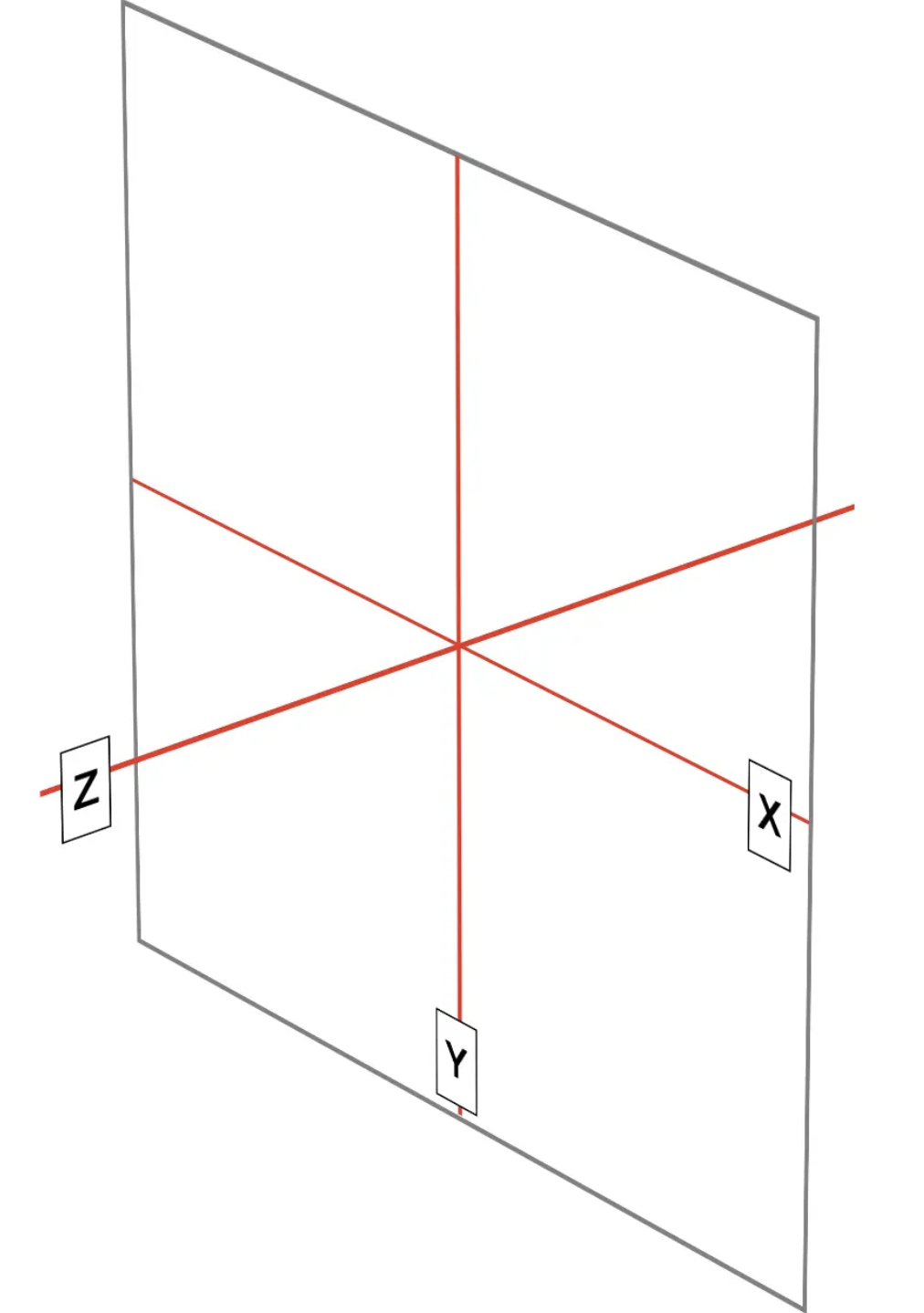
1.1 In CSS, the Cartesian coordinate system is represented by three axes (as shown below):
- x-axis (horizontal axis)
- y-axis (vertical axis)
- z axis (depth axis)
Each element has its own reference , and each axis moves relative to itself.
2D deformation only needs to focus on the x-axis and y-axis; 3D needs to add the z-axis
Positive values of the x-axis are on the right and negative values are on the left .
The positive value of the y-axis is vertical down, and the negative value is vertical up.
The z-axis jumps out of the monitor and points in front of your eyes. Positive values on the z-axis are closer to you, negative values are further away.
1.2 Rotation <br /> If the element is rotated, the axis is also rotated. Deformation after rotation is the axis calculation after relative rotation
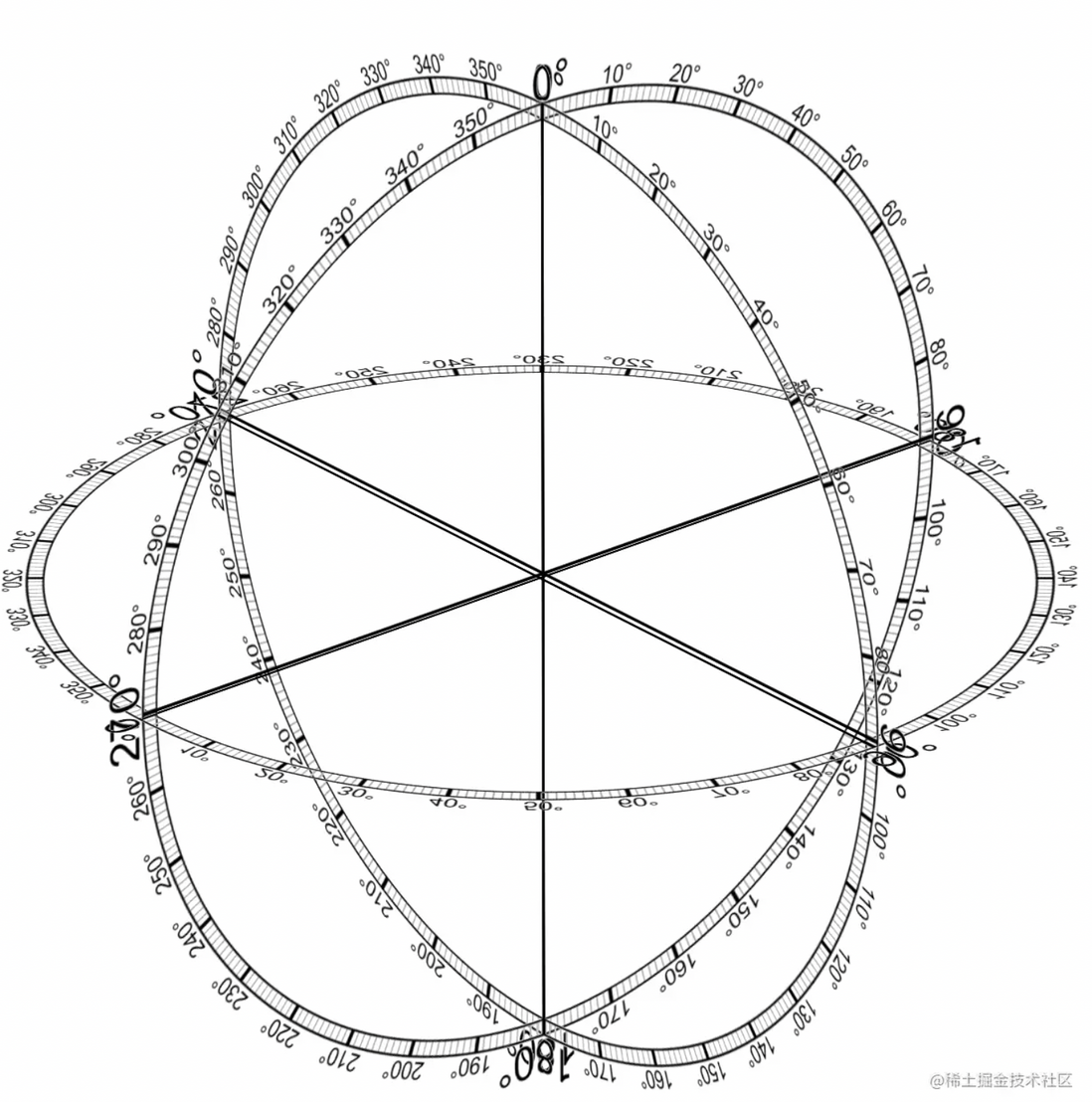
Another coordinate system used in CSS warping functions - spherical coordinate system
Commonly used
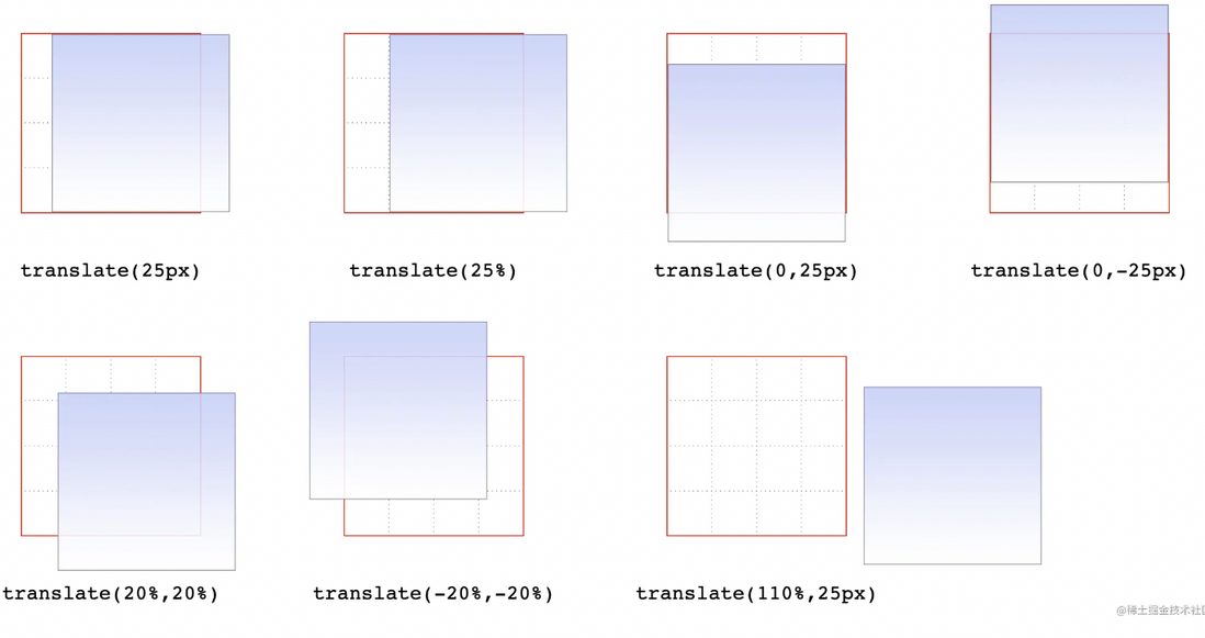
pan
- translate()
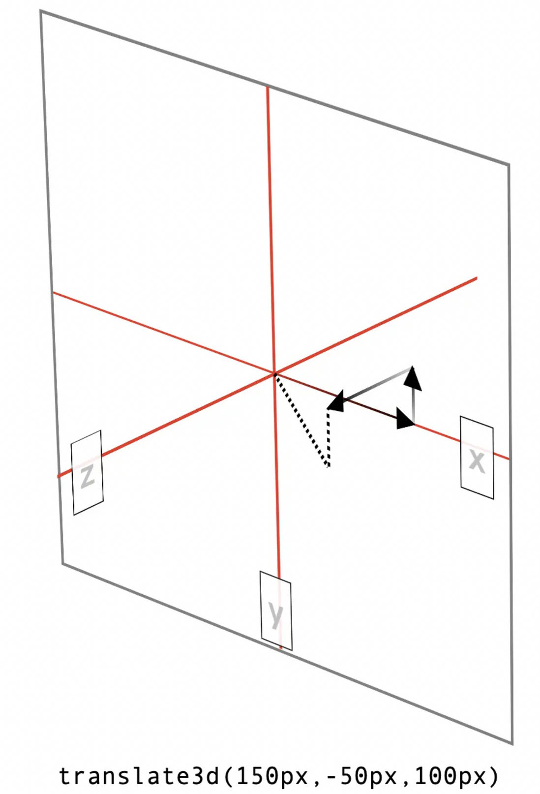
- translate3d()
- translateX()
- translateY()
- translateZ()
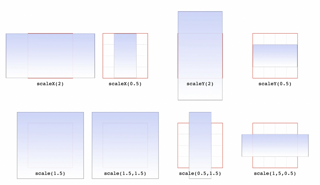
zoom
- scale()
- scale3d()
- scaleX()
- scaleY()
- scaleZ()
rotate
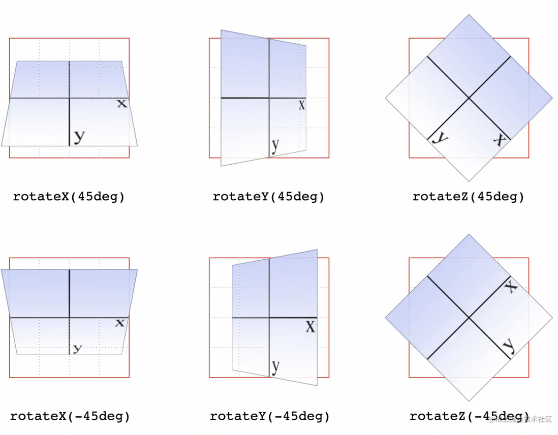
- rotate()
- rotate3d()
- rotateX()
- rotateY()
- rotateZ()
rotate3d(x,y,z,deg) 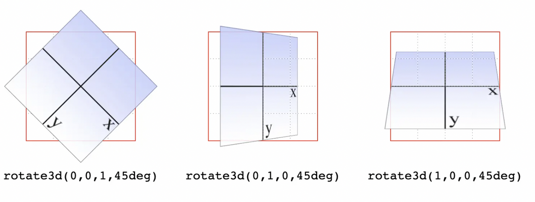
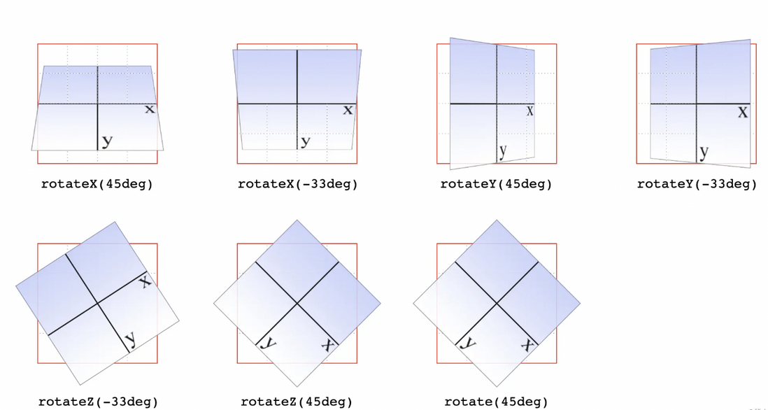
rotate(45deg) with 3D rotation, it is rotate3d(0,0,1,45deg)
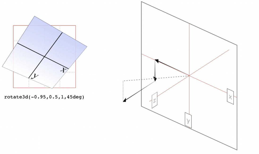
Use rotate3d() . The first three values specify the vectors of vectors x, y and z in 3D space, and the fourth value is the angle value , which means rotate(45deg) in the above figure is in 3D space, which is equivalent to rotate3d(0,0,1,45deg) ). The first three numbers set the three components of a vector whose magnitude is 0 on the x and y axes. The size on the z-axis is 1. Therefore, this vector is on the z-axis and points in the positive direction, i.e. towards the viewer. If you look at the origin of the vector, the elements are rotated clockwise.
Suppose the rotation function is a vector described by rotate3d(-0.95,0.5,1,45deg) . Assuming a cube with a side length of 200 pixels, this vector has a size of 190 pixels on the x-axis and points to the left. The size on the y-axis is 100 pixels, pointing down. The size on the z-axis is 200 pixels, pointing towards the viewer. This vector points from the origin (0,0,0) to (-190px, 100px, 200px) . As shown below:
ps: rotate3d(1,1,0,45deg) --- is not equivalent to rotateX(45deg) rotateY(45deg) rotateZ(0deg) .
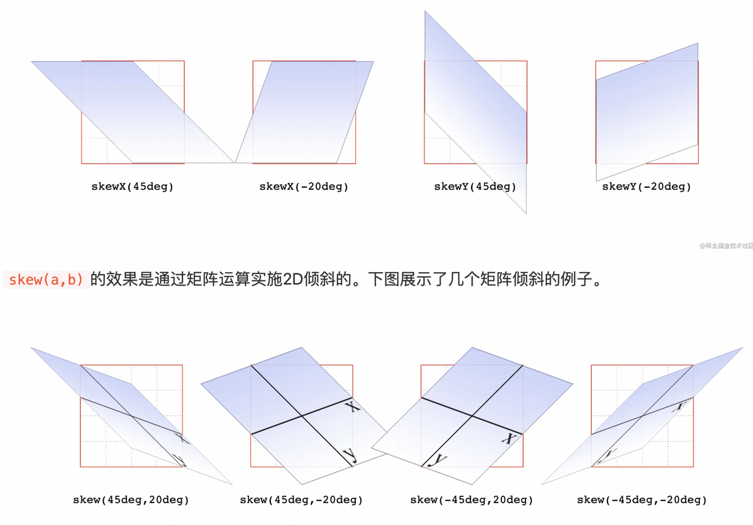
tilt
- skew()
- skewX()
- skewY()
perspective point
When changing the shape of an element in 3D space, it is basically necessary to give the element a certain field of view. Viewsheds give elements a front-to-back depth, which can be set as desired. Can be understood as the focal length of the lens
Bigger means farther, smaller means closer; near big and far small;
There are 3D effects that need to be configured and used together
- perspective()
Values before 500px to 1000px produce a "moderate viewfield". The figure below shows the results obtained with different viewshed values for the same rotation angle.
Must be positive and cannot be zero. Any other value will cause the perspective() function to be ignored. Be sure to put the perspective() function in the first place, as long as it is also before the transformation of the viewport.
The difference between the perspective property and the perspective() function
- The perspective() function only defines the viewport for the target element , such as declaring perspective(800px) rotateY(45deg). Then only elements to which this rule applies can use the set viewport.
- The depth of view defined by the perspective property applies to all children of the target element.
other
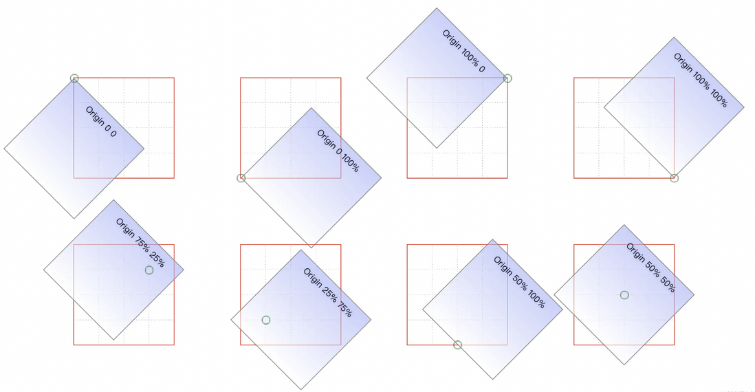
move origin
- transform-origin
The deformations seen so far have one thing in common, they all take the absolute center of the element as the origin of the deformation.
The first value is for landscape, the second is for portrait, and an optional third value is the length on the z-axis.
Deformation
- transform-style
Sets whether the element's children are located in 3D space or a plane.
 .outer {
    transform: perspective(750px) translateY(60px) rotateX(-20deg);
    transform-style: perserve-3d;
}

.inner {
    transform: perspective(750px) translateZ(60px) rotateX(45deg);
}
<div class="outer">
    <div class="inner">inner</div>
</div>
ps: transform-style The set deformation method may be overwritten by other attributes, resulting in invalid perserve-3d
- overflow: visible
- filter: none
- clip: auto
- clip-path: none
- mask-image: none
- mask-border-source: none
- mix-blend-mode: normal
Treat the back
In 3D morphing, the backface-visibility property makes it possible to see the back of the element.
 .card {
position: relative;
perspective: 800px;
transform-style: preserve-3d;
width:200px;
height:280px;
transition: all .6s;
border: 1px solid #000;
border-radius: 4px;
}

.card:hover {
transform: rotateY(180deg);
}
img {
position: absolute;
width:100%;
height: 100%;
transition: all .5s;
backface-visibility: hidden;
}
/*由于我们将两个图像都藏在了背面,所以另一面没有任何东西。 所以接下来需要再把.front-face翻转180度*/
.back-face {
transform: rotateY(180deg);
}

<div class="card">
    <img class="front-face" src="1.jpg">
    <img class="back-face" src="2.jpg">
</div>
Notice
- Extent Box : Outline and margins are not included when calculating the extent box
- Transformed elements have their own stacking context : small or large before transforming, and the space the element occupies on the page remains the same as before transforming . holds for all deformation functions
- Represents one or more deformation functions: separated by spaces . Such as: transform: rotate(30deg) skewX(-25deg) scaleY(2);
- Transformation order : starting from the first on the left, to the last
- Correctly set values : When there are multiple deformation functions, each must be set correctly to ensure that all are valid. If one function is invalid, the entire value will be invalid.
- Deformation stacks : Deformations generally do not stack . If you change the shape of the element, and then want to add a deformation, you must modify the original deformation.
- Transforms cannot yet be applied to primitive inline boxes . Primitive inline boxes refer to inline boxes such as spans and hyperlinks. These elements can be deformed with the block-level parent element, but cannot be rotated directly. Unless you change their display to display:block, display:inline-block, etc.
There is a 3D effect that needs to be used with
**perspective**transition: property duration timing-function delay
Transition ~ property, trigger action, transient.
 transition-property: width, heitht, color ;
trnasition-duration: 1s, 1.5s, 2s ;
transition-timing-function: ease, linear, ease-in-out ;
transition-delay: 0s, 1s, 0s ;

transition: width 1s ease ,heitht 1.5s linear 1s, color 2s ease-in-out ;| value | describe |
|---|---|
| transition-property | Specifies the name of the CSS property that sets the transition effect. |
| transition-duration | Specifies how many seconds or milliseconds it takes for the transition effect to complete. |
| transition-timing-function | Specifies the speed curve for the speed effect. |
| transition-delay | Defines when the transition effect starts. |
transition-property:none|all|_property_
Specifies the name of the CSS property that sets the transition effect.
| value | describe |
|---|---|
| none | No attribute will get the transition effect. |
| all | All properties will get transition effects. |
| property | Defines a comma-separated list of CSS property names to apply transition effects. |
Support for transition animation properties
transition-duration:_time_
Specifies how many seconds or milliseconds it takes for the transition effect to complete.
| value | describe |
|---|---|
| time | Specifies the time (in seconds or milliseconds) it takes for the transition effect to complete. The default value is 0, which means no effect. |
transition-timing-function
Specifies the speed curve for the speed effect.
| value | describe |
|---|---|
| linear | Specifies a transition effect that starts and ends at the same speed (equal to cubic-bezier(0,0,1,1)). |
| ease | Specifies a transition effect that starts slowly, then gets faster, and ends slowly (cubic-bezier(0.25,0.1,0.25,1)). |
| ease-in | Specifies a transition effect that starts slowly (equal to cubic-bezier(0.42,0,1,1)). |
| ease-out | Specifies a transition effect that ends slowly (equal to cubic-bezier(0,0,0.58,1)). |
| ease-in-out | Specifies a transition effect that starts and ends slowly (equal to cubic-bezier(0.42,0,0.58,1)). |
| cubic-bezier(_n_,_n_,_n_,_n_) | Define your own value in the cubic-bezier function. Possible values are numbers between 0 and 1. |
transition-delay
Defines when the transition effect starts.
| value | describe |
|---|---|
| time | Specifies the time, in seconds or milliseconds, to wait before the transition effect starts. |
Notice
- Requires event triggering, so it can't happen automatically when the page loads
- is one-time and cannot be repeated unless triggered repeatedly
- Only the start state and the end state can be defined, and the intermediate state cannot be defined, that is to say, there are only two states
- A transition rule can only define the change of one attribute and cannot involve multiple attributes.
animation:_name_duration _timing -function_delay _iteration - count_direction
animation ~ keyframes, reciprocity
 <style>
    .box {
      height: 100px;
      width: 100px;
      border: 15px solid black;
      animation: changebox 1s ease-in-out 1s infinite alternate running forwards;
    }

    .box:hover {
      animation-play-state: paused;
    }

    @keyframes changebox {
      10% {
        background: red;
      }
      50% {
        width: 80px;
      }
      70% {
        border: 15px solid yellow;
      }
      100% {
        width: 180px;
        height: 180px;
      }
    }
  </style>

<div class="box"></div>| value | describe |
|---|---|
| animation-name | Specifies the keyframe name that needs to be bound to the selector. . |
| animation-duration | Specifies the time, in seconds or milliseconds, to complete the animation. |
| animation-timing-function | Specifies the speed curve for the animation. |
| animation-delay | Specifies the delay before the animation starts. |
| animation-iteration-count | Specifies the number of times the animation should play. |
| animation-direction | Specifies whether the animation should take turns playing in reverse. |
animation-name:_keyframename_|none;
| value | describe |
|---|---|
| keyframename | Specifies the name of the keyframe that needs to be bound to the selector. |
| none | Specifies no animation effect (can be used to override animations from cascades). |
animation-duration:time
| value | describe |
|---|---|
| time | Specifies the time it takes to complete the animation. The default value is 0, which means no animation. |
animation-timing-function:_value_
The animation-timing-function uses a mathematical function called the Cubic Bezier function to generate the velocity curve. You can use your own values in this function, or predefined values:
| value | describe |
|---|---|
| linear | The speed of the animation is the same from start to finish. |
| ease | default. The animation starts at a low speed, then speeds up and slows down before ending. |
| ease-in | The animation starts at a low speed. |
| ease-out | The animation ends at a low speed. |
| ease-in-out | The animation starts and ends at low speed. |
| cubic-bezier(_n_,_n_,_n_,_n_) | Own value in cubic-bezier function. Possible values are numbers from 0 to 1. |
| steps(5, end); | How many segments are the animations divided into? |
animation-delay:time
| value | describe |
|---|---|
| time | Optional. Defines how long to wait before the animation starts, in seconds or milliseconds. The default value is 0. |
animation-iteration-count: _n_|infinite;
| value | describe |
|---|---|
| n | A value that defines the number of times the animation is played. |
| infinite | Specifies that the animation should play indefinitely. |
animation-direction: normal|alternate;
| value | describe |
|---|---|
| normal | Defaults. The animation should play normally. |
| alternate | The animation should take turns playing in reverse. |
refer to
- https://juejin.cn/post/6844903874579578887#heading-17
- https://jelly.jd.com/article/6006b1025b6c6a01506c8775
- https://www.zhangxinxu.com/wordpress/2012/09/css3-3d-transform-perspective-animate-transition/
- https://www.w3school.com.cn/cssref/pr_transition.asp




**粗体** _斜体_ [链接](http://example.com) `代码` - 列表 > 引用。你还可以使用@来通知其他用户。