background,
Maybe we sometimes subconsciously think that the current actual development css property is enough, but some time ago I suddenly thought: "Will our thinking be limited to the commonly used css properties, thus losing "Creativity", just like invention 车 before most people would think 骑马 is fast enough to meet their own needs, so I specially organized my study notes and specially I went to learn some unpopular css attributes, and I really gained a lot, so today I will give you less of these brain-opening attributes, ready to experience together css the charm of it.
1. Appetizer css background image: paint
我们开发中使用的背景图大部分是(png, webp等)图片 、 svg矢量图 、 canvas画图 , 但是其实我们也可以选择---01312ffe18441c9522dabf3ebcb25e58 css , That css how does this guy in a programming language that doesn't even "can be called" draw complex pictures?
1: Assign css properties to elements
div class="box"></div> <style>
.box {
width: 180px;
height: 180px;
border: 1px solid;
background: paint(xxxx); // 主角在此
} paint(xxxx); The "method name" of the drawing is filled in here. You can see what the "method name" is when you look down. The reason why I write "xxxx" here is very casual, because I want to express this name Get up anytime.
2: Import js files
 <script>
      if (window.CSS) {
        // 因为加载文件 需要启动server
        CSS.paintWorklet.addModule("./paint-grid.js");
      }
    </script>
The usage is a bit weird, but the core actually introduces a js文件 .
3: Define the exported method in the js file
paint-grid.js File:
 registerPaint(
  "xxxx", // 这就是: 方法名
  class {
    paint(context, size) {
      context.fillStyle = 'red';
      context.fillRect(10, 10, 39, 39);
    }
  }
);
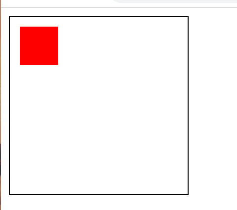
paint method is similar to canvas , and the part js can be used normally.
Current effect display:
4: can export more
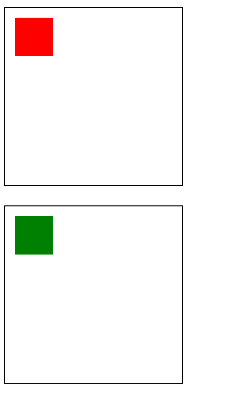
When I saw that I needed to specify the "method name" of the drawing instead of the "file name", I knew that he must be able to export more than one:
 registerPaint(
  "xxxx1",
  class {
    paint(context, size) {
      context.fillStyle = 'red';
      context.fillRect(10, 10, 39, 39);
    }
  }
);

registerPaint(
  "xxxx2",
  class {
    paint(context, size) {
      context.fillStyle = 'green';
      context.fillRect(10, 10, 39, 39);
    }
  }
);
Styling of two elements
 <style>
      .box {
        background: paint(xxxx1);
      }
      .box2 {
        margin-top: 20px;
        background: paint(xxxx2);
      }
5: Variables give background flexibility
We need to draw a "non-fixed-size back view" for a long time. At this time, in paint-grid.js window cannot be obtained, but we can use css变量 :
 // 在全局定义方便js修改
  :root {
    --bg-size: 60;
  }
paint-grid.js file
 registerPaint(
  "xxxx1",
  class {
    static get inputProperties() {
      return ["--bg-size"];
    }
    paint(context, size, properties) {
      var bgSize = properties.get('--bg-size');
      context.fillStyle = "red";
      context.fillRect(10, 10, bgSize, bgSize);
    }
  }
);
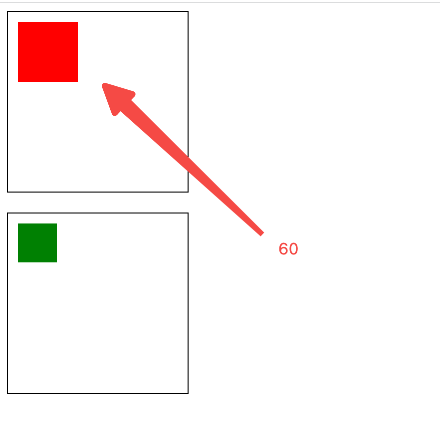
inputProperties defines which attributes need to be obtained, and the third parameter of paint can receive these attributes, so it feels that this attribute is still useful.
6: Notes
- Cannot write
alertin the drawing method of thejsfile, it will cause an error to block the drawing: - Pay attention to maintaining the correlation between
paint-grid.jsfile andcssfile, because everyone who writes code will subconsciously not think thatjsmethod iscssThe attributes in the file are used, which may lead to problems such as failure to delete or not dare to delete in the future. - It is suitable for processing simple graphics. If the complexity is high or other "libraries" are required, it is not recommended.
Second, the font triple (hollow, gradient, background)
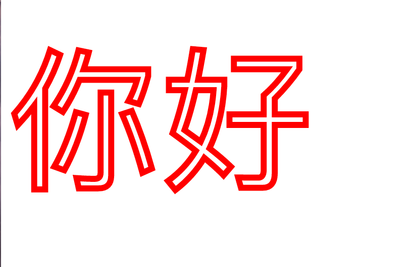
1: Hollow characters are not uncommon
 p {
    font-size: 150px;
    color: white;
    -webkit-text-stroke: 6px red;
  }
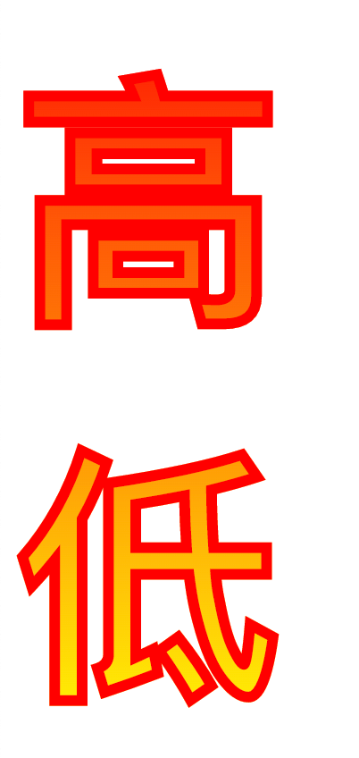
2: Gradient text
 p {
        font-size: 150px;
        color: white;
        -webkit-text-stroke: 6px red;
        background-color: rosybrown;
        background-image: -webkit-linear-gradient(top, red, #fd8403, yellow);
        -webkit-background-clip: text;
        color: transparent;
      }
<p>
高
<br>
低
</p>3: Text Background
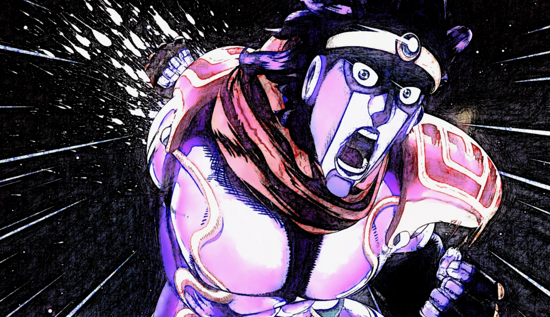
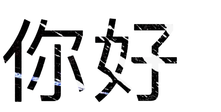
We used a picture of the "Platinum Star" (the 'character' from Jojo's Bizarre Adventure) as a background for the text:
 div {
        font-size: 150px;
        background: url(../imgs/jojo.webp) no-repeat;
        background-size: 100%;
        background-origin: border-box;
        -webkit-background-clip: text;
        color: transparent;
      }
The key point here is -webkit-background-clip: text , which means that the area outside the text in dom is cropped, so the text area is left, and then the text is set to be transparent.
3. He's here, he's here, he's here with cool cutscenes
Let's take a look at the animation effect we use css font attribute:
Countdown to the Bone King:
The idea here is to use the 文字的背景图 attribute, but the difficulty is how to make the text larger.
1: Difficulties and pitfalls
What's so difficult about making the text bigger? You might say that these so are simple, we set the label where the text is located span position: absolute; positioned in the middle of the parent, wouldn't it be OK? But if it is set like this It will cause -webkit-background-clip: text; to fail, that is, the text is out of the document flow.
Some students will think transform:scale(1.5); to dynamically control the size of the text, but transform will still make -webkit-background-clip: text; invalid.
So what I thought of was to set the flex to center the text in div 636f421e9a249ed5e0c63e08a7bc7813---, and then increase the font-size attribute.
Another problem is the background color, because the background color of the outer layer of the text cannot be set when the background image is set.
2: Implementation ideas
First of all, a total of three layers are required, the first layer wrap is responsible for the black background color and overflow: hidden; to truncate our text and make it bigger, the second layer box is responsible for the text Centered, and set font-size attribute to inherit internal elements, the third layer span label is responsible for the storage of text ①②③, because to control the display and concealment of these texts, it is necessary to dom package.
3: Implement the code
The code is a bit vulgar and not polished 😊
 <!DOCTYPE html>
<html lang="en">
  <head>
    <style>
      #wrap {
        background-color: black;
        width: 500px;
        height: 500px;
        margin: 0 auto;
        overflow: hidden;
      }
      .box0 {
        background: url(../imgs/jojo.webp) no-repeat;
      }
      .box1 {
        background: url(../imgs/一起干饭.jpeg) no-repeat;
      }
      .box2 {
        background: url(../imgs/gat.webp) no-repeat;
      }
      #box {
        width: 500px;
        height: 500px;
        font-size: 150px;
        margin: 0 auto;
        background-size: 500px 500px;
        background-position: center;
        -webkit-background-clip: text;
        -webkit-text-fill-color: rgba(0, 0, 0, 0.2);
        display: flex;
        justify-content: center;
        align-items: center;
      }
      .text {
        display: none;
      }
    </style>
  </head>
  <body>
    <div id="wrap">
      <div id="box">
        <span class="text">①</span>
        <span class="text">②</span>
        <span class="text">③</span>
      </div>
    </div>
    <script>
      const oBox = document.getElementById("box");
      const textArr = document.getElementsByClassName('text')

      let i = 0;
      let n = 800;
      setInterval(()=>{
        oBox.style.fontSize = n + 'px';
         n+=3
         if(n > 800){
            n = 10;
            textArr[1].style.display = 'none'
            textArr[2].style.display = 'none'
            textArr[0].style.display = 'none'
            textArr[i].style.display = 'block'
            oBox.classList.remove('box1')
            oBox.classList.remove('box2')
            oBox.classList.remove('box3')
            oBox.classList.add(`box${i}`)
            i++
            if(i > 2){
              i = 0
            }
         }
      },5)
    </script>
  </body>
</html>
Change the text to "◤ ◢ ✿" and the effect of the first animation will appear!
Fourth, quotation marks: quotes
The so-called quotation marks are equivalent to adding 'book title number' to the title of the book, and adding 'colon double quotation marks' to the language. Of course, he also has some magic tricks.
1: Basic use
<div class="box">jojo的奇妙冒险</div> <style>
.box {
quotes: "《" "》";
}
.box::before {
content: open-quote;
}
.box:after {
content: close-quote;
}
</style> Rendering:
It should be noted here that if content: open-quote; is not written, the front and back 'book titles' will disappear, but only content: close-quote; is not written, """ will remain displayed.
2: Seems tasteless?
The current basic way of writing is too tasteless, isn't it just to give "" an alias open-quote ? And the key is to occupy my before and after , it feels superfluous, for example, I can replace it with the following method:
 :root {
    --open: "《";
    --close: "》";
  }
  div::before {
    content: var(--open);
  }
  div::after {
    content: var(--close);
  }
<div class="box">jojo的奇妙冒险</div>3: Matryoshka master quotes rise
In fact, quotes 's housekeeping ability is that it can accept n parameters!
 .box {
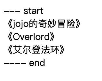
    quotes: "--- start" "---- end" "《" "》";
  }
  .box::before {
    content: open-quote;
  }
  .box:after {
    content: close-quote;
  }
<div class="box">
<div class="box">jojo的奇妙冒险</div>
<div class="box">Overlord</div>
<div class="box">艾尔登法环</div>
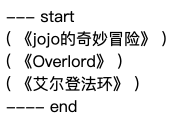
</div> The magic happens, when there is a nested structure, the inner element will use the third and fourth parameters as "quotes", 套娃事件 appears:
 .box {
    quotes: "--- start" "---- end" "(" ")" "《" "》";
  }
  .box::before {
    content: open-quote;
  }
  .box:after {
    content: close-quote;
  }
<div class="box">
<div class="box">
<span class="box">jojo的奇妙冒险</span>
</div>
<div class="box">
<span class="box">Overlord</span>
</div>
<div class="box">
<span class="box">艾尔登法环</span>
</div>
</div> To be honest, this nesting doll is quite capable, and we can say close-quote the attribute is empty, what I think of is the list:
 .box {
    quotes: "--- start" "---- end" "1: " "" "-- 2:" "" "---- 3: " "" "------ 4: " "";
  }
  .box::before {
    content: open-quote;
  }
  .box:after {
    content: close-quote;
  }
<div class="box">
<div class="box">
第一:
<div class="box">
第二:
<div class="box">第三:</div>
</div>
<div class="box">
第二:
<div class="box">
第三:
<div class="box">第四:</div>
</div>
</div>
</div>
<div class="box">
第一:
<div class="box">第二:</div>
</div>
</div> Be careful not to write close-quote will make css not find where it ends, so it is better to write and give null.
5. Restore Master: all
The CSS all shorthand property resets all properties except unicode-bidi and direction to their initial values, or inherits values.
This is a tougher property that resets almost all CSS properties:
Let's set up the basic environment first
 .wrap {
    font-size: 30px;
    font-weight: 900;
  }
  .box {
    width: 100px;
    height: 100px;
    border: 1px solid;
    background-color: red;
    color: white;
  }
  .box1 {
    all: initial;
  }
  .box2 {
    all: inherit;
  }
  .box3 {
    all: revert;
  }
<body>
<div class="wrap">
<div class="box">你好</div>
<div class="box box1">你好: initial</div>
<div class="box box2">你好: inherit</div>
<div class="box box3">你好: revert</div>
</div>
</body>1: initial : restore to the initial value
As the name suggests, all the properties on div are reset, whether it is "background color" or "font color", even width and height, so this is completely initialized.
But there is a big hole, he will change div original display: block to display: inline , that is to say all: initial; Empty without filtering based on the tag attribute, so this attribute is a bit too absolute and should be used with care.
2: inherit: the integration value is retained
Still as the name suggests, set all properties to "inherit parent", and restore its own properties, such as width and height, but inherit font size and font weight.
Not all default values of css properties are 'inherited', for example the default value of position is not integrated, but position can be set to position: inherit; , which is See the next attribute for hidden dangers.
3: revert: restore
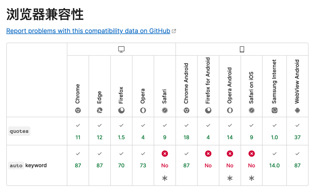
Although it seems that the effect is almost the same as inherit , there is a big difference in essence. For example, if at this time wrap parent element is set position: absolute; , then set all: inherit的position: absolute; , all:revert的元素是position: static , 也就是说目标元素单纯的还原成最开始的样式, 剔除The properties set later are dropped, but some default inherited properties are retained. Although this property has poor compatibility, it is the best!
4: Priority of all
 .box{
    all: revert;
    background-color: red;
}
The background color here can be set successfully, so all should be considered a one-shot deal, only reset the previous style of setting all属性 .
 // 父级
  .box {
    background-color: red !important;
  }
 .box1 {
   all: revert;
 }
The above does not take effect, because all can only reset the attributes whose priority is not as good as your own selector, so you need all: revert!important; .
6. Target element style :target
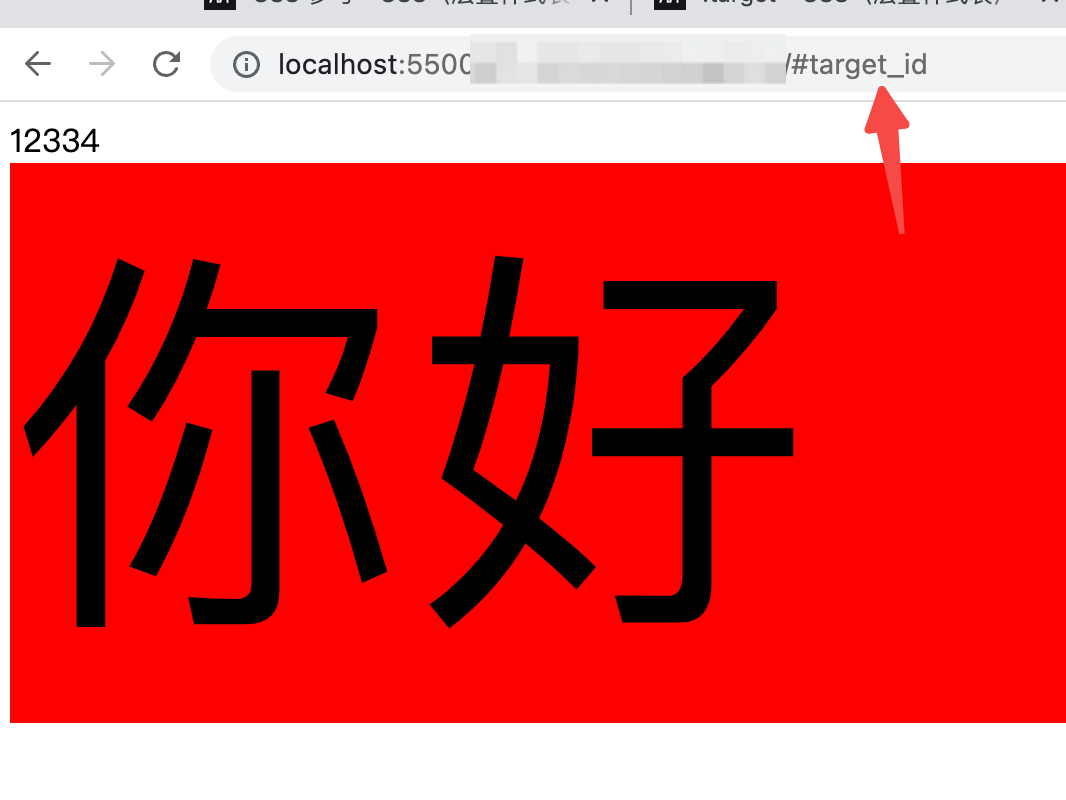
This property makes the page url参数 dom元素
1: Jump to select
For example, the current url is https://www.xxxxxxxxxxx.com/#target_id then:
 :target {
    background-color: red;
    font-size: 200px;
  }
<div id="target_id">
你好
</div>2: Animation after jump
What I think of is to make the element have an animation effect every time an element is selected. It is too simple to demonstrate. Let me talk about the tasteless point of this attribute. The binding relationship between the attribute and the DOM structure is weakened, and the code is not easy to maintain and read.
Seven, the placeholder style setting of the input box: placeholder-shown
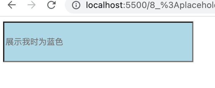
You can set the style when input is displayed in the component placeholder :
 input:placeholder-shown {
        background-color: lightblue;
      }

      input {
        width: 300px;
        height: 60px;
      }
<input placeholder="展示我时为蓝色" /> Enter the content to restore
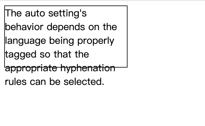
8. The Art of Wrapping Displays: hyphens
Do we need a 'hyphen' when an English word must wrap:
 <div class="box">
      The auto setting's behavior depends on the language being properly tagged
      so that the appropriate hyphenation rules can be selected.
    </div>
.box {
border: 1px solid black;
width: 200px;
height: 100px;
}The protagonist Storm
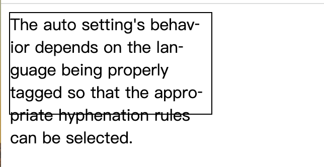
 .box {
        border: 1px solid black;
        width: 200px;
        height: 100px;
        hyphens: auto;
      }
It is a pity that the style of 'hyphen' cannot be freely defined, otherwise it must be a little interesting.
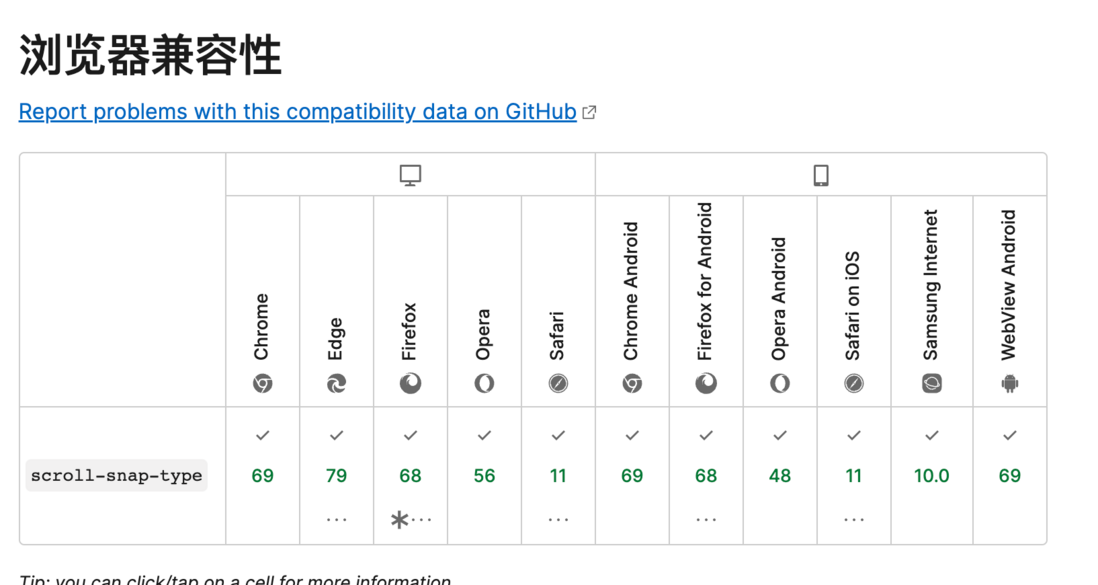
9. High-quality scrolling experience: scroll-snap-type
Define a "temporary pause point" when scrolling, this problem is more straightforward to look at the gif animation directly:
In simple terms, each inertial slide will stay at the position of a specific element, a bit like a scrolling 'anchor':
 <!DOCTYPE html>
<html>
  <head>
    <style>
      .box {
        width: 200px;
        height: 150px;
        border: 1px solid;
        border-left: 5px solid black;
        border-right: 5px solid black;
        margin: 40px;
        overflow: auto;
        scroll-snap-type: y mandatory;
      }
      .item {
        border-top: 1px solid red;
        height: 150px;
        /* scroll-margin-top:20px; */
        scroll-snap-align: start none;
      }
    </style>
  </head>
  <body>
    <div class="box">
      <div class="item">11111</div>
      <div class="item">22222</div>
      <div class="item">33333</div>
      <div class="item">44444</div>
      <div class="item">55555</div>
      <div class="item">66666</div>
    </div>
  </body>
</html>
scroll-snap-type: y mandatory; Set y When the axis scrolls, try to stay on the 'element point', scroll-snap-align: start none; the scroll starting direction of the target element itself is used for alignment, Tells the browser where to stay on child elements after scrolling.
Setting on the child element scroll-margin-top: 20px can set a certain detection distance and add a rebound effect:
end
That's it for this amazing css journey, hope to progress with you.











**粗体** _斜体_ [链接](http://example.com) `代码` - 列表 > 引用。你还可以使用@来通知其他用户。