
这篇内容之前是发在自己的个人公众号志语自乐中的,然后看到 SF 周刊中有一篇《与众不同的夜间开关交互效果》,于是想着在这里也发一下。当时只是为了整一个效果,并没有对 HTML 和 CSS 有太多细节优化考虑。
几天前突然在群里看到有人发了这样一个视频,设计师很开心的设计,前端开发很痛苦的敲代码。视频的某一帧截图是这样的,应该有很多人看过。

后来小秦在页面仔群里居然 at 我,问这个是不是可以实现的。这不是开玩笑么,要实现这个效果还不是时间问题?既然问了,那就动手做吧,反正最近也手痒(其实是公众号太久没更新了)。
分析需求
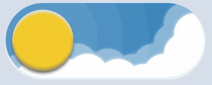
这个 switch 开关主要就是亮色、暗色主题的切换,设计上应该是就是想用太阳、白云和月亮、星星来表明。至于 switch 开关么,反正就是 checkbox 的选中与未选中,那么可以用 input:checked 这个选择符来改变样式。

从这个截图里也可以看到效果,接着可以从这个 gif 图中看到是有动效的。

哦了,大概的情况已经了解,那么就开工吧。
需求分解
绘制椭圆的胶囊、太阳、月亮,还有那个光晕这个就没啥好说的,无非就是 border-radius 和 box-shadow 的一些组合,没有设计稿,全靠意念以及取色工具来操作。


要说一下,就是黑夜中的星星绘制。这个原本想着用 emoji 来整的,因为✨这个在输入法中是存在的。

不过,考虑到系统兼容性,算了,还是用 CSS 来画一下吧,反正用渐变来整,也是简单的。主要就是 radial-gradient 绘制一个渐变,然后通过 background-size 改变大小,以及 background-position 改变位置,最后让这个渐变平铺 background-repeat 就好了。
大概的 CSS 就是这样:
.star .item {
  position: absolute;
  top: 20px;
  left: 60px;
  width: 20px;
  height: 20px;
  overflow: hidden;
  background-image: radial-gradient(transparent 70%, #fff 100%);
  background-size: 20px;
  background-repeat: repeat;
  background-position: -10px -10px;
}插播广告:之前整了一个渐变的小工具,随便玩玩,还是挺不错的。《获取渐变色的 CSS 代码其实很简单》
https://linxz.github.io
样式完成了,然后就是加动效了。这里的动效其实很简单,可以直接用 transition 就可以搞定了。不过我有一些地方用了 animation,当时想着是那个缓冲的效果。后来,Evan 说可以用 cubizer 啊,刚开始我没反应过来,想着,就一个简单的动效还整这些,而且这个只是随便玩玩的 demo,何苦太折磨自己呢。

这小机灵,原来是用 cubizer 做缓冲效果。看来平时用 linear 之类的太习惯了,脑中想到的只有 linear、ease 之类的值。
最终
反正呢,最终完成之后,效果肯定不是百分百还原,只是仅可能接近吧。用了不少时间,真的太耗体力了。
最终效果 GIF 图

最终的代码
很长很随性的 HTML 和 CSS,就不要吐槽代码有多烂,标签为什么不搞一个 div,为什么不用 xxx 之类的内容,反正就是玩玩而已。
<input type="checkbox" />
<div class="lightDarkSwitch">
  <div class="light">
    <div class="circle">
      <div class="dark">
        <div class="circle">
          <div class="item"></div>
          <div class="item"></div>
          <div class="item"></div>
        </div>
      </div>
    </div>
    <div class="circleShodaow"></div>
    <div class="circleShodaow"></div>
    <div class="circleShodaow"></div>
    <div class="cloud">
      <div class="item"></div>
      <div class="item"></div>
      <div class="item"></div>
      <div class="item"></div>
      <div class="item"></div>
      <div class="item"></div>
      <div class="item"></div>
      <div class="item"></div>
    </div>
    <div class="star">
      <div class="item"></div>
      <div class="item"></div>
      <div class="item"></div>
      <div class="item"></div>
      <div class="item"></div>
      <div class="item"></div>
      <div class="item"></div>
      <div class="item"></div>
      <div class="item"></div>
      <div class="item"></div>
      <div class="item"></div>
    </div>
  </div>
</div>
body {background-color: rgb(215, 222, 234);}
input {
position: absolute;
top: 100px;
left: 50%;
width: 390px;
height: 146px;
z-index: 99;
opacity: 0;
transform: translateX(-50%);
}
.lightDarkSwitch {
position: absolute;
top: 100px;
left: 50%;
width: 390px;
height: 146px;
overflow: hidden;
margin: 0;
box-shadow: 0 10px 8px 0 rgba(51, 83, 113, .26) inset,
0 -10px 8px 0 rgba(85, 123, 158, .26) inset,
0 3px 2px 1px rgb(239, 245, 249),
0 6px 2px 1px rgb(216, 223, 227);
border-radius: 146px;
transform: translateX(-50%);
}
.lightDarkSwitch > div {
position: absolute;
width: 100%;
height: 100%;
border-radius: 146px;
z-index: -1;
}
.circle {
position: absolute;
top: 13px;
width: 120px;
height: 120px;
overflow: hidden;
border-radius: 50%;
z-index: 10;
}
.circleShodaow {
position: absolute;
top: -40px;
width: 220px;
height: 220px;
border-radius: 50%;
z-index: 7;
}
.circleShodaow + .circleShodaow {
top: -90px;
width: 320px;
height: 320px;
}
.circleShodaow + .circleShodaow + .circleShodaow {
top: -140px;
width: 420px;
height: 420px;
}
.cloud {
filter: drop-shadow(-20px -20px 0 rgba(255, 255, 255, .4));
}
.cloud .item {
position: absolute;
width: 80px;
height: 80px;
background-color: #fff;
border-radius: 50%;
box-shadow: 0 0 6px 0 #fff;
}
.cloud .item:nth-child(1) {
top: 20px;
right: -20px;
}
.cloud .item:nth-child(2) {
top: 60px;
right: 0;
}
.cloud .item:nth-child(3) {
top: 100px;
right: 40px;
}
.cloud .item:nth-child(4) {
top: 120px;
right: 80px;
}
.cloud .item:nth-child(5) {
top: 110px;
right: 130px;
}
.cloud .item:nth-child(6) {
top: 100px;
right: 190px;
}
.cloud .item:nth-child(7) {
top: 110px;
right: 230px;
}
.cloud .item:nth-child(8) {
top: 120px;
right: 300px;
}
.light {
background-color: rgb(60, 134, 188);
}
.light .circle {
left: 13px;
background-color: rgb(243, 203, 43);
box-shadow: 0 5px 5px 0 rgb(215, 222, 234) inset,
0 -5px 5px 0 rgb(175, 156, 80) inset,
0 5px 6px 0 rgb(109, 106, 98);
transform: rotate(-30deg);
}
.light .circleShodaow {
left: -40px;
background-color: rgba(255, 255, 255, .05);
}
.light .circleShodaow + .circleShodaow {
left: -90px;
}
.light .circleShodaow + .circleShodaow + .circleShodaow {
left: -140px;
}
.dark {
position: relative;
z-index: 11;
}
.dark .circle {
top: 0;
left: 120px;
background-color: rgb(202, 207, 214);
box-shadow: 0 5px 5px 0 rgb(215, 222, 234) inset,
0 -5px 5px 0 rgb(131, 131, 131) inset,
0 5px 6px 0 rgb(109, 106, 98);
}
.dark .circle .item {
position: absolute;
top: 50px;
left: 20px;
width: 40px;
height: 40px;
overflow: hidden;
border-radius: 50%;
background-color: rgb(151,157, 176);
box-shadow: 0 3px 1px 0 #7d7d7d inset,
0 -3px 1px 0 #ababab inset;
}
.dark .circle .item:nth-child(2) {
top: 20px;
left: 50px;
width: 20px;
height: 20px;
}
.dark .circle .item:nth-child(3) {
top: 72px;
left: 80px;
width: 22px;
height: 22px;
}
.star {
position: absolute;
width: 200px;
height: 100%;
z-index: 15;
}
.star .item {
position: absolute;
top: 20px;
left: 60px;
width: 20px;
height: 20px;
overflow: hidden;
background-image: radial-gradient(transparent 70%, #fff 100%);
background-size: 20px;
background-repeat: repeat;
background-position: -10px -10px;
}
.star .item:nth-child(2) {
top: 44px;
left: 34px;
transform: scale(.6);
}
.star .item:nth-child(3) {
top: 56px;
left: 64px;
transform: scale(.6);
}
.star .item:nth-child(4) {
top: 96px;
left: 40px;
transform: scale(.3);
}
.star .item:nth-child(5) {
top: 86px;
left: 50px;
transform: scale(.3);
}
.star .item:nth-child(6) {
top: 106px;
left: 70px;
transform: scale(.4);
}
.star .item:nth-child(7) {
top: 36px;
left: 166px;
transform: scale(.45);
}
.star .item:nth-child(8) {
top: 56px;
left: 156px;
transform: scale(.3);
}
.star .item:nth-child(9) {
top: 40px;
left: 202px;
transform: scale(1.2);
}
.star .item:nth-child(10) {
top: 70px;
left: 192px;
transform: scale(.4);
}
.star .item:nth-child(11) {
top: 90px;
left: 172px;
transform: scale(.8);
}
input:checked + .lightDarkSwitch .light {
background-color: rgb(30, 34, 60);
}
input:checked + .lightDarkSwitch .light > .circle,
input:checked:hover + .lightDarkSwitch .light > .circle {
transform: translate(240px, 0);
}
input:checked + .lightDarkSwitch .light .circleShodaow {
left: 210px;
background-color: rgba(120, 120, 120, .2);
}
input:checked + .lightDarkSwitch .light .circleShodaow + .circleShodaow {
left: 170px;
}
input:checked + .lightDarkSwitch .light .circleShodaow + .circleShodaow + .circleShodaow {
left: 120px;
}
input:checked + .lightDarkSwitch .light .cloud {
animation: fadeOut 600ms linear 0s 1 forwards reverse;
}
input + .lightDarkSwitch .light .circle {
transform: translate(0, 0);
transition: all 400ms linear;
}
input + .lightDarkSwitch .light .circleShodaow {
transition: all 400ms linear;
}
input + .lightDarkSwitch .light .cloud {
animation: fadeIn 600ms linear 0s 1 forwards reverse;
}
@keyframes fadeIn {
0% {
transform: translateY(0);
}
20% {
transform: translateY(-5px);
}
100% {
transform: translateY(240px);
filter: drop-shadow(-20px 120px 0 rgba(255, 255, 255, .4));
}
}
@keyframes fadeOut {
0% {
transform: translateY(140px);
}
40% {
transform: translateY(120px);
}
100% {
transform: translateY(0);
filter: drop-shadow(-20px 120px 0 rgba(255, 255, 255, .4));
}
}
input:checked + .lightDarkSwitch .dark .circle {
left: 0;
transform: translate(0, 0);
}
input + .lightDarkSwitch .dark .circle {
transition: all 400ms linear;
}
input + .lightDarkSwitch .star {
animation: starFadeOut 600ms linear 0s 1 forwards;
}
input:checked + .lightDarkSwitch .star {
animation: starFadeIn 600ms linear 0s 1 forwards;
}
@keyframes starFadeIn {
0% {
transform: translateY(-30px);
}
20% {
transform: translateY(10px);
opacity: 0.6;
}
80% {
opacity: 0.8;
}
100% {
transform: translateY(0);
opacity: 1;
}
}
@keyframes starFadeOut {
0% {
transform: translateY(0);
opacity: 1;
}
20% {
transform: translateY(-5px);
}
100% {
transform: translateY(-240px);
opacity: 0;
}
}
input:hover + .lightDarkSwitch .light > .circle {
transform: translateX(20px);
}
input:hover + .lightDarkSwitch .light .circleShodaow {
transform: translateX(5%);
}
input:checked:hover + .lightDarkSwitch .light .circle {
transform: translateX(220px);
}
input:checked:hover + .lightDarkSwitch .light .dark .circle {
transform: translateX(0);
}
input:checked:hover + .lightDarkSwitch .light .circleShodaow {
transform: translateX(-5%);
}


**粗体** _斜体_ [链接](http://example.com) `代码` - 列表 > 引用。你还可以使用@来通知其他用户。