 极客观点
极客观点 项目管理
项目管理 HarmonyOS
我在 ICS 应用程序中使用带有 holo.light 主题的标准 Switch 控件。
我想将切换按钮的突出显示或打开状态颜色从标准浅蓝色更改为绿色。
这应该很容易,但我似乎不知道该怎么做。
原文由 JamesSugrue 发布,翻译遵循 CC BY-SA 4.0 许可协议
我在 ICS 应用程序中使用带有 holo.light 主题的标准 Switch 控件。
我想将切换按钮的突出显示或打开状态颜色从标准浅蓝色更改为绿色。
这应该很容易,但我似乎不知道该怎么做。
原文由 JamesSugrue 发布,翻译遵循 CC BY-SA 4.0 许可协议
派对迟到了,但我就是这样做的
风格
 <style name="SCBSwitch" parent="Theme.AppCompat.Light">
        <!-- active thumb & track color (30% transparency) -->
        <item name="colorControlActivated">#46bdbf</item>

        <!-- inactive thumb color -->
        <item name="colorSwitchThumbNormal">#f1f1f1
        </item>

        <!-- inactive track color (30% transparency) -->
        <item name="android:colorForeground">#42221f1f
        </item>
    </style>
颜色
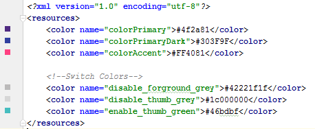
布局
<android.support.v7.widget.SwitchCompat
    android:layout_width="wrap_content"
    android:layout_height="wrap_content"
    android:layout_alignParentRight="true"
    android:checked="false"
    android:theme="@style/SCBSwitch" />
结果
查看启用和禁用开关的颜色变化

原文由 Hitesh Sahu 发布,翻译遵循 CC BY-SA 3.0 许可协议
3 回答824 阅读✓ 已解决
2 回答2.1k 阅读
2 回答948 阅读✓ 已解决
1 回答1.1k 阅读✓ 已解决
1 回答723 阅读✓ 已解决
2 回答840 阅读
2 回答781 阅读
 android
到目前为止,最好使用 AppCompat.v7 库中的 SwitchCompat。然后,您可以使用简单的样式来更改组件的颜色。
参考: Android 开发者博客
编辑:
它应该正确应用的方式是通过
android:theme="@style/Theme.MyTheme"这也可以应用于父样式,例如 EditTexts、RadioButtons、Switches、CheckBoxes 和 ProgressBars: