 极客观点
极客观点 项目管理
项目管理 HarmonyOS

如题,现在搞前端移动开发的是怎么模拟的,用几个FF插件或者Chrome插件吗?
有其它软件模拟不,请推荐几个插件,或者软件的,可能问的不对题,还希望理解
 html5
html5
就其跟原来说就是更改浏览器向服务器发送的User Agent。
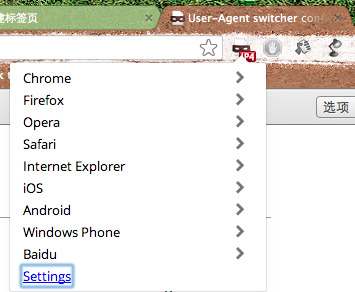
来个FireFox的: User Agent Switcher
https://addons.mozilla.org/en-US/fire...


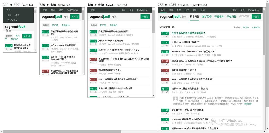
Responsive Design Trick
将以下内容添加至浏览器书签:
javascript:document.write('<!DOCTYPE html><html><head><meta charset="utf-8"><title>Responsive Design Testing</title><style>body { margin: 20px; font-family: sans-serif; overflow-x: scroll; }.wrapper { width: 6000px; }.frame { float: left; }h2 { margin: 0 0 5px 0; }iframe { margin: 0 20px 20px 0; border: 1px solid #666; }</style></head><body><div class="wrapper"><div class="frame"><h2>240<span> x 320</span> <small>(mobile)</small></h2><iframe src="' + window.location + '" sandbox="allow-same-origin allow-forms" seamless width="240" height="320"></iframe></div><div class="frame"><h2>320<span> x 480</span> <small>(mobile)</small></h2><iframe src="' + window.location + '" sandbox="allow-same-origin allow-forms" seamless width="320" height="480"></iframe></div><div class="frame"><h2>480<span> x 640</span> <small>(small tablet)</small></h2><iframe src="' + window.location + '" sandbox="allow-same-origin allow-forms" seamless width="480" height="640"></iframe></div><div class="frame"><h2>768<span> x 1024</span> <small>(tablet - portrait)</small></h2><iframe src="' + window.location + '" sandbox="allow-same-origin allow-forms" seamless width="768" height="1024"></iframe></div><div class="frame"><h2>1024<span> x 768</span> <small>(tablet - landscape)</small></h2><iframe src="' + window.location + '" sandbox="allow-same-origin allow-forms" seamless width="1024" height="768"></iframe></div><div class="frame"><h2>1200<span> x 800</span> <small>(desktop)</small></h2><iframe src="' + window.location + '" sandbox="allow-same-origin allow-forms" seamless width="1200" height="800"></iframe></div></div></body></html>')
然后打开需要模拟的网页,点击这个书签,so easy。
UA Trick
安装这个Chrome Extension
https://chrome.google.com/webstore/detail/user-agent-switcheruserag/ighgcligfbemmpnidpkhikmnmeohfafb


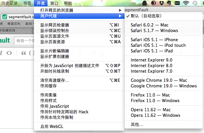
如果仅仅是简单的 responsive 页面模拟的话,Chrome 和 FF 就不需要装插件了。两者都能在审查元素里,找这个功能,可以模拟手机屏幕尺寸,改变页面显示大小。如图:
- Chrome 的是打开审查元素,点击右下角的齿轮设置,然后选择 Overrides,设置需要的屏幕尺寸即可。
- Firefox 的也一样是打开查看元素,不过直接在它右上角可以找到这个按钮。


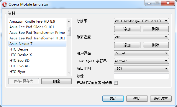
其次,还有各种各样的在线测试工具:
http://www.leiphone.com/warlial-responsive-tool.html
撰写回答
你尚未登录,登录后可以
- 和开发者交流问题的细节
- 关注并接收问题和回答的更新提醒
- 参与内容的编辑和改进,让解决方法与时俱进
推荐问题
js 如何将Key属性相同的放在同一个数组?
{代码...} 说明:id和name是动态的,有可能后台返回的是age和school,不是固定id和name想要的结果是; {代码...}13 回答12.9k 阅读
Next.js做纯前端是否可行?
最近在学习Next.js存在一个疑问,如果只需要做前端界面的渲染和交互后端逻辑都用java来做,是否还需要使用Next.js,还是说直接使用React+Tailwind css更好7 回答2.1k 阅读
想在H5项目,Vue3中实现扫一扫的功能,怎么实现比较好?
想在H5项目,Vue3中实现扫一扫的功能,怎么实现比较好?或者那种插件兼容性会比较好呢?5 回答1.4k 阅读
如何实现一个深拷贝函数?
在项目开发中,如何实现一个深拷贝函数?3 回答1.3k 阅读✓ 已解决
快开发完的Vue3项目要做SEO该如何处理?
快开发完的Vue3项目要做SEO该如何处理?项目已经快开发完了,领导让做SEO,目前的需求是首页做SEO,其他页面不需要优化去论坛上查了一下,发现好多针对Vue的SEO库都过时弃用了,大家有什么好用的库推荐吗?5 回答1.5k 阅读✓ 已解决
git提交记录问题?
"git add .“添加了所有文件.这样导致了项目里每一行代码的修改记录都变成了这次的提交备注"update gitignore"。后续其他同事也提交了几次记录。想着回滚回这次修改以前的,再让同事们重新提交自己的修改。但同事们已经pull过代码,可能也区分不出来了。 有什么方法删除掉gitignore的这次提交,并保留同事们后续的提交?2 回答1.3k 阅读✓ 已解决
怎么获取动态弹出对话框的模拟单击?
我在用js实现自动化刷课脚本的时候,要处理一个“继续学习”弹出对话框,才能播放。使用document.queryselctor('.continue')获取不到,好像也没有click事件;6 回答1.2k 阅读✓ 已解决
Chrome开发人员工具里面就有现在的设置选项,可以模拟手机浏览器的,或者帮我一起改进这个项目。 https://github.com/greatghoul/mobivie...