 极客观点
极客观点 项目管理
项目管理 HarmonyOS
考虑以下代码段:
 .parent {
  display: flex;
  flex-direction: column;
  width: 400px;
  border: 1px solid red;
  align-items: center;
}
.child {
  border: 1px solid blue;
}
<div class="parent">
<div class="child">
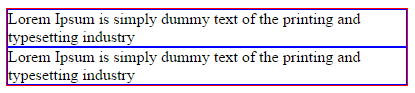
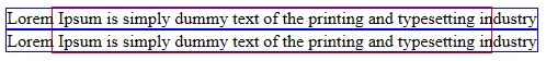
Lorem Ipsum is simply dummy text of the printing and typesetting industry
</div>
<div class="child">
Lorem Ipsum is simply dummy text of the printing and typesetting industry
</div>
</div>
在 Chrome 中,文本按预期换行:
但是,在 IE11 中, 文本没有换行:
这是 IE 中的已知错误吗? (如果是,将不胜感激指针)
有已知的解决方法吗?
这个类似的问题 没有明确的答案和官方指针。
原文由 Misha Moroshko 发布,翻译遵循 CC BY-SA 4.0 许可协议
将此添加到您的代码中:
我们知道块级子级应该占据父级的整个宽度。
Chrome 明白这一点。
无论出于何种原因,IE11 都需要一个明确的请求。
使用
flex-basis: 100%或flex: 1也可以。注意:有时需要对 HTML 结构的各个级别进行排序,以查明哪个容器获得了
width: 100%。 CSS 换行文本在 IE 中不起作用