 极客观点
极客观点 项目管理
项目管理 HarmonyOS
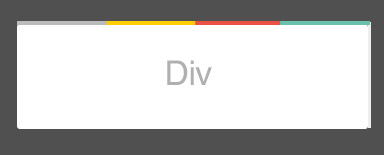
如何创建如下图所示的多色边框?
原文由 Hamed mayahian 发布,翻译遵循 CC BY-SA 4.0 许可协议
您可以在没有 pseudo-elements 的情况下做到这一点,只需 border-image: linear-gradient
 .fancy-border {
  width: 150px;
  height: 150px;
  text-align:center;
  border-top: 5px solid;
  border-image:   linear-gradient(to right, grey 25%, yellow 25%, yellow 50%,red 50%, red 75%, teal 75%) 5;
}
 <div class="fancy-border">
  my content
</div>
原文由 Theodore K. 发布,翻译遵循 CC BY-SA 3.0 许可协议
2 回答875 阅读✓ 已解决
4 回答985 阅读✓ 已解决
2 回答1.3k 阅读✓ 已解决
2 回答1k 阅读✓ 已解决
2 回答2.6k 阅读
1 回答1k 阅读✓ 已解决
2 回答898 阅读✓ 已解决
您可以使用
:after或:before伪元素和 csslinear-gradient来完成,如下所示: