 极客观点
极客观点 项目管理
项目管理 HarmonyOS
我在我的 Web 应用程序中为支付页面创建了一个模式,并希望显示支付提供商的品牌;条纹。
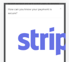
默认情况下,图像为 1950x927。我可以使用 style 但这不会使图像大小真正动态;即它在桌面上可能看起来不错,但仍然延伸到移动设备上的模态。
桌面:
移动的:
如何使用模态响应加载图像大小?
以下是我页面上的代码:
<!-- Modal content-->
<div class="modal-content">
<div class="modal-header">
<button type="button" class="close" data-dismiss="modal">×</button>
<h4 class="modal-title">How can you know your payment is secure?</h4>
</div>
<div class="modal-body">
<img src="{{ asset('img/stripe.png') }}" style="height:250px;">
<p>Stripe has been audited by a PCI-certified auditor and is certified to <a href="http://www.visa.com/splisting/searchGrsp.do?companyNameCriteria=stripe" target="_blank">PCI Service Provider Level 1</a>. This is the most stringent level of certification available in the payments industry. To accomplish this, they make use of best-in-class security tools and practices to maintain a high level of security at Stripe.</p>
</div>
<div class="modal-footer">
<button type="button" class="btn btn-default" data-dismiss="modal">Close</button>
</div>
</div>
原文由 James 发布,翻译遵循 CC BY-SA 4.0 许可协议
有关更多信息,您可以 在此处 阅读
尝试这个: