Bootstrap 4:仅一列的最小宽度

新手上路,请多包涵

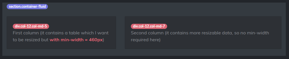
我用 Bootstrap 4 创建了一个基本的基于网格的布局。

我有两列:左和右。左栏是 div.col-12.col-md-5 ,右栏是 div.col-12.col-md-7 。问题是,左列里面有一个表格,由于表格不是可调整大小的,我希望左列的最小宽度为 460 像素(这样表格中的数据总是可以正确看到)。但我确实希望右侧的另一列能够完全响应并不断调整大小(直到屏幕尺寸 < md 断点 -768px-)。

我的布局看起来像这样:

布局

为了尝试实现这种行为,我创建了这段 css:

 @media (min-width: 768px) {
    .min-width-460-md {
        min-width: 460px;
    }
}

我已经将 .min-width-460-md 类应用于左列。所以我的 html 代码看起来像下一个:

 <section class="container-fluid">
    <div class="row">
        <div class="col-12 col-md-5 min-width-460-md">
            First column (left) which contains a table and needs to be min-width 460px.
        </div>
        <div class="col-12 col-md-7">
            Second column (it contains more resizable data, so no min-width required here).
        </div>
    </div>
</section>

问题是,当这个新类应用于左列时,当它达到 460px 时,它会停止调整大小(如我所愿),但右列位于左列下方,如下所示:

问题 :(

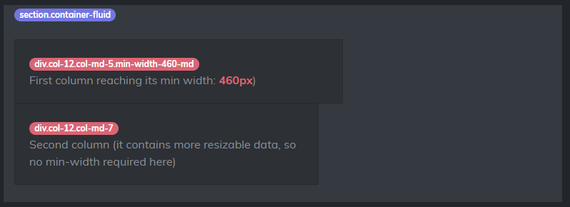
我显然不希望这种情况发生。我真正想要的是,当左列达到 460px 时,它会停止调整大小,但右列会继续调整大小,直到屏幕达到小于 768px -md- (然后两列都将是 col-12)。

有没有办法用 css + Bootstrap 4 做到这一点?

提前致谢!

原文由 Lucas Colombo 发布,翻译遵循 CC BY-SA 4.0 许可协议

阅读 1k
2 个回答

最简单的方法是使用右侧的 自动布局 列( .col )…

 <section class="container-fluid">
    <div class="row">
        <div class="col-12 col-md-5 min-width-460-md border">
            <table class="table table-striped">
                ..
            </table>
        </div>
        <div class="col bg-dark text-white">
            Second column (it contains more resizable data, so no min-width required here).
        </div>
    </div>
</section>

演示: https ://www.codeply.com/go/IB5xTytQAq

原文由 Zim 发布,翻译遵循 CC BY-SA 3.0 许可协议

这是一个简单的问题。您不能将 col-* col-md-* 用于此类工作。很难正确显示。

检查下面的片段。

 .new-section{
background-color: black;
color: white;
padding: 30px;
}
.new-section .row{
display: -webkit-box;
display: -ms-flexbox;
display: flex;
-webkit-box-orient: horizontal;
-webkit-box-direction: normal;
    -ms-flex-direction: row;
        flex-direction: row;
-ms-flex-wrap: wrap;
    flex-wrap: wrap;
    margin-left: -15px;
    margin-right: -15px;
}
@media (min-width: 768px){
.new-section .row{
-ms-flex-wrap: nowrap;
    flex-wrap: nowrap;
}
}
.new-section .row .min-width-460-md,
.new-section .row .right-column{
padding-left: 15px;
padding-right: 15px;
}
.new-section .row .min-width-460-md{
border: 1px solid #f2f2f2;
-ms-flex-preferred-size: 100%;
    flex-basis: 100%;
-webkit-box-flex: 0;
    -ms-flex-positive: 0;
        flex-grow: 0;
-ms-flex-negative: 0;
    flex-shrink: 0;
}
@media (min-width: 768px){
.new-section .row .min-width-460-md{
-ms-flex-preferred-size: 460px;
    flex-basis: 460px;
}
}
.new-section .row .right-column{
width: 100%;
}
 <section class="container-fluid new-section">
    <div class="row">
        <div class="min-width-460-md">
            First column (left) which contains a table and needs to be min-width 460px.
        </div>
        <div class="right-column">
            Second column (it contains more resizable data, so no min-width required here).
        </div>
    </div>
</section>

这不是 bootstra@4 的正确解决方案。这个片段是你所期望的。以下代码为 bootstrap@4 解决方案。

 @media (min-width: 768px) {
        .min-width-460-md {
            flex-basis: 460px !important;
            max-width: 460px !important;
        }
    }
 <link href="https://maxcdn.bootstrapcdn.com/bootstrap/4.0.0/css/bootstrap.min.css" rel="stylesheet"/>

    <section class="container-fluid">
        <div class="row flex-md-row flex-md-nowrap">
            <div class="col-12 min-width-460-md bg-secondary">
                First column (left) which contains a table and needs to be min-width 460px.
            </div>
            <div class="col-12 bg-warning">
                Second column (it contains more resizable data, so no min-width required here).
            </div>
        </div>
    </section>

原文由 Rahul 发布,翻译遵循 CC BY-SA 3.0 许可协议

撰写回答
你尚未登录,登录后可以
  • 和开发者交流问题的细节
  • 关注并接收问题和回答的更新提醒
  • 参与内容的编辑和改进,让解决方法与时俱进
推荐问题