 极客观点
极客观点 项目管理
项目管理 HarmonyOS
opacity 与 fill-opacity 在 SVG 中有什么区别?
我参考了 fill-opacity 和 opacity 的文档,但我很困惑这是什么意思
fill-opacity: 当前对象内容的不透明度
对比
不透明度:对象的透明度
原文由 ak_rails 发布,翻译遵循 CC BY-SA 4.0 许可协议
opacity 与 fill-opacity 在 SVG 中有什么区别?
我参考了 fill-opacity 和 opacity 的文档,但我很困惑这是什么意思
fill-opacity: 当前对象内容的不透明度
对比
不透明度:对象的透明度
原文由 ak_rails 发布,翻译遵循 CC BY-SA 4.0 许可协议
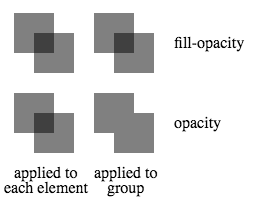
除了影响每个单独元素的哪些部分受到影响(例如填充与描边)之外,另一个区别是当元素在组内重叠时会发生什么。 opacity 影响整个组的透明度,而 fill-opacity 影响组内各个元素的透明度。这样做的一个结果是,当此类组中的元素重叠时,在使用 fill-opacity 时重叠区域会产生复合效应,但在使用 opacity 时则不会。当对组内的每个元素或组本身应用 0.5 的(填充)不透明度时,下图对此进行了演示。
 <svg height="200">
  <g transform="translate(0, 0)">
    <rect x="10" y="10" width="40" height="40"   fill-opacity="0.5"/>
    <rect x="30" y="30" width="40" height="40"   fill-opacity="0.5"/>
  </g>
  <g transform="translate(80, 0)"                fill-opacity="0.5">
    <rect x="10" y="10" width="40" height="40"/>
    <rect x="30" y="30" width="40" height="40"/>
  </g>
  <g transform="translate(0, 80)">
    <rect x="10" y="10" width="40" height="40"        opacity="0.5"/>
    <rect x="30" y="30" width="40" height="40"        opacity="0.5"/>
  </g>
  <g transform="translate(80, 80)"                    opacity="0.5">
    <rect x="10" y="10" width="40" height="40"/>
    <rect x="30" y="30" width="40" height="40"/>
  </g>
  <text transform="translate(170,45)">fill-opacity</text>
  <text transform="translate(170,125)">opacity</text>
  <text transform="translate(10,175)">applied to</text>
  <text transform="translate(0,190)">each element</text>
  <text transform="translate(90,175)">applied to</text>
  <text transform="translate(103,190)">group</text>
</svg>
原文由 Andrew Willems 发布,翻译遵循 CC BY-SA 3.0 许可协议
13 回答12.7k 阅读
7 回答1.8k 阅读
3 回答1k 阅读✓ 已解决
3 回答1.2k 阅读✓ 已解决
2 回答1.1k 阅读✓ 已解决
5 回答2.2k 阅读
2 回答792 阅读✓ 已解决
区别正是名称所指示的:)。
fill-opacityis applicable only to thefillof the element (or in other words, just its background),stroke-opacityis applicable only to thestroke而opacity适用于两者。opacity是一种后处理操作。也就是说,元素(或组)作为一个整体(填充+描边)被渲染,然后根据不透明度设置调整透明度,而fill-opacity和stroke-opacity是中间的步骤,因此透明度被单独添加到描边和填充。所以当stroke-opacity和fill-opacity一起使用时,结果仍然与使用opacity不同在它们重叠的地方显示出来)。您可以在下面的前两个元素中直观地看到差异。同样如罗伯特(在评论中)所示,
fill-opacity不适用于image而opacity有效。在 CSS 世界中,您可以将其视为类似于以下代码片段中的内容。 (请注意,我并不是说它们相等, SVG 和 CSS 之间存在细微差别。这只是试图解释这些 SVG 属性在 CSS 中的含义。)