 极客观点
极客观点 项目管理
项目管理 HarmonyOS
我对 CSS 很陌生,它对我来说仍然很神奇。
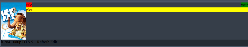
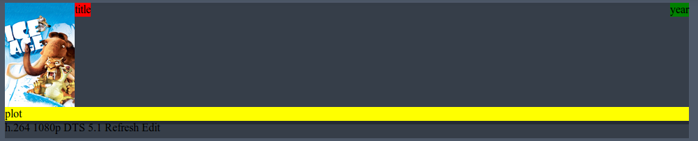
我想让我的 div movie_item_content_plot 在新行上。目前我在 HTML 中使用 <br> 并且效果很好。 When I replace the <br> with clear: both; the div appears between movie_item_poster and movie_item_toolbar - but this is not what I want to have.它应该在 movie_item_content 但在 movie_item_year 和 movie_item_plot 下。
这 是一个可以玩的小提琴。
想要的布局( <br> )
布局错误( clear: both; )
HTML
 <div id="movie_item">
    <div class="movie_item_poster">
        <img src="..." style="max-width: 100%; max-height: 100%;">
    </div>

     <div id="movie_item_content">
        <div class="movie_item_content_title">title</div>
        <div class="movie_item_content_year">year</div>
        <br> <!-- I want to replace this br -->
        <div class="movie_item_content_plot">plot</div>
    </div>

    <div class="movie_item_toolbar">
        Lorem Ipsum...
    </div>
</div>
CSS
 #movie_item {
    display: block;
    margin-top: 10px;
    height: 175px;
}

.movie_item_poster {
    float: left;
    height: 150px;
    width: 100px;
}

.movie_item_content {
    float: right;
}

.movie_item_content_title {
    float: left;
}

.movie_item_content_year {
    float: right;
}

.movie_item_content_plot {

}

.movie_item_toolbar {
    clear: both;
    vertical-align: bottom;
    width: 100%;
    height: 25px;
}
原文由 Lucas 发布,翻译遵循 CC BY-SA 4.0 许可协议
这样的事情怎么办。
您不必同时浮动
movie_item_poster和movie_item_content。只需漂浮其中一个…这是一个 JSFiddle 。