使用 CSS 模糊图像或背景图像的边缘

新手上路,请多包涵

我知道有很多新的 CSS 过滤器,我想知道是否有办法将它们应用于图像或背景图像。我读过的所有内容都在谈论用阴影柔化图像,但是,阴影是一种颜色,我想模糊图像的边缘,以便在它们彼此相邻时可以更无缝地将它们混合在一起。现在看起来你只能使用阴影或对整个图像应用模糊(根据我所阅读的内容)。

我能想到的最接近的是一个半透明的盒子阴影….像这样

-webkit-box-shadow: 12px 29px 81px 0px rgba(0,0,0,0.75);
-moz-box-shadow: 12px 29px 81px 0px rgba(0,0,0,0.75);
box-shadow: 12px 29px 81px 0px rgba(0,0,0,0.75);

原文由 Startec 发布,翻译遵循 CC BY-SA 4.0 许可协议

阅读 886
2 个回答

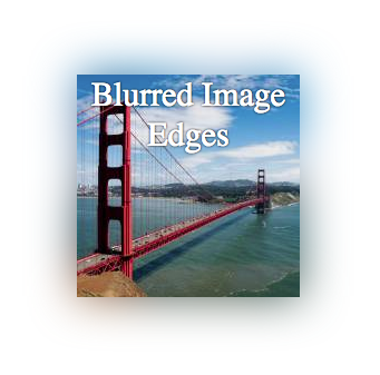
如果您正在寻找的只是模糊图像边缘,您可以简单地使用带插图的框阴影。

工作示例:http: //jsfiddle.net/d9Q5H/1/

截屏

HTML:

 <div class="image-blurred-edge"></div>

CSS

 .image-blurred-edge {
    background-image: url('http://lorempixel.com/200/200/city/9');
    width: 200px;
    height: 200px;
    /* you need to match the shadow color to your background or image border for the desired effect*/
    box-shadow: 0 0 8px 8px white inset;
}

原文由 Leonardo 发布,翻译遵循 CC BY-SA 3.0 许可协议

我不完全确定你想要什么样的视觉最终结果,但这里有一个简单的方法来模糊图像的边缘:将一个带有图像的 div 放在另一个带有模糊图像的 div 中。

这里的工作示例:http: //jsfiddle.net/ZY5hn/1/

截屏

HTML:

 <div class="placeholder">
     <!-- blurred background image for blurred edge -->
     <div class="bg-image-blur"></div>
     <!-- same image, no blur -->
     <div class="bg-image"></div>
     <!-- content -->
     <div class="content">Blurred Image Edges</div>
</div>

CSS:

 .placeholder {
    margin-right: auto;
    margin-left:auto;
    margin-top: 20px;
    width: 200px;
    height: 200px;
    position: relative;
    /* this is the only relevant part for the example */
}
/* both DIVs have the same image */
 .bg-image-blur, .bg-image {
    background-image: url('http://lorempixel.com/200/200/city/9');
    position:absolute;
    top:0;
    left:0;
    width: 100%;
    height:100%;
}
/* blur the background, to make blurred edges that overflow the unblurred image that is on top */
 .bg-image-blur {
    -webkit-filter: blur(20px);
    -moz-filter: blur(20px);
    -o-filter: blur(20px);
    -ms-filter: blur(20px);
    filter: blur(20px);
}
/* I added this DIV in case you need to place content inside */
 .content {
    position: absolute;
    top:0;
    left:0;
    width: 100%;
    height: 100%;
    color: #fff;
    text-shadow: 0 0 3px #000;
    text-align: center;
    font-size: 30px;
}

请注意,模糊效果使用的是图像,因此它会随着图像颜色的变化而变化。

我希望这有帮助。

原文由 Leonardo 发布,翻译遵循 CC BY-SA 3.0 许可协议

撰写回答
你尚未登录,登录后可以
  • 和开发者交流问题的细节
  • 关注并接收问题和回答的更新提醒
  • 参与内容的编辑和改进,让解决方法与时俱进
推荐问题
logo
Stack Overflow 翻译
子站问答
访问
宣传栏